

This post was co-authored by Chris McMeeking, Alistair Barrell, and Jennifer Dailey.
How applications use color can cause issues for users with disabilities. For non-sighted users, using colors to denote information, such as the role of items, is problematic. It’s dangerous to assume that users have access to trait information through VoiceOver. Users with color blindness or other visual disabilities may have trouble distinguishing these colors, but they see well enough to not be dependent on VoiceOver. If role information is only available as either color or VoiceOver traits, these users won’t know the role of an item. This can create a lot of issues when using default controls as when used in the wrong context the default styling isn’t accessible.
This post will cover:
- General issues that can occur with color within applications.
- WCag criteria that apply
- Specific issues dealing with the Top Navigation Bar in iOS
The issues discussed in this post fall under the following WCag 2.0 success criteria:
- 1.4.1 – Use of color (A)
- 1.4.3 – Color Contrast (AA)
- 1.4.6 – Color Contrast Enhanced (AAA)
Note: This post is iOS-centric, as there are some interesting iOS-specific color issues—but the concepts apply equally to Android.
Issues with Color
There are many issues that can arise with the use of color. Below are a few examples, along with descriptions of default controls and typical practices.
Color as Information (1.4.1)
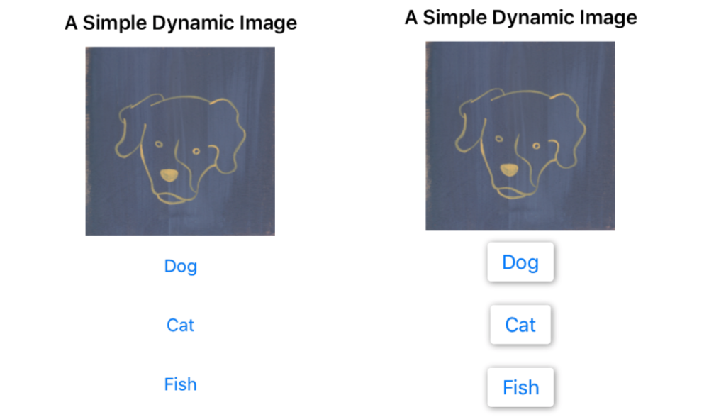
When dealing with accessibility, it’s important to remember that there is information in your application outside of its text content. It’s fairly common to use color as the primary indicator for different types of controls. For example, the default iOS style is to have blue text in a button, with a white-on-white (i.e., transparent-on-white) background. This is an example of using color as information.
The example below shows two sets of buttons. In the left example, we’re using the blue text to inform the user that the controls are buttons. Notice that in the right example, we’ve added a subtle 3D effect to our buttons. Now the color isn’t the only visual indicator conveying the role information to sighted users. When context alone isn’t enough to know the role of visible controls, color shouldn’t be the only indicator.
Text Contrast (1.4.3, 1.4.6)
This is fairly straightforward. When including text in your application, ensure the text is on a background that allows users to easily distinguish between the two. For example this (this) is difficult to read. In order to pass this criteria, you must have a color contrast ratio of 4.5:1 for all elements (except for text larger than 18pt). A contrast ratio of 7:1 is required to pass the similar AAA requirement.
iOS Top Bar Contrast
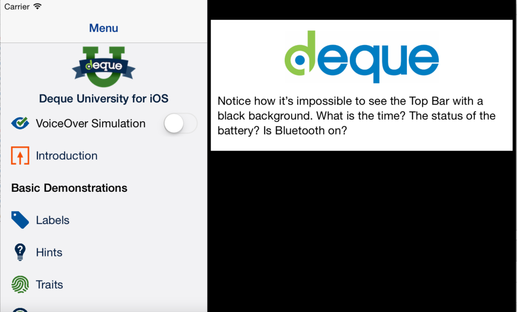
Top Bar Contrast refers to the color contrast between the item color in the Top Bar of iPads (which includes elements like the time and the battery status) and the background color/image of the current app. Because the iPad doesn’t have a navigation bar, unlike the iPhone, the background color of the Top Bar will change with the background color of the app. If the contrast isn’t great enough, it may be impossible for users to effectively use the Top Bar.
Color contrast is important not only from an accessibility standpoint, but a usability one also. If the background color doesn’t contrast well enough with the text color of the top bar, users with and without sight impairments may not be able to effectively read important device information. For example, if the main background of your application is black, when you’re using a tablet form factor in split view mode, the black background ends up being displayed behind the top navigation bar. Since the elements of the top Navigation bar are black, they completely disappear!
Fixing Background Color for the Top Bar
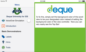
In this example, our application itself is completely accessible; however, the design choices within our application caused iOS elements to break. To fix this issue, we simply need an additional view in our hierarchy. Don’t add your background color styling to the root view of the layout. Leave the root view white (or transparent), and add a view on top of it, with a little bit of space for the top navigation bar. If you’re adding constraints, the constraint should refer to the “top layout guide.” Then add your main application background color to this view, and move the rest of your views into this, treating it as the new root view of your application.
Best Practice
There’s no simple way to maintain color contrast in your applications. Only through careful manual inspection of all text elements can you be sure your application complies. We recommend maintaining a color contrast ratio of 4.5:1 for all text elements. Also, it’s important to keep in mind that not only do your backgrounds need to be checked against your content, but also against the containing context. As in our iOS Top Bar example, it’s possible to have your background colors affect more than just the contents of your application.
To find more accessibility tutorials, visit our other blog posts and download our Deque University for iOS app, available on the App Store and Github!
Learn more…
- Read more Accessibility Best Practice posts
- Sign up for a mobile accessibility webinar
- Discover how Deque products can help you make sure your apps and websites fully accessible


