Illustration of a scientist pretending to physically adjust the contrast on a giant mobile device

Testing Color Contrast in Mobile Apps

I love colors.  This fact should not surprise anyone who knows me (I’m an avid knitter, and I love seeing how different colors can interact with each other in patterns).  On top of just being nice, colors can be helpful for parsing through data, providing feedback, and creating visual continuity.  But, using the wrong colors can make a bad impression.  Attempting to read bright text against a bright background, for example, not only hurts the eyes, but it can also be downright unreadable, especially for those with color blindness.

Screenshot of a dated site design using harshly contrasting yellows, reds and a rubber duck image.
I personally would have gone with some different colors for this site.

How do we make sure that the color palette chosen for your app results in a good user experience, even for those with low vision and color blindness?  In this blog post, I’ll cover

What is Acceptable Color Contrast?

Simply put, having an acceptable color contrast means that any visible text in your app can be seen clearly by any sighted user, even people with low vision or color blindness. When designing an app, it is important to ensure that the background colors do not interfere with the app’s foreground text.  So, at what point is there a good enough contrast between the text and its background where it can be called “acceptable”? And, how do we make sure that text is readable by everybody, including those with low vision or color blindness?

The Web Content Accessibility Guidelines (WCAG) has a specific guideline (WCAG 1.4.3) to help figure out whether text is readable for sighted users. This criteria uses a particular algorithm to map color combinations into comparable ratios.  Using this formula, WCAG states that a 4.5:1 color contrast ratio with text and its background is adequate for regular (body) text, and large text (14+ pt bold, or 18+ pt regular) should have at least a 3:1 color contrast ratio.

Special Considerations for Mobile

Unfortunately, mobile is not that simple.  Before we jump right into ways to test for mobile, there are a few things to keep in mind when testing specifically on mobile apps.  In particular, the rise of Dark Mode as an OS-wide setting, and what to do about Large Text.

Dark Mode

In the last few years, iOS and Android have both released a system-wide “Dark Mode” feature.  If your app supports Dark Mode, you should test your app for color contrast issues in both Dark and Light Modes.  If your app has any other themes that affect background and text colors, you should test the color contrast on each of those themes as well.

Large Text

It is difficult to determine text size by looks, particularly on mobile, which can have a wide range of DPI and screen sizes.  For this reason, unless you know for sure that a certain font is 18+ pt or 14+ pt bold (24px or 19px bold for web), do not assume that text can be considered large.

High Contrast Settings

There are a few “High Contrast” settings available.  In iOS, there’s “Increase Contrast,” and in Android, there’s “High Contrast Text.”  Both of these are OS-wide settings where a user can increase color contrast across their entire device.  Even though it’s great to support these settings in your apps, you cannot use them as a way to meet WCAG criteria.  When testing color contrast in your app, make sure that you have all high contrast settings set to “OFF.”

Testing Methodologies

There are a few different ways you can test color contrast, and it all depends on what information you have access to.  Fortunately, there are many websites and desktop applications available that can help calculate the color contrast ratio, so that you do not have to calculate it yourself!  Below, I have highlighted four different ways to test color contrast on mobile.

Using Color Palettes

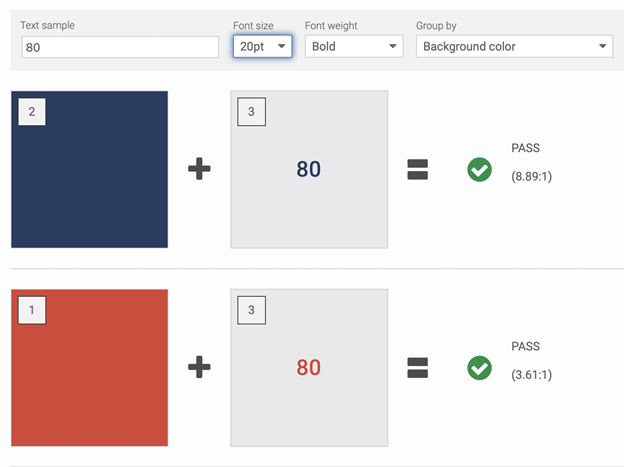
If you have access to your mobile app’s color palettes, this can be quite simple.  I personally recommend using Deque’s Color Contrast Checker.  Plug in the colors and input which are background and which are text colors, and it will tell you whether your color palettes meet WCAG 1.4.3. If they do not, it can recommend alternate colors that will meet this criteria.  This is the preferred way of checking color contrast, as it will give you the most accurate color contrast ratios.

The Contrast Checker has a dark blue and a bright red against a light gray background. The dark blue has an 8.89:1 color contrast ratio, and the bright red has a 3.61:1 color contrast ratio. The Contrast Checker states that both colors pass because the font size is set to 20pt bold (large text).

Testing on Simulators

If you do not have access to the color palette but have access to the mobile app on a simulator, you’ll have to use a website or desktop app that allows you to use a color picker.  I have used both Deque’s Color Contrast Analyzer (website) and the Colour Contrast Analyzer (desktop app), and both work quite nicely.  For each text element on screen, use the color picker tool to get the rendered text and background colors.  To assess these colors as accurately as possible, you’ll want to pick the lightest pixel in the text, and the darkest pixel in the background (or vice versa if the text is dark and the background is light).  Note that using the color picker tool may not be 100% accurate; however, it is a fairly accurate way to estimate the color contrast.

The Color Contrast Analyzer shows that the dark blue used against a light gray background (which is displayed in the app) has an 8.77:1 color contrast ratio.

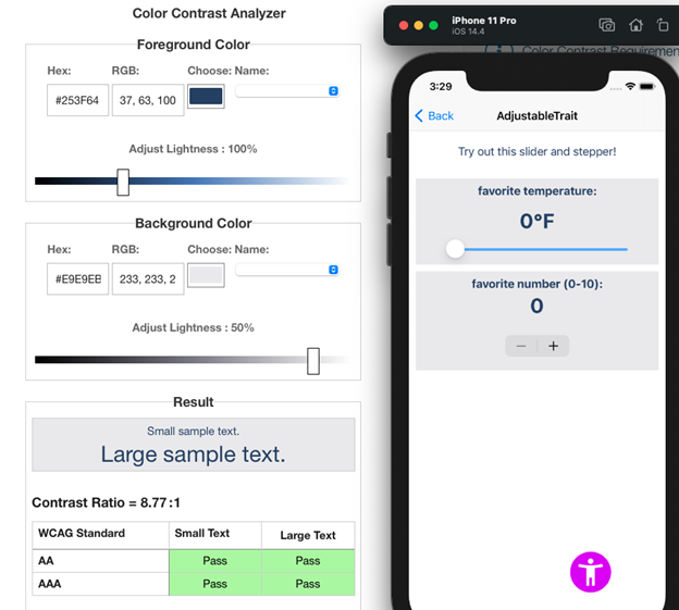
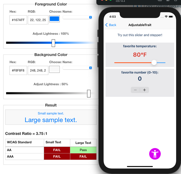
Here in this screenshot, the text elements that use the dark blue pass with a color contrast ratio of 8.77:1; however, in the next screenshot, the default color for the “Back” button present on most iOS apps has a color contrast ratio of 3.75:1, which does not meet WCAG success criteria.

The contrast analyzer again, now showing most iOS apps has a color contrast ratio of 3.75:1

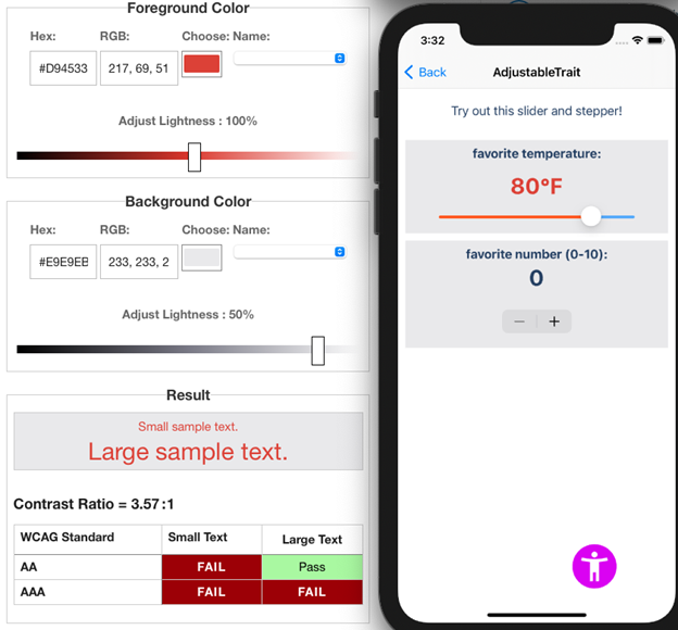
If the text color can change based on user input, check that color contrast too!  In this example, when the slider is shifted to a higher value, the text color changes from dark blue to bright red.  The new color contrast of this text element is 3.57:1.  I happen to know in this instance that the font size is 30pt bold, so it does pass color contrast because it counts as large text.

Another example with user input changing the contrast this time.

Testing on Devices

Testing on a device is similar to testing on a simulator but involves an extra step.  You first will have to take a screenshot of every screen and send it to your computer.  Then, you can follow the same steps as testing on a simulator.  Make sure to get screenshots with each different theme, and a screenshot if the text changes color!

axe DevTools Mobile

If you want to save some time with testing, but don’t have access to the color palette, axe DevTools Mobile can help!  It can accurately check the color contrast of every text element on-screen for you, saving you time and money.  Try out axe for Android (it’s free)!

Conclusion

There is a lot to consider when testing color contrast for mobile, but having adequate color contrast can be a simple way to make your app better for many users, including those with low vision or color blindness.  If you want to learn more about mobile accessibility, check out our other blog posts and try out our iOS and Android products! If you have any questions, feel free to contact us, our experts are always willing to help.

Photo of Jennifer Korth

About Jennifer Korth

Jennifer Korth is a software engineer who has been working in iOS accessibility at Deque since 2015. While Deque was her introduction to accessibility, one of her projects before graduating from the University of Michigan in 2017 was working closely with C.S. Mott Children’s Hospital to create an accessible, stress-relieving Hololens application for children undergoing cancer treatments and other procedures. In her free time, she loves playing video games with friends, knitting, and having board game nights with her family.
update selasa

Comments 6 responses

  1. Hi Jennifer, nice article,

    I think it is useful to add that the WCAG 2.x contrast methods are being replaced for WCAG 3.0 by the APCA: Advanced Perceptual Contrast Algorithm. The simple version is the link associated with this post.

    I bring this up because the 2.x (1.4.3) contrast was conceived over 12 years ago, but unfortunately is not always applicable to today’s web content. It is not perceptual, and fails to predict contrast appropriately if the background is darker than about #aaa. This is clearly a problem for use with any “Dark Mode” — WCAG 2.x contrast math is incapable of correctly indicating contrasts with dark color pairs. I discuss this with examples in this gist: https://gist.github.com/Myndex/c30dba273aa5eca426ad9f5200917c9d

    In addition, there is a mass of misinformation about the level of contrast needed for fluent readability, especially for body text. While 1.4.3 indicates 4.5:1 is the AA level for the text size typically used in body text, it fails to specify a minimum size, and 4.5:1 is insufficient contrast for columns of small thin body text.

    The accepted preferred standard for body text, as indicated in international standards such as the ISO, is 10:1 (that is using different math, for WCAG 2.x, it’s more in the area of 11:1). 4.5:1 is inadequate for columns of body text. Other international standards such as ANSI and ISO also proscribe text below a minimum font size, which WCAG 2.x does not (WCAG 3.0 does). As a result, here again, we see text that is too small in webcontent, even for normal vision, not even considering impairments.

    Here are some key points regarding font size:

    Our perception of contrast is not only affected by surrounding elements and the environment, but the “Spatial Frequency” of the stimulus itself. A higher spatial frequency means smaller, thinner, and more crowded. This applies very much to text and the font size and design used.

    In a typical eye exam for acuity (ability to focus), legibility at a particular level means getting three out of five letters correct, using bold wide letters at maximum contrast. This is wholly insufficient for fluent, easy reading.

    “Legibility” is not “readability”.

    “Normal” print is usually considered 11.5pt to 12pt, this is equivalent of 16px on screen. And this is for normal vision. To relate this to real world visual acuity, if you think of an eye doctor’s chart, and focusing on a capital E. If that E is at the legibility or acuity limit for 20/20 vision, and that is at full contrast, it is equivalent to a Helvetica capital E that is 3.9px on screen, meaning a 5.5px CSS font-size. (In print, this is a 4pt font on coated paper).

    But that is the minimum for “just making out” the letters at ~70% accuracy. That is legibility, not readability. For readability, the lower case x-height needs to be a minimum of twice that cap height. This is called the critical font size for readability.

    This means that while a 5.5px font may be the minimum for 20/20 legibility, the minimum for readability is 15.6px, hence the common default of 16px (in print, about 12pt, the typical standard in books). And this is for normal vision. Someone with 20/40 needs twice that, about a 31px font. This is why the WCAG standard requires that users have the ability to zoom text larger.

    While text that is too small is hard to read, so is text that is too big. Above approximately 96px, reading speed decreases. Also, very large fonts make it difficult for a user to enlarge the smaller text on the page, as most browsers presently zoom all text regardless.

    The current WCAG 2.x requires that text be able to be zoomed up by 200%, though that really only accommodates 20/40. Those with low vision need substantially larger text. New guidelines are in the works regarding this.

    In closing, I hope this has been a useful addendum to your article. This is an area of active research and development, all poised for a more readable future.

    Thank you for reading,

    Andy

    Andrew Somers
    W3 AGWG Invited Expert/Silver Task Force
    Myndex Color Science Researcher
    “Any personal opinions expressed are not necessarily those of the W3.org/AGWG”

  2. Outstanding article Jennifer. Amazing comment by Andy. Thank you for outlining 5he thought process mixed with practical validation aspects.

  3. I suggest using the NEW APCA colour contrast tool as it is superior to the colour contrast analyser tool especially for dark mode on mobile screens.

  4. Hi,

    Thanks for the article and the comments, find it quite insightful and to the point.

    One clarification I have is about iOS device contrast setting.

    The article suggests that we can’t depend on device contrast settings as away of meeting WCAG’s contrast ratio. I would like to understand the reasoning behind this.

    Certain font sizes and colours combinations specified in Human Interface Guidelines doesn’t meet contrast ratio. The only way to make meet the ratio at an OS level would be to switch the contrast mode ON.

    I suppose the question is — why shouldn’t we rely on device feature to enable high contrast views (for mobile apps) rather than making all content is the screen meet the contrast ratio (which often makes the screen quite busy, adds to cognitive load and provides less visual hierarchy).

  5. Actually, I believe supporting those accessibility settings is technically WCAG compliant.

    WCAG has a note that says: “Setting user preferences within the content to produce a conforming version is an acceptable mechanism for reaching another version as long as the method used to set the preferences is accessibility supported.”

    Source: https://www.w3.org/WAI/WCAG22/Understanding/conformance#conforming-alt-versions

    I agree it should NOT be done. But technically can. I’m mainly looking at things like switch buttons on Apple’s devices that are low contrast.

  6. Regarding Senthil and Giovani’s comments about the operating system level high contrast settings, there are a few reasons why relying on them is not a good idea.

    First of all, I want to point out that the WCAG note that Giovani quoted, does not actually indicate that those settings can be used to meet conformance. The note reads, “Setting user preferences within the content to produce a conforming version is an acceptable mechanism for reaching another version as long as the method used to set the preferences is accessibility supported.” The OS level high contrast settings would not be considered “within the content”, thus cannot be used to meet the criteria.

    Secondly, when it comes to Android and the segmentation of the OS across manufacturers, you cannot guarantee that the high contrast setting will behave consistently in all scenarios. My colleague shared that in a previous job, they had a button that met color contrast, but on certain Samsung devices, turning the high contrast setting on actually caused it to fail.

    While it is unfortunate that Apple’s Human Interface Guidelines don’t align with WCAG, if you want your app to be compliant, you shouldn’t rely on the Increase Contrast accessibility setting. I disagree that ensuring text meets WCAG color contrast without the high contrast setting on “makes the screen quite busy, adds to cognitive load and provides less visual hierarchy”. The goal of not relying on the setting is to provide a good an accessible user experience for everyone, then an enhanced contrast experience for those that need it.

Leave a Reply

Your email address will not be published. Required fields are marked *