“To err is human. To prevent, suggest, and correct are divine.” – Raghavendra Peri
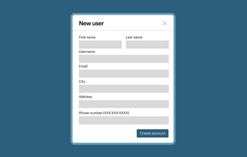
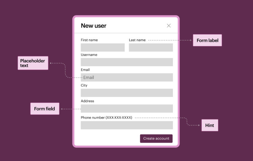
When we submit user data in financial transactions, travel, and entertainment bookings, or by filling out surveys, we often make mistakes. Let’s imagine we submit a form three times, but we fail each time without knowing the reason why. A friend tells us to correct the fields that are marked in red. Another friend says to look for a tick mark in the date of birth that says that the date format is not correct.
Even though many of us are familiar with these colors and visual cues, we can’t expect all users to know about color and other visual cues. If failing to complete forms correctly is a common experience for a person without disabilities, then I wonder about the frustrations of a person who is color blind, a person who is blind or low vision, or a person who has limited cognitive abilities and who needs help in understanding these complex scenarios.
A form is never without error validation and an accessible form is never complete with accessible error identification.
Now that we understand a bit about placeholders, required fields, and creating accessible forms using native HTML, let’s look at form validation and error identification. If you have not taken a look at the other posts in this series, we highly recommend that you start from the beginning:
- The Anatomy of Accessible Forms: The Problem with Placeholders
- The Anatomy of Accessible Forms: Required Form Fields
- The Anatomy of Accessible Forms: Best Practices
When it comes to identifying & preventing form errors, the Web Content Accessibility Guidelines (WCAG) version 2.0 has provided a set of guidelines that we would need to implement.
WCAG 2.0 specifies the following guidelines for accessible form validation and error identification:
- SC 3.3.1 Error identification
- SC 3.3.3 Error suggestions
- SC 3.3.4 Error Prevention in legal and financial transactions
There are two methods of validating the forms: server-side validation and client-side validation. We will go through each method and see how each of them contributes to an accessible experience for users.
Server-Side Validation
Server-side validation means the data submitted in a form is sent to a web server and; is validated on the server using scripts such as PHP, JSP, Perl, etc. When a server-side validation takes place, the page that contains the form refreshes. If there are any errors then the errors are displayed to the users. This is one of the oldest methods of validating forms.
If a server-side validation takes place and the user is sent to a page to identify and correct the errors, then use the following tips to notify users of the errors:
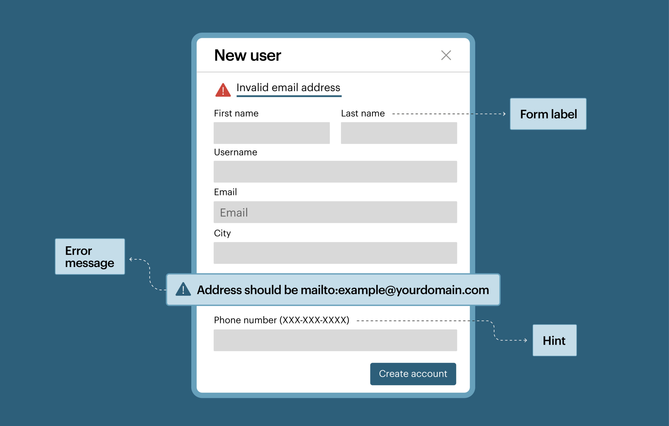
- Change the title of the page: users, including people with disabilities, tend to check the page title when the page refreshes or when they are sent to a new page. Making sure that page title contains “Alert form has errors” will allow users to immediately know that there are errors on page and form failed validation.
- Give the error a heading level: Provide a header, preferably a H1, so that assistive technology users can jump directly to the error and correct it.
- Visually style the error in such a way that it is distinguishable from other content: This helps all users identify the error easily.
- Make sure that errors are clear and informative: Each error must specify which form field has the error and a short note on how to fix it.
- Provide a same-page link so that users can jump directly to the form field that has the error.
Client-side Validation
Client-side validation means the form validation is handled by a browser using JavaScript. This type of validation provides instant feedback to the users during data entry or once the form is submitted. In this case, the data is not sent to the server for validation.
There are multiple methods where errors are presented to the users in client-side validation. However, the concept of exposing the error and providing adequate feedback to the user to rectify that error remains the same.
Refer to the following points on how best to notify the users about errors in client-side validation:
- Present the errors in text.
- Make sure that errors are clear and informative so that users can fix the errors.
- Don’t use visual cues like color or icons alone to identify the form fields that have the errors– If color or icons are used, you must also provide the same information in an alternative method so that it is accessible to all users.
- Move the focus to the first form control that has the error or move the focus to the common error message.
- Associate the inline errors with form fields by using the aria-describedby attribute.
- Provide appropriate suggestions– for example if the email field is not valid, instead of displaying the error message as “invalid email,” display “invalid email enter example@yourdomain.com”.
There are many factors that contribute to a successful form submission. While WCAG 2.0 provides guidelines to be compliant, the guidelines can go only so far. It is the duty of developers, designers, and content authors to provide an easy, accessible experience to users. Although you may be compliant with WCAG, you should also consider if you are providing that effortless, smooth experience. Go that extra mile to make your forms accessible and usable.
We welcome your questions, suggestions, and feedback. Please do let us know if you would like to see any more posts on any particular topic and we will address them in our future posts.