
The other day, I was filling out an online exam registration form. They asked me to enter my office address, home address, work phone, and home phone. I filled in the details without any issues. However, when I wanted to verify whether I filled in all the details in the right fields, the text “Office address” and other field text disappeared. I was stuck wondering what to do. Do I re-enter the data into each field to make sure it’s correct? Unfortunately, that was the only way to check each field, which turned out to be both time-consuming and frustrating.
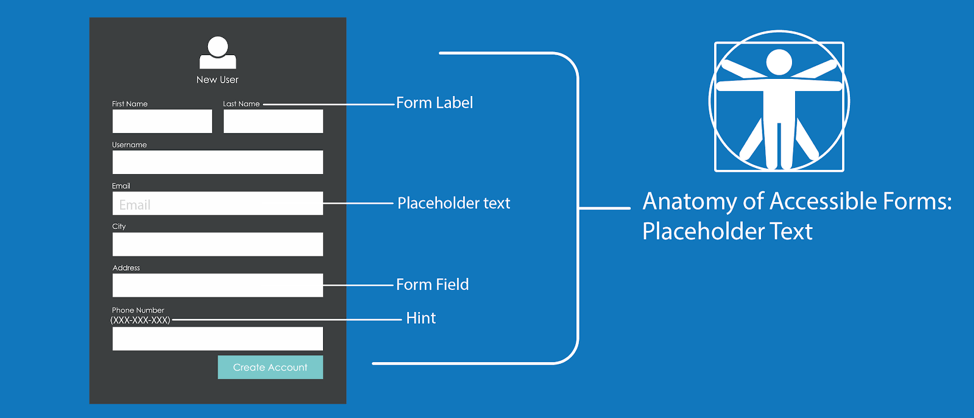
The placeholder attribute provides short instructions of the expected value for an input field. For example, the format for a date as MM/DD/YYYY or the requirements for a new password.

The text input field displays the placeholder’s short instructions at first, but will disappear once the user enters text. Your best option is to place the label and any instructions outside of the form field as text on the page rather than placeholder text in the input. This practice ensures the user can always see the form field’s label and instructions.
The placeholder attribute works with the following input types:
- Text
- Search
- URL
- telephone
- password
HTML5 introduced the placeholder attribute, and since then it has become widely used. Designers and developers want to use a placeholder in forms as they believe it is more appealing than a visible label and instructions. This is because it takes up less space, especially on smaller devices and screens.
In part one of the series on accessible forms, we will see why using a placeholder is not great from an accessibility standpoint and how to use a placeholder attribute successfully.
Avoid the Placeholder Attribute
According to research conducted by Nielsen, using placeholder text in a form field causes a poor user experience. This is because placeholders confuse many users. In particular, people with cognitive disabilities tend to have issues understanding placeholder text because they think it is pre-populated text and will try to submit the form without entering their specific information.
It is important to note that not all screen readers will announce the placeholder attribute. If it is not read by a screen reader, the user may miss the information.
Placeholders Fail Color Contrast
The default color of a placeholder in a form field is light grey, which often doesn’t pass the Web Content Accessibility Guidelines (WCAG) Success Criteria (SC) 1.4.3 guideline. According to the WCAG SC 1.4.3, the visual presentation of text and images of text must have a color contrast ratio of at least 4.5:1, and different browsers present the color of the placeholder attribute differently. For the placeholder to pass successful color contrast requirements, proper CSS must be used:
Sample CSS Code for Placeholder
Code examples:
::-moz-placeholder {
	color: #333;
	opacity: 1;
}

::-webkit-input-placeholder {
	color: #333;
}
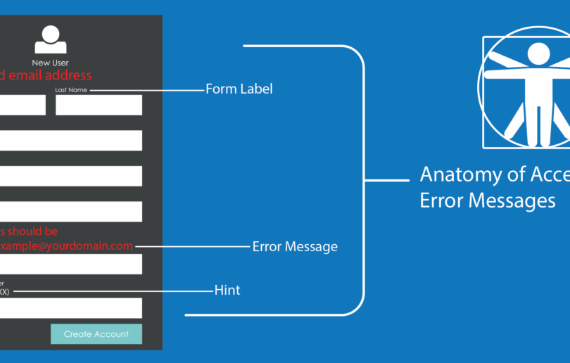
A Placeholder Is Not a Replacement for Visible Labels
The trend of using placeholders to provide visible labels for form fields creates a bad user experience and accessibility practice. Since placeholders disappear once users enter their data into the form controls, they don’t have any idea which form field goes with which placeholder. This disappearing act is especially negative for people with short term memory, people with traumatic brain injuries, people with Autism, people with ADHD, and people with low vision.
Furthermore, users will not be able to check that they entered the right data into the right form field if the placeholder is used as the field’s visible label. The need to recheck and re-enter data is a huge cognitive burden on all users, including people with disabilities.
Avoid Providing Instructions Using a Placeholder Attribute
Instructions help users submit a form successfully. However, if a placeholder attribute provides the instructions, the user might not be able to use the instructions effectively. As placeholders disappear when the user starts filling in the form, users might miss critical information. For example, don’t using a placeholder attribute to provide instructions for a password field. Users need to continually see the instructions to know the password requirements.
Example Syntax for Password Placeholder
<label for=”password1”>Password</label>
<input type=”text” id=”password1” placeholder=”Password should be 8 characters with one number, one special character”>
Preview
In the example above, the password needs a special character, a number, and must be 8 characters long. However, these instructions disappear as soon as the user starts typing in the field. Entering a password can become more complicated if it requires more variations.
To reduce confusion or user error, always provide instructions in the form of consistent text that users can see. It’s also a best practice to associate the instructions to the form controls using the aria-describedby method for screen reader users.
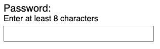
Example Syntax for Static Hint
Code example:
<label for=”password”>Password</label>
<input type=”text” id=”password” placeholder="enter password" aria-describedby=”password-hint”>
<span id=”password-hint”>Password should be 8characters long with a number & a special character</span>
Preview
Password should be 8 characters long with a number & a special character
In the example above, the password instructions remain constant even after the user enters data into the password field.
Placeholder to Floating Label
There is a growing trend to use the placeholder as a form field’s visible label, but instead of the placeholder disappearing when a user enters data, it floats above, below, or to the side of the form control. These are called floating labels. While various design and accessibility practitioners have mixed opinions on floating labels, we recommend testing them with your users. For more information on floating labels, take a look at the following articles:
- Floating labels are problematic
- Are Float Labels Really That Problematic After All?
- Floated Labels Still Suck
In my opinion, using the placeholder as intended by the HTML specification provides the best user experience for everyone. If you choose to use a placeholder, use it for short instructions or input examples only.
Points to Remember
- Avoid placeholders whenever possible
- Make sure the color of placeholder text meets the WCAG SC 1.4.3 requirement of a 4.5:1 contrast ratio
- Don’t provide instructions with a placeholder attribute
- Provide instructions next to the form control as text
- Associate instructions with its respective form field using aria-describedby
- If there is no other option than to use a placeholder as a replacement for a visible label, use one of the floating label methods
(This piece was originally published 6/6/2019, but updated on 1/22/2024.)
