
When it comes to filling out an online form, we all want pretty much the same thing: clear instructions, a quick process, and a seamless experience.
For people with disabilities, having this kind of positive experience is made possible when someone has done the work of making the form accessible.
As an accessibility expert, when I fill out an online form, I’m always thinking about the experience. How easy were the instructions to follow, and how clear and straightforward was the process? Would someone with a visual or motor disability have the same experience I did?
Just the other day, I tried to fill out a form on a travel site. I was amazed by the quality of the experience. Using an assistive device, I was able to fill in all the details on that travel site within five minutes without any confusion or errors along the way.
Do you know what made this possible?
It was because the form had descriptive labels that were consistent and present at all times. The form marked all of the mandatory fields, provided instructions that were easy to follow, grouped relevant form fields that clearly defined the purpose of those fields, and used minimal placeholders that gave necessary hints. Above all, the form communicated the role, name, and state of the form controls to the assistive technology that I was using.
In this post, we’re going to learn some techniques for how to create these kinds of accessible experiences. But before we get started, I recommend reading two of our previously published posts on this topic:
- The Anatomy of Accessible Forms: The Problem with Placeholders
- The Anatomy of Accessible Forms: Required Form Fields
In today’s post, we will go through all the ingredients of creating an accessible form that provides the best user experience for all users. We will go through each aspect of creating an accessible form, understand why a particular step is important, and how it affects people with disabilities or users in general.
Use native HTML
The first rule for creating a truly accessible form is to use native HTML form controls as much as possible. Most of them are accessible by default with all assistive technologies, and they are semantically correct.
Let’s look at some examples of native form elements:
<input type=”text”>

<input type=”radio”>

<input type=”checkbox”>

<button>Submit</button>
Since we’re using the native HTML controls, the name, role, and state of the elements are exposed by default to all assistive technologies. If we create a custom control using WAI-ARIA techniques, however, all of these elements need to be provided manually using various ARIA attributes like aria-label, aria-checked, and role= “radio.”
Provide a visible label
The next step in the process is to provide visible labels for each form control. Without visible labels, form controls are not usable to any user, let alone a person with a disability. A visible label is simply text that is in close proximity to the form control that it is representing.
<strong>First Name</strong>

<input type=”text”>

<strong>Terms & Conditions</strong>

<input type=”checkbox”>
In the example code above, I have used a strong tag to highlight the labels so that users can distinguish them easily.
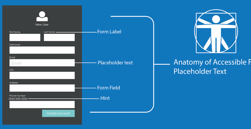
Since we are talking about visible labels, we should also address placeholder attributes.
For some input types, we can use the placeholder attribute—but this is not the same as providing a visible label! The placeholder disappears once the user inputs data into the form. To learn more about the pitfalls of using placeholder attributes, you can read The Anatomy of Accessible Forms: The Problem with Placeholders.
Include programmatic labels
Now that we have understood why we need visible labels and, we also need to associate them programmatically to their form controls. Without the programmatic association of the labels, assistive technology users cannot identify the purpose of the form field.
When a user’s focus moves into a text field, it is read out as “edit field” without notifying the accessible name provided to it. To make sure that the visible accessible name is notified to the users we need to programmatically associate the visible label with a form field.
<label for=”firstname”>First Name</label>

<input type=”text” name=”firstname” id=”firstname”>

<label for=”lastname”>Last Name</label>

<input type=”text” name=”lastname” id=”lastname”>
In the above example, we have used the “for and id” method to associate the form field with its visible label. While there are multiple ways to achieve the programmatic association, using the id method is recommended.
Provide descriptive labels
Now that we have provided visible labels and associated them with their respective form fields, the next step is to check if the form labels are descriptive enough. Will the user be able to read through the label, understand the purpose, and perform the successful action? For example:
<label>Name</label>

<input type=”text”>

<input type=”text”>
In the above example, we can see that for both form fields, the visible label is “name.” This is not descriptive enough for the users to take necessary action. Each form field should contain its own visible label and it should be descriptive. We can improve the example above by providing visible labels for both form fields and specifying where the first name and last name should be entered:
<label for=”fname”>First Name</label>

<input type=”text” name=”firstname” id=”fname”>

<label for=”lname”>Last Name</label>

<input type=”text” name=”lastname” id=”lname”>
Group form controls
Sometimes, there will be a set of form controls that belong to a group and are provided with a group-level visible label to provide context. The group-level visible label conveys the necessary information to the users so they can take action. Let’s understand this with an example:
<p>Do you have a passport</p>

<input type=”radio” name=”passport” id=”yes”>

<label for=”yes”>Yes</label>

<input type=”radio” name=”passport” id=”no”>

<label for=”no”>No</label>
In the above example, we can see that “do you have a passport” is the primary group level visible label for the set of radio buttons. But when assistive technology users navigate to these radio buttons, they miss the key information provided by the primary group level visible label because it doesn’t receive keyboard tab focus.
In addition, the elements “Yes” and “No,” when read out alone by assistive technology, don’t make sense. To help with this problem in HTML, we use fieldset and legend attributes to help us bind the group-level form controls. These attributes will be announced to assistive technology users as expected. Here is the same example with fieldset and legend:
<fieldset>

<legend>Do you have a passport</legend>

<input type=”radio” name=”passport” id=”yes1”>

<label for=”yes1”>Yes</label>

<input type=radio” name=”passport” id=”no1”>

<label for=”no1”>No</label>

</fieldset>
In the example above, we can see that fieldset is binding the form controls inside a group and the legend attribute is used as the primary group level visible label that will be exposed when the assistive technology user moves the focus to the first radio button either in tab or shift+tab navigation.
Provide instructions
Some of the form fields need additional instructions to fill the data successfully. These instructions must be available to the users at all times like visible labels. We can bind the instruction to the form fields using an aria-describedby attribute.
<label for=”dob”>Date of Birth</label>

<input type=”text” aria-described=”dob1” id=”dob”>

<span id=”dob1”>MM/DD/YYYY</span>
In the above example, the instruction is provided below the form field and is bound using an aria-describedby to the text field. If the instruction is not bound to form fields, then assistive technology users who use the tab key navigation might miss the key information.
Identifying form inputs purpose
Accurately entering information into form fields can be difficult, especially for people with cognitive disabilities. The purpose of a text field that is collecting the data specific to the user can be programmatically identified using the HTML autocomplete attribute. This technique can also help to personalize the interface by replacing or augmenting form input labels with words from a defined vocabulary, or even graphical symbols.
<label for=”fname”>First Name</label>

<input type=”text” name=”firstname” id=”fname”> autocomplete=”given-name”>
In the above example, the autocomplete attribute on the input form field helps the user agent to recollect the first name. This makes filling out forms easier and less likely to result in errors, especially for people who may have trouble accurately remembering, reading, or typing information.
Provide accessible name
Some form fields might need a programmatic name to help understand the purpose of the field better and perform actions apart from visible text labels. However, we need to ensure the programmatic name does not override the visible text label completely. We want it to complement and enhance the user experience, especially for speech-input users who attempt to use the visible text label as a means of navigation or selection when interacting with form fields:
<label for=”bday”>Date of Birth (MM/DD/YYYY)</label>

<input type=”text” aria-label=”Birthday” id=”bday”>
In the above example, the user not only doesn’t get important instructions, but they’re likely to be confused about what the ideal input is for this form field. We have to include the visible text label as part of the accessible name, and it’s a best practice to start with a visible label.
<label for=”search”>Search</label>

<input type=”text” aria-label=”Search by City, State or Zipcode” id=”search”>
In the above example, the accessible name complements the visible text label and helps users to better understand the purpose of the form field and what information to enter.
Summary
Following the best practices above will enable you to create a form that is usable and accessible to all users. And remember, native HTML is the key to creating positive user experiences!
