
SwiftUI & Accessibility: Goodies & Gotchas Part 2
SwiftUI has been a game-changer for both iOS development and accessibility. In addition to making it easier to create beautiful apps with less code, it’s provided lots of goodies that make it easier for developers to create a good accessibility experience. If you’ve read the first part of this mini blog series, you’re already familiar with the goodies that come with SwiftUI accessibility, but not the gotchas.
What are gotchas? Gotchas are things that can make it easier for developers to make an accessibility mistake. It’s important to note that a goodie can become a gotcha if misused. In part 2 of our SwiftUI and accessibility blog series, we will go over the flip side of goodies: Gotchas!
Gotcha #1 Default Basic Accessibility
Remember earlier when I said that goodies could also be gotchas if misused? Well, default basic accessibility – our first gotcha – is just that! As impressive as the default accessibility capabilities are, this out-of-the-box accessibility experience can vary tremendously depending upon the view. The basic accessibility experience may be adequate for some views in an app, but it may result in a bad accessibility experience for others!
Let’s take the Add a Plant screen in Plantiverse, for example. This screen contains a default textField, two pickers, a custom toggle, a custom slider, and a custom stepper. A handful of things stand out when we go through this screen with VoiceOver; for one, elements within containing views are not grouped (e.g., the two pickers); this leads to repeated information and extra swiping to consume all of the necessary information about the controls. In addition, it’s not clear which information goes with what. Another thing that stands out quite a bit is the custom controls on our screen – the VoiceOver announcements for these are confusing at best and nonexistent at worst.
We talked about how custom controls don’t have the same default accessibility features that default controls do. We can see this on the screen with all three custom controls – toggle, slider, and stepper. Let’s talk about what’s going on with each of these controls:.
The custom toggle announcement doesn’t make it clear that it’s a button, so a VoiceOver user wouldn’t be able to tell from the announcement alone.
The custom slider announces and focuses the label and value label that accompanies the control, but the active control (the slider itself) is skipped over entirely and never focused.
This experience is terrible – it means that someone using assistive technology can’t use that slider. VoiceOver does focus the labels and buttons on the custom stepper; however, we still have to swipe back and forth between the value label and increment/decrement buttons if we want to hear the current value associated with the stepper. This experience isn’t as bad as what happens with the custom slider, but it’s not great, and it is very cumbersome and disorienting to use with assistive technologies.
This recording is an excellent demonstration of why the basic default accessibility for SwiftUI is not always enough. Yes, VoiceOver announces/focuses most elements, but the announcements are often insufficient, and a few custom controls are entirely skipped over with assistive technology. This scenario is a genuine concern with out-of-the-box accessibility and shows why it can become a gotcha quickly!
Gotcha #2 accessibilitySortPriority
Another goodie that’s also a gotcha: accessibilitySortPriority! Since this view modifier’s introduction at WWDC, I’ve had nightmarish visions of all the potential accessibility issues if this was misused. Changing the order in which accessibility elements are focused with assistive technology is a big decision that a developer should not take lightly. If done incorrectly, your app can be confusing and inefficient for assistive technology users to navigate. If you’re considering using .accessibilitySortPriority, here are some things to help make that decision:
- Which elements and in what order would a user want to navigate through them?
- Which order makes the most sense?
- Which sort order provides all the necessary context?
Elements’ sort priority must be determined by what makes the most semantic sense to a user and not where you WANT users to swipe to first. You should only use this API if it makes your app easier and more logical to navigate.
Also, I would be remiss if I didn’t say that you should NEVER EVER use .accessibilitySortPriority to increase the prominence or consumption rate of something that’s revenue-generating – that is a severe misuse and abuse of this API. The purpose of .accessibilitySortPriority is to improve your app’s navigation, not to manipulate the user experience to increase revenue or eyeballs on something (ex., don’t change sort priority to focus on a ‘pay’ button first if it doesn’t make logical sense for navigation).
Another reason that .accessibilitySortPriority is a gotcha is that there are scenarios where it might seem like a good solution but it isn’t. If a view contains multiple instances of a frequently focused view with assistive technology, consider using the .accessibilityChildren(.contain) behavior instead to avoid a potentially repetitive, cumbersome navigation experience.
Take the main screen of Plantiverse, for example – we have header elements for each room; this header element contains a button on the left side, text in the center, and another button to the right of the text. I initially thought that the header view would be a good candidate for .accessibilitySortPriority since it’s reasonable to expect that users might want to hear the room’s name first; after all, what good is an edit button if you don’t first know what you’re editing? I gave this a shot and quickly discovered that the experience wasn’t great. The screen recording below shows the resulting experience.
In the recording above, we have to swipe to hear the announcement for the room and both buttons. After going through more than one header element this way, the flaws become very apparent – lots of swiping and some information announced when we might not always want to hear it. I decided to use .accessibilityChildren(.contain) to improve the experience; this resulted in being able to swipe through each room header as a singular element rather than swiping through every single element within the header. The screen recording below demonstrates the experience when .accessibilityChildren(.contain) is used instead of .accessibilitySortPriority.
Notice how concise and efficient the .accessibilityChildren(.contain) example is without sacrificing context or information. We’re treating the header and its children as a singular element when we navigate to reduce the user’s work in terms of navigation. The announcement still informs us that there are actions available within the header – this gives users the option to learn about the available actions if they decide, rather than forcing them to hear the announcement every single time for every single header on the screen.
Gotcha #3 SF Symbol Images
Our third Gotcha is SF Symbol Images. In SwiftUI, the systemName based Image initializer is a convenient way to make a button based on an SF Symbol. Suppose we use this initializer and do not add an accessibilityLabel. In that case, the VoiceOver announcement for the image will lack context and be much less meaningful and more confusing. Check out the screen recording below to see what the experience is like with an SF Symbol image and no added accessibilityLabel.
“Gear Shape.fill, button”….yikes! This announcement lacks context, and it’s confusing since, based on the VoiceOver announcement alone, we don’t know for sure what the control does; gear shape.fill doesn’t give a clear, definite purpose for this button. Thankfully, this is a straightforward fix – add an accessibilityLabel to the image, and the result will be a more precise, meaningful announcement for users.
Gotcha #4 Text-Based Image Overlays
Text-based image overlays are our fourth gotcha. One of the more exciting additions to SwiftUI is image overlays – an element that allows some overlay – shape, color, text, or otherwise – to be applied to an image. The text-based overlays stood out quite a bit as a significant potential gotcha; it’s easy to get caught up in what they can add to an element in terms of design and forget the nuances of accessibility.
In the scenario where a developer adds a text-based overlay on an image, it might seem sufficient to add an accessibilityLabel; however, that is not sufficient. This ‘fix’ doesn’t take into account low vision or color blind users that might not be using VoiceOver; these users wouldn’t be able to consume the same information from the image that other users can… this is not accessible!
Take a look at the screenshot of our plant detail screen below – our plant image has a text overlay of the plant name. Sure, it looks nice, but the color and transparency of the text do not contrast enough against the image. As a result, the information in the text overlay will not be accessible to low vision and color blind users who aren’t using VoiceOver – this is not accessible – we want everyone to be able to consume this information!
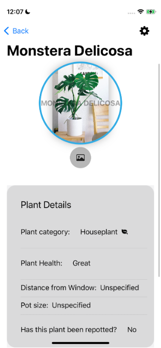
To avoid this scenario, make sure the color of the text overlay contrasts enough with the image so that the text is fully visible to colorblind and low vision users!
Gotcha #5 “Pobody’s Nerfect”
Our fifth and final gotcha is “pobody’s nerfect”. No matter how many cool things SwiftUI does, no matter how great the barebones default accessibility is, there will NEVER be a substitute for experiencing your app’s accessibility firsthand. With accessibility, context is SUPER essential, which is why the human element of experiencing an app’s accessibility is crucial in creating an accessible app.
Regardless of how advanced, robust, or stable SwiftUI is now or in the future, these things will always be true. Additionally, never operate on the assumption that everything in SwiftUI is working flawlessly or even as it should be – it is always good to double and triple check, especially when it comes to matters of accessibility. Suppose an accessibility API isn’t working as expected and that a human never tests it firsthand. In that case, that inaccessibility could quickly reach and impact your users in a big, negative way.
One last point on this gotcha is that SwiftUI and the accessibility APIs we’ve talked about are still relatively young; therefore, there are still some bugs present – it happens! Think back to our Add Plant screen in Plantiverse – although we use .accessibilityRepresentation on our custom controls, VoiceOver completely skipped over our custom slider due to a bug in .accessibilityRepresentation. Imagine if we didn’t experience Plantiverse’s accessibility firsthand – this decision would severely negatively impact our users because we wouldn’t know that a bug was making our custom controls behave inaccessibly. Bugs happen, pobody’s nerfect; this is why you should check your app’s accessibility yourself!
The screen recording below shows the behavior of the .accessibilityRepresentation bug if you want to take another gander. Note that unless we turn VoiceOver off and then back on, we do not have the desired accessible experience for our custom controls.
To summarize Goodie #5: pobody’s nerfect: mistakes and bugs happen, so make sure you experience your app with assistive technologies to make it fully accessible!
How can I fix issues from Gotchas?
This post discussed five gotchas in SwiftUI accessibility; although they’re sneaky, they are fixable. There are several different approaches you can take to remedy issues from gotchas.
- Use accessibility preview in Xcode – it can save you time while developing by giving you a snapshot of the accessibility of elements on a screen
- ALWAYS experience your app with assistive technology
- axe DevTools XCUI with SwiftUI support is now available!
- axe DevTools for iOS supports UIKit
- Deque can help:
- Manual assessments and audits
- Accessibility consulting
- Check out the example app from this post on GitHub for accessibility examples in SwiftUI