

The Apple development industry has been buzzing about SwiftUI since its introduction at Apple’s World Wide Developers Conference (WWDC) in 2019, and it’s no wonder why – thanks to swiftUI’s declarative syntax, it’s very readable and developers can create beautiful apps with fewer lines of code.
One of the most exciting things about SwiftUI is Accessibility; this framework does a lot of the heavy lifting for us, so we can make our app’s accessibility experience great with less work. In fact, with SwiftUI, common user elements like sliders, buttons, text fields and lists, images, etc., are already enabled for accessibility. Basic accessibility labels and values are automatically assigned to them. YES, you read that right – most of the standard elements in SwiftUI have basic accessibility out of the box! How cool is that?
Sure, we have out-of-the-box accessibility, but that often won’t be enough to provide the user with a great accessibility experience. Consider a scenario where we create a totally custom stepper element from scratch without using the default SwiftUI Stepper; if we settle for the barebones accessibility experience, this control won’t be able to be activated with VoiceOver, which is inaccessible! Thankfully, SwiftUI has a lot of handy APIs (or view modifiers in SwiftUI lingo. Note: I’ll be using the terms API and view modifier interchangeably for the remainder of this post) to help fill in the gaps between basic accessibility and full accessibility.
At the past few WWDCs, there have been so many helpful, powerful additions to the SwiftUI accessibility framework, which allow developers to create an excellent accessibility experience in their apps with much less elbow grease and heavy lifting – I like to call these “goodies.”
Simply put, a goodie is an aspect of the SwiftUI accessibility framework that makes it easier for a developer to do something to improve the accessibility of the app.
I wanted to familiarize myself with SwiftUI accessibility, so I created a simple app called Plantiverse – it’s an app that you can use to keep track of all your plants room by room. You’ll be seeing a handful of screenshots and screen recordings from Plantiverse that I’ve included to demonstrate the accessibility experience. The app is available on a public GitHub repo [https://github.com/kateowens12/Plantiverse]; feel free to download it or fork it and play around with the accessibility – it’s a great way to get to know SwiftUI accessibility.
Now, let’s talk about some goodies in SwiftUI!
Goodie #1 Default Basic Accessibility
The first goodie we’re covering today is very special and powerful. As mentioned earlier in this blog post, most standard SwiftUI elements are enabled for accessibility basically by default. With SwiftUI, when you create a simple button or a text field view, it will be focusable with assistive technology without any extra work. I wasn’t kidding when I said this goodie is powerful. Even though the out-of-the-box basic accessibility will often not be enough to provide an excellent accessibility experience, it gets us closer by giving us a head start. Let’s preview what default basic accessibility is like in practice with the Plantiverse app.
Below is the main screen of Plantiverse; every plant in each room of our Plantiverse consists of a section made up of plant info tiles. Each tile displays the plant’s name, tasks due, and plant health and category if available. Press play on the recording below to preview the default basic accessibility experience for this screen.
As demonstrated in the video, VoiceOver announces each room section header as “line.e.horizontal.decrease, Button, Heading.” [swipe right] “Living Room.” [swipe right] “Add, button.” As far as accessibility goes, this announcement is decent at providing some rudimentary accessibility – we can focus on the elements, activate the buttons, and hear VoiceOver announce each piece of information in the header element. Going a bit further down the screen, when we focus on the plant tile, the announcement goes something like “Monstera Deliciosa, re-pot due, houseplant, good.” Again, we can consume all the information displayed in the plant tile and activate the tile with VoiceOver. Not too bad, considering we didn’t have to do any additional work to achieve this, thanks to automatic basic accessibility in SwiftUI!
The default accessibility of SwiftUI certainly leaves something to be desired, however. The announcements for some of the elements could be more descriptive and have more context, while others provide a lot of extra information that the user may not want automatically. This basic accessibility experience is just that – basic. But, we were able to achieve this without any additional work – if that’s not a goodie, then I don’t know what is!
Goodie #2 Accessibility Representation
We mentioned earlier that fully custom controls (i.e., steppers created from scratch) are not completely accessible by default. The consequences of this are potentially severe – assistive technologies may skip over these types of controls entirely, which means assistive technology users may be unable to activate them. Thankfully, we’ve got Accessibility Representation to help us out with this. The Accessibility Representation API replaces accessibility elements in a view with accessibility elements of another view. In our case, it would replace our custom toggle’s accessibility elements with that of a custom, fully accessible toggle’s accessibility elements.
If it weren’t for Accessibility Representation, we would have to add and remove a handful of accessibility traits from our custom toggle; this leaves room for error since it could be easy to forget an accessibility trait or two, and it’s more work for the developer. With this in mind, Accessibility Representation makes this a whole lot simpler. Applying the accessibility elements of a default control type to our custom control is simple – we specify the desired type of view/element’s accessibility in the `.accessibilityRepresentation` closure, and voila! Pretty cool, right?
Let’s take a look at our Add a Plant screen in the Plantiverse example app. This screen has three completely custom controls: a repotted Toggle, a window distance Slider, and a pot-size Stepper. For a fully accessible experience, we want each custom control to announce its accessibility label, accessibility value, and the active control (e.g., adjustable, switch button).
The announcement for the Toggle is precisely the behavior that we want – the Toggle’s label, value label, and role are all announced as a single announcement, and we can activate it with assistive technology. This Toggle is entirely custom and built without using a default Stepper element, so it’s pretty cool that we were able to make it fully accessible by using .accessibilityRepresentation on the view and specifying a default Toggle in the closure.
Note: You might notice something off about the announcement for the custom slider and custom stepper – I discovered this bug in Apple’s `.accessibiltyRepresentation` view modifier – when it’s using the representation of an adjustable control, VoiceOver must be turned off and back on again for the control to be focused.
Goodie #3 Accessibility Custom Content
Say hello to goodie #3 – accessibility custom content! This goodie is so cool – it gives developers a way to provide information to users in smaller, more specific portions when they need it and specifically choose to consume it. This API is great for views with complex data sets since those can be overwhelming to navigate using assistive technology, and default announcements often provide more information than a user needs each time an element of that type is focused with assistive technology.
Take our plant tiles on the main screen of Plantiverse, for example. By default, VoiceOver announces ALL. THE. THINGS. on the plant tile EVERY. SINGLE. TIME. As a user, that means that for each plant tile you focus on, you’ll hear plant name, tasks due, plant health, and plant category – that’s a lot of info! It’s a reasonable assumption that a user may only want to know the most critical information by default, the plant’s name, and any tasks due; this is a perfect use case for accessibility custom content!
The recording above demonstrates a much better accessibility experience. By default, the announcement gives users the most critical and time-sensitive information, and then they can decide to use the rotor to hear the additional available information. I don’t want to play favorites, but accessibility custom content might be one of my favorite parts of SwiftUI accessibility (don’t tell the other APIs)!
Goodie #4 accessibilitySortPriority
Let’s talk about the plant details page of the Plantiverse app. We have an edit button in the right corner of a toolbar at the top of the screen. By default, the edit button is skipped by VoiceOver even when we swipe through every single element of the screen. As a result, a user using assistive technology won’t be able to use it and, in some cases, won’t ever know that it exists – this isn’t good! Thankfully, SwiftUI has something that can help us – accessibilitySortPriority!
With this API, a developer can change the order in which accessibility elements are focused with assistive technology. .accessibilitySortPriority is powerful and has some excellent use cases, but developers must use it with a lot of thought. When deciding if .accessibilitySortPriority is suitable for a scenario, ask yourself this: “will the user have more context or a better experience if one element is focused before or after another?” Only use this API when it makes sense for the user in terms of navigation and semantic views. When used appropriately, accessibilitySortPriority can truly shine!
The recording below shows the voiceover announcement for the plant detail screen with the default .accessibilitySortPriority. You’ll notice that we can never focus the edit button in the upper right corner of the top toolbar.
The next recording shows what happens when a developer sets the .accessibilitySortPriority for the edit button in the top toolbar. You’ll notice that we can focus the edit button in an order that makes sense for the navigation experience of this screen.
Goodie #5 Accessibility Preview
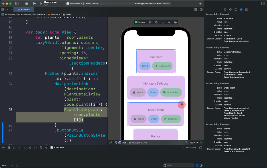
The Accessibility Preview has been a fantastic addition to Xcode for those who develop in SwiftUI. Instead of running our app every time we want to know what the accessibility experience is like, we can see a preview in Xcode – no running required! The Accessibility Preview shows an element’s accessibility properties, such as .accessibilityLabel, .accessibilityValue, and .accesibilitySortOrder, to name a few. This goodie can save lots of time in the development process since you can use it without building and running your app. It’s a great way to keep tabs on your app as you’re actively writing code, so you can be aware of what your app’s accessibility is like every step of the way.
The screenshot below shows the Accessibility Preview for the plant tiles view of Plantiverse. The elements in the preview are in the same order that they will be announced/focused with assistive technology.
Summary
Now that we’ve gone over the accessibility goodies in SwiftUI, I think it’s safe to say that these goodies go way beyond good – they’re great! Each one of the goodies makes it easier for a developer to provide a great accessibility experience in their app, but there’s a flip side to goodies: gotchas. In our next post, we’ll talk about accessibility gotchas in SwiftUI and how they can make it easier for a developer to actually create an inaccessible experience for users.
