
Fixing accessibility issues can be difficult, but it is especially difficult and stressful if you’re fixing them in QA or the final testing phase in a time crunch. Simply put: when you don’t plan for accessibility early in the UX phase, you’re planning to fail at accessibility.
“When you explicitly fail to plan, you implicitly plan to fail.” – Benjamin Franklin
At Deque, we call this “Shift Left”, or, the importance of implementing accessibility early in the software development lifecycle. In other words, accessibility should start early in the UX design phase, and continue in the development and QA stages. Not only is Shift Left Accessibility less stressful, but it is also more cost-effective to fix accessibility bugs in the design.
PAUSE: Prefer learning through video? We have created a multi-part webinar series on accessibility heuristics you can watch right now.
GO: In the post below, we will talk about how designers can shift left and address accessibility early on with the following accessibility heuristics.
What Are Accessibility Heuristics?
Usability heuristics are a set of simple, efficient rules, created by Jakob Nielsen and Rolf Molich in 1995, to help designers create better user interfaces. The accessibility heuristics we’ve designed to shift left use the same heuristics methodology as Nielsen and Molich and specifically evaluate design assets for accessibility.
We built a list of accessibility heuristics because designers truly need a better understanding of WCAG, and WCAG is notoriously technical and difficult to interpret in practice if you’re not an accessibility expert. As we previously mentioned, it is crucial for designers to design for accessibility, as this will prevent accessibility issues down the line for developers and QA.
10 Accessibility Heuristics
We’ve created these ten accessibility heuristics to bring accessibility upstream by integrating such considerations directly into your design process. The heuristics below are based on the technical requirements of WCAG and are written in a way that is more tailored towards designers.
- INTERACTION METHODS AND MODALITIES – Users can efficiently interact with the system using the input method of their choosing (i.e. mouse, keyboard, touch, etc.).
- NAVIGATION AND WAYFINDING – Users can easily navigate, find content, and determine where they are at all times within the system.
- STRUCTURE AND SEMANTICS – Users can make sense of the structure of the content on each page and understand how to operate within the system.
- ERROR PREVENTION AND STATES – Interactive controls have persistent, meaningful instructions to help prevent mistakes, and provide users with clear error states which indicate what the problems are and how to fix them whenever errors are returned.
- CONTRAST AND LEGIBILITY – Text and other meaningful information can be easily distinguished and read by users of the system.
- LANGUAGE AND READABILITY – Content on the page can easily be read and understood by users of the system.
- PREDICTABILITY AND CONSISTENCY – The purpose of each element is predictable, and how each element relates to the system as a whole is clear and meaningful, to avoid confusion for the users.
- TIMING AND PRESERVATION – Users are given enough time to complete their tasks and do not lose information if their time (i.e. a session) runs out.
- MOVEMENT AND FLASHING – Elements on the page that move, flash, or animate in other ways can be stopped, and do not distract or harm the users.
- VISUAL AND AUDITORY ALTERNATIVES – Purely visual or auditory content that conveys information has text-based alternatives for users who can’t see or hear.

How To Conduct Heuristic Evaluations
A typical heuristics evaluation process usually involved between 3 to 5 designers, and will roughly look like this.
- Scope assessment – what do you want to analyze? Is it a component, web page, or website?
- Recruit evaluators – who will perform the heuristic evaluation (3-5 people recommended)?
- Define your ranking scale – How present are certain criteria?
- Evaluate against your heuristics
- Debrief and prioritize issues (only applicable if you have more than 1 evaluator)
- Report your findings for improvement
Accessibility heuristics work well because they are simple to conduct, easy to learn, generate low overhead, and provide new viewpoints. Again, the earlier you can identify accessibility issues, the easier it gets for your team to create an inclusive experience. It begins as early as your design phase!
Navigating and Wayfinding: Example Time!
Users can easily navigate, find content, and determine where they are at all times within the system.
Below is an example of seven checkpoints to evaluate the example heuristic listed above. The scale on a heuristics evaluation is important. In our example, we’ve used a star, a checkmark, an x, and N/A for not applicable. These symbols have a point system assigned to them as well.
| Navigating and Wayfinding | * (+2) | Y (+1) | X (-1) | N/A (+0) |
|---|---|---|---|---|
| Is there a clear, visible indicator set on all active elements as they receive focus? | ||||
| Does the page have meaningful title text, with page-specific information going first? | ||||
| Are the page title element and H1 the same or similar? | ||||
| Does the page have meaningful headings for each major section? | ||||
| Can the links’ purpose be defined from link text alone or their immediate context? | ||||
| Is a “skip link” provided at the very top of the page, and is it revealed on focus? | ||||
| Does the organization of navigation elements facilitate wayfinding? |
These heuristics are based on WCAG 2.0 A/AA standards. Below is an example of a wireframe from when Deque.com went through a redesign. When you apply heuristics you can use them on a wireframe, mockup or prototype. Let’s look at part of the wireframe below and evaluate it for a few of the Navigation & Wayfinding questions.
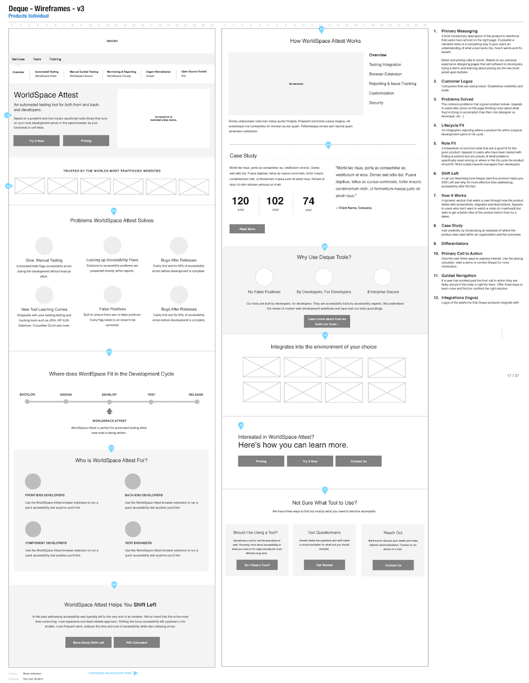
- Is there a clear, visible indicator set on all active elements as they receive focus? On a wireframe, you cannot tab through the elements so this question is not applicable yet. However, this question serves as an important reminder for designers to remind developers to code a visible focus indicator.
- Does the page have meaningful title text, with page-specific information going first? If you look at the wireframe below, it is unclear if the H1 is the “Products” or “WorldSpace Attest.”. As a designer, it is important to work with your content creator to designate a consistent H1.
- Is a “skip link” provided at the very top of the page, and is it revealed on focus? In the wireframe below there is not a particular link that says “skip to main content,” so this question would be an “X”. It is possible that it is an intentional design choice to not build a skip link, but instead, you build a table of contents that is accessible. This question will spark that important accessibility discussion.
In Conclusion
Using these heuristics is a fantastic way to move accessibility upstream in your product lifecycle. The most cost-effective and least stressful way to ensure the quality of your software is to catch accessibility defects as early as possible in the design phase.
Accessibility heuristics can help you get started “shifting left.” They are meant as standalone considerations to add to your design toolbelt, so you can progressively approach your designs in a more inclusive way. We hope you enjoy them!