
Increase Contrast is an accessibility feature available in iOS that allows users to increase the contrast of all text and controls across their entire device. Even if your app is WCAG compliant, some users may benefit from having controls and other elements stand out in your app. In this blog post, I will cover:
- how to check if your app responds to Increase Contrast
- the various ways to support Increase Contrast
- how Dark Mode is affected
- some best practices for supporting Increase Contrast
If you would like, follow along with an app I made for this blog post!
WCAG Compliance
One disclaimer before we get started: Supporting Increase Contrast does not make your app WCAG compliant. This blog post is purely about supporting a great feature in iOS that can help users feel more comfortable with using your app. You can learn more about testing Color Contrast in mobile apps here.
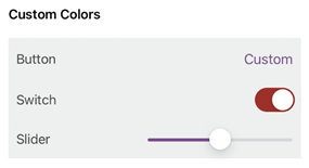
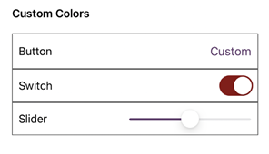
Increase Contrast
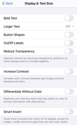
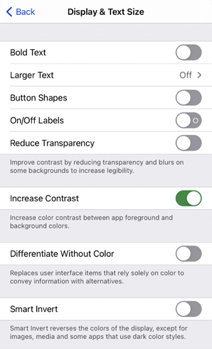
Before digging right in, you may want to first check which components in your app already respond to Increase Contrast. To try it, go to Settings > Accessibility > Display & Text Size, and select “Increase Contrast.” When enabled, you may notice in Settings that text immediately becomes darker, each individual cell becomes more defined, and each control appears darker, including the back button. This is the behavior you want in your app.
 |
 |
| Default | Increase Contrast On |
How to Support Increase Contrast
There are four different ways to support Increase Contrast. The way you choose to support it depends on how color is already incorporated into your app, and whether you have a specific color palette in mind.
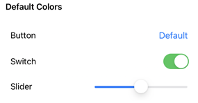
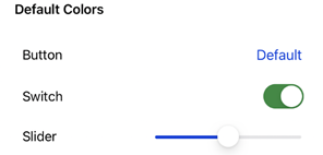
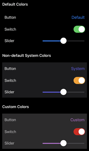
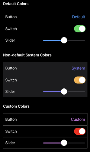
Using Default Colors
The easiest way to support Increase Contrast is to simply use the default color scheme. All controls and text become darker when Increase Contrast is enabled.
 |
 |
| Default | Increase Contrast On |
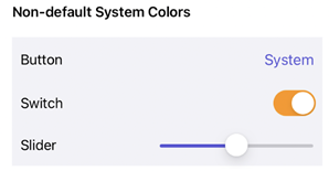
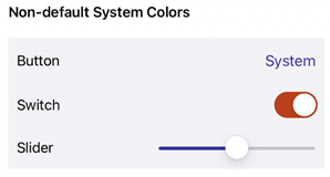
Using System Colors
If you want to branch out of the default colors, another option is to use “System colors.” System colors automatically adapt to Dark Mode and accessibility settings (such as Increase Contrast). You can learn more about System colors in Apple’s Human Interface Guidelines. In this example, I used the “Label” color for the text color, System Indigo for the button and slider tint colors, and System Orange for the Switch’s tint color. I also used System Gray 6 as a background color.
 |
 |
| Default | Increase Contrast On |
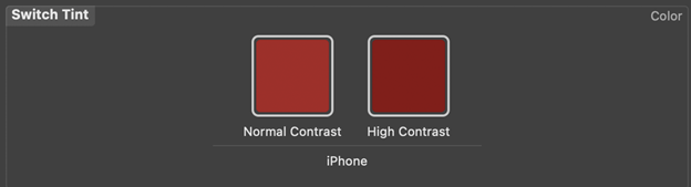
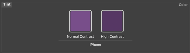
Using Colors in Assets
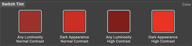
If you have specific design requirements, you may have your colors defined as a Color Set in an xcassets folder. To allow these colors to support Increase Contrast, simply select the “High Contrast” option under “Appearances,” then, you can adjust the color for High Contrast.
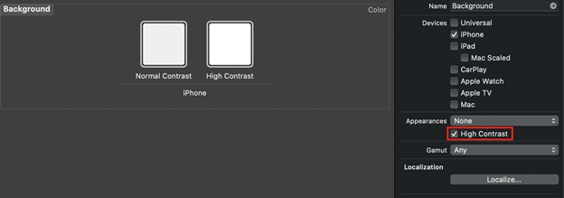
In the following screenshots, you can see how the “Switch Tint” and “Tint” colors are defined in my assets and how they look within my app. You may also notice how the “Background” colors (above) do not look drastically different in the Color Set, but in the app, there’s a huge difference!
 |
 |
| Default | Increase Contrast On |
Using Coded Colors
If your colors are defined in code, you have two options: you can either respond to the UIAccessibility.darkerSystemColorsStatusDidChange notification, or you can override traitCollectionDidChange.
Notification Listener
If you would prefer to listen for the UIAccessibility.darkerSystemColorsStatusDidChange notification, add an observer in an initializer (or in viewDidLoad on a ViewController):
NotificationCenter.default.addObserver(self,
                                       selector: #selector(updateColors),
                                       name:
UIAccessibility.darkerSystemColorsStatusDidChangeNotification,
                                       object: nil)
Then, in your “updateColors” function, change colors based on whether the property is enabled:
@objc
private func updateColors() {
    if UIAccessibility.isDarkerSystemColorsEnabled {
      label.textColor = UIColor.black
    } else {
      label.textColor = UIColor(white: 0.9, alpha: 1.0)
    }
}
In my app, instead of changing a color, I used this notification listener to add a border around each control and its associated label.
Override TraitCollectionDidChange
If you would prefer to override the TraitCollectionDidChange function, use the “accessibilityContrast” property in traitCollection to update colors based on whether Increase Contrast is enabled:
override func traitCollectionDidChange(_ previousTraitCollection: UITraitCollection?) {

super.traitCollectionDidChange(previousTraitCollection)

   // Increase Contrast disabled
   if traitCollection.accessibilityContrast != .high {
      self.label.textColor = .brown
   }

   // Increase Contrast enabled
   } else {
      self.label.textColor = .darkText
   }
}
What about Dark Mode
There may be some users who want increased contrast, even on Dark Mode. This means that if your app supports Dark Mode, it will have to support Increase Contrast on Dark Mode too!
 |
 |
| Increase Contrast Off, Dark Mode On | Increase Contrast and Dark Mode On |
Luckily, default and system colors already support Dark Mode with Increase Contrast enabled. With custom colors, however, you may need to adjust your Color assets for the “High Contrast” setting (notice that “Dark Appearance with High Contrast” is its own color):
If you have your colors defined in code, the easiest way to support both is by overriding traitCollectionDidChange. Here’s an example of how this can be done:
override func traitCollectionDidChange(_ previousTraitCollection: UITraitCollection?) {

   super.traitCollectionDidChange(previousTraitCollection)

   let darkModeIsEnabled = traitCollection.userInterfaceStyle == .dark

   // Increase Contrast disabled
   if traitCollection.accessibilityContrast != .high {

      if darkModeIsEnabled {
         self.label.textColor = .lightGray
      } else {
         self.label.textColor = .brown
      }

   // Increase Contrast enabled
   } else {
      if darkModeIsEnabled {
         self.label.textColor = .lightText
      } else {
         self.label.textColor = .darkText
      }
   }
}
How to Support Best Practices with Increase Contrast
Now we’ve covered all the different ways that you can support Increase Contrast in your app. Does this mean that literally every single color in your app should respond to this accessibility setting? The short answer is “No.”
In general, I would recommend having text colors, tint colors, and any “accent” colors respond to Increase Contrast. For example, in Settings, as we saw at the beginning of this post, the background color of a TableView changes to a darker color, but TableViewCells keep the same background color. The visual divider between each TableViewCell changes to a darker color too. This is to make it easier for users to distinguish what is a cell (and therefore tappable) and what is not.
For the colors that will end up supporting Increase Contrast, make sure that they do, in fact, increase the contrast. Ensure also that the added colors are not distracting. As always, follow Apple’s Human Interface Guidelines on how to best incorporate color into your app.
Final Thoughts
However you end up supporting Increase Contrast, do what is best for your users! Supporting this accessibility setting may be simple, but it can make a world of difference.

