

For those of us who have good vision and hearing, websites and digital media can provide very colorful, stimulating, and impactful experiences. But what if you couldn’t see color? What if you couldn’t hear, or needed to keep your computer or phone muted? What if you couldn’t see at all? If you’re a web professional, how can you make sure that a person who is colorblind, fully blind, or deaf (or all of the above!) is able to have the same impactful experience with your website as everyone else?
Most people use multiple senses to perceive and interact with websites and apps: primarily sight, but also hearing and touch. A person who can’t see will rely on a screen reader, which allows them to hear the content of a webpage. If that person also couldn’t hear, they would rely on the screen reader to translate the text from a webpage into braille through a refreshable braille display.
Designing a site for people of all abilities means that the content of the site needs to be perceivable and understandable in multiple ways. That often means being redundant. It also often means making sure that everything has a text-based equivalent. Text is by far the easiest medium for assistive technology to translate.
This blog post addresses three related topics in the area of accessible design:
- Providing text or visual alternatives when using color as a form of information
- Making sure that audio cues don’t rely entirely on the user’s ability to hear
- Ensuring that references to visual information like color, shape, and position are presented so that users without sight can still understand
These three topics are all part of the Web Content Accessibility Guidelines (WCAG), and were designed to help prevent web authors and designers from accidentally excluding users who are unable to use one or more of their senses when using the web.
Color as Information
Color is often used as a pointer in digital media to draw the user’s attention to some specific element. Unfortunately, somewhere between 5% and 10% of people on Earth are at least partially colorblind. A red outline around a form field to indicate an error may be useful for many people, but if a person looking at it can only perceive red as a shade of gray, the information conveyed by the red outline (i.e. the fact that there’s an error) will be lost on them.
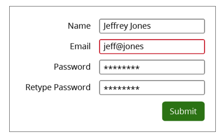
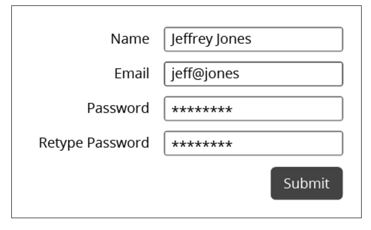
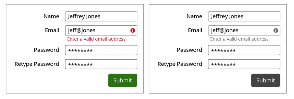
If, however, the red outline is accompanied by a text-based error message and an exclamation point icon, the error will be obvious regardless of whether the person looking at it can see color or not.
Representations of more complex information, like charts and graphs, are where color particularly comes into play. In many cases, color is just one visual aspect that helps to communicate information – along with shape, size, proximity, texture, labels, and a whole host of other indicators. Most charts and graphs are relatively simple, and it’s easy enough to use attributes like contrast and text labels to make sure that the information is color-agnostic.
As more information is represented, divorcing meaning from color becomes more difficult. The trick to designing charts and graphs well is to convert them to grayscale and see how they look. Better yet, show the grayscale version to a friend or coworker. If they can understand the information in the graph, then you can be reasonably sure that the graph doesn’t rely on color alone to convey information.
As a designer, or as a content creator, your job is to make sure that your designs and content aren’t totally reliant on color to be understood. There are a number of desktop and browser-based tools available to help you test your work, including:
- Color blindness filters and proofing in Photoshop and Illustrator
- Color Oracle (desktop-based color blindness simulator for Mac, Windows, and Linux)
- NoCoffee (a Chrome plugin: use for functional websites and web-based prototypes)
If you test our your design and notice some problems with how you’re using color, here are a few techniques you can use to improve your design:
- Use text labels or icons to label elements that are not obvious in black and white
- If using multiple solid shapes to convey different types of information (like in a bar graph, for example), augment the color with a pattern or texture.
- You can also increase or decrease the value of each color (the darkness or lightness) so that they have sufficient contrast in comparison with each other.
Keep in mind that not only users with genetic color blindness are affected. People with low vision and elderly people also sometimes have a harder time perceiving color. The differences in colors will also be less noticeable in a low contrast environment, such as on a screen viewed in bright sunlight. Many people also still print digital materials like emails and visual aids (such as graphs and charts) on paper, and may not be able to print in color.
Visual Information
Color isn’t the only visual characteristic that can be used to describe objects on a web page. Using shape or size to call attention to certain objects – in other words, as a visual cue – is actually a very useful technique for conveying information. Using more than just text can be particularly helpful for people with learning or cognitive disabilities.
However, if a person has very low vision or is completely blind, they may not be able to perceive this type of information at all. As with the use of color, the key is to make sure that the same information is represented in multiple ways so that it can be perceived by multiple senses. Representing the same information using text (either as offscreen text or as a text label) is generally the best way, as text can be translated to a variety of devices, including screen readers and braille displays.
Graphical Symbols
One of the most common types of visual information used in sites and apps today are graphical symbols, like icons. Icon font sets like Font Awesome have made is easier than ever for designers and developers to implement icons with a variety of meanings into all sorts of digital and print media.
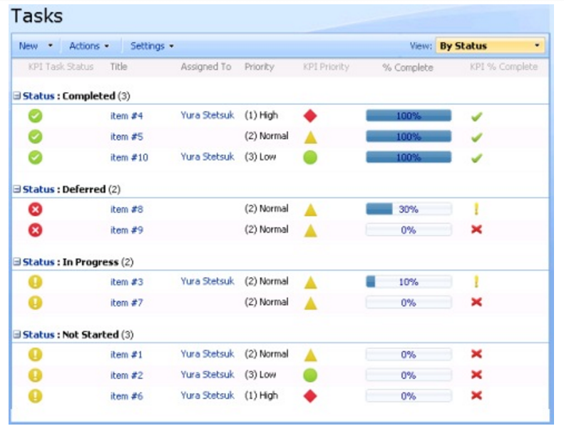
In the example above, multiple sets of icons are used to describe the status, priority, and completion amount of tasks. For each set, shape is used in addition to color to differentiate each icon from one another. The meanings of the icons also duplicate textual information that is present elsewhere in the table. A sighted user would be able to glance at the table quickly and understand certain metadata about each task by looking at the icons. Because the information conveyed by the icons is also represented in text, a non-sighted user would also be able to understand the information within the table fairly easily.
But what if there was no textual information accompanying the icons? Take this example:
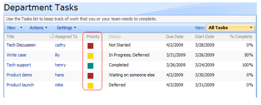
The Priority column in this tasks table uses colored squares in red, yellow, and green to represent high, medium, and low task priority. Ideally, each icon would have alternative text associated with it so that non-sighted users would be able to understand it. In this example, color is also the sole identifying feature of each icon, so for the sake of colorblind and low vision users, it would be best to either use a different shape for each priority level, or to replace or augment the icons with a visible text label.
When designing with icons and symbols, always do a quick reality check to make sure your design is informative to users of all abilities. One trick is to temporarily remove all icons and non-text symbols from your design. Can you understand everything in the design without them? If important information is now missing because the icons are missing, make sure that you’ve written alternative text for those icons. You can also consider whether it would harm your design too much to add visible text labels to supplement the icons.
Visual Information in Text
The WCAG success criterion for Sensory Characteristics (1.3.3) also specifically references the use of visual information in instructions. For example, text on your site may instruct users to find additional information in the upper right. If you can’t see the page and are using a screen reader to understand it, you won’t be able to tell which elements are in the upper right portion of the page because locational information isn’t conveyed to screen readers.
If, however, your text instructs the user to find additional information using the “help” button in the upper right portion of the header, a screen reader user will know to navigate to the header (which is easy if the site uses landmarks) and to listen for a button labeled “help.” Sighted users will still be able to use the locational information (“in the upper right”). Adding additional description will help you make sure that non-sighted users aren’t left out.
Auditory Information
Another type of sensory information is information conveyed by sound. This is rarely used on websites nowadays, but sounds that are used to call the user’s attention to a notification or to a particular action are often used in mobile apps and desktop applications, like video games. For example, an email app on a phone may play a sound to notify you that a new email has arrived. A video game in which you control a character may play a warning sound if your character is standing in something that causes damage.
As with color and other visual information, the key to making auditory information accessible is to make sure that the same information is conveyed visually and/or textually. In the case of the email app notification, having a textual notification in the phone’s notification area will often do the job. Allowing the option for haptic feedback (such as a vibration) or visual feedback (a blinking light on the phone) can also work. Haptic feedback on a video game control or a pulsing red border around your character or the edges of the screen can convey the same warning as a sound.
Keep in mind that these techniques don’t just help users who are deaf or hard of hearing. They also help users who have their devices muted or on low volume. Maybe you’d like to be notified of new emails during a meeting but don’t want your phone to distract others around you. Or you may want to play a video game while your spouse or children are sleeping in the next room.
Tips and Takeaways
Making sure that information can be perceived by more than one sense is key to creating a design that will be usable for everyone. While the use of color, shapes, and sounds is effective in drawing attention to design elements and in helping people understand different types of information, designers need to keep in mind that not everyone can see, hear, or understand those cues.
As you’re evaluating your design, ask yourself these questions:
- If I convert everything to grayscale, am I still able to understand everything?
- If I remove all icons and graphic symbols and replace them with alt text I’ve written, is all of the same information represented?
- Does any text on the page reference elements by color, shape, or size only?
- If I turn the sound off, are all notifications and errors still conveyed to me?
If you are not the person who implements designs for sites and apps into code, make sure you annotate your designs with non-obvious things like alt text for icons. You will want to make sure those accessibility features won’t be missed when the design goes to development.
Above all, remember that when it comes to design, redundancy isn’t a bad thing. It’s all right – and is often preferable – to give users multiple ways to find information, perform actions, and perceive content. Remember that accessibility has its roots in usability, and creating a truly usable website or application means taking all types of users and their many different learning styles and abilities into account.
Resources
- Understanding WCAG success criteria 1.3.3 – Sensory Characteristics
- Understanding WCAG success criteria 1.4.1 – Use of Color
- BBC Mobile Accessibility Guidelines – on incorporating audio alerts
- Examples of using visual cues from Oregon State University
Caitlin Geier is a UX designer on Deque’s product team. As a UX designer, Caitlin’s work with accessible design flourished once she began working for Deque. She is passionate about understanding the users she’s designing for, and she continually strives to incorporate accessibility elements into her work in order to ensure that all users can benefit from inclusive design.
