
This is the second part of a two-part companion post, based on the talk Caitlin gave at CSUN 2017. The talk and posts are geared primarily towards designers, with an emphasis on user experience design. 
In Part 1 of Design Before Code, I introduced the first 3 of 5 key areas to focus on when starting out with accessibility so that you can build a good foundation for incorporating accessibility into your design practice. Those keys are: understanding principles of usability, understanding your users, and working with your team. This post will offer technical guidance on some of the practical issues of building accessibility into your design process, and I’ll take a deeper look into elements that need more thought in the design phase, including some advice on using pattern libraries to help with accessibility.
Key #4: Understand the Tricky Bits
If you’re working directly (or even indirectly) with the developers who will be building what you design, it’s good for you to understand that some things are more difficult to implement accessibly than others. Some elements need more thought up front and more collaboration is needed to determine the best way to design and implement the element. I’ve highlighted four of the major types of elements to watch out for that have come up in my time working in accessibility.
Forms
If you have spent any time at all designing for web or mobile, then you probably know that forms can be simultaneously the easiest and trickiest elements of a page to design. In one sense, forms are pretty straightforward – you know the information you need to collect from your users, and there are traditionally only so many different types of fields you can present to users in order to collect that information. It’s not hard to slap some fields on a page, hook it up to a database, and call it a day.
What is difficult is putting together a form that’s easy to use. Simply put, most web forms are an exercise in frustration for users. There’s a ton of research (and a ton of differing opinions) out there on what makes a form usable and why. There are also a number of guidelines in WCAG that center around the accessibility of user inputs, with a particular emphasis on web forms. (Jog your memory on WCAG, aka the Web Content Accessibility Guidelines, on the W3C site.) Long story short: it’s much easier to make a bad, unusable mess of a form than it is to make a good form.
Making a form usable involves thinking about a number of things: is the type of field appropriate for the type of data the user will be inputting? Do the label and help text for the field help the user understand what types of data they can enter into the field? In the case of accessibility, there are a few more particular guidelines. According to WCAG 2.0, web forms require:
- Visible labels for every field (that are always visible!)
- Programmatic labels for every field
- Help text and error messaging that are actually helpful
- Keyboard access for every field
- Visible focus indicators on everything that can be accessed by the keyboard
- The option to review what you’ve entered into a form before you submit it, particularly if submitting the form means you’ll be putting your financial or legal data in the hands of others
If you’re focused on the usability of the forms you design, you probably already have some of this covered. In most cases, WCAG’s requirements around form fields and user inputs actually serve to make forms even more usable by forcing you to double-check that your forms are doing what they should be doing for your users.
Tables
Here I’m specifically referring to data tables. Using data tables can be a very effective way to communicate information: an interactive data table can be a good way to allowing users to sort through, organize, or find a piece of data within a much larger set of data.
That being said, data tables can be difficult to make accessible, particularly if they are complex. Screen readers have a specific mode for interacting with tables, and screen reader users typically expect tables to be read in certain ways. In particular, cells within data tables which exist within a specific context need to be communicated to screen reader users as well.
If you’re working on a design for a complex data table, my advice is to give it some extra thought. Some questions to ask yourself are:
- What are the main pieces of information people should get out of this table?
- Is there any non-essential information that can be removed?
- Is there another way the information in this table could be represented that would make it easier for users to understand and interact with it? (Is a data table the right way to display the information?)
- Would splitting the data up into multiple tables make it easier for users to understand the information?
It’s a good idea to perform usability testing or A/B testing with any complex data tables you design if only to understand whether people can interpret the information in the table well enough for that data to be useful to them. In most cases, redesigning a data table so that it’s simpler or so that it’s no longer a data table can have great impact on all users and can make it much easier to make the data itself accessible.
Custom Controls
What I mean by “custom controls” in this context is a form field or other type of interactive element that is not a native HTML element. It is possible – and sometimes necessary – to use non-standard HTML attributes and JavaScript to create an interactive control. These types of controls are what I am referring to.
One troublesome aspect of custom controls is that they’re much more difficult to make fully accessible. Screen readers and other assistive technology are built to work with native HTML elements, like <label> and <input>. If, instead, the developer decides to use a <div> with a content-editable attribute and styles it to look like a form field, that form field will not be accessible by default. It will actually take a lot more work to make the field fully accessible because all of the accessibility features will have added to the field from scratch.
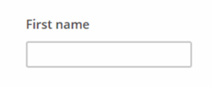
Here you can see the form field “First Name” coded in two different ways: one using native HTML elements, and the other using the “contenteditable” attribute on a <div>. Both elements look the same through the magic of CSS, but only one of them is accessible.
Accessible Code Example
<lable>First Name</label>
<input type="text" name="fname" class="av-text" id="fname">
Inaccessible Code Example
First Name
<div id="input" contenteditable></div>
Both examples will look like this:
In some cases, particularly for more complex controls, it’s just not possible to use a native HTML element. This will most likely be because there are no native elements that provide the functionality your design calls for. For example, most calendar widgets are custom controls. HTML5 does offer an input type called “date” as a native control, but its implementation and appearance across browsers is inconsistent and sometimes not even supported. In the case of a calendar/date input, it tends to be much better and more consistent for the user experience to either use an existing jQuery plugin and restyle it to suit your site or to create your own from scratch.
In either case, as the designer, you will need to do some work to make sure it looks, feels, and acts the way it should. This includes making an effort to understand how screen readers would use such a control. Do some research to find out what’s already out there (googling something like “accessible calendar widgets” can be a good start) and how they work. Pick an example or two and find a couple screen reader users to test them so you can understand how screen reader users expect something like a calendar widget to work. Design a prototype and work with a developer to actually build it so that you can test your own version with screen reader users. When you have a version you’re happy with, find a good place to store it – for example, in a pattern library – so that other teams at your company can benefit from the work you did.
Dynamic Content
Last but not least, dynamic content refers to content that is updated on a page in real time, without the page refreshing. A couple examples: a stock ticker that updates every 5 seconds, or a “create password” field that gives you advice on how secure your new password is as you type. In general, this type of content is being provided in real time because it is somehow useful to the user at that time. But as a designer, you have to strike a fine balance: not enough information, and the user won’t be informed to the extent they need. Too much information and you risk overwhelming them.
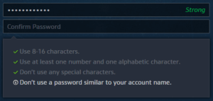
The same principle applies to users with disabilities. For example, if a user with cognitive disabilities is interacting with a control and the interaction causes text to suddenly appear and move every which way, that user may become very confused, or may decide what you’re asking them to do is too difficult and give up. As another example, if you give frequent updates to users when they’re creating a password but those updates don’t get conveyed to screen readers automatically, screen reader users will have a less useful experience. But if you convey every single update to screen readers in real time, they may be overwhelmed to the point that they forget what they were typing in the first place.
The two best things you can do when designing dynamic content are:
- Consider what information your users need to have immediately. If they don’t need it immediately, why are you displaying it?
- Test prototypes with users. What information do they need to do the tasks you’re asking of them? Is it necessary to give them that information dynamically, or not? If it is, what’s the bare minimum amount of information they need to make what they’re doing a good experience?
In general, the less information you need to push out to the user dynamically, the less you’ll need to worry about how that information will be conveyed to users with disabilities. If you do need to push information out dynamically, make sure it’s easy to understand, make sure it’s easy to find, and make sure people using assistive technology can access it.
Key #5: Style Guides and Pattern Libraries
A lot of what I’ve talked about can be done by a team or company in a sustainable way by building and implementing a pattern library. By pattern library, I mean a set of reusable components which includes instructions on when, where, how, and why to use them. A pattern library can also include more traditional style guide elements, like samples of typography and colors, or instructions on how to use the logo.
A pattern library can consist of mockups alone or can contain fully coded examples which can be dropped into applications. Perhaps a designer or a developer adds to it semi-regularly, or perhaps there is a small team dedicated to supporting it. Regardless of who created and maintains it, understand that a pattern library is useful for everyone involved in the development process. Having a pattern library helps designers be more consistent in how they present the organization’s brand and in how they design interactions. A pattern library can also save time because designers won’t have to design the same elements over and over. The same goes for developers – if code snippets and guidelines are given for implementation, developers won’t have to spend their time reinventing the wheel. QA can also benefit when testing because they will be able to refer to the pattern library when trying to determine whether a component is behaving as expected.
In terms of accessibility, defining accessibility features for patterns within a library can greatly reduce the amount of work needed to make a page or a site accessible. Accessible color combinations can be defined to prevent designers from using text with low contrast. For interactive elements like form fields, a pattern library could include label placement, error messaging tone and style, and instructions on how to programmatically associate help text and error messages. Custom components like calendar widgets or comboboxes can benefit greatly from being included in a pattern library, particularly if most or all of the accessibility concerns are worked out ahead of time. Much of the legwork of making a custom component accessible can be lessened or removed by creating a reusable pattern.
A short list of patterns libraries which include accessible patterns and guidelines:
- U.S. Web Design Standards
- Salesforce Lightning Design System
- BBC Global Experience Language
- Deque Pattern Library
Where Can You Go from Here?
There’s a lot to learn and a lot to know about web accessibility. And as with other principles of design and coding, accessibility standards and best practices evolve as technology changes and becomes more advanced. Even once you have a baseline of understanding about digital accessibility requirements and techniques, it can take a lot of effort to keep up with new trends and developments.
This is why it’s doubly important to start with the basics and keep coming back to them. Understanding the basics of usability and using that understanding as a framework when talking with users of all different types can give you great insight as to what makes something accessible or not. Relying on colleagues for help to fill in the gaps in your knowledge will go a long way in helping you learn what aspects of web accessibility are in your wheelhouse, and what aspects are not.
As a designer, accessibility in products often starts with you, but you’re not the only stop on the accessibility train. It’s incredibly useful for you to know what some of the accessibility concerns are around more complex elements, like form fields or dynamic content, even though you likely won’t be the person taking care of the implementation. Likewise, if you’re reading this as a developer, know that creating and implementing accessible elements or patterns isn’t entirely on your shoulders.
The best thing you can do to keep your focus on accessibility is to continue to learn and continue to make things better bit by bit. Going from 0 to 100 in accessibility can be a project of years, but don’t let that intimidate you. The accessible user experience will always be a work in progress. If you and your team continue to make the effort to be empathetic and to learn, your users will see it and they will appreciate it.


