
What Are Focus Indicators?
Have you ever noticed the blue outlines that sometimes show up around buttons or form fields? What about when you click on a menu item? Have you ever tried to make those outlines disappear?
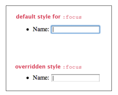
Browsers use the :focus-visible css pseudo class to give outlines to form fields and other elements when they’re focused. Here’s another hint: if you decide to get rid of the browser default outlines, make sure to replace them with something else! There’s a whole subset of users who rely on these outlines to tell them where they are on the page.
These outlines are called focus indicators. They’re visual markers that show (indicate) which element on a web page is focused. Only one element on a page can be focused at a time, and it should be obvious. Most all focusable elements are interactive – form fields, links, buttons, tooltips, etc.
A rule of thumb for accessible design: if you can interact with an element with the mouse, you should also be able to use the keyboard to perform the same actions. And if you’re using a keyboard, anything you interact with should have visible focus.
Why Focus Matters
The key purpose of focus is to give a user guidance.
For users who can see, having a focus that is clearly visible and recognizable is important. It’s a pattern just like any other element you design and should adhere to your standards of consistency. Your focus shows users what is “clickable,” and it helps to identify what an element is.
Who Needs Focus Indicators, Anyway?
Who doesn’t navigate websites with a mouse, you ask? As it turns out, a lot of people (1 in 4 adults in the U.S. have a disability) use the keyboard as their primary means of using the web, including:
People who use screen readers. Screen reader users are often blind, but not always! People with low vision or cognitive disabilities (like dyslexia) also use screen readers to help them understand content on the web. Screen readers are almost entirely controlled using the keyboard.
People with limited mobility. For example, people who don’t have enough fine motor control in their hands to use a mouse. They may use something like a mouth stick to operate a standard keyboard, or a switch, which simulates a keyboard.
Power users. A power user could be someone like a web developer, who spends all day writing code. Or an administrator who does a lot of data entry. I personally like to be able to tab through a web form while I’m filling it out rather than clicking on each field.
It should also be noted that “focus visible” is a requirement for a site to be considered accessible under the Web Content Accessibility Guidelines (WCAG). WCAG is the most commonly agreed upon accessibility standard, and an increasing number of countries have laws that require that public-facing websites meet the WCAG standard.
What’s Focusable on a Web Page?
A number of different elements on a web page can (and should!) be focusable. All of them need to have a focus indicator of some sort to make them look different from the surrounding elements. Here are a few of the many things that should be focusable on any website:
- Links
- Buttons
- Form Fields / Controls (text fields, select boxes, radio buttons, etc.)
- Menu items
- Things triggered by hover, like tooltips
- Widgets, like a calendar picker
Again, if you can interact with an element with a mouse, you should be able to use the keyboard to interact with it, too.
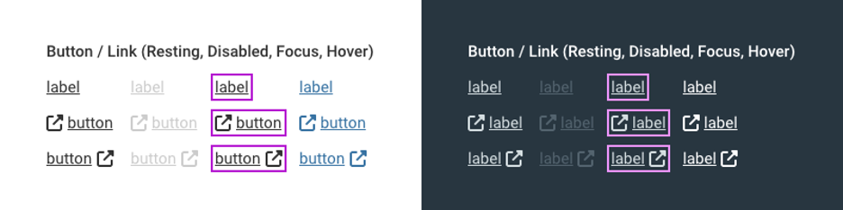
What Focus Indicators Look Like
Showing an outline around an element helps everyone who is a) using a keyboard to navigate and b) can also see the screen.
Want to see how it works? Reload this page, and then hit the Tab key a few times. You should see yellow outlines around some of the items in the header, like the logo and the social media icons.
Every time you hit Tab, the outline moves to the next element in the focus order (which is usually the order in which each element appears in the code). You can hit Enter or Return to activate the link. You can navigate most of the web with the keyboard using the Tab, arrow, and Enter/Return keys.
The most common browsers (Firefox, Chrome, Internet Explorer and Safari) all have default focus indicators for most (if not all) elements built into the browser. If you don’t define focus anywhere at all, you will at least be able to rely on the native browser indicators.
However, focus indicators look different across browsers. If you want your website to have a consistent look and feel across multiple browsers, it would be worth investing the time to define focus styles.
Creating an Accessible Default Focus
There are a few keys for well-designed focus indicators. Some of them have already been mentioned above. For easy consumption, here’s a list:
- Good contrast
- Complementary shape and size to the element
- Color scheme is complementary, but also stands out
- Doesn’t need to be the same for all elements
- Animations help users track focus movement
- Should degrade gracefully (be visible on older browsers)
- Should be the same across browsers
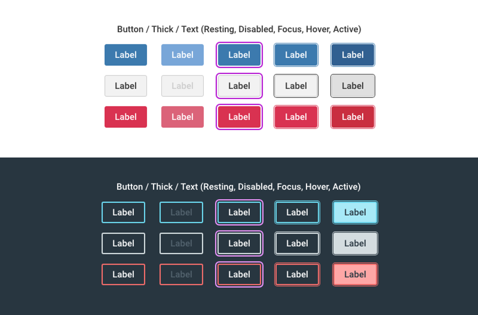
Designing for Focus
- Make a list of all focusable elements. How many variations of each do you have? If there are primary and secondary buttons that use different colors, will the same focus indicator work for both of them?
- Think about your color scheme. Are you using a callout / highlight color? Would that color work well for focus? If not, is there a different color that would?
- In a lot of cases, a good focus state might be the same as the hover state. If your hover state is obvious, consider using that as a focus indication as well.
- It’s generally a good idea to replace the native browser focus style for all elements with a custom style so that focus indicators are consistent across browsers.
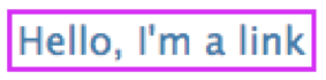
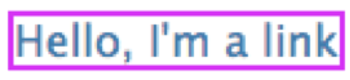
Let’s look at the default CSS focus for our pattern library, Cauldron:
*:focus {
    outline: 2px solid #d71ef7;
}
Our default focus is a saturated purple so that it shows up against a white (#ffffff) or off-white (#fdfdfe) workspace. It has an outline of 2px so it’s a bit more visible than a single 1px stroke, and there is a 2px offset so it doesn’t butt up against the text, such as when you focus a link.
Good Example
Bad Example
Tab around your application and notice where your focus looks really good and where it looks… um, less good. The places where the focus style feels out of place may be candidates for a custom focus.
Custom Focus
There are two instances in which we use custom focus:
- When you want to give the focusable element special prominence (e.g. inputs or terminal buttons).
- When the default focus color doesn’t work against a specific background.
Let’s look at a few custom focuses we developed for Cauldron.
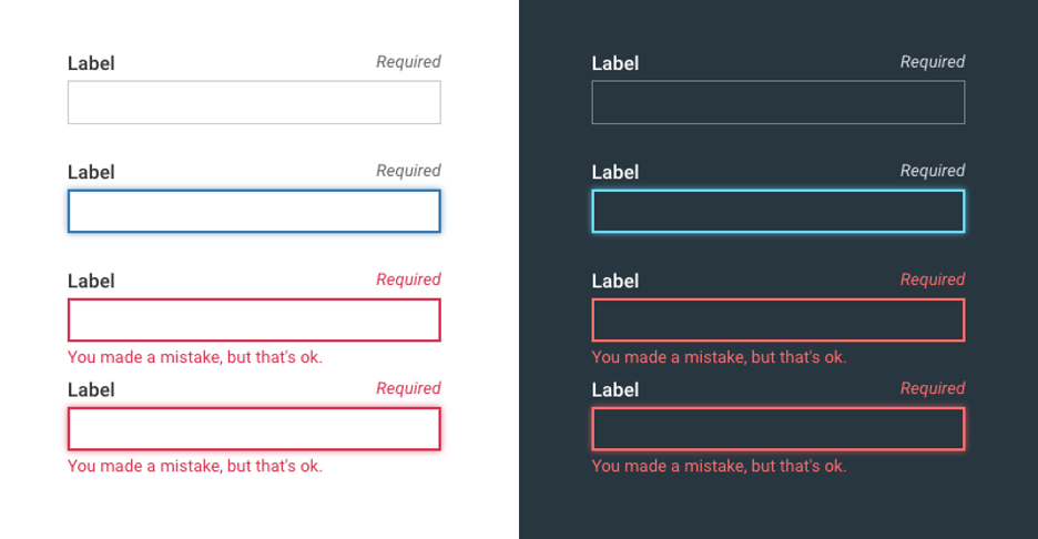
Field Inputs
This is a non-focused field from Cauldron.
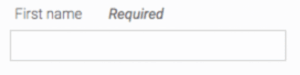
We wanted our field focus to have a distinct feel and to adjust to the field’s state. We chose to co-opt the color of the field’s stroke and give it a gentle glow to indicate focus.
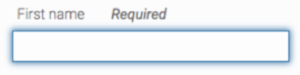
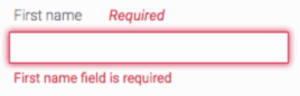
When the field is in the error state it gets a thicker stroke and red outline along with the supporting error text.
When focus returns to an error field, the thick border diffuses back into a glow, giving visual continuity to the non-error focus state.
We tried to make the focus state for fields feel like a natural extension of the pattern rather than something that overlays it.
Buttons
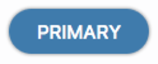
This is a non-focused primary button from Cauldron:
Our terminal button focus is a personal favorite not only because our front-end developer did a brilliant job implementing it but also because it’s visually interesting and immediately identifiable as a focused state.
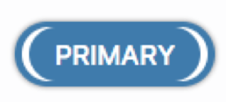
Our secondary and error buttons use the same focus but have their color changed to appropriately match the text.
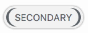
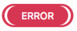
We made button focuses very visually distinct so they would pop out as they are used for terminal actions in our applications.
Dialogs
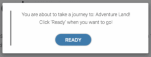
When a screen reader user enters into a form that has text or a header, that information needs to be read out. Therefore, the form would need to be focused in some way. This often shows up as the entire form being highlighted (sometimes invisibly?). When we have text areas, we use a couple of different focuses to allow AT to read out without being visually messy.
For chunks of text that will be read out in a block, we use a left bar that appears in the gutter of the bounding object such as here in our alert. Once you tab out, it goes to the first tabbable object, which, in this case, is the READY button.
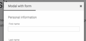
For things like modals, where we have a form with a clear header, we use an underbar to indicate focus. It also moves to the first tabbable object after you hit Tab, which in this case would be First name.
Default Doesn’t Fit
There are times when you don’t want to make a custom focus but the default doesn’t fit the color of the background. I bet you can guess what you’re supposed to do: change the focus’ color. Below is an example from our toasts.
Good Example
Bad Example
Even though the close X uses the default focus, we needed to change the color to better pass color contrast and fit the color scheme better.
Things to Avoid
A few things to try and steer clear of when designing your focus:
- A focus that’s too discrete. I think we’ve all experienced the horrible dotted line focus that’s visible to practically no one. The focus should be visually clear.
- Disappearing focus. This is often a z-index issue of some sort, and you see it a lot in tabbed menus. It’s important to check and make sure the focus of an element isn’t being cut off by something else.
- Visually mismatched focus. This one is certainly up to your design discretion, but don’t forget the old rule: if something feels off, it usually is.
How / When to Tackle Focus Indicators
Regardless of when you start, the first thing you’ll want to do is make a list of all of the focusable elements you’ve used or will be using on the site. How many color or style variations of each do you have? Is your site using any custom widgets or controls? Does your site (or system) use multiple color schemes?
There are two spaces you might be in when designing focus indicators:
- Designing new patterns
- Improving an existing application
The best time to tackle designing focus indicators is before the element patterns have been implemented – for example, when starting from scratch on a new site or when doing a style refresh for an existing site. While you can make a push to change focus indicators on the fly, it’s often easier to design for focus when designing the element patterns themselves, for multiple reasons:
- It’s easier to get buy-in for focus indicators when they exist as part of a cohesive design.
- It’s easier to implement focus at the same time as other states, like the hover state.
- It’s easier to design focus when designing other states (like hover and active) because you have time to give more thought to how focus fits in with the rest of the design.
My advice: include focus indicators early, and evaluate them often. The hardest way to include focus in an application is to do it on a short deadline. Your site’s users will thank you for including focus indicators from the start, too.

