

This is a continuation of Paul J. Adam’s ongoing Accessibility Support Series, where he explains how to build accessible widgets and which screen readers they’re compatible with.
In the last post in the A11y Support Series we talked about ARIA role=”alert” Modal Dialogs. Continuing on with our series, we’re going to build another accessible ARIA widget: a simple role=”button” UI control. Then we’ll test what screen reader and browser combinations are supported when using other ARIA attributes allowed on role=”button.”( i.e. aria-expanded, aria-pressed, and aria-disabled). Although aria-haspopup can also be used on role=”button”, we’ll save that for another post on the menu button pattern.
Check out the Live Demo
Button, Toggle button, Expanding Button, or Menu Button
Instructions for building a proper role=”button” UI control can be found at the WAI-ARIA Authoring Practices 1.1. The Authoring Practices says that in addition to the normal button widget there are two other types of buttons, Toggle button (aria-pressed) and Menu button (aria-haspopup). This post will discuss ordinary buttons, toggle buttons, and expanding/collapsing buttons.*
Aside from stating that it’s an allowed tribute for that role, the ARIA Spec and Authoring Practices doesn’t have much information on using aria-expanded=”true/false” on a role=”button” widget that expands and collapses.,*(See the ARIA 1.1 Spec on button (role) for more information). There is also an Authoring Practices button role Example.
Why Not Just Use a Real <button>!?
Good question.There are a lot of great reasons – that I’ll cover below – , for using a native <button> or <input type=”button”> control over a custom <div role=”button”>. So why the heck would you ever use a role=”button” over a real <button>? Well, for starters:
- Retrofitting accessibility into legacy website cannot change HTML tags which breaks CSS.
- Absolute control over CSS appearance of your button across multiple browsers/operating systems.
- Framework choice already determined and you’re stuck with DIV buttons.
It doesn’t really matter to me why you can’t use a real <button> over a <div> button, what’s more important is did you code the custom role=”button” control to work EXACTLY the same as a native <input type=”button”>? Screen reader users don’t care if you used a native <button> or an ARIA role=”button” so long as it’s accessible.
There’s an ideal way to implement accessibility in the early stages of website development, using the proper tags for the right controls. And then there’s the real world of websites that are not coded to perfection and designed with no accessibility in mind from the start. ARIA is your savior when it comes to making real-world websites accessible.
How Does a Native <button> Work, Exactly?
Usage
Buttons are used to trigger an action or event (i.e. submitting a form, opening a dialog, canceling an action, or deleting an item).
Buttons are not used to open webpages, instead use Links.
Appearance
| macOS | iOS |
|---|---|
 |
 |
Buttons look different depending on in what browser and operating system they’re viewed. Inconsistent button designs do bother folks who want to maintain complete control over the appearance of their buttons in all platforms. Many usability experts recommend keeping the standard design of native buttons as they appear in that user’s device, because they already expect that look and feel. By using a custom styled button you’re deviating from the standard experience for that OS.
But if you use buttons, make sure they retain the same standard appearance so they are easy to identify.
Buttons need a fully visible keyboard focus outline so users can see them when tabbing.
NOTE: blog post and demo does not modify the CSS of the <span role=”button”> and <a href role=”button”> examples. If these demos were used in the real world you will need to style them to look like actual clickable buttons and not plain text spans or blue underlined links. The aria-expanded and aria-pressed button examples have extra styles to make them look pressed.
Keyboard Operation
Buttons operate with Enter key and Spacebar key! A common problem is that <div role=”button”> controls don’t work with the Enter AND Spacebar keys or they don’t work with the keyboard at all. They’re either skipped right over when tabbing or pressing enter, or spacebar keys have no effect because they only have a mouse-dependent onclick JavaScript event.
NOTE: When using a screen reader like NVDA or JAWS pressing the spacebar and enter key will activate onclick events on buttons. They do this because most fake buttons are not accessible. Try it with the screen reader turned off.
NOTE for Mobile: Tap events are treated like onclick events. VoiceOver can activate a fake <div onclick> button with a double tap but the user would have to guess that it’s a button to begin with because there is no role so they would only hear it as plain text. Android works like a desktop computer with a keyboard connected unlike iOS.
JavaScript onclick + <button> = Accessibility Magic!
When a JavaScript onclick event is attached to a native <button> or <input type=”button”> the keyboard accessibility for both Enter and Spacebar keys is included for free and you don’t need a role attribute.
So just one onclick event is accessible on a <button> but that same event on a <div role=”button”> will not be accessible at all to keyboard users.
<button> vs <a href=”#”>
- <button> has a button role, <a href> has a link role.
- <a href=”#” role=”button”> only works with click and enter key, <button> works with spacebar also.
- Focus jumps to top of page when user activates an <a href=”#”> control whereas focus stays put on a <button>.
- <button> looks like a Button, <a href> looks like a Link.
- If you forget the href attribute, i.e. <a onclick> then there is NO role, NO keyboard focusability, and NO enter key activation. <a> is basically the same as a <span> unless you have the href attribute.
.preventDefault() Required for ARIA role=”button” Controls
Notice that in the Live Demo where the role=”button” and <a href=”#” role=”button”> examples are missing the JavaScript .preventDefault() method when you press Enter and Spacebar keys those custom ARIA controls don’t function like a real native button. When you press Spacebar key the browser scrolls down the page just like the Page Down key functions. That’s because scrolling down the page is the default behavior of the Spacebar key, and we need to prevent that default behavior.
You’ll also notice that on the <a href=”#” role=”button”> controls when you press the Enter key or click the link/button the browser scrolls and moves focus to the top of the page. So both a <div role=”button”> and an <a href role=”button”> need JavaScript event.preventDefault();.
Native <button> or <input type=”button”> controls don’t need this extra code!
Keyboard Focusability
HTML Native Controls Focusable by Default
- <button>
- <a href>
- <input>
Common Non-focusable Custom Fake Buttons
- <span onclick>
- <div onclick>
- <img onclick>
- <a onclick>
Span, div, and img elements are not focusable unless they have a tabindex=”0″ attribute/value applied. Tabindex=”0″ only lets the user TAB to the control but it does not let the onclick event magically work with enter and spacebar keys. You need a <button> for free keyboard accessibility.
If you want to make a <span> focusable you need to add tabindex=”0″ then add an onkeydown event in addition to the onclick to make it keyboard operable.
Keyboard Operability with JavaScript
Native <button>
To make a button keyboard operable all you need is the onclick event and it works with Enter and Spacebar keys!
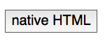
Code
<button onclick="alert('native HTML button activated')">native HTML</button>
Output
Custom ARIA <a href=”#” role=”button”>
<a href> does give you the Enter key for free with an onclick event but you still need to add an extra onkeydown event that checks for keyCode 32 (Spacebar) and if that key is pressed the default behavior (scrolling the page) is prevented and instead jQuery .toggle() method is run. This is still extra work than a <button> and our control looks like a link now not a button.
Code
<a href="#" role="button" onclick="event.preventDefault();$('#span2').toggle()" onkeydown="if(event.keyCode==32){event.preventDefault();$('#span2').toggle()};">a href role preventDefault</a>
Output
Custom ARIA <span role=”button”>
<span> has no focusability and no accessibility role. Whereas <a href> defaults to link if you don’t add role=”button”, <span> has no default role. Add tabindex=”0″ to make the <span> focusable and role=”button” to give it a role. The onclick event will not fire on enter and spacebar keys with a <span> . That means you have to add an onkeydown event and check if the enter or spacebar keys are pressed, then prevent the default behavior for the spacebar key and run the code.
Code
<span role="button" tabindex="0" onclick="alert('custom ARIA button activated')" onkeydown="if(event.keyCode==13){alert('custom ARIA button activated with Enter key')}; if(event.keyCode==32){event.preventDefault();alert('custom ARIA button activated with spacebar key')}">custom ARIA preventDefault</span>
Output
custom ARIA preventDefault
Focus Management after Button Activation
The ARIA Authoring Practices role=”button” Keyboard interaction specifies where focus should be sent after a button opens or closes a modal dialog, or if focus should remain on the button if the action does not change context.
If your button changes context, (i.e.. loads a new view into the page of a single page app), then you should send focus to the starting point for that new page.
WAI-ARIA Roles, States, and Properties
The focusable button control must have role=”button”. An accessible label is required which is first derived from the text inside the button element. If there is no text inside the button then an aria-label or aria-labelledby attribute can be used to give the button an accessible name.
aria-disabled
If a description of the button’s function is present then aria-describedby points to the id of the description text. If the ARIA button is disabled then it must have aria-disabled=”true” applied.
Code
<span role="button" tabindex="0" onclick="if(this.hasAttribute('aria-disabled')){this.removeAttribute('aria-disabled');this.removeAttribute('style')}else{this.setAttribute('aria-disabled','true');this.style.color='silver'}" onkeydown="if(event.keyCode==13 || event.keyCode==32){event.preventDefault();if(this.hasAttribute('aria-disabled')){this.removeAttribute('aria-disabled');this.removeAttribute('style')}else{this.setAttribute('aria-disabled','true');this.style.color='silver'}}">custom aria-disabled on activation preventDefault</span>
Output
custom aria-disabled on activation preventDefault
Screenshot
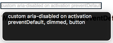
VoiceOver macOS: “custom aria-disabled on activation preventDefault, dimmed, button”
aria-pressed
If the button is a toggle button, e.g. a Bold text button, then it has an aria-pressed=”true/false” state to let the screen reader user know when the button is pressed.
Code
<button aria-pressed="false" onclick="this.style.borderStyle=(this.style.borderStyle!=='inset'?'inset':'outset'); if(this.style.borderStyle=='inset'){this.setAttribute('aria-pressed','true')}if(this.style.borderStyle=='outset'){this.setAttribute('aria-pressed','false')}">aria-pressed</button>
Output
aria-pressed has a bug in iOS 10 where the toggle button state will not be correct on a native <button> unless the additional role=”button” attribute is added. Bug report filed at: AX: aria-pressed state not correctly conveyed to VoiceOver iOS on <button> unless role=button added.
Screenshot
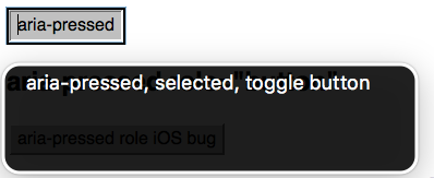
VoiceOver macOS: “aria-pressed, selected, toggle button”
aria-expanded
The authoring practices does not cover aria-expanded but it’s an allowed attribute on role=”button” and it is very common to see buttons that expand and collapse content used in modern websites. You could make a very simple expanding menu with just role=”button” and aria-expanded=”true/false”, the same code could be used for an accordion and a hamburger menu. You don’t necessarily have to use menu and tab roles to convey state to screen reader users when aria-expanded works well with button and link roles. aria-controls should also point to the id of the container the button expands and collapses.
Code
<button aria-expanded="false" aria-controls="divExpand" onclick="this.style.borderStyle=(this.style.borderStyle!=='inset'?'inset':'outset'); if(this.style.borderStyle=='inset'){this.setAttribute('aria-expanded','true');$('#divExpand').toggle()}if(this.style.borderStyle=='outset'){this.setAttribute('aria-expanded','false');$('#divExpand').toggle()}">aria-expanded</button>
<div style="display:none;" id="divExpand">aria-expanded button activated</div>
Output
Screenshot
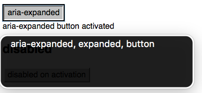
VoiceOver macOS: “aria-expanded, expanded, button”
Screen Reader Support Test Results
Desktop screen readers have excellent support for all the ARIA attributes tested today. However, on mobile both VoiceOver iOS 10 and Android TalkBack/Chrome do not support the aria-pressed attribute unless the additional role=”button” attribute is present. The worst bug is with the latest versions of TalkBack Android/Chrome where aria-expanded has no support on role=”button”. Firefox shines on mobile Android with full support for all the attributes tested just like Firefox on desktop.
So the workaround to get almost perfect support for aria-pressed is add some extra code, role=”button”, to your <button> tag. This reminds me of writing <footer role=”contentinfo”> to make sure the footer landmark works in more screen readers.
A bug report needs to be filed with Google to get aria-expanded working in Chrome on Android.
| Attribute/Value/IDref | VoiceOver macOS 10.12/Safari | NVDA Windows 7/Firefox | VoiceOver iOS 10/Safari | TalkBack Android/Chrome | TalkBack Android/Firefox |
|---|---|---|---|---|---|
| role=”button” | Yes | Yes | Yes | Yes | Yes |
| aria-pressed | Yes | Yes | Yes (role=”button” only) | Yes (role=”button” only) | Yes |
| aria-expanded | Yes | Yes | Yes | No | Yes |
| aria-disabled | Yes | Yes | Yes | Yes | Yes |
Closing Thoughts
There’s a lot to consider when making a custom button control fully accessible with an experience equal to a native <button>. You need tabindex=0, role=button, onkeydown, .keyCode == 13, .keyCode == 32, event.preventDefault(), and extra CSS to make it look like a real button. Screen reader and keyboard-only users don’t really care if you use a real <button> or a <div role=”button”> as long as you’ve actually copied all the accessibility of a real button to your ARIA button. The reality is that most faux <div> buttons are not keyboard or screen reader accessible at all, and as a developer you’re responsible for implementing the full functionality of the control you use based on its role. So either use native buttons or mimic them completely.
Our next post will be on role=”checkbox” and creating custom fake checkboxes that fully mimic a native <input type=”checkbox”>. Thanks for reading! Feel free to leave any questions or comments below.

