

The following post is the second in Paul Adam’s new blog post series, “WAI-ARIA Widgets, Design Patterns, and Accessibility Support .”
In the first post in the A11y Support Series we talked about ARIA Tab Panels. Continuing our series we will build another accessible widget, a role=”alertdialog” Detail Message Dialog, and test what screen reader and browser combinations are supported.
Alert Dialog or Message Dialog
Instructions for building a proper role=”alertdialog” accessible widget can be found at the WAI-ARIA Authoring Practices 1.1. The Authoring Practices say examples include action confirmation prompts, warning messages, or help for an invalid form entry. The dialog should be modal. Keyboard focus is set on an element in the dialog depending on the dialog contents.
See the ARIA 1.1 Spec on alertdialog (role) for more information and note there are differences in what the ARIA Spec and ARIA Authoring Practices recommend for setting focus to the dialog.
Is it a Simple Message or Detail Message Dialog?
A dialog is considered a detail message dialog when:
- If it’s more than one sentence in length
- If it has information where punctuation is essential
- If it contains detail information that might need to be copied like a number or address
- If it has an interactive element like a link.
If the dialog doesn’t exhibit any of these characteristics then it’s a simple message dialog.
Focus Management
Simple message dialogs have focus set to the confirmation button (e.g., the OK button). Detail message dialogs have focus set on the element containing the message. This is according to the WAI-ARIA Authoring Practices but I’m not sure I agree with setting focus to the static text inside the dialog – simply because it seems more logical to set focus to the first keyboard focusable element inside the dialog. The live demo has an alertdialog exact to ARIA Authoring Practices (and one that also deviates from the ARIA Authoring Practices).
role=”document” and tabindex=”0″ on Detail Message
In the alertdialog exact to ARIA Authoring Practices the pattern seems to be designed for NVDA because it says the detail message should be focusable and have a role=”document”. In the alertdialog that deviates from the ARIA Authoring Practices we’re setting focus to the first button inside the dialog. <button> elements can receive .focus() from JavaScript by default without needing a tabindex=0 like the static text.
When you send screen reader focus into a role=”dialog” or “alertdialog” container then the accessible name (aria-label/aria-labelledby) and description (aria-describedby) text values will be spoken aloud automatically in addition to the role, “Dialog” or “Alert Dialog”.
NVDA Forms Mode Behavior & Insert + Spacebar Key
In a normal role=”dialog” or “alertdialog” NVDA will go into Forms Mode when focus is sent into the dialog. Forms Mode means NVDA users an only tab around the dialog. They can’t press the up/down arrow keys to read through the dialog with linear navigation.
To exit forms mode NVDA users can press Insert + Spacebar keys and then enter Browse Mode where they can use the arrow keys and quick navigation keys to read through the dialog rather than just the TAB key.
Most accessibility folks are confused by this behavior and wonder if screen reader users understand how the read the dialog or if the dialog code is broken because it’s not working properly with NVDA. This is similar to the problems with using role=”application”. Forms Mode/Browse mode issues don’t affect other screen readers like VoiceOver and TalkBack. I’ve heard that JAWS isn’t affected by the role=”alertdialog” Forms Mode issue like NVDA.
Deviating from the WAI-ARIA Authoring Practices by Setting Focus to First Button
My preference – and what seems to work much better with VoiceOver – is to send focus to the first logically focusable element inside the dialog, and then the dialog’s role and accessible name/description will be spoken automatically. You would expect that the NVDA users should hear when they enter a dialog container, and then manually enter Browse Mode with Insert + Spacebar key to read all the dialog text if they missed any content on entering the dialog. NVDA sill works great with sending focus to the button inside the dialog. This is because all the dialog content is still spoken aloud automatically to NVDA based on the role and accessible name/description attributes.
If you use the construction for the alertdialog as recommended in the WAI-Aria Authoring Practices, you’ll find that VoiceOver doesn’t work well at all. In fact, it seems to be much worse.
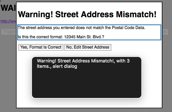
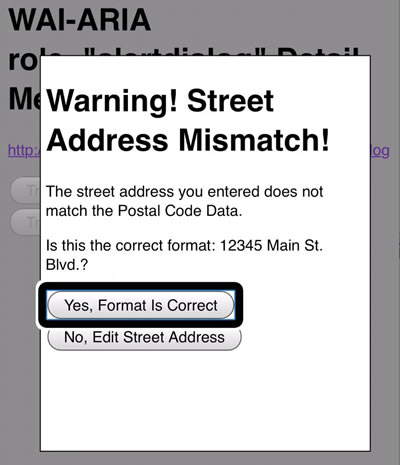
VoiceOver Output: “Warning! Street Address Mismatch! with 3 items. alert dialog”
But if you send focus to a button inside the dialog then VoiceOver will speak the accessible name and description of the dialog properly.
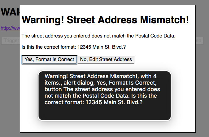
VoiceOver Output: “Warning! Street Address Mismatch! with 4 items. alert dialog Yes, Format Is Correct button The street address you entered does not match the Postal Code Data. Is this the correct format: 12345 Main St. Blvd.?”
Sometimes it makes sense to bend the rules of the ARIA Authoring Practices.
The ARIA 1.1 Spec alertdialog (role) actually says “When the alert dialog is displayed, authors should set focus to an active element within the alert dialog, such as a form edit field or an OK button.” which seems to contradict what the ARIA Authoring Practices recommends or, at least, the ARIA Spec is not speaking to differences between a Simple Message vs. Detail Message Dialog.
Putting the Modal in Modal Dialog
Modal means that the user can’t interact with any content outside of the dialog. So the keyboard, mouse, and screen reader interactions MUST be trapped inside the dialog. One way to trap focus inside a dialog is to remove focusability of the disabled main content underneath the dialog.
After the user opens the dialog we use JavaScript (jQuery) to modify the attributes and values of the HTML elements and then construct the dialog dynamically after we hide everything in the main content and navigation containers.
You hide content from screen readers with aria-hidden=”true” but that doesn’t remove keyboard focusability, so you also have to set tabindex=”-1″ on links and the disabled attribute on buttons. Otherwise the screen reader user could still TAB to those main content controls. That means the user won’t hear any accessibility information spoken due to aria-hidden=”true”.
jQuery Code to Hide Main Content
$('main, [role=navigation]').attr('aria-hidden','true');
$('body').attr('style','background-color:gray;');
$('a').attr('tabindex','-1');
$('a').attr('style','cursor:default;');
$('button').attr('disabled','true');
WAI-ARIA Roles, States, and Properties
The main dialog container must have the role=”alertdialog” attribute value set to tell the screen reader user the widget type and keyboard interaction. The Demo Exact to ARIA Authoring Practices follows the requirement that message areas have role=”document” and tabindex=”0″ but the other demo does not follow this recommendation. The role=”alertdialog” container also must have an accessible name via either aria-labelledby attribute that references the title of the dialog, or an aria-label if there is no visible title. Usually the dialog title is an H1 but the spec doesn’t provide any recommendation for headings. The dialog container should also have an accessible description via aria-describedby referring to the message element that has role document, or just the message text container if not using role=”document.” You probably don’t want to set a dialog description if the content is very long, or contains complex information like forms and data tables.
HTML/ARIA Code for Alert Dialog to ARIA Authoring Practices
<div role="alertdialog" aria-labelledby="alertHeading" aria-describedby="alertText">
<h1 id="alertHeading">Warning! Street Address Mismatch!</h1>
<div id="alertText" tabindex="0" role="document">
<p>The street address you entered does not match the Postal Code Data.</p>
<p>Is this the correct format: 12345 Main St. Blvd.?</p>
</div>
<button id="yes">Yes, Format Is Correct</button><button>No, Edit Street Address</button>
</div>
HTML/ARIA Code for Alert Dialog that Deviates from ARIA Authoring Practices
<div role="alertdialog" aria-labelledby="alertHeading" aria-describedby="alertText">
<h1 id="alertHeading">Warning! Street Address Mismatch!</h1>
<div id="alertText">
<p>The street address you entered does not match the Postal Code Data.</p>
<p>Is this the correct format: 12345 Main St. Blvd.?</p>
</div>
<button id="yes">Yes, Format Is Correct</button><button>No, Edit Street Address</button>
</div>
Live Demo
Screen Reader Support Test Results
| Attribute/Value/IDref | VoiceOver OS X 10.11/Safari | NVDA Windows 7/Firefox | VoiceOver iOS 9.3/Safari | TalkBack Android/Chrome | TalkBack Android/Firefox |
|---|---|---|---|---|---|
| role=alertdialog | Yes | Yes | Yes | Yes | Yes |
| aria-labelledby | Yes | Yes | Yes | Yes | Yes |
| aria-describedby | Yes | Yes | Yes | Yes | Yes |
| role=document | No | Yes | No | Yes | No |
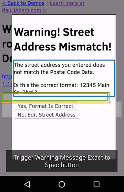
Issues on Mobile with Alert Dialog Exact to ARIA Authoring Practices
On iOS VoiceOver focus does not go into the detail message dialog when activated with JavaScript .focus() set to the role=”document” and tabindex=”0″ container. Instead, the VoiceOver focus remains on the triggering button and you can’t swipe to the next or previous elements, you would have to then use explore by touch to set focus into the dialog manually.
I’ve also noticed this same issue in other live accessible dialog examples where .focus() is set to the role=”alertdialog” container element rather than a focusable control inside the dialog. VoiceOver’s focus on iOS does not go into the container and you can’t swipe. You can only use explore by touch to enter the dialog.
Focus Set to Dialog Text
iOS VoiceOver/Safari
VoiceOver Output: “Trigger Warning Message Warning! Street Address Mismatch!, Yes, Format Is Correct, No, Edit Street Address, The street address you entered does not match the Postal Code Data., Is this the correct format: 12345 Main St. Blvd.?”
Android TalkBack/Chrome
TalkBack Chrome Output: “Warning! Street Address Mismatch! The street address you entered does not match the Postal Code Data. Is this the correct format: 12345 Main St. Blvd.?
Warning! Street Address Mismatch!
The street address you entered does not match the Postal Code Data.
Is this the correct format: 12345 Main St. Blvd.?
Yes, Format Is Correct
No, Edit Street Address
document”
Android TalkBack/Firefox
TalkBack Firefox Output: ” ” (nothing is spoken aloud)
Focus Set to Dialog Button
iOS VoiceOver/Safari
VoiceOver Ouput: “Yes Warning! Street Address Mismatch!, The street address you entered does not match the Postal Code Data., Is this the correct format: 12345 Main St. Blvd.?, Yes, Format Is Correct, No, Edit Street Address”
Android TalkBack/Chrome
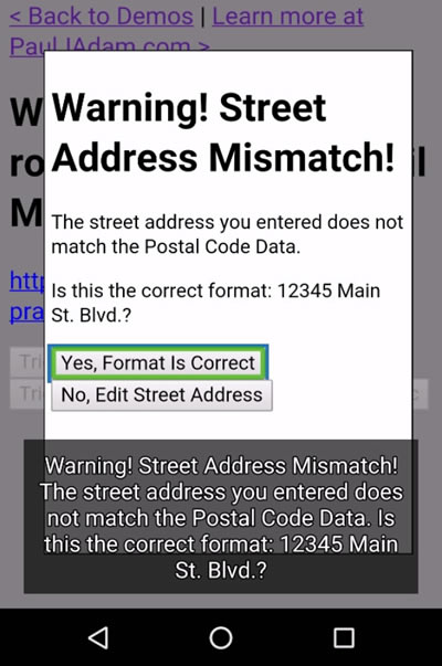
TalkBack Chrome Output: “Warning! Street Address Mismatch! The street address you entered does not match the Postal Code Data. Is this the correct format: 12345 Main St. Blvd.?
Warning! Street Address Mismatch!
The street address you entered does not match the Postal Code Data.
Is this the correct format: 12345 Main St. Blvd.?
Yes, Format Is Correct
No, Edit Street Address
Yes, Format Is Correct button”
Android TalkBack/Firefox
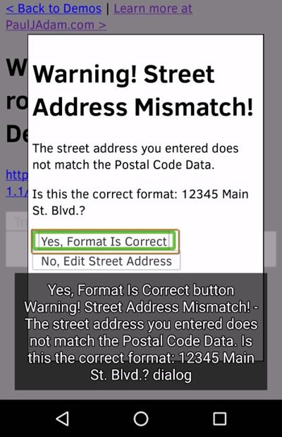
TalkBack Firefox Output: “Yes, Format Is Correct button Warning! Street Address Mismatch! The street address you entered does not match the Postal Code Data. Is this the correct format: 12345 Main St. Blvd.? dialog”
Closing Thoughts
NVDA Forms Mode for dialog roles and the less useful behavior of VoiceOver when following the WAI-ARIA Authoring Practices exactly make creating a universally accessible widget much more complex than you might initially think. I did not expect to write blog posts this long about each individual ARIA widget but once you get into the details of ARIA and screen reader support a short blog post is not always possible.
To try an keep the next blog post in the ARIA Support Series possibly simpler we’ll cover a role that seems very basic, role=”button”, but we’ll find out it’s always more complex than you expect once keyboard behavior and JavaScript keyCode events are properly coded. Stay tuned for more accessibility support posts on building accessible widgets and other “Deque How To” posts for practical accessibility hacks!
Paul J. Adam is an Accessibility Evangelist at Deque Systems. His focus is on Mobile Accessibility and Modern Web Accessibility, with expertise in Mobile Web, Native iOS & Android, Hybrid Apps, Responsive Web Design, HTML5, JavaScript, WAI-ARIA, WCAG 2.0, and Modern Web development techniques. Paul’s been a registered Apple Developer since 2011, and spends his free time creating iOS apps and learning modern JavaScript development. You can reach him on Twitter at @pauljadam.

