Pinch to zoom, accessibility for mobile web

Accessibility for Mobile Web: Fixing Pinch to Zoom

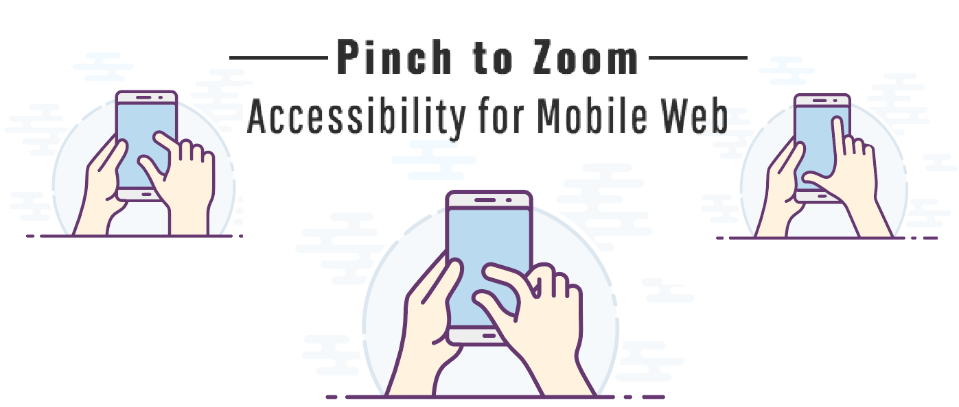
Hey, everyone! Let’s talk a little bit about pinch to zoom on a mobile device. A key feature of mobile browsing is being able to zoom in to read content and then to zoom out to locate content on the page. Sadly, there is a misconception among responsive developers and designers that a properly implemented responsive web design site doesn’t need to allow zooming.

I want to dive into the accessibility effects of what happens when you disable pinch to zoom. I will discuss the different examples of what happens when developers and designers disable this feature on both iOS and Android devices and ultimately why they should not disable pinch to zoom.

Follow along here in my recorded walkthrough if you’d like:

WCAG 2.0 and Pinch to Zoom

Pinch to zoom is when a user zooms in on a mobile device by pinching the screen, allowing you to zoom in and out. Sometimes designers and developers decide that they want to disable that feature. Let’s explore what happens to the code when this feature is disabled. For example, an important bit of code under Meta Tag is called Viewport. I’m going to discuss the good and the bad about disabling this bit of code.

Under the World Wide Web Consortium’s (W3C) web content accessibility guidelines (WCAG), is success criteria 1.4.4, which is titled “resize text”. It reads, “Except for captions and images of text, text can be resized without assistive technology up to 200% without loss of content or functionality. “This success criterion is Level AA, which is the middle level of conformance, meaning the web page satisfies all the Level A and AA success criteria. If developers and designers disable and prevent pinch to zoom from happening, we’re actually failing this success criterion.

Pinch to Zoom on iOS Devices

The first example I’m going to provide illustrates the best practice behind the code for pinch to zoom. This code is responsive design, the code is actually in the head and is meta name viewport. The name viewport is the location where pinch to zoom could be disabled and there are two ways to disable pinch to zoom in this meta tag. Let’s look at this a little closer, you’re going to see a content and there are two things you will want to pay close attention to.

First, is user-scalable=no and maximum-scale=1.0. These tags are the ones that will turn pinch to zoom shut off, disabling the feature. Now, by removing these tags, you fix this issue. Additionally, Apple and iOS devices, recently updated their new versions so that this is not possible, which is a great win for accessibility. Even if someone tried to put this snippet of code in it would not disable touch to zoom.

Pinch to Zoom on Android Devices

However, this is not the case with the Android device. With an Android device, the device will still recognize this meta tag. Unfortunately, allowing developers or designers to disable pinch to zoom.

The best rule of thumb is that if you’re unsure of something empathetically think of what the end user is doing. Consider the contrast issues with using a phone in sunlight or you’re a person with low vision. Imagine you are someone with limited fine motor control. Or even the developer did a poor job with responsive design and having zoom enabled is necessary to just use the page (yes, this happens). Go to the device and test it with these constraints and design with accessibility in mind. Leave your comments and questions below!

Photo of CB Averitt

About CB Averitt

CB Averitt is a Principal Consultant with Deque Systems. He has been in web development for over 17 years and has experience with front-end and back-end development as well as design and user experience. He has completed hundreds of assessments and remediations in numerous technologies. He has conducted many at major accessibility conferences such as CSUN’s “Annual International Technology and Persons with Disabilities Conference” as well as Knowbility’s “John Slatin AccessU.” CB is a scuba instructor and a drummer, but not usually at the same time.
CB has completed hundreds of assessments and remediations in numerous technologies such as web, PDF, and mobile. He has performed numerous presentations across the State of South Carolina. He has presented at major accessibility conferences such as CSUN’s “Annual International Technology and Persons with Disabilities Conference” as well as Knowbility’s “John Slatin AccessU”. CB has been a volunteer with The South Carolina Assistive Technology Advisory Committee (SC ATAC) for over 9 years.
update selasa

Comments 4 responses

  1. You make this important point very well. And you touch on a point I have only recently noticed – that iOS 11, as you say, now ignores the offending user-scalable and maximum-scale attributes. I only discovered it because in two recent audits I did, for two different clients, the markup both contained them and I was all ready to fail the pages, until when I tested with an iPhone I found they both allowed zoom. Let’s hope Androids take the same stance soon.

    I think it is worth saying, however, that it could be a long time before all current users running earlier versions of the operating system on their phones and iPads upgrade, so even for Apple phones developers should avoid this accessibility failure, as also for androids and other devices.

    As to why developers do this, I a am fairly certain that it is not deliberate in most cases. The viewport meta tag is one of those things that most developers don’t know much about, so when they are creating their page header they either copy it from a previous site they or someone else did or they Google for information about it (as I used to when I was a developer!) And there are loads of articles out there giving viewport meta tag examples, all with the above wrong items in them, often without any explanation as to what they are there for!

    This is one of those self-perpetuating fallacies that abound on the internet without anyone knowing why they say what they do!

  2. Excellent points Guy, thanks for responding.
    I too agree, even though this may “pass” on updated iOS devices, the unknown is questionable (and the known with Android). If the code is found, it should be addressed.

    Again, great points. Thank you!

  3. Keeping pinch-zoom is more than accessibility for sight impaired users.
    It is also about User choice.

    Some of us want to zoom out to see either:
    a) the full page layout we are familiar with and used to navigating
    b) to see as much content and navigation as possible to get a fast overview of the site and whether it is easy and worth exploring.

    On a tablet, it is so frustrating when, having selected “Desktop View” – the site fails to pinch-zoom.

    Web Designers should never limit Users’ choices in the name of “appearance”.

  4. Hi Jules,
    You’re so right. I totally agree. Thank you for adding that additional information.
    CB

Leave a Reply

Your email address will not be published. Required fields are marked *