
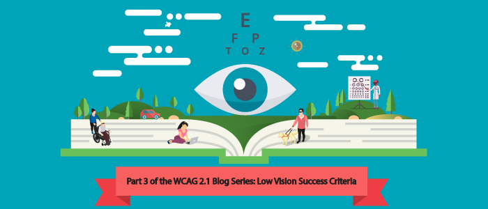
Hi, everyone! I’m back to talk more about WCAG 2.1 and its latest December 7th working draft. We actually had a separate recording of this video ready to go, but since latest version, there have been a few changes so we have an up-to-date video ready for you.
This video focuses on low vision and offers a brief overview of the other topics that we’ll be covering in the next sections for cognitive and mobile.
Feel free to follow along with the video below:
Latest WCAG 2.1 Working Draft: 20 New Success Criteria
Are you ready for a glimpse of the accessibility future? The World Wide Web Consortium (W3C) just released the December 7th version of the WCAG 2.1 working draft. Currently, there are 20 proposed new success criteria. Now, don’t worry, this is just a working draft. These are proposed new success criteria. They may not all make it.
Let’s take a closer look at these 20. Your first question may be, “how many level A are there versus AA, versus AAA?” Currently, six of the new proposed SC at level single A, nine of the new proposals are at level double-A, leaving five of the new proposals at triple-A, for that total of 20. This could change, but that’s what we’re seeing right now in this 7th version of the working draft that was released on December 7th.
WCAG 2.1 Focus Areas
Another interesting way to look at these 20 new proposals is how do they break down amongst the focus areas? In the last video, I discussed the main areas of focus, which were low vision, cognitive, and mobile.
In this new working draft, four of the new Success Criteria (SC) are from the needs of low vision. Six of the new success criteria are coming from the cognitive needs, and the remaining 10 are for mobile needs. In this instance, “coming from” refers primarily to the SC came from those different areas, but it doesn’t mean that that’s the only disability that it will impact. As we know, good accessibility actually leads to universal design, i.e. design that’s best for everyone.
Reflow or “Horizontal scrolling is absolutely evil.”
With an overview in place, the first group of success criteria focuses on low vision. There are just four success criteria, which is best described by a persona quote before diving into the formal text of the success criteria. A persona quote will answer the question “What is it that a person with low vision would say if you don’t meet this SC?” The first new proposed success criterion is called reflow and it is coming in at a double A recommended.
The first thing that a person with low vision would say to you if your page doesn’t have text that reflows properly is, “Horizontal scrolling is absolutely evil.” If you would like an additional resource on this topic, Dr. Wayne Dick’s ran a research an experiment on this success criteria. It is important to empathetically understand the Operational Overhead Caused by Horizontal Scrolling.
With that in mind, reflow, the text for this SC might not help you understand horizontal scrolling immediately, but that is the intent for left to right languages. The actual text as it stands today for this proposed SC read “Content can be presented at a width equivalent to 320 CSS pixels, without loss of information or functionality, and without requiring scrolling in two dimensions, except if you have parts of the content which require two-dimensional layout for usage or meaning.” That’s verbose and technically accurate and well-written. It is important to understand that this success criterion is trying to prevent horizontal scrolling on left to right or right to left languages.
Graphics Contrast or “Did you actually want me to see that important information in the graphic?”
The next sc for low vision is one that many people have already been doing out of the goodness of their heart. The name of this proposal is Graphics Contrast and it is coming in at a recommended double A.
The persona quote for a person with low vision would be, “did you actually want me to see that important information in the graphic?” or “did you actually want me to see that user interface control?” Most often the contrast on it is so light that people cannot see it.
You may know that in WCAG 2.0, there is a requirement for contrast, but if you look closely, it’s only for text. The important thing to remember about this success criteria is that it is not related to text, currently, WCAG 2.0 doesn’t have this contrast requirement for graphics. This was a gap.
To fill that, we have Graphics Contrast, and the requirement, as it stands today in the December 7th version of WCAG 2.1, is as follows, “the visual presentation of the following have a contrast ratio of at least three to one against adjacent colors user interface components and graphical objects where parts of graphics required to understand the content are conveyed to the user. If you are curious about the three to one ratio, feel free to contact Glenda because she was (one of) the SC manager(s) for this proposal.
Text Spacing or “If you just let me adjust the line height, spacing between paragraphs, the letter spacing, and the word spacing, I could actually read this.”
Text Spacing is coming in at double-A for people with low vision. What would a person with low vision say if you’re not allowing text spacing? They’d probably say something like this: “This text is so hard for me to read. If you just let me adjust the line height, the spacing between paragraphs, the letter spacing, and the word spacing, I could actually read this.”
The requirements, as written in this version of WCAG for text spacing are as follows: “If the technologies being used, allow the user agent to set text style properties, then no loss of content or functionality occurs by setting all of the following, and by changing no other style properties: line height, spacing underneath paragraphs, letter spacing, and word spacing.”
Content on Hover or Focus or “Popups Make Me Lose Control”
The final low vision SC that’s proposed for WCAG 2.1 that’s specifically based on low vision need is Content on Hover or Focus. It’s coming in at a recommended double-A.
Imagine that you’ve magnified your screen, and all of a sudden there is a popup that’s taking up so much of your screen and you can no longer do what you were needing to do. You can’t get behind the popup, you can’t control it, because that screen is assuming that you’re not at magnification, so it’s impossible to use. The same thing might happen when you’re trying to use a menu system, where at magnification, you can’t control things, hover and focus, that you could if you were at default magnification.
The important snippet of the SC to focus on is “when pointer hover or keyboard focus triggers additional content to become visible, the following are true: that it is dismissible, that it is hoverable, or it is persistent.” You may find additional details on this success criterion at this link: (Content on Hover or Focus).
These four SC and the specific text that was published in the December 7th issue were reached consensus by the current Accessibility Guidelines Working Group. The leader on this particular SC was Steven Repsher from Boeing.
Don’t miss our next episode, we’ll be talking about the new SC that is specifically brought in for people with cognitive disabilities. Looking forward to talking about that soon!
