In part one of this blog series on building accessible Android apps with Jetpack Compose, we learned how Accessibility Services behave with Jetpack Compose and how Jetpack Compose creates a Semantics Tree which in turn helps Accessibility Service in gathering data.
In part two, we’ll review various real-time simple examples to understand how to make basic composables like Text Field, Buttons, and Switches accessible to Accessibility Service users.
Buttons
Example 1
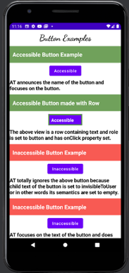
The first Button in the above screenshot looks like this in Declarative APIs:
Button(
            onClick = { Toast.makeText(context, "This is an Accessible Button!", Toast.LENGTH_SHORT).show() },
            modifier = Modifier.constrainAs(example1) {
                top.linkTo(divider1.bottom, margin = 10.dp)
                start.linkTo(parent.start)
                end.linkTo(parent.end)
            }
        ) {
            Text(text = "Accessible")
        }
This Button is fully accessible by the Accessibility Services like Talk Back because the Name, Role and Action associated with the composable all are announced as “Accessible, Button. Double tap to Activate.” Jetpack Compose’s native Button class supplies all the necessary semantics to make it fully accessible by default.
Example 2
Now, let’s take a look at a more customized Button. Below is an example showing how one can make customized UI elements according to their needs, and at the same time make sure that the button is accessible.
The second Button in the screenshot above is actually a Row type composable which has been coded to look like and work as a Button. Here is how that looks in declarative APIs:
Row(
     modifier = Modifier
      .size(height = 40.dp, width = 120.dp)
      .background(color = Color(98, 0 , 238))
      .constrainAs(example4) {
         top.linkTo(divider4.bottom, margin = 10.dp)
         start.linkTo(parent.start)
         end.linkTo(parent.end)
     }
     .clickable(
         enabled = true,
         onClick = {
            Toast.makeText(context, "Accessible", Toast.LENGTH_SHORT).show()
       },
       role = Role.Button
     )
) {
    Text(
      text = "Accessible",
      fontWeight = FontWeight.Bold,
      modifier = Modifier.padding(10.dp),
      color = Color.White
   )
}
The role is assigned as Button, and onClick is also defined by making it clickable.
This helps to turn on Accessibility Services like TalkBack or Switch Access to test your UI and better understand where accessibility violations occur.
Example 3
The third button in the screenshot above is Inaccessible because the Text of the Button is set to “invisibleToUser.” Talk Back ignores the button and moves on to the next UI element when one tries to focus it. This is how the button is coded using declarative APIs:
Button(
       onClick = { Toast.makeText(context, "This is an Inaccessible Button!",
Toast.LENGTH_SHORT).show() },
       modifier = Modifier.constrainAs(example2) {
         top.linkTo(divider2.bottom, margin = 10.dp)
         start.linkTo(parent.start)
         end.linkTo(parent.end)
       }.semantics {  }
    ) {
       Text(
          text = "Inaccessible",
          modifier = Modifier.semantics { this.invisibleToUser() }
       )
}
This example demonstrates that during UI development, if we have to make an element invisibleToUser, then it is very important to make sure that it is accessible through Accessibility Services or else the Accessibility Service totally ignores the composables which are marked as invisible to the user.
TextField/EditText Examples
Example 1
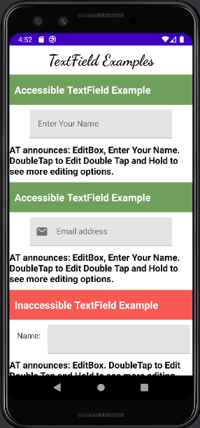
The first TextField in the screenshot above is Accessible as Talk Back announces: “EditBox, Enter Your Name. Double tap to Edit, Double Tap and Hold for more editing options.” All Name, Role and Actions associated with the UI element are announced by Talk Back.
It is important to note that Accessibility guideline WCAG 1.3.1 Level A requires labels to persist even when there is text entered into the EditText. Compose does a pretty good job with keeping the label intact all the time.
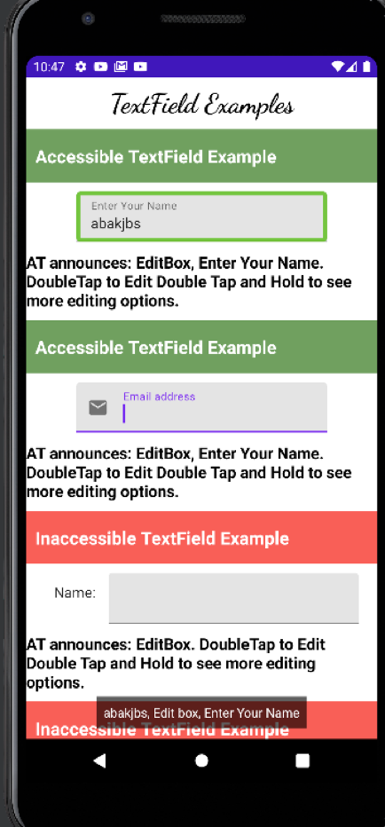
In the screenshot above, you’ll notice when text is entered in the TextField, or when it is focused, the label remains intact, making it fully accessible.
With XML views, to make an EditText accessible, you have to associate a TextView as a Label for the EditText in order to tell the Accessibility Service that there is a label attached to it. This is how it is done in Jetpack Compose:
val textStateTextField = remember { mutableStateOf(TextFieldValue()) }
  TextField(
     value = textStateTextField.value,
     onValueChange = { textStateTextField.value = it },
     label = { Text(text = "Enter Your Name") },
     modifier = Modifier.constrainAs(example1) {
       top.linkTo(divider1.bottom, margin = 10.dp)
       start.linkTo(parent.start)
       end.linkTo(parent.end)
    }
)
Example 2
Jetpack Compose has convenient APIs to attach leading and trailing Icons in TextFields. It also provides APIs to set content descriptions for those icons.
The second TextField in the screenshot above demonstrates how to add a leading icon to a TextField. You may choose not to give Content Description to the icon if the Label is descriptive enough, but providing a Label to the TextField is absolutely necessary. This is how the TextField is coded:
TextField(
         value = text,
         leadingIcon = { Icon(imageVector = Icons.Default.Email, contentDescription = "") },
         //trailingIcon = { Icon(imageVector = Icons.Default.Add, contentDescription = null) },
         onValueChange = {
           text = it
          },
          label = { Text(text = "Email address") },
          modifier = Modifier.constrainAs(example4) {
            top.linkTo(divider4.bottom, margin = 10.dp)
            start.linkTo(parent.start)
            end.linkTo(parent.end)
          }
   )
Example 3
The third TextField in the above screenshot is inaccessible because it does not have a label associated with it so when a Talkback user focuses on this Text Field it announces: “EditBox. Double tap to Edit, Double Tap and Hold for more editing options.” if you notice the label “Name” is not part of the text announced by the Talkback. It looks like there is a label on the left of the TextField but it does not act as the label to it. This is how the TextField looks like in code:
Row(
      modifier = Modifier.constrainAs(example2) {
        top.linkTo(divider2.bottom, margin = 10.dp)
        start.linkTo(parent.start)
        end.linkTo(parent.end)
      }
   ) {

     Text(text = "Name: ", modifier = Modifier.padding(start = 10.dp, end = 10.dp, top = 10.dp))

     val textStateTextField2 = remember { mutableStateOf(TextFieldValue()) }
     TextField(
       value = textStateTextField2.value,
       onValueChange = { textStateTextField2.value = it },
    )
  }
You may argue that by using “mergeDescendants” semantics property for the Row, you can group the Text and the TextField but then also the TextField remains inaccessible. The only difference will be that Text and TextField will be focused at the same time using mergeDescendants instead of getting focused one at a time.
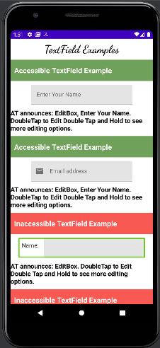
It’s very important to provide a Label to the TextField in Jetpack Compose. Grouping TextField with a Text composable makes no difference.
Switch Examples
Example 1
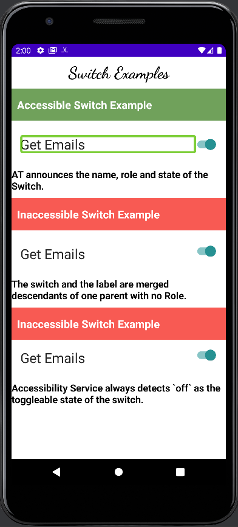
The first Switch is accessible because TalkBack announces: “On, Get Emails, Switch, Double Tap double tap to toggle.” Creating an accessible Switch in Compose is not easy.
In the screenshot, you’ll see that TalkBack is focusing only on the text and not on the control, which is by design. You can make this Switch accessible by combining the Switch composable with the Text composable and then clear the semantics of the Switch composable. This is how the first switch looks in code:
MaterialTheme() {
       val (isSwitchChecked, setSwitchState) = remember { mutableStateOf(true) }
       Row(
         modifier = Modifier
           .constrainAs(example1) {
              top.linkTo(divider1.bottom, margin = 10.dp)
              start.linkTo(parent.start)
              end.linkTo(parent.end)
            }
            .semantics(mergeDescendants = true) { }
            .padding(16.dp)
       ) {
        Text(
          text = "Get Emails",
          modifier = Modifier
            .toggleable(
                value = isSwitchChecked,
                onValueChange = { setSwitchState(!isSwitchChecked) },
                role = Role.Switch
              )
              .weight(1f),
          fontSize = 25.sp
        )

        Switch(
          checked = isSwitchChecked,
          onCheckedChange = { setSwitchState(!isSwitchChecked) },
          modifier = Modifier
            .clearAndSetSemantics { }
            .padding(top = 5.dp)
        )
    }
}
The important things to note here are:
- The Text composable (which acts as the Label for Switch) and the Switch itself are grouped together inside a Row composable.
- The Row has mergeDescendants set to true.
- By clearing away the semantics of the switch the Talk Back focuses on the Text. If the semantics of the switch are not cleared then the Talk Back focuses on the switch again after focusing on the row which is the case with the second switch in the above screenshot.
Example 2
The third Switch in the screenshot above has a “toggleable” type modifier set for the parent row which by default adds the state “off” to the Switch. The Talkback announces: “On, Get Emails, off, Switch…” notice how “off” state is attached even when the switch is in On state. This is how the third switch looks in code:
Row(
      modifier = Modifier.constrainAs(example3) {
        top.linkTo(divider3.bottom)
        start.linkTo(parent.start)
        end.linkTo(parent.end)
      }
       .semantics(mergeDescendants = true) { }
       .padding(16.dp)
       .toggleable(
          value = isSwitchChecked2,
          role = Role.Switch,
          onValueChange = { setSwitchState2(!isSwitchChecked2) }
        )
   ) {
      Text(
        text = "Get Emails",
        modifier = Modifier.weight(1f),
        fontSize = 25.sp
      )
      Switch(
        checked = isSwitchChecked2,
        onCheckedChange = { setSwitchState2(!isSwitchChecked2) },
        modifier = Modifier.clearAndSetSemantics {  }
      )
    }
Checkbox Examples
Example 1
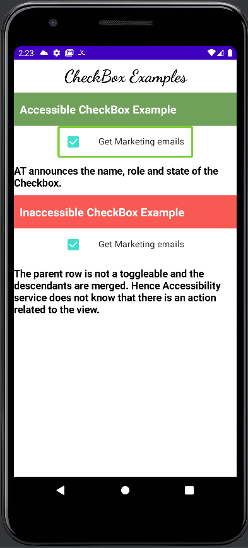
Creating an accessible checkbox in Compose is pretty easy. The first checkbox in the above screenshot announces: “checked, marketing emails, Checkbox, Double tap to toggle.” So all three Name, Role, State and Action are announced by the Talkback. This is how the first checkbox looks in code:
Row(modifier = Modifier
      .toggleable(
      value = checkedState,
      enabled = true,
      role = Role.Checkbox,
      onValueChange = { setCheckBoxState(!checkedState) }
   )
   .semantics(mergeDescendants = true) { }
   .constrainAs(example1) {
     top.linkTo(divider1.bottom)
     start.linkTo(parent.start)
     end.linkTo(parent.end)
   }
 ) {
    Checkbox(
      checked = checkedState,
      modifier = Modifier.padding(16.dp),
      onCheckedChange = null
)

Text(text = "Get Marketing emails", modifier = Modifier.padding(16.dp))

}
Important things to note in the above code are:
- The Row is acting like a Checkbox.
- I have used a “toggleable” type modifier to tell the Talk Back that by clicking anywhere on the row, the Checkbox can be toggled.
- Also, note that the descendants of the Row are merged.
Example 2
The second checkbox in the screenshot above is a bit confusing when TalkBack focuses on it. After focusing on the whole Row when the user swipes right, the switch is focused again, resulting in a confusing experience for the Talk Back user. This is how the second switch looks in code:
Row(modifier = Modifier
            .semantics(mergeDescendants = true) { }
            .constrainAs(example2) {
                top.linkTo(divider2.bottom)
                start.linkTo(parent.start)
                end.linkTo(parent.end)
            }
        ) {
            Checkbox(
                checked = checkedState1,
                modifier = Modifier.padding(16.dp),
                onCheckedChange = { setCheckBoxState1(!checkedState1) }
            )
            Text(text = "Get Marketing emails", modifier = Modifier.padding(16.dp))
        }
Custom Accessibility Actions in Jetpack Compose
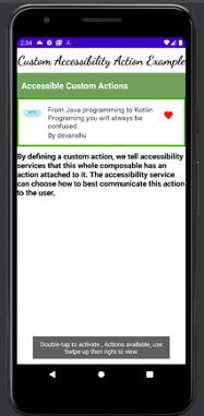
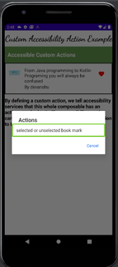
Compose allows us to set custom accessibility actions on composable. Consider a scenario with a favorite button on top of an item that when clicked will take the user to another screen. We need to tell Accessibility Service that there are more actions associated with the view and politely ask it to handle those multiple actions.
In the screenshot below, the red favorite button has custom accessibility actions associated with it. When TalkBack focuses on the list item this is what is announced in the end: “…Double-tap to activate, Actions available, use Swipe up then right to view.”
How to grab Composition Hierarchy in Jetpack Compose
Jetpack Compose allows developers to look at the composition hierarchy through automated tests. Using the ComposeTestRule it is easy to print the merged as well as unmerged composition hierarchy. Here is an example of how to do that:
composeTestRule.setContent {
            AxeConApp()
        }
        composeTestRule.onNodeWithText("Text Field Examples").performClick()

        composeTestRule.onRoot(useUnmergedTree = true).printToLog("TAG-UN-MERGED")
        composeTestRule.onRoot(useUnmergedTree = false).printToLog("TAG-MERGED")
}
How should I test my Application for Accessibility Bugs?
- Use Accessibility Services like TalkBack or Switch Access to test your application.
- Remember, an app’s experience should be identical between a non-AssistiveTechnology user and an assistive technology user.
- Use axe Devtools Mobile for Android with automated test – we support Jetpack Compose!
With all the basics that we discussed in this post, we are ready to build not only Android applications, but accessible Android applications using Jetpack Compose. With more complex APIs will come more complex accessibility issues. It is highly recommended to consider putting in an accessible app architecture even before app development that reduces accessibility bugs.

