
A common accessibility issue that I’ve noticed in Android applications is nesting active elements together. I want to discuss why this is inaccessible in a demo and who it could possibly effect. I will also walk you through where in the developer tools you can find this issue, how to fix it, and how to follow best accessibility practices. Follow along with the video below if you’d like:
Overview
In this blog post we will discuss:
- Nesting elements into a single focusable container
- When nesting elements is a bad idea
- When nesting elements is a good idea
Getting Started
Let’s deep dive into talkback accessibility and a common violation that I see around nested active elements in Android Apps. We’ll talk best practices and discuss how Deque has developed a rule to automatically analyze and scan for this issue. Let’s begin, what I have here is an emulator. One of the cool things about the Android accessibility ecosystem is when you see emulators, they work essentially exactly like devices.
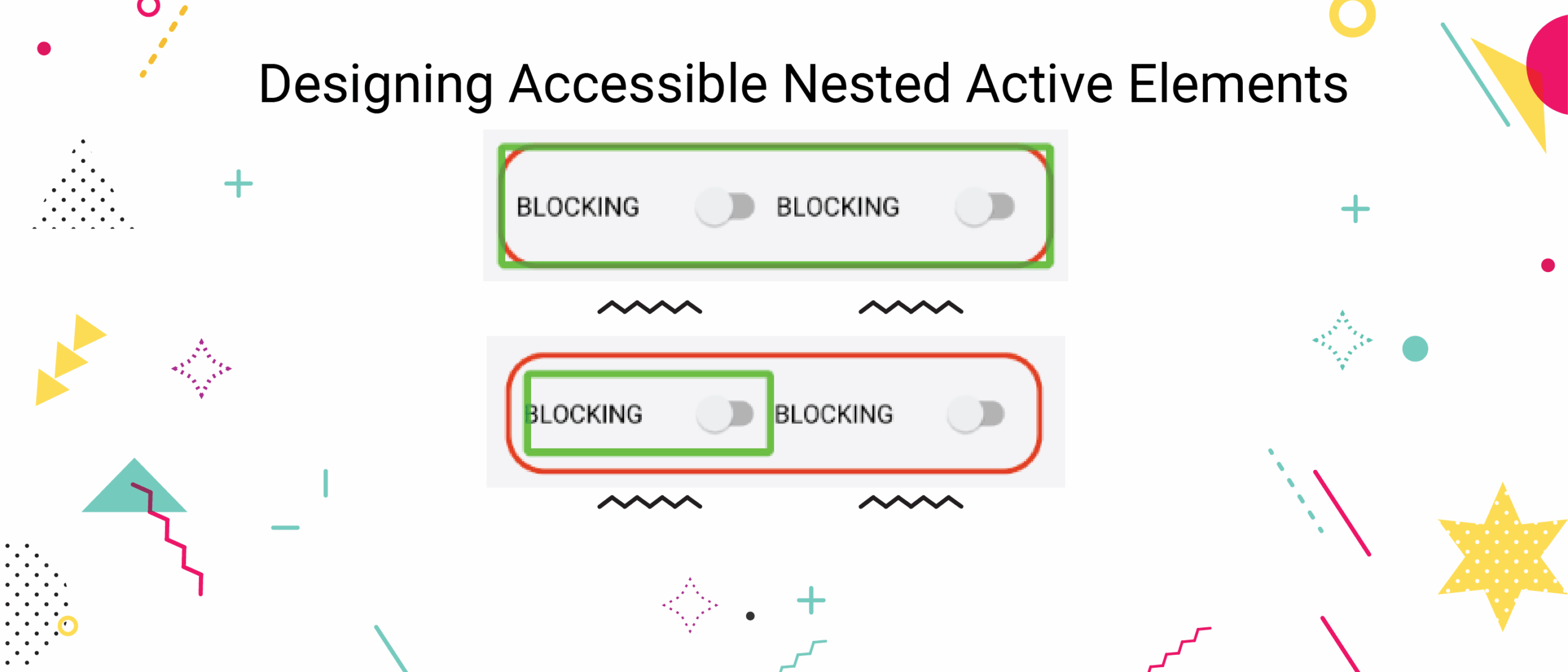
I’m showing this example on an emulator because it’s a little more convenient for demo purposes. To start, you’ll see I have this toast popping up at the bottom, reading “blocking off switch”. This is the text that would be read out loud by a talkback if I had the device in my hand. Now I’m bouncing back and forth between these two switches. If I go outside of this switch and click on here as I touch to explore gesture, I focus another view that is wrapping these two switches together. Now this is the fundamental issue that I want to talk about.
Why nesting active elements is bad
When nesting of elements together, it becomes very unclear what type of thing you’re trying to accomplish as a screen reader user. Picture that you’re blind and you are going through this app in the different ways you can navigate. For example, if I am a touch to explore user, I am finding elements that are nested within other elements. This is confusing because if I drag my finger across the screen I can end up hitting multiple touch targets within the same touch target. The other problem we get with this is when a user is navigating via tabs.
My tab navigation versus my swipe navigation actually end up being different because sometimes things are focusable and sometimes things are accessibility focusable. My swipe navigation and my keyboard navigation end up being different type of touch targets. I just hit the right arrow button and I do different things than if I hit the tab key.
To fix this problem we need to a) be able to identify this issue and b) we want to understand exactly why it’s happening. What is causing these multiple touch targets? What other issues might we see outside of talkback focus? When we explore these questions we understand the core of this problem.
Fixing inaccessible nested active elements
Now let’s explore how to use accessibility tools to find this problem. Notice here I’m sharing, I have this screen here where I can show focus and as I scroll over the screenshot I’m seeing the different areas of accessibility focus. If you open the developer tools you can start to analyze these controls. Let’s dig into the accessibility property of one of these controls, there are a couple of switches within a linear layout. When we’re scrolling over the switches, we have:
- importantForAccessibility = true
- clickable = true
We have two views here that are clickable, both of theses switches are clickable and also the linear layout. They’re all clickable and focusable and that is actually why they’re being accessibility focused. When we look at the text we get null text blocking off, text blocking off but focusable true and clickable true. This is confusing based on what we discussed above, because not only are we going to want to try and activate one of these controls but when we focus this bigger rectangle we activate it.
Implications of Nested Active Elements
What does activating a collection of elements even mean? That’s a confusing thing and you can see we’ve marked up this demo here simulating this inaccessible situation, but you can actually end up seeing this in a lot of different things. One of the places I see this is coming from some hybrid libraries that are potentially reliant on web view. When the web view ends up being clickable and also containing other clickable elements, it’s a very confusing situation to be a talkback user who’s hearing that they can take action with some element that is also composed of other actionable elements.
Another place where you can see this create accessibility problems is for switch control. If you’re a switch control user and you’re cycling through the active elements on the screen you end up at minimum having an unnecessary target, which if you have a one second delay on your scanning is frustrating. At the same time you can end up activating something that you don’t intend to activate or that has an undefined behavior. What we want to do is go in and make this not actionable. In this case, the solution would be to make this outline not focusable.
Best Practices
Why is this hybrid application wrapping web view and clickable to begin with? We don’t want this thing to be clickable at all. This is similar fix here, what we have is an informative control and an informative element. Clickable is false and focusable is false, that’s good. We have a switch here which is going to be clickable and focusable and we have the linear layout which is clickable and focusable. We also have made the touch target size for this nice and big. However, we just no longer need to interact with this switch, right? In talkback as I try to click on these things, I’m clicking on the minor, the informative control, and I can’t focus it individually but I can focus the talkback switch individually.
This is good behavior because I have this nice big touch target, basically this is saying “hey, all of the behaviors you can get if we make this linear layout actionable, all of the information is wrapped in this control”. What we’re going to do is look at a good example of this where we have this passing. This passing example should say, “hey, all of the information is available on this switch” or, potentially, as a best practice, we could wrap all of that information together. On the example over here we could say, “hey, all of the information conveyed by this switch is available in this rectangle” and then provide the switch action on that big layout.
What that allows is for a nice big touch target without having to even focus the individual controls, this a best practice. It’s a little more painful to code up in our case in the emulator, what we have is the most simple version, which is to associate the two with a label for, that way in switch control, you end up only focusing on the switch. In talkback you can access the two controls individually, that’s the easiest way to code it. Ultimately, we end up associating these two with the label for attribute, but if you want to go the next mile, you can do is wrap those two things together in one accessible target.
Conclusion
Nesting elements together can provide a more seamless user experience. It limits the overall number of on screen focusable targets for Screen Reader users, which is good. However, if two elements provide an action, they MUST be separate. Even if individual targets do eventually get their own focus, nesting active elements into one target is confusing, and creates undefined behavior if a user should attempt to activate such a target. Also, nesting overly nesting informative controls can lead to long announcements and a lack of structural feel to your application. Let separate controls be separate controls and nest elements together when you need to create relationships amongst groups of controls. Finally, only nest a single active control in any particular focusable group.

