

Accessibility Is Usability
Say it with me: Accessibility is usability! Consider for a moment the five “dimensions” of usability put forth by veteran usability expert Whitney Quesenbery. According to Quesenbery, in order for a design to be considered usable, it must be:
- Effective
- Efficient
- Engaging
- Error Tolerant
- Easy to Learn
Now imagine a web page (a very poor web page) which experts in the field of web accessibility would be quick to call “inaccessible.” On this particular page, form fields are missing labels, the information is unorganized and semantically ambiguous, controls can’t be activated using the keyboard, and content that was never intended for user consumption is exposed to screen readers. How many of Quesenbery’s five dimensions do you think are compromised by this kind of design?
The answer: All of them, in one way or another. With this hypothetical worst-case scenario in-mind, you’ll soon come to realize that by solving accessibility problems, you’re also solving usability problems.
Process Adaptation: Accessibility at the Design Stage
Understanding just how dramatically accessibility considerations can impact the overall usability of web content, you have to ask yourself: how can I best guarantee that accessibility problems don’t creep into my products?
The answer may be simpler than you think. The single most effective mitigation against poor accessibility, and therefore poor usability, is the education and empowerment of UI and UX designers.
Designers who understand accessibility principles are better equipped to deliver their work to others in the organization with a complete and unambiguous set of usability requirements. Clear requirements are very powerful – they help ensure that design intent, defined deliberately by user experience professionals, is perpetuated throughout the entire software development lifecycle.
This kind of preemptive approach to accessibility is a massive efficiency win – partly because it’s so cost-effective. There’s a considerable difference between identifying accessibility problems at the design stage as opposed to discovering them after release. A tremendous amount of time and effort is required to re-design, re-implement, re-test, and re-release a piece of functionality. On the other hand, it’s comparatively trivial to adjust the behavior of the same functionality during the design stage, before it ever reaches development.
Training Imperative: Design Principles for Designers
In order to avoid creating designs which are inherently inaccessible, or which include fundamental barriers to good usability, I suggest that designers incorporate a small handful of accessibility-related design principles into their practice. Once fully integrated, these principles can be applied to all new design work, and the rest of the development team will continue to reap the benefits of their influence.
Use Sufficient Color Contrast
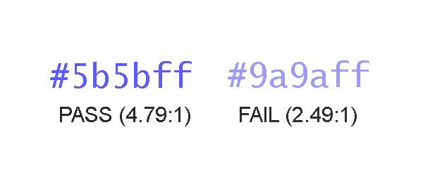
For regular-sized text content, be sure to choose colors that achieve at least a 4.5 to 1 contrast ratio between the text and its background. Large text (above 18pt or 14pt bold) must only achieve a more meager contrast ratio of 3 to 1. Remember that this contrast requirement also applies to images of text (which should be avoided in general, if at all possible).
Distinguish Embedded Links
Links come in two flavors, so to speak:
- Those that are isolated in a section of the page that is clearly designated as navigation
- Those that are embedded in other text content, like me
In the case of the latter, designers should use some type of distinguishing visual characteristic, such as an underline, to identify links in a manner that does not rely on color alone. In short, color must not be the only visual feature that calls attention to a link’s unique identity, unless that link is not surrounded by any other text content.
Reinforce Color As Information
When color is used to convey information, such as in a monthly earnings chart that uses a legend to assign a meaning to each color, make sure that some other means of identifying the same information is available. For instance, a combination of color and pattern could be used to distinguish the bar for “March” from the bar for “February” in an earning chart, or the names of each month could be embedded directly below (or within) the bar instead of isolated in the key.
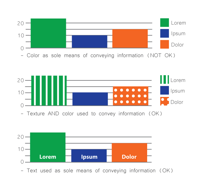
As a reality check, as yourself: “if I was incapable of distinguishing one color from another, would I be able to understand the information being presented to me?” The answer must be “Yes.”
Don’t Hide Controls Under the Hovers
Some interactive user controls are peripheral to the main workflow and are not desired to be shown in the default page layout. It is common practice in such circumstances to hide these controls, and to show them only when the user decides that he or she needs them. This is fine; but you must design the behavior of such hiding mechanisms so that users need to take an explicit action to summon, and dismiss, the additional controls. Do not make them appear temporarily only when the user’s cursor hovers over a page area.
It is perfectly acceptable to display text content in a popup tooltip which appears when an element is hovered, or receives focus; but this type of popup is not appropriate for user interface controls. Controls that only become available when other portions of the page are hovered are notoriously difficult to reach for both keyboard-only users and people using speech recognition software.
Know Your Role
Acquire a basic understanding of the semantic roles put forth in the WAI-ARIA specification. As a designer, you shouldn’t feel required to know the ins and outs of each semantic role, but you should be able to recognize when your design contains objects that are attempting to fill multiple roles (in other words, be multiple things) all at once. Cull these objects from your design and explore ways of allowing each object in your design to serve a single specific purpose.
Other Considerations
Observe the following additional principles as well – your users will thank you.
- Don’t suppress focus indication
- Give isolated links self-descriptive text content (avoid link text like “more info”)
- Avoid ultra-minimalist input borders
- Give input fields permanently visible labels
Technical Approach: Capturing Accessibility Requirements
Once you’ve internalized the design principles described above and are comfortable applying them to new design solutions, it’s time to develop a technique for capturing your accessibility-related requirements for others in your organization. This is an important step that helps ensure the decisions you’ve made regarding things like reading order, keyboard interactivity, and document structure will inform the remaining stages of the development process.
Document Structure and Semantics
The easiest way to create an artifact that captures information about document structure and semantics is to annotate your design comps with this information. This can be as simple an exercise as drawing* boxes on important structural elements, such as:
- Headings
- Navigation areas
- Links
- Buttons
- Images
- Page header and footer
Spending a small amount of time assigning a semantic identity to key design components will prevent a lot of confusion down the road, and will give developers the information they need to implement your design according to your vision for the users’ experience. Otherwise, you roll the dice and hope that the button you designed, used to download a PDF of this year’s product catalogue, won’t simply be implemented as a clickable <div> element that will confound users of assistive technology and will be completely unreachable by individuals using a keyboard.
*I use the term “drawing” here in the most general sense possible. You do not need to use a pen or pencil to conduct this exercise. By all means, use all the tools at your disposal to annotate your comps, including the tools you used to create the comps in the first place – e.g., Illustrator, Photoshop, Sketch, Axure, Balsamiq, etc.
Reading Order
Make a copy of your design comp and draw boxes around each area of the page, numbering them sequentially according to the order in which you intend users to read the content. Not all web content must be designed to be read as if it were a page in a book, but content that provides important context for understanding other parts of the page should be encountered in the proper order. This helps assure that users who experience your design sequentially have the requisite information to understand where they are.
Developers can use styling in a variety of ways to implement a given visual layout. As a result, it’s important to ensure that the source code of your view is arranged in an order that preserves the meaning of its content. Make note of the intended content order, and pass it on.
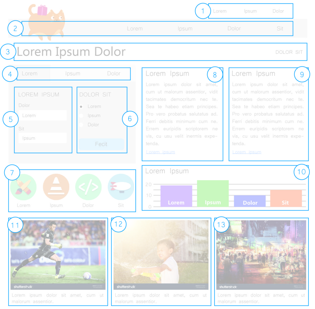
Image Semantics
Identify and document which images in your design are informative and which are decorative. Precise definitions of these terms are available in the WCAG specification, but a useful litmus test you can use is as follows: ask yourself if you could replace the image with a stock image without causing the essential meaning or significance of the content to be altered or diminished. If the answer is “No”, then the image is probably informative and will need an alternative text value.
Depending on the structure of your organization, it might not be your responsibility as a designer to supply alternative text for images. Regardless, it’s your prerogative to mold the user experience of the page. Deciding which images are meaningful, and which are not, is an integral part of shaping that experience.
Mouse/Keyboard Operability
Document the intended mouse and keyboard operability of each interactive component in the design. This will be a familiar exercise to many designers, who are already familiar with stipulating the intended behavior of UI components. Somewhat new, perhaps, is the notion that you need to start considering hover and focus to be equivalent modes of UI interaction. Any dynamic UI behavior that that is triggered on hover should also be triggered when the object receives focus, as in when a user presses the Tab key to arrive at the component.
Take some time to consider how keyboard-only users will interact with every aspect of your UI. If you find yourself struggling to explain how a component should work with the keyboard, it’s time to take a step back and reconsider the design of that particular component. Applying these considerations will streamline your design, improving its usability and its accessibility.
Conclusion
As user experience designers, you are in a unique position to make informed decisions about things like document structure, keyboard interactivity, and reading order, which have a huge impact on the accessibility (and therefore the usability) of the products you create. As a result, it’s imperative that you apply some basic accessibility principles to your work in the interest of achieving success in those areas. It’s equally important that you document the results of your decision-making for other groups in your organization so they too can benefit from your knowledge and guidance. I hope that the principles and techniques described above will empower you toward that end!
Matt Isner is a JavaScript Developer at Deque Systems. Matt specializes in teaching development teams to plan, test, and code for accessibility and has helped orchestrate large remediation efforts of complex enterprise applications. He is intrigued by the idea of the computer system as an expression of human neurobiology, and champions the notion that accessible web content is better understood by both humans and computers.

