
Measurements. They’re the thing you dread at the end of your design process where you have to lean wayyyy back in your chair, pour yourself another cup of coffee, look at the ceiling and say “Ok, let’s get this over with.”
Now there are lots of tools, libraries, patterns, and software that can make this faster, but at the end of the day, a precision prototype’s job is to communicate how certain aspects of a design should be represented down to an element’s behavior, color, typeset, size and scale– and you gotta do it.
Now, when it comes to accessibility there are other implications of your design that you’re responsible for articulating to your development team. In this article, we’re going to go through five common accessibility annotations that you can start adding to your designs today.
To demonstrate how to use them, we’ve put together a little example application. All of the assets you see in the article will be available for free at the end of the article.
One thing to note before we get started: just like design measurements, accessibility annotations are best suited at the pattern level. Once you’ve made a pattern accessible, many aspects of it don’t have to be re-defined or re-articulated every single time you employ that pattern in your designs. However, for the purpose of this exercise we’re going to annotate as though nothing is a pattern, but, you know, don’t do that or you’ll go crazy.
Example Site for Annotations
To better illustrate the five common annotations, I built a fake eCommerce sock site called Tutzies. Each annotation has a screenshot of the fake site illustrating how to use each annotation.
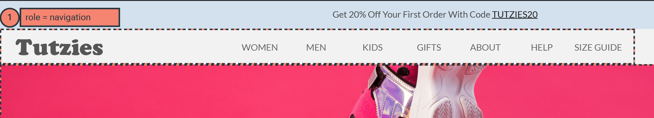
Tabs
Let’s start with something I think most designers are familiar with: tab order. This is the order that elements are focused when you tab through the interactive elements on an application. This is important because this is how keyboard-only (KO) or Assistive Technology (AT) users move through and are presented with the information and functionality of your application. If you’re looking for a rule as to how to mark up tab order, typically it follows the top-down reading order of the page.
Let’s take a look at our example:
![[Tutzies homepage, tab annotations]](https://www.deque.com/wp-content/uploads/2020/03/Picture1-1.png)
For those with a keen eye, you’d notice that there isn’t a Skip Link in this example, which would typically be the first tab stop. You’re right, and in reality, for a site like this there should be one, but for simplicity, it was omitted.
Buttons and Links
Buttons and Links are a pretty easy set of annotations and most designers will be able to start using right out the gate. All you have to do is, well, indicate whether something is a button or is a link. How pedantic you need to be with this is up to you and your development team. I personally only use it when I need to define something that is non-obvious, such as something that is styled like a link but acts like a button such as something like + add another.
Let’s take a look at our example:
![[Tutzies homepage, buttons and links annotations]](https://www.deque.com/wp-content/uploads/2020/03/Picture1-2.png)
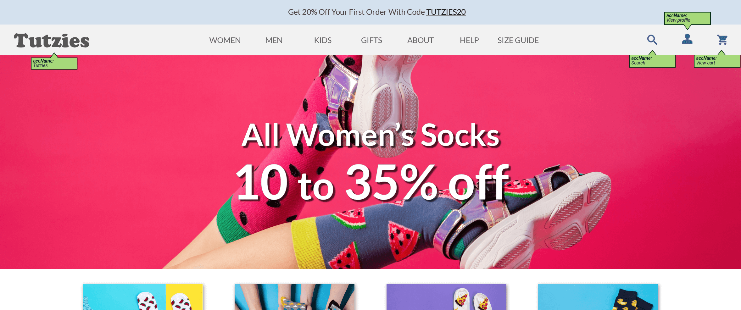
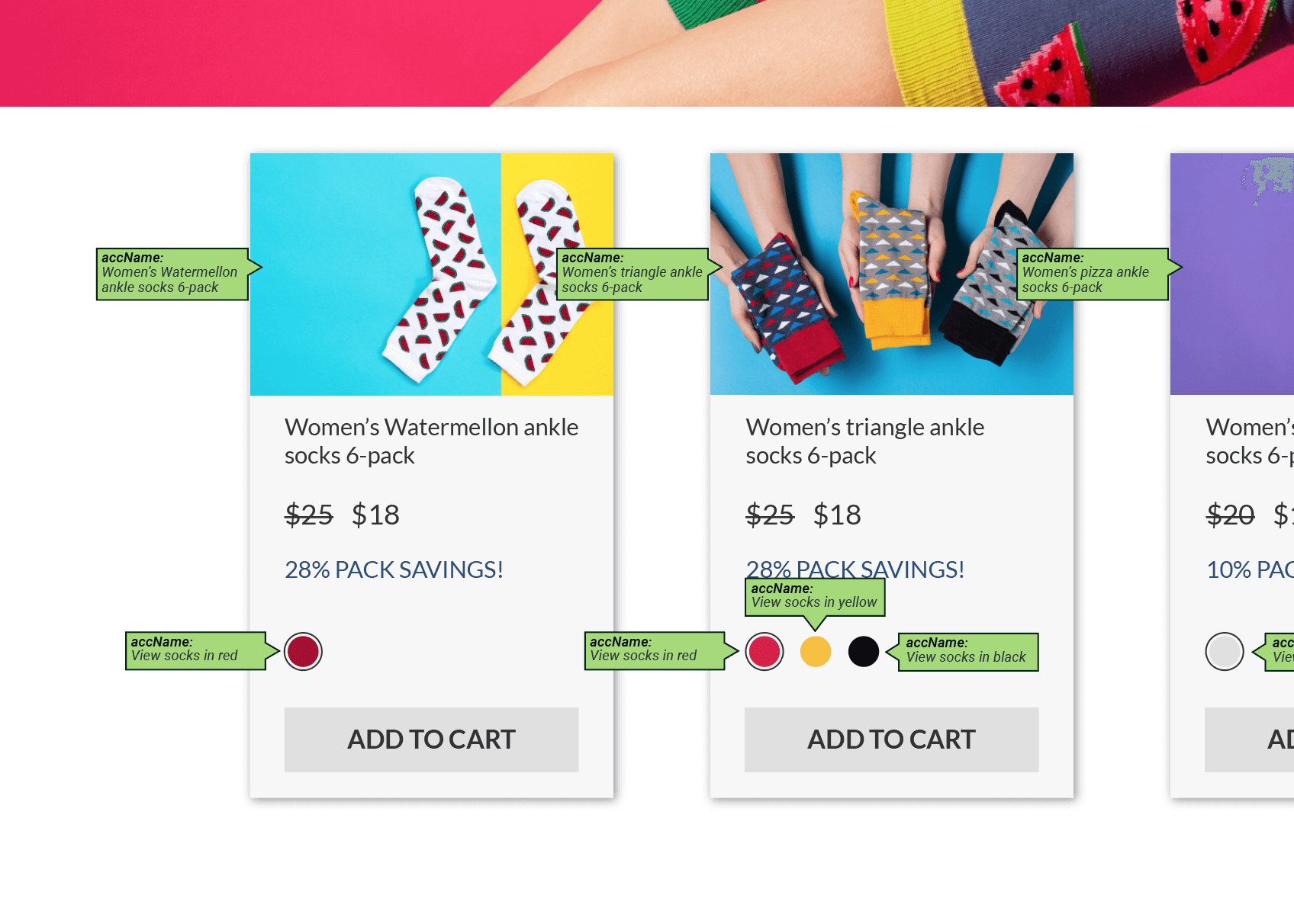
Accessible Names
Accessible names (AccName) are information you provide to an element that allows it to communicate to an AT user what it is and, if needed, how it works. Common elements that need them are icons (that are not already labeled by text), non-decorative images, and non-standard controls (like the aforementioned radio control).
Let’s take a look at the example:
![[Tutzies homepage, accName annotations]](https://www.deque.com/wp-content/uploads/2020/03/Picture1-3.png)
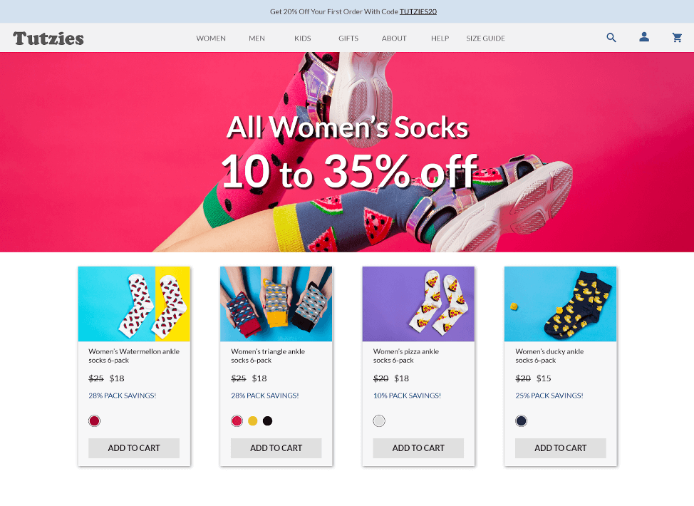
Wait, what about the giant banner image? It is considered a decorative image so it doesn’t need an AccName and the text on it is overlaid on the image so a screen reader will pick that up no problem. The ADD TO CART buttons do not need an AccName because the text on the buttons is sufficient.
If you’re struggling to decide if something needs an AccName or not, a good exercise to try is to imagine if you weren’t able to visually see an element. What information would a screen reader need to tell you in order for you to understand what it is and what to do with it? If that information isn’t present inherently on or around the element, it needs an AccName.
Headings
In this article I’m not going to go into a long diatribe about properly structuring content and reading order and how to do what, when, etc… Mostly because there is a lot of variances and, in reality, there are many correct answers depending on what you’re trying to emphasize and how.
Just know that many screen readers can skip from one <h> tag to another so it’s probably a good idea to make sure they share a cohesive narrative. What that narrative is is up to you. Here’s what you need to know: Make sure your <h> tags cascade and are nested properly <h1-n> and be consistent.
Let’s take a look at the example:
![[Tutzies homepage, Headings annotations]](https://www.deque.com/wp-content/uploads/2020/03/Picture1-4.png)
Roles
Ok, I’m going to level with you. The definition of role may not be up to the UX designer…even Deque’s UX designers do not annotate roles in their designs. The reason why is because ARIA definitions are left up to our development team because that’s just the way it works for us.
However, we’ve included 3 common role definitions in this example in case it’s something that you’d like to start annotating in your designs and, in all honesty, they are fairly easy to identify.
Let’s take a look at the example:
![[Tutzies homepage, Roles annotations]](https://www.deque.com/wp-content/uploads/2020/03/Picture1-5.png)
Wrap-Up
A few important takeaways when starting to annotate your designs for accessibility:
- Talk with your development team. Find out what kinds of information they would like to have come from you and in what form. At the end of the day, the goal of these annotations is to build accessible applications.
- Don’t feel obligated to get all of these concepts at once. If this stuff feels daunting, don’t worry! Just try and incorporate one or two things at first. Maybe start with a design you’ve already built and retroactively annotate it as practice.
- Use whatever method works for you. Honestly, some of these might be overkill for every prototype you create. Maybe you just want to add some notes to the prototype? Maybe some of the annotations you handle in your feature tickets? Do what works best for you.
- These aren’t the only accessibility annotations that exist. There are lots more that you could add to the kit like aria-live region support, subtitles, etc…
Here is a link to download the kit and examples we featured in this article. You can download the kit as Adobe Illustrator (AI) files, Sketch files, or SVGs.

P.S. Below are a few other free and useful accessibility tools you can start using today:


