
“You are not your users.”
“Involve people with disabilities in user testing.”
“The average user does not exist.”
“Design for the extremes, and the middle will take care of itself.”
We hear these phrases all the time, yet a lot of people still believe that accessibility is mostly a quality assurance or developer’s responsibility, something they should only have to think about when the actual coding phase begins. But some of the really impactful decisions that make or break accessibility for people with disabilities and seniors are, in fact, made during the design phase.
Yes, you read that right. Let me rephrase it for you: a lot of the accessibility issues that people run into on our sites and applications are caused by uneducated decisions made during the design phase. You and I have the power to do something about that.
In this post, we’ll explore some of the design trends we increasingly run into on the Web today, and how decisions made during the design phases can have a hugely detrimental effect on anyone who uses the web in a slightly differently way. But first…
If you’ve designed a cockpit to fit the average pilot…
In the late 1940s, the United States Air Force had a serious problem: pilots couldn’t maintain control of their planes. This became such a serious problem that at one time, 17 pilots crashed in a single day. It appeared at first that the pilots were to blame, but research later indicated otherwise. So if the pilots weren’t causing the crashes, then what was the problem?
Researchers eventually connected the dots. Back in 1926, when the U.S. military was designing its first-ever cockpit, engineers had standardized dimensions based on data gathered from measuring hundreds of pilots. For over 30 years, the size and shape of the seat, the distance between the pedals and the stick, the windshield’s height, and even the shape of the pilots’ helmets were all built according to the average dimensions of a 1926 pilot. Clearly, pilots had gotten bigger since then.
By 1950, the U.S. Air Force authorized a new study, to capture the average measurements of over 4000 pilots. Everybody thought that redesigning the cockpits based on the new measurements would fix the problem. But Gilbert S. Daniels – a young scientist working for the U.S. Air Force – disagreed. Little did he know, Daniels was about to make a discovery that would change the world of design forever.
Using the data gathered through this extensive study, Daniels calculated the average of the 10 physical dimensions believed to be most relevant for cockpit design, including height, chest circumference and sleeve length. These formed the dimensions of the “average pilot.” And what Daniels found stunned everyone, including himself: not a single one of those 4000 pilots fit within the average range on all 10 dimensions. This led Daniels to conclude that “if you’ve designed a cockpit to fit the average pilot, then you’ve designed it to fit no one.”
…then you’ve designed it to fit no one
If you’ve ever rented a car, or shared one with someone that was of a different build than you, then you know how important it is to adjust your mirrors, your seat, and maybe even your steering wheel before you hit the gas.
Likewise, if you’ve spent any amount of time thinking about accessibility challenges in web design, then Daniels’ discovery resonates with you. Sites and applications built to please the average user rarely work without a mouse, and fail to provide a meaningful experience to people with disabilities who use assistive technologies. Products built for the average user only work as long as you perfectly fit within all predefined parameters. And as Daniels’ findings have taught us, the vast majority of users never perfectly fit the mold of the “average user.”
As such, it makes sense to assert that when we design a product to please the average user, then we design it to please no one.
Web design trends are certainly cool, but for the past 25 years they’ve made web browsing for people with disabilities increasingly difficult. The user experiences we used to break with proprietary DHTML and inaccessible Flash content have now been replaced with equally unusable experiences, this time created with modern HTML, CSS and JavaScript. Technologies may have changed for the better, but if the content we author still doesn’t work without a mouse, or if it still isn’t conveyed reliably to assistive technologies, then what good did these technology changes do to help bridge the gap for digital inclusion?
Designing for Inclusion
Three such examples of current design trends that have a tremendously negative impact on people with disabilities are: placeholder text labels, parallax scrolling and conversational interfaces (chatbots). As we’ll see in the next few paragraphs, each of these trends are likely to create significant barriers for some of us, if basic accessibility concepts are not taken into consideration.
Placeholder Text Labels
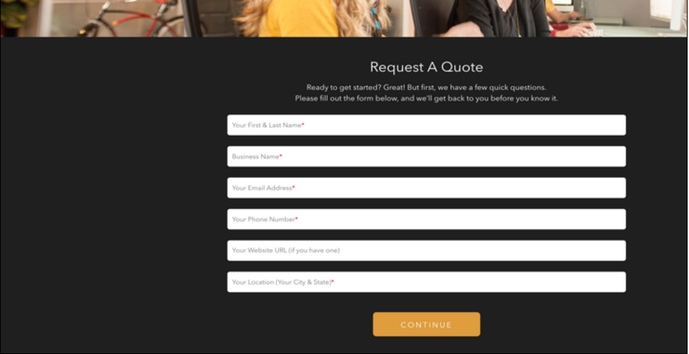
Placeholder text labels are very popular in forms, especially in situations where real estate is limited. By using text labels directly inside the text fields, designers can efficiently save valuable screen space, and provide a slick, modern look to their forms. But what if someone who is colorblind fails to notice low contrast labels? What if someone who has attention deficit disorder can’t remember what the labels were, once all fields have been filled in? What if those placeholder labels are not recognized by someone’s assistive technology, because he or she has a visual impairment? What can that person do then? How can he or she use the form efficiently?
Granted, placeholder text can provide a very interesting feel to the design of your forms. The goal is not to forbid them for the sake of accessibility. But keeping some user challenges in mind when designing placeholder text labels might lead you to darken the color of the label through CSS, so it’s more noticeable. You may want to pair that label with a visual indicator, so it’s not mistaken for a pre-filled value. You might end up using a real label element programmatically associated with the field, so it’s reliably conveyed to assistive technologies. And you may even end up adding a little bit of JavaScript to the mix, so the label element floats above the field once information has been implemented, so it remains visible at all times. Now you’ve made wonderful improvements to your form, without sacrificing any of the intended functionality.
Parallax Scrolling
Parallax scrolling is another very popular feature found on modern digital products these days. Most websites are now being built as single-page applications, where users scroll to multiple views, with parallax effects creating interesting feelings of depth. With striking background images that reveal themselves at specific points in the navigation, and complex movement that adds richness to the interface, authors think they can create a smoother, more engaging experience for everyone.
But did you know that as many as 35% of people over the age of 40 are likely to feel nauseous when looking at websites that rely on parallax scrolling? What good is creating rich interactions to showcase your product, if a third of your users over the age of 40 are potentially going to feel physically sick experiencing it because they’ve developed some kind of a vestibular disorder?
Again, from an accessibility standpoint, the idea isn’t to discourage you from ever using parallax scrolling. The trend is increasingly popular and as such, it’s not going away anytime soon. But once you realize how movement can affect web use, then you might be tempted to adapt your design to prevent your users from feeling physically sick as they browse your products. For example, you might decide to provide a mechanism at the top of your page, so users who have vestibular disorders can disable the scrolling and movement, and just enjoy your content in a static, linear way if it floats their boat (sorry, couldn’t resist the pun!) You may even go a step further, and design a warning, so people have a chance to opt-out of the parallax effect as they first load the page. Chances are, even people who aren’t subject to motion sickness will appreciate the option.
Conversational Interfaces (Chatbots)
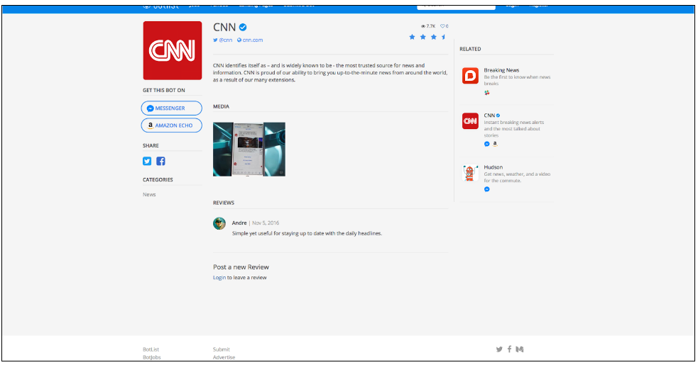
Chatbots represent a new trend in how people access information, make decisions, and communicate. Some people think that chatbots are the beginning of a new form of digital access. Some people even believe that messaging apps are the platforms of the future, and chatbots will be how their users access all sorts of services. In the past two years alone, Facebook Messenger has hosted over 35,000 chatbots that now replace traditional user interfaces, on services like 1-800-flowers or CNN. The concept of replacing a traditional interface with a conversation certainly makes sense because you then meet your potential clients where they already spend most of their time. But there is also an increased risk that people with disabilities (especially those with vision impairments) will be left behind. This can happen if the content pushed through these services is not programmatically conveyed to assistive technologies.
For someone who has a visual impairment, the concept of no user interface is extremely appealing. There’s no new visual layout to discover and make sense of, no application to download and log into, no confusing or overwhelming navigation patterns to figure out, etc. As an author, you may be surprised to learn that most chatbots out there are not compatible with screen readers. The most basic of features like buttons and links are often not even conveyed to non-sighted users. Knowing this, you might want to make sure that options presented to interact with the chatbot are not just announced as “text field,” but also convey the buttons’ labels. You may decide to run tests with a screen reader yourself, to validate that each piece of information grabs focus when swiped to, and is efficiently conveyed back to the user in full. Perhaps you can even double-check that as the interaction moves from one point to the next, the focus is naturally moved to this next interaction point, so users don’t have to start back from the top of the screen each time the screen gets refreshed.
By paying attention to these details, you’ll make your design more accessible to people with disabilities, and your design will be more robust. That also increases the likelihood that your design will work efficiently across a myriad of devices.
Broadening your Personas
Daniels’ discovery has led other thought-leading designers to conclude that by designing for the extremes, we’re ensuring that the middle can take care of itself. Designing for a 45 year-old professional male with an annual income of over $100k who’s really into high-end computers is still relevant if you’re building a digital product for Apple or Razer. But if you were just to factor in additional particularities to this kind of persona, like attention deficit disorders, vestibular disorders, or visual impairments, then that same persona suddenly would lead us to think very differently about our design choices. It would naturally influence how we would implement those design choices, and would provide extremely valuable insight as to how our users would use our products. By designing for the extremes, we can avoid barriers and provide a much better user experience for everyone.
For more information about current design trends as they relate to digital inclusion, be sure to download the slides of my CSUN 2017 presentation, “2017 design trends and their impact on accessibility.” And feel free to reach out to me over Twitter at @dboudreau, or share your thoughts in the comments below.