Auditing Design Systems for Accessibility
Since beginning my career in 2012, learning about inclusive design has been fettered with blockers and educational gaps. It’s my ambition to help unblock designers, developers, and tech folks who want to build better, more inclusive experiences. In this blog post, I hope to inform my fellow designers especially about where we need to come in for accessibility considerations.
I will focus on what I believe to be the most pivotal accessibility work that designers can do: creating design systems with baked-in accessibility compliance. In particular, we’ll focus on learning how to find accessibility issues in our existing design systems and documenting those issues in a way that makes them actionable for ourselves and our teams.
Would you prefer this article in an audio or visually-focused format? You can stream a video version of this article on YouTube!
Table of Content
- Design Systems and Accessibility
- Subatomic Particles
- Atoms
- Molecules
- Organisms
- Templates and Pages
- What Happens When a Design System Forgets Accessibility?
- Design Should Consider Accessibility
- Auditing Design Systems
- Review what’s in existing files
- Capture all live components
- Cross-reference and start to map issues
- Baking Accessibility into our Audit
- Common accessibility issues in design
- There’s more to accessible design than color contrast.
- How to Document an Audit
- Include background details
- Build your audit
- Group themes and commonly occurring items
- Be mindful of intent vs. application
- What should you do with your audit?
- Make your audit work for your audience
- Design with not for disabled people
- Summary
- Tools to get started on your audit:
Design Systems and Accessibility
What exactly is a design system? A design system is a single source of truth for a product, site, or experience. These include a shared purpose and a set of values for a design/development organization, as well as brand elements and component pieces. Design systems group related implementation elements together, define their purpose and clarify their delivery.
When done correctly, a design system should evolve and scale with an organization. These systems are important because they enable us to work at scale, do something once then apply it everywhere, and establish a more consistent brand. But most importantly, a design system is essential because it helps us scale accessibility as well.
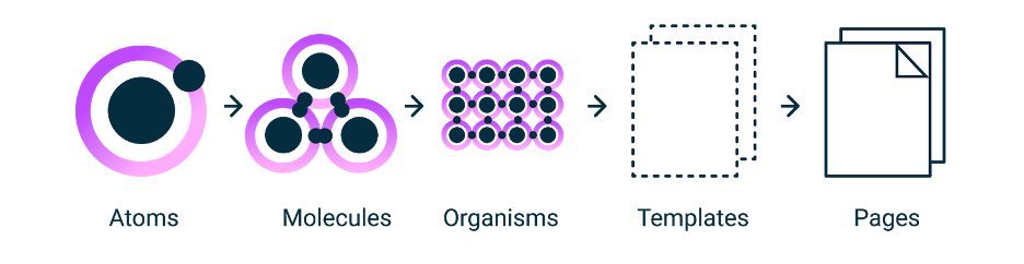
Each atom, molecule, and organism we create in our system affects our ability to scale upwards and meet the needs of disabled people. My mention of atoms, molecules, and organisms is a direct reference to Brad Frost’s “Atomic Design” (which I recommend reading if you’re interested in design system thinking).
When “Atomic Design” was released in 2016, it marked a pivotal shift in design thinking in digital landscapes. Though many teams had already begun to use pattern libraries and frameworks, such as Bootstrap, “Atomic Design” acknowledged something we had all started to see: digital design needed better systems.
Over four years later, Brad Frost’s book is still quoted regularly when design teams make a case for design systems. We can also use this methodology to help inform how to design accessibility at scale and audit our systems for accessibility compliance. In “Atomic Design,” Brad Frost breaks down the scale of design systems using an atomic approach. Our systems essentially build on top of each other, starting with elements, such as atoms, which can be combined to create molecules and can be further combined to form organisms.
These organisms inform and create templates that can then apply to specific pages in our platforms. Each person and team has a slightly different understanding or jargon around this scale, but these principles’ fundamental elements tend to carry consistently through most digital design systems.
We don’t have to have a robust or “perfect” design system to use this methodology or audit for accessibility. What is covered in this blog post can be applied at any point in our design system’s development, regardless of whether our team is just starting, already has a well-documented usable system, or is somewhere in between.
Subatomic Particles
Let’s start by breaking down how atomic design tends to scale. But before we discuss atoms, let’s talk about our “subatomic particles,” the foundational elements that carry up to our design system.
They aren’t our atoms, but they inform the creation of atoms. These subatomic particles tend to be things like brand colors or typefaces. While these elements alone may not seem the most important for our system, they will affect all of the elements we create, from our smallest scale to our full-blown pages.
Atoms
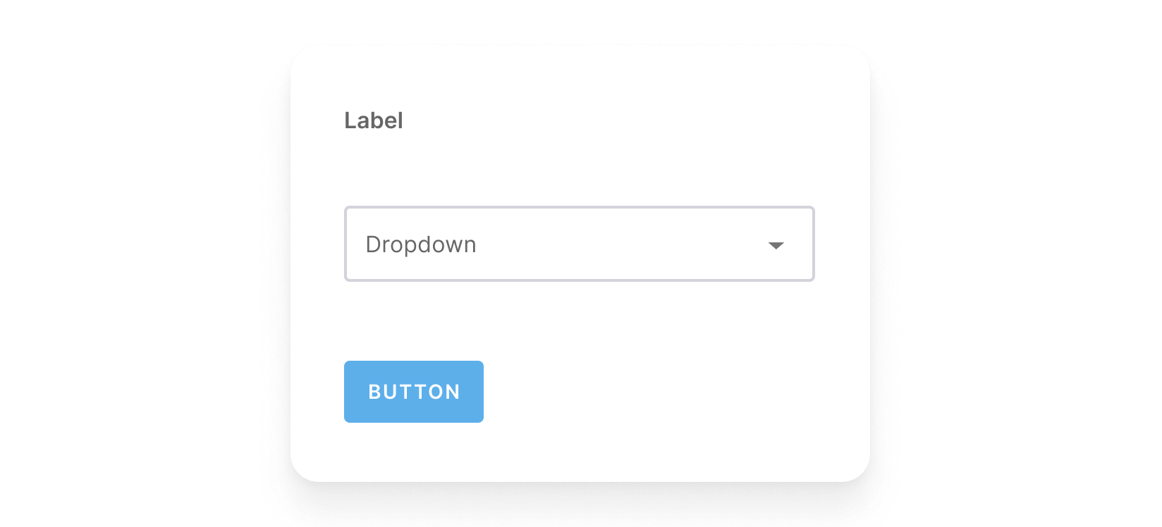
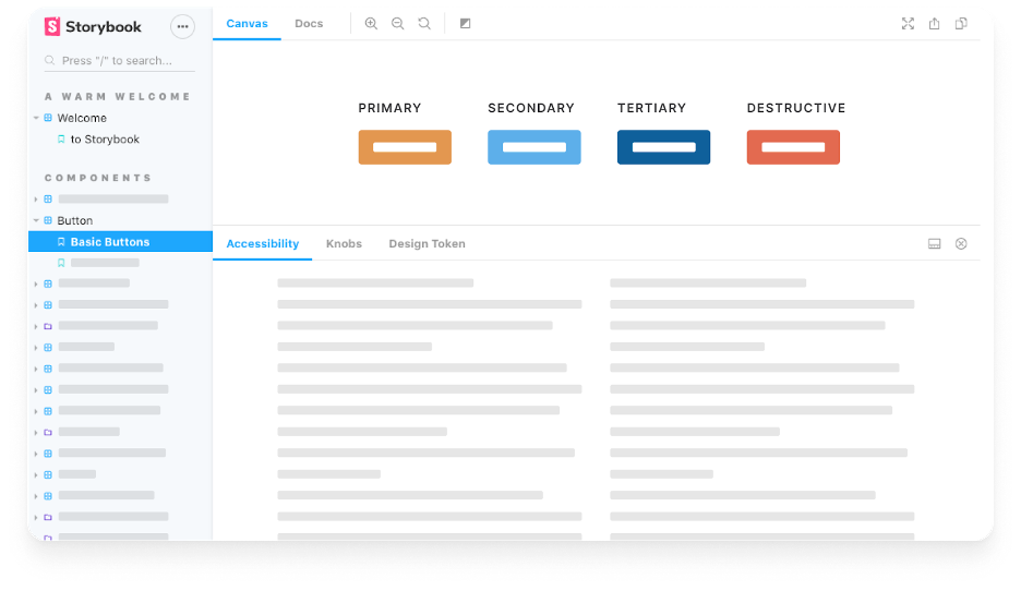
Atoms demonstrate all of our base styles at a glance, which can be a helpful reference to keep coming back to as we develop and maintain our design system. Some systems have greater granularity than others, so be mindful that words like “atoms” in this context can sometimes mean different things in different teams.
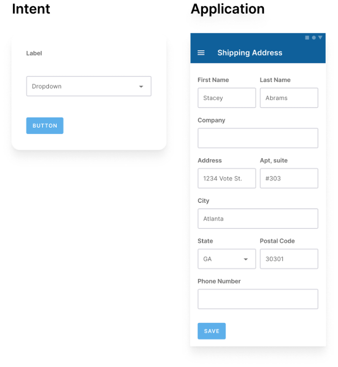
For our purposes, atoms are elements such as form labels, inputs, and buttons, and other things that can’t be broken out without ceasing to be functional. The example below is a label, a dropdown selector, and a button, each serving as a unique atom. But like atoms in the natural world, interface atoms don’t exist in a vacuum and only really come to life with application.
Molecules
In the next step up in the atomic scale, we have molecules: molecules are relatively simple groups of elements, or atoms, functioning together as a unit.
For example, a form label, dropdown selector, and save button can now be a functional form field unit. When combined, these abstract atoms suddenly have a purpose. Before we had a label, a dropdown, and a button, but we can now create a purposeful interface by combining these elements.
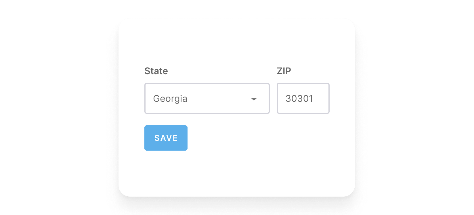
Selecting the button atom now saves the dropdown input, and the label indicates the purpose of these inputs. The results: a simple, portable, reusable component that can be dropped anywhere a dropdown input or save form is needed.
Organisms
Scaling up again: organisms are relatively complex components composed of groups of molecules and or atoms and even other organisms. These organisms form distinct sections of an interface.
Building up from molecules to more elaborate organisms provides designers and developers with an essential sense of context. Organisms demonstrate those smaller, simpler components in action and serve as distinct patterns that can be used repeatedly.
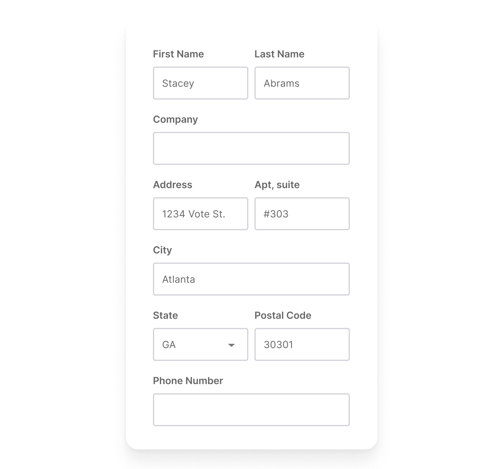
Below is our example dropdown/save form applied to a specific context, in this case, a shipping information form. This organism is also made up of other atoms and molecules and serves a more specific purpose.
Templates and Pages
Moving away from our analogy, we can use our atoms, molecules, and organisms to create templates and pages. Templates are page-level objects that place components into a layout and articulate the designs underlying content structure.
If we are reusing the structure of a page for a lot of different applications, we can use that template for other pages. A template displays all the necessary page components functioning together, providing context for our relatively abstract molecules and organisms.
By defining a page’s template, we can create a system that accounts for different dynamic content, all while providing needed guardrails for the types of content that populates certain design patterns.
Finally, pages are specific instances of templates that show what an experience looks like with actual, representative content in place. In addition to demonstrating the final interface as our users will see it, pages are central for testing the effectiveness of underlying design system elements. We can look at how all of those patterns hold up when real content is applied to the design system at the page level.
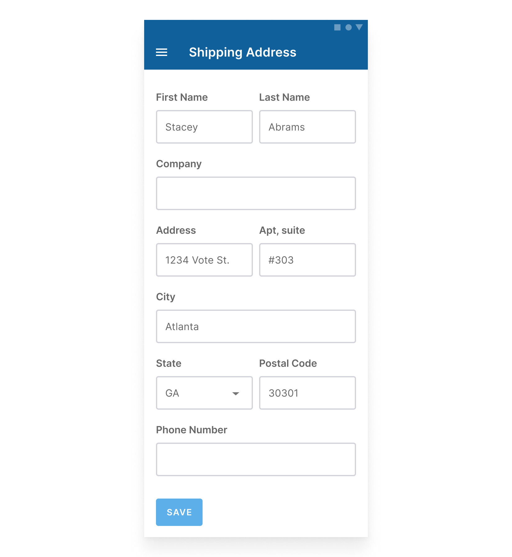
In the example below, we’ve taken our shipping information form and applied it to a specific page within our site or application.
What Happens When a Design System Forgets Accessibility
So we’ve taken our atoms, put them into a molecule, bundled the molecule with other atoms and molecules to create an organism, and then applied it to a page and or template. These are the atomic design principles that have made our design systems thrive, both in design and development. A well-scaled design system can make it infinitely easier to ideate around users’ needs and make our workflow highly effective. Pretty easy, right?
But wait, hold up!
Atomic design is excellent, but when we created this example interface, we weren’t thinking about accessibility. We were just thinking about the design system. Doing this can have implications on the entire system, so let’s take a step back to understand some of those implications.
In our example interface, we created a page with issues including, but not limited to:
- Use of a hamburger menu with no visual label and a lack of clarity around programmatic label. Hamburger menus do not provide a clear context, and users can struggle to understand its purpose without labeling, both visual and programmatic.
- None of the form fields have required indicators, so users wouldn’t know what is required or optional.
- The form fields have poorly contrasted borders, meaning that users may struggle to know where to select the form field to enter their data (the current contrast ratio is 1.48 to 1).
- Form field labels are placed next to each other. Will users be able to zoom in on this interface up to 200% without losing content or functionality?
- No input instructions are provided. Will users know how to prevent errors from occurring if an input is not matching the desired format?
- The color contrast on the save button is not high enough. As a result, users may struggle to read it (the current contrast ratio is 2.38 to 1).
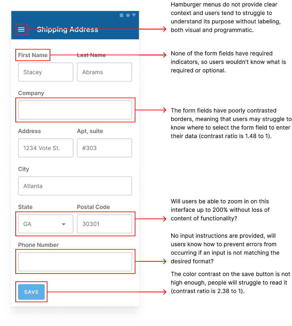
There may be even more issues than this, but we can start to understand how inaccessible things can quickly become just with a few incidents. If we use atoms, molecules, and organisms without thinking about accessibility, we will have elements with accessibility concerns and issues baked in all over the page, even across our experience. Auditing full pages can be a little overwhelming, especially when issues are related to a component’s inherent design or how a component was built.
To simplify, let’s go back to the very beginning. Before we made the organism or a molecule, we had our atoms. We can start by looking at this page’s accessibility by beginning with one atom: our button. Our example button design may have a few shortcomings, but to keep it simple, let’s focus on how it didn’t meet color contrast compliance.

This error relates not only to our atom but also our subatomics in our text styles and color options. Earlier in this post, we talked about those foundational elements and how they can affect these designs. Now we can see the ramifications of using those foundations to create atoms without accessibility in mind.
Our button has used a sky blue color in its background and white text on top. Our text is 14 pixels, uppercase, and a semi-bold weight. We can tell this button doesn’t meet color contrast requirements when we test this using a color contrast checker. This combination of colors/type has a ratio of 2.39 to 1 when the contrast needs to be 4.51 to pass the minimum required level.
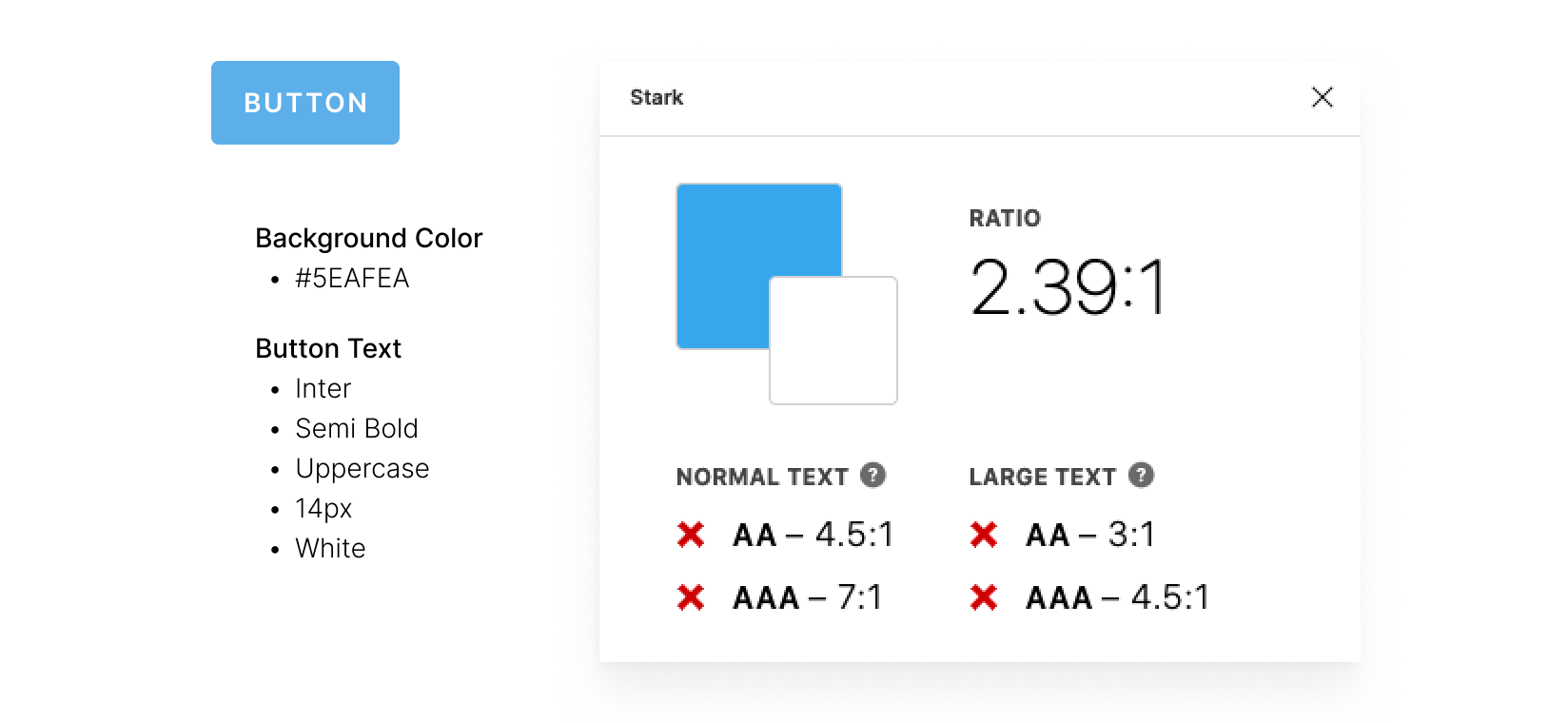
But as I previously mentioned, this combination of colors will affect more than just this component. We know there’s an issue with a component, and we know that it’s very likely going to affect others because its problem is foundational. This is where our auditing really starts to come into play.
Design Should Consider Accessibility
Issues like the color contrast example are why design needs to be thinking about accessibility, particularly with design systems. There’s a misconception in design communities that accessibility tends to be primarily developers’ responsibility, but developers can’t fix design system issues when they’re design-centric.
In fact, a Deque case study from last year found that 67% of accessibility issues originate in design.
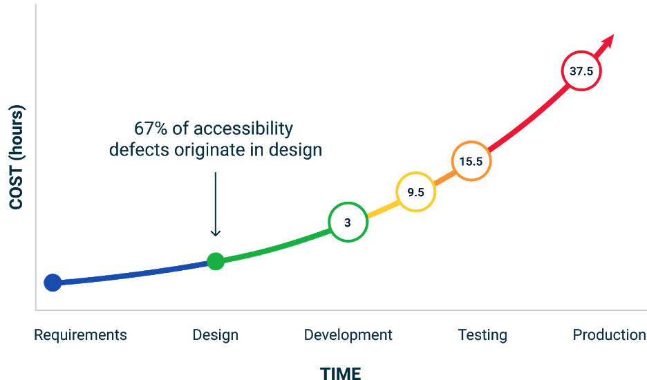
As shown above, fixing accessibility issues can amplify time and money spent if not addressed early and often. Since design systems are how we scale most efficiently, prioritizing accessibility in these systems can save a lot of time and money. When applied at a broad scale through our design system, fixing things like color contrast can cause sweeping accessibility improvements in our products.
Auditing Design Systems
Review what’s in existing files
The easiest time to review our designs for accessibility compliance is before development. However, many of us work on design systems with a combination of live components, inflight components, and even components that are live but undocumented. The starting steps of an accessibility audit for our design system look like a standard component audit. We want to review our components, which are being most actively used to create designs and document what exists.
We don’t have to start thinking about accessibility just yet. Instead, the intent here will be to document what exists and gather elements with similar purposes together. Before making our work more accessible, we need to understand how accessible our system is now and how far we need to go. We can audit a single component, related components, or a whole system of components. We can even audit a single button and still get actionable results. It’s all about how we want to approach it and the resources we have within a period of time.
We may find that existing design components include atoms, molecules, and organisms. It’s important to capture all of these, as well as noting their intended purposes. We don’t have to write up complete documentation or anything like that just yet — just a note will do.
Capture all live components
Similarly, we should capture all live components. We can do this by referencing our design files, development libraries, live experience, or anything in between as long as we capture what exists or what is intended to be made. We should also include such things as different interaction states like hover or focus.
We could do this by capturing each pattern library and live component via screenshot, then uploading it into an inventory file with the date, time, and location. Then, each item captured can be placed on a page named by purpose. Capturing components this way is useful when documenting what is currently live because what currently exists can easily change in a live product. This ensures that we can remember where and when they existed.
Remember, the purpose of capturing these components is to audit the system itself first and what exists. This part of your process is simply about knowing what our users are interacting with and making sure we can understand how much a component impacts our system holistically.
For example, our buttons will have more significant impacts on our users because they are a core component used across our experience. Other components may still have significant impacts if they are related to essential interactions, such as a user’s ability to log in.
Cross-reference and start to map issues
In the last part of our system audit, we want to ensure that what we’ve captured is consistent across all parts of our experience and note any standalone or unique instances. We need to make sure that these buttons in designs are consistent with what is in the development library and that these are also consistent with what’s live.
When capturing what is live, we can cross-reference this with our design team, and we can start to see where gaps exist. Now you might be thinking, “just auditing our design system isn’t going to help with accessibility!” But remember, accessibility should be baked into our existing design system strategy. We need our design system to be audited and scaled to be empowered to scale accessibility. These practices should go hand in hand.
And now that we’ve audited our system, we can talk about what we need to be reviewing for accessibility compliance and how.
Baking Accessibility into our Audit
Common accessibility issues in design
What should we be auditing design-wise? As we talked about earlier, 67% of accessibility issues start in design, so it may be more than we realize! There are many items outlined in the web content accessibility guidelines, and many of them relate to design just as much as they do development. Even though our earlier example was focused on a typical example of accessibility in digital design, there’s a lot more than color contrast that we need to keep in mind.
Some other standard accessibility requirements that need to be outlined in design include:
- Color usage
- Content strategy
- Heading structure
- Link behaviors
- Hover and focus states
- Form (errors, labels, etc.)
- Layout (consistency, responsiveness)
- Media (captions, alt text, etc.)
- Tab order and bypass blocks
- Timing
- Typography
- And more!
A good place to reference what we need to consider is WCAG’s Quick Reference Guide, which includes all of these items and more, as well as ways to meet these guidelines. This quick reference is also super handy when doing your audits and running components through review.
When we have a set of components outlined by purpose, it’s easier for us to look past the UI and see into these other accessibility needs. Now we can look at our atoms, molecules, and organisms according to their styling and purpose, which will help us address more than the surface issues.
There’s more to accessible design than color contrast.
You might be thinking, doesn’t WCAG only really apply to color contrast or UI? But accessibility audits within our design systems are not just about color contrast, or UI, alone. Auditing our design system for accessibility is about UX just as much as it is about UI. As we discussed, much of accessibility lies in other parts of our system, including content, hierarchy, imagery, and so much more. While UI accessibility does matter, designers tend to think our responsibility to accessibility is focused mostly on color and type because we don’t realize how closely tied UX is to accessibility.
So let’s review a component together, looking past UI.
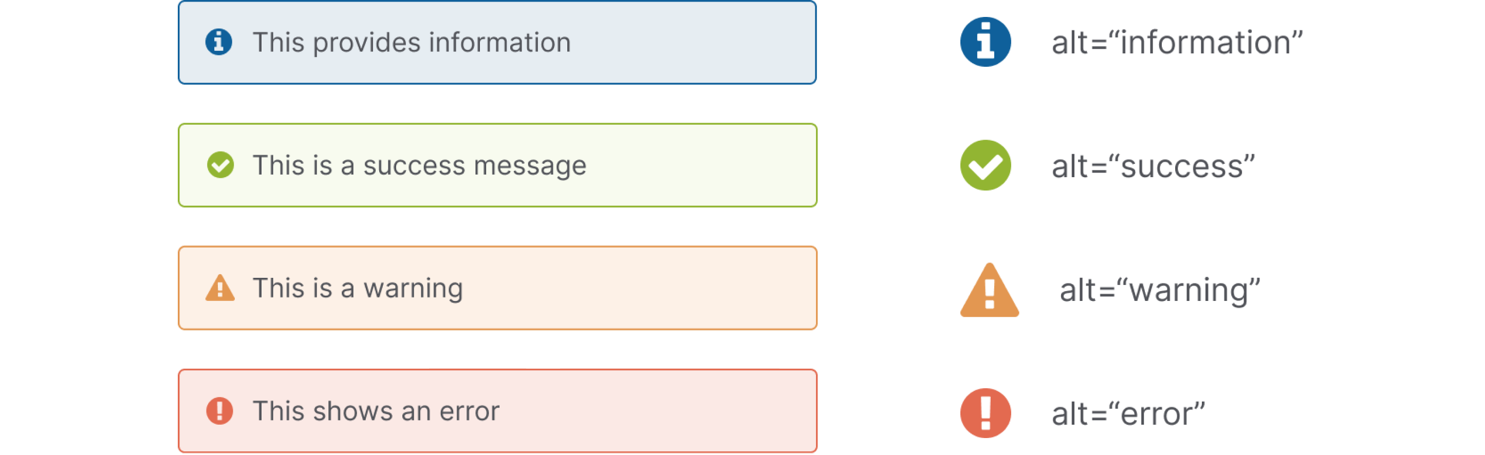
This example alert is designed to have a set of different types of messages: information, success, warning, and error. There are a couple of UX items we can investigate with this alert. For example, we can ask ourselves, should these icons have alt text? Let’s say that these icons don’t currently have alt text, but we think they should because we want this icon to convey an alert tone to users who may not see the icon.
So in our accessibility audit, we can note that there’s no alt text used for these icons and relate it to WCAG 1.1.1 Non-Text Content. If we’re using these icons elsewhere with similar purposes, this note in our audit will help us scale this UX element to many different instances.
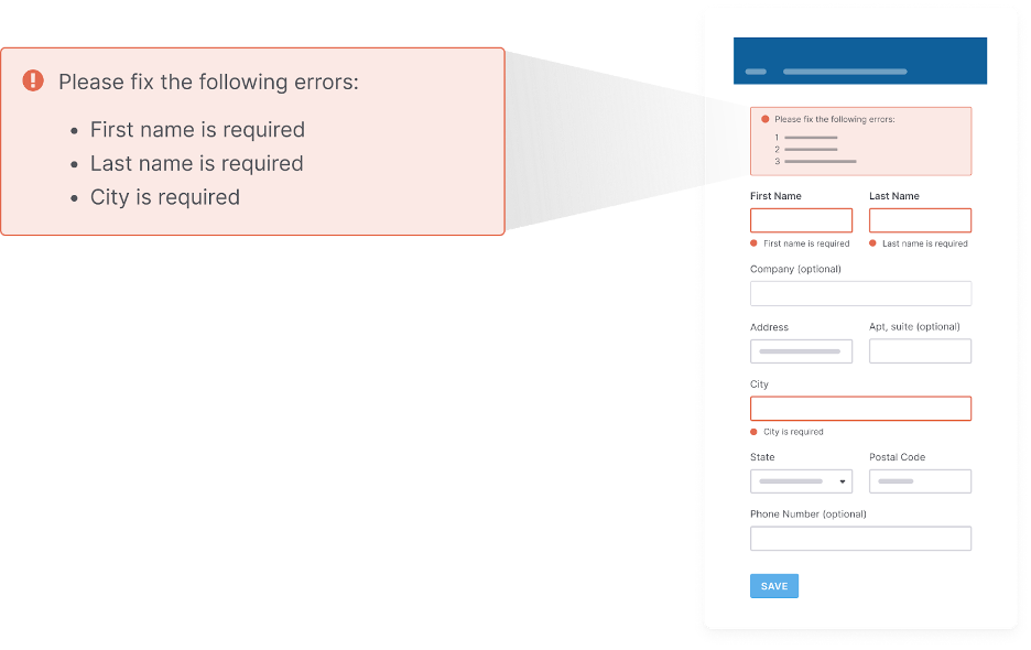
Or, let’s say our error alert shows multiple errors in one alert container. We will need to ask if this alert identifies what errors need fixing, where the errors are, and how to fix them. If our alert doesn’t do these things, we can note this issue and relate it to a WCAG 3.3.1 Error Identification.
These are just some of the questions that we as designers can and should be asking ourselves when we’re looking at our existing components and building new ones. If we have these components lined up together and a reference for their contexts, it can be easier for us to understand potential accessibility gaps and add them to our audit.
One last thing before we learn how to document an audit: our design system audit should be reviewing both designs and code for accessibility. If our components live in a component library or are live, we’ll want to review their code as well. Because while we can fix 67% of issues in design, like all accessibility, our work does not start or stop in one team.
I know some designers may cringe at the idea of reviewing code for accessibility issues, but we don’t have to be developers to audit code. To review code, we can partner with developers directly and even take a pass using tools that enable us to audit code, on pages or specific components. Many tools enable us to audit code, on pages or specific components.
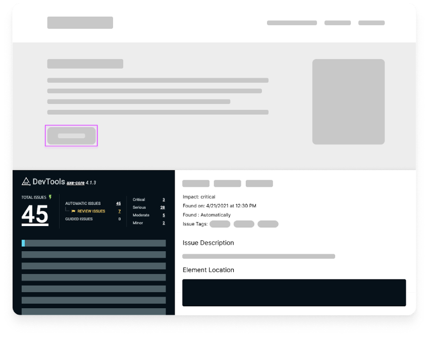
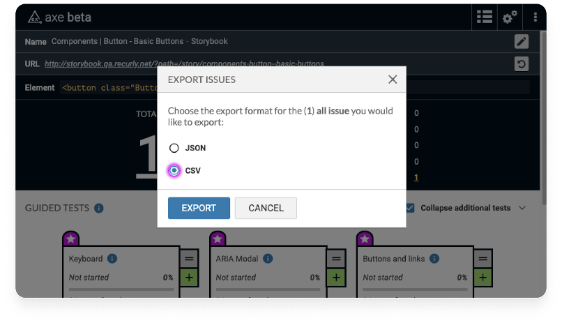
I’ll call out the axe DevTools plugin for Chrome as a good option for designers to try out when they audit design systems. Axe DevTools will tell you what the issue is when you select more info, which WCAG criteria it relates to, and the user impact. Using this tool, we can run both automated tests and guided manual tests to do a thorough review of our designs and code.
To use axe DevTools:
- In Chrome, I’m going to right-click and choose Inspect and select the axe DevTools tab.
- For a component audit, you can select Scan Part of My Page. Then, select the part of the page you want to audit and click Scan.
- Use the Highlight tool to focus on design items you’d like to focus on
- Save your results or export the issues as a CSV or JSON file
How to Document an Audit
So far, I’ve talked a lot about what a design system is and what to look for in a design system accessibility audit, but let’s talk about how to document an audit. I know I’ve alluded to adding things to our audit a few times, but how does that look?
Include background details
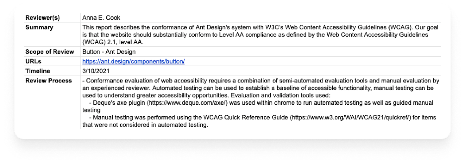
Any accessibility audit, regardless of whether it’s our design system, code, or page, etc., requires you to start by building a background. We should mention who is reviewing, a summary of what we’re reviewing, and what level of accessibility we’re looking to meet. We’ll also want to include the scope of the review, timeline, and outline the review process.
This background is essential because our audit will always be referenced after it is complete, and we need to ensure that whoever is reviewing it has context for the review. If our review is older, whoever is looking it over can know it may not be as relevant anymore. Including these details will help us and our peers use the audit to the fullest extent possible. It will also create an excellent comparison benchmark for future audits.
Build your audit
Since we have discussed auditing itself, I will only go over building our audit briefly. Having a list of items we have captured will help us know what issues exist, what their severity is, and ways we can fix them.
If we’re using axe DevTools Pro, we can export findings and fine-tune the details based on our organization’s needs. Axe always has a rich amount of details it includes by default, so I have found it easy to customize based on my audience and audit requirements. We can also manually add items to the axe CSV or JSON file we’re using as we encounter more issues or when/if we’re auditing in our design tool rather than in code.
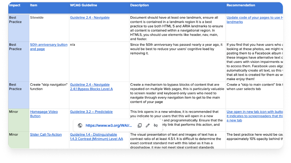
In general, I recommend at least including:
- Item/component – What component is related to this issue? Links to screenshots are valuable here as they can help someone understand what we’re referring to.
- WCAG Guideline – What issue in WCAG is related to this? A link to the related WCAG item using WCAG’s quick reference guide can help a lot in setting context.
- Impact – how much will this impact users or the business? How often is this item used (more often = more significant impact)? Is this item used for necessary actions (such as logging in)? Axe DevTools Pro will recommend impact, which is helpful as a baseline.
- Description – Describe the issue you’ve found in more detail
- Recommendation – Explain ways your team can address the issue. In many cases, there are multiple ways an issue can be addressed. We can describe possible fixes to help our team understand options.
I encourage you to customize your approach to find what works best for you and your team. What matters most is that you’re trying to document issues in a way that makes them actionable and so that your organization or your team can act accordingly.
Group themes and commonly occurring items
Additionally, when conducting and documenting your audit, I recommend grouping commonly occurring items together. Again, this touches back on our atomic scale: if a contrast ratio issue was occurring on many different items, you could group them into a set of issues. Grouping and theming, especially for your design system audit, is very important because it means that you’re going to have a much higher impact without having to do a lot of fine-tuning at a lot of different places. The power of a design system is that one change will have a considerable impact with only a bit of effort.
Be mindful of intent vs. application
Another important thing to keep in mind: you will likely find you don’t capture everything that needs to be made more accessible when auditing your design system alone. That’s because designers tend to work in complex systems and design systems are all about intent. So there’s always going to be circumstances where what you captured in your audit and fix doesn’t fit your design system’s application.
Your atoms might be excellent and accessible, but your organisms need more attention because they’re more unique to specific circumstances. Or perhaps the implementation of your design system components is not accessible because of things like the copy you ended up using.
This is part of why I went through our atomic scale: to help us understand that there’s a difference between intent and application. Starting with the design systems will go very far, but it’s not necessarily going to fix everything on your live site because the application is different.
What should you do with your audit?
Once we finish our audit, what should come next? First, you’ll need to empower your team with the findings in the spreadsheet you’ve created. Getting handed a spreadsheet with hundreds of items helps when fixing issues, but it’s going to be intimidating if you just hand a stakeholder a spreadsheet and say, “Here you go!”
Instead, here’s what you should do with your audit to help make it more useful:
- Outline impact areas and determine how many items are critical, serious, moderate, minor, and best practice.
- Identify key themes, items that occurred most commonly across the system.
- Create an impact framework to identify which issues have the highest impact and the lowest level of effort.
- Share results with your team and organization in a digestible, positive way.
- Work with stakeholders to prioritize improvements.
Make your audit work for your audience.
The most important thing about your accessibility audit itself is making it actionable and sharing the results with your team in a way that makes it easy for them to learn from and act on.
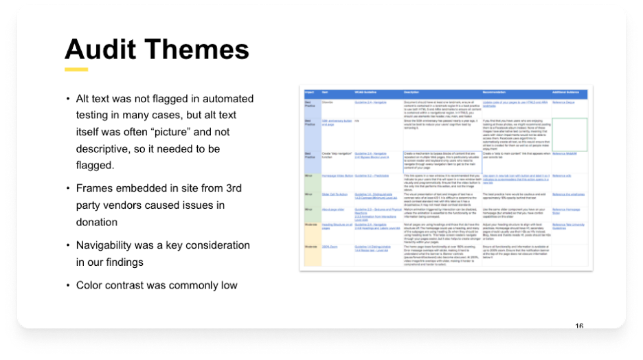
Below is an example of an audit shareout for a client where I outline the most commonly occurring issues, themes, and high-impact items. When we’ve wrapped up our audit, we need to make sure we present everything we’ve discovered, but at a high level. That is, we need to outline what is most critical to fix and key themes and share an impact framework to help identify which issues can be fixed most quickly with the highest impact.
Putting these together, along with our complete audit, means that we can share results in a digestible way and work with stakeholders to prioritize improvements while also having details we can act on for each issue.
Design with not for disabled people
Lastly, remember that accessibility is just a form of design that requires discussion and testing the way all design does. The difference is that accessibility is about making sure our designs are accessible to disabled people’s needs.
One of the most essential aspects of accessible design is designing alongside people with disabilities instead of for people with disabilities. WCAG is written with and by people with disabilities, so it’s great to use in an audit. But is it everything? No, like all design, accessibility requires us to talk to people and learn about their unique circumstances, especially when using our sites and products.
Auditing cannot replace testing and designing with disabled users. While I won’t advise a perfect inclusive research strategy in this blog post (maybe another), I want to call this out because I don’t want anyone to think that an audit is everything about accessible design. It’s a key component, but we need to continually hear and respect users’ needs and people with disabilities. I encourage you to take the insights from your audits, find ways to ask users what they think, test your ideas with them, and pay particular attention to your marginalized users.
In Summary
Starting to audit design systems for accessibility can be a significant undertaking, no matter how comfortable you are with accessibility. However, I want to encourage you to stay curious. Many designers are not trained in accessibility, and that’s on educational institutions, not you. The fact that you’re interested in learning is a huge step.
If you’re new to auditing designs or code for accessibility, try axe DevTools Pro, open WCAG’s Quick Reference, and play around, document things you’re finding. Ask yourself questions. Ask your team questions. Just playing around with these tools, skimming these guidelines, and being curious is going to take you so far. Honestly, much of my accessibility knowledge has come from those practices.
Amazing article! Thanks for being so thorough and providing a solid framework for how to get started an accessibility audit for design systems.
You reference a case study from last year that yielded a result of 67% of accessibility issues stemming from the design side. I would be very interested in seeing more details about the study but the link doesn’t appear to be working. Would you be able to update the link or provide a url to the article?
Thanks again for sharing and I’ll be utilizing your suggestions to help