
Something you may not be aware of: at any given time: roughly 20% of Americans have either a temporary or permanent disability that may prevent them from enjoying the same experience with a website as the rest of the population. The disability might range from having decreased vision as a result of aging or breaking an arm – to something more serious – such as becoming permanently blind or developing a serious medical condition that necessitates using a wheelchair for life.
Keeping this 20% in mind – regardless of whether their respective disabilities are temporary or permanent – is essential when it comes to incorporating accessibility into your design plan. Accessibility is one of the hallmarks of intuitive user-centered design and can end up benefiting all users. But it all starts with the general principles of usability.
Some questions you should be asking yourself when designing a site for accessibility: Does the information architecture of your site makes sense? Do the error states you’ve designed help your users fix their mistakes? Are you thinking about consistency in your design? The answers to those questions will go a long way towards helping you make your site accessible.
That being said, there are some things specific to accessibility that you should be thinking about as you’re designing. In this post, I’ve outlined 5 simple design considerations to keep in mind that you can incorporate into your designs to help you to make your website more usable and more accessible.
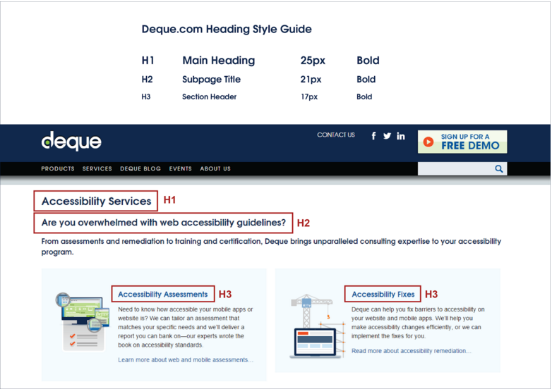
#1 Specify Heading Levels in Your Wireframes and Style Guides
Headings do exactly what their name implies – they mark the beginning (or the head) of a section of content. They’re tags given to pieces of text to help determine both the style and meaning of that text. Headings also serve a greater purpose in defining the hierarchy of the content on the page. If you’ve done any basic HTML, you will likely have encountered the heading tags – H1, H2, H3, and so on.
All users visiting a website use the largest text to help them understand the purpose of the page. The largest text (for example, the heading of this post) should tell users what the page is about, and should be marked by an H1 tag. Smaller sections can have titles (or subheadings) as well – the section of the post you’re reading now is titled “Specify Heading Levels in Your Wireframes and Style Guides,” and that title is marked up as an H2.
So, if seeing section titles using big font sizes helps a user understand content better, what if that user is blind? Screen readers also make use of the heading tags – a screen reader user can quickly get an overview of the page by going through each heading one by one.
It’s important to not only define consistent visual styles for headings, but also to use the HTML-defined heading tags so that users with limited or no vision can benefit from them as well. When designing a page, you can help your developers choose the right heading level to use by noting what the heading levels should be in your wireframes.
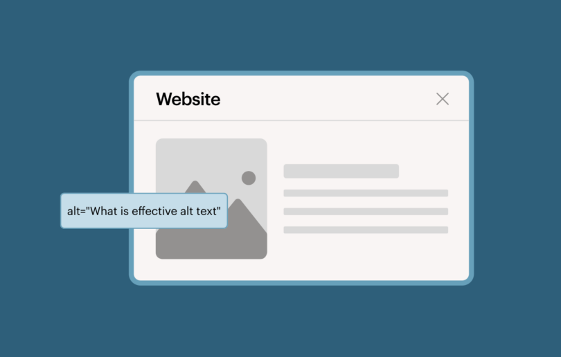
#2 Write Alt Text for Images
Another easy thing you can add to your wireframes is alternative text (alt text) for any images you’re using. Alt text does not show up on the page itself – its primary purpose is to communicate what is in the image to screen readers. Some images don’t need to have alt text – for example, if the image is a background image and doesn’t convey any extra information to the user, mark it up with an empty alt text (alt=””). Including the alt tag but not the text will cause the screen reader to skip over the image altogether so that the user’s time isn’t wasted with descriptions of an image that doesn’t provide meaningful content.
If, however, you have an image with text in it, that text needs to be included in an alt tag, or else screen readers users will miss it altogether. This is particularly important for controls that are images, like buttons or menu items. The alt tag must include ALL of the important text that is present in the image, or else it will not be considered strictly accessible.

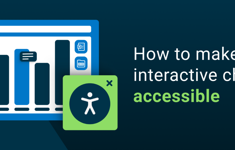
Complex Images
If you have a complex image, like a bar chart or an infographic, alt text may not be enough. The alt text tag is meant to be used for short, tweet-sized bits of text. To describe something like a bar chart with many data points, you may need something more robust, like a long description (longdesc) or figure caption (figcaption) to fully describe it. W3C’s Web Accessibility Initiative has a good article on creating descriptions for complex images.
#3 Design Skip Links
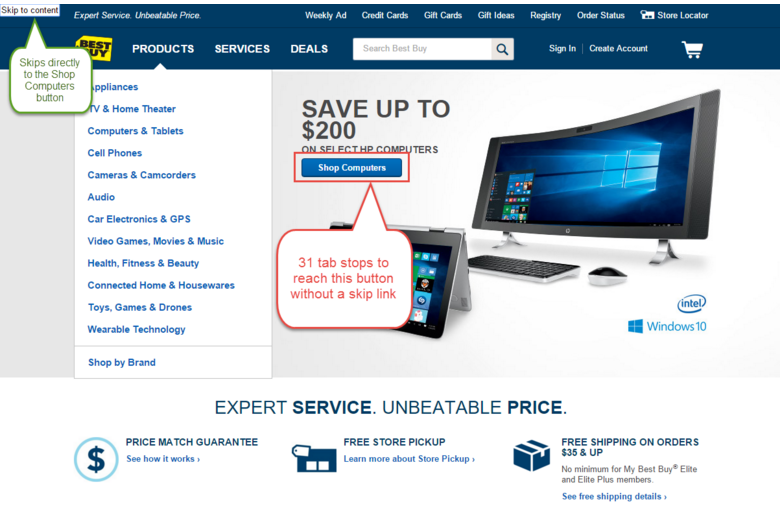
By default, screen readers (and keyboards!) are designed to go through the code of a webpage from top to bottom. If you’re using a mouse, you have the freedom to click on whatever strikes your fancy. But people who are blind or physically disabled often don’t have that luxury. Many of them rely on their keyboard only. This means they often have to tab through a bunch of stuff in the header and main menu before they even reach a link or button in the content.
Take Best Buy’s homepage, for example. Because they expand the ‘Product’ submenu automatically on page load, a person using a keyboard who wants to reach the first part of the content – the Shop Computers button – would have to tab through 31 different links and buttons before s/he could get there. Luckily, Best Buy’s website includes a skip link, which becomes visible the first time you hit the tab key on page load. If you activate the link by hitting Enter or Return, you’re taken directly to the Shop Computers button.
Providing skip links doesn’t have to be a chore. Skip links don’t have to be visible all the time; they can live off-screen until someone uses the tab key to start perusing the page. You can design skip links in a style that matches the website, and even include effects, like animation. WebAIM, one of the foremost resources for web accessibility, uses animation to draw the user’s attention to their skip link. Incidentally, they also have a comprehensive article about including skip links on websites.
A final note about skip links: when designing, you might want to ask yourself, “does my site have any longs lists of links other than the main menu, or any other important information that should be easy to get to?” For example, a keyboard user may want to skip through a long list of product filters so they can get to the products on the page. A user may also want to skip straight to the footer to easily access something like contact information. If there are lots of links and buttons to navigate through on your site, you can build a better user experience by creating a skip link menu with multiple links inside it.
#4 Choose Your Fonts Wisely
In other words, don’t use fonts that are too fancy, too thin, or too thick. This should be a no-brainer, but sometimes it’s tempting to add to the style of a site by styling the fonts as well. It’s important to remember that many of your users will have some sort of visual disability. Even something as common as mild farsighted vision can have an impact on how well a user is able to read the text on your site.
In fact, clear, easy-to-read text benefits everyone – from older people, like your mother or your grandmother, to those with mild to moderate visual disabilities. Clear text can even benefit the everyday user with perfect vision. I have nearly perfect vision myself, and I sometimes have to squint to read text on webpages. So if I have trouble with those pages, then imagine how much more difficult to read they would be for someone with partial vision loss!
For example, say I’ve chosen a nice, thin, stylish font for my site:

Nice, right? Well, I’ve shown it to my grandmother, and she has cataracts. This is what she sees:

Had I used something a bit thicker and less stylized, like Arial or Open Sans, my grandmother likely would’ve been able to read it more easily.
Want to test it yourself? A plugin for Google Chrome called NoCoffee can help you see how people with visual disabilities will see the fonts and colors on your site.
#5 Check Your Color Contrast
What color is your site’s normal text? What color are links? What color are your buttons, and what color are your buttons’ text labels? The contrast between the colors you’re using for text and the colors behind them can drastically affect how easy they are to read. Having good color contrast is not only helpful for people with moderate visual disabilities, but also for people who have some form of colorblindness. Colorblindness can range from an inability to tell the difference between red and green, to full colorblindness, which effectively means the individual sees everything in grayscale.
Strictly speaking, the Web Content Accessibility Guidelines (WCAG) ask that the color of the text against the color of the background behind it reach a certain threshold – normal sized text (up to 14pt) must have a ratio of at least 4.5 to 1 against the background color. 18pt fonts and above (heading size fonts, generally) must have a 3:1 contrast ratio.
A quick way to check your color contrast on the fly is to convert your designs to grayscale every so often. You can do this fairly easily in Photoshop, Illustrator and Sketch. If you have trouble making out details of your design when zoomed at 100% in grayscale, it’s likely some of your users will have trouble, too.
A more robust way to check your contrast is to use a color contrast checker, ideally when you’ve just begun to choose your colors. An excellent option is the Tanaguru Contrast-Finder – simply plug in the hex codes for your text (foreground) color and your background color, and it will evaluate the contrast ratio based on accessibility requirements. If your color combination doesn’t meet the specs, Tanaguru will give you a number of alternate color options that will. This can be a very helpful tool for determining an accessible color palette. If you aim for a ratio of 4.5 or higher, your can be reasonably assured that your color choices won’t hinder anyone from using your site.
A Final Word on Accessible Design
There is a lot to learn about accessibility – if you’re just starting out, don’t feel like you have to learn everything at once. Even doing a little bit, like ensuring that you use an easy-to-read font, can go a long way for a number of people. As you learn more about accessibility, you can incorporate more into your design work.
It’s also important to keep in mind that accessibility doesn’t begin and end with the designer – other people involved in the process of creating a product should be held accountable, too. A good chunk of making a website accessible involves marking up HTML and JavaScript so that each page will correctly handle keyboard operations and screen readers. Unless you also do front-end development as part of your role, understanding the ins and outs of ARIA roles will probably fall to the developers working on the site.
That said, since design is typically the beginning of the development process, the people who can have the greatest effect on accessibility – and on general usability – are often the designers. If you’re passionate about creating a product that everyone can use effectively, you should become passionate about accessibility as well.
Caitlin Geier is a UX designer on Deque’s product team. As a UX designer, Caitlin’s work with accessible design flourished once she began working for Deque. She is passionate about understanding the users she’s designing for, and she continually strives to incorporate accessibility elements into her work in order to ensure that all users can benefit from inclusive design.
