We recently released an update to our open source JavaScript accessibility testing engine, axe-core version 2.1.7. This release comes with an update to our free Chrome extension (Firefox coming soon), as well as updates to our open source modules axe-webdriverjs and react-axe.
Here are some highlights of the code changes included in this release, as noted in our Changelog:
Add promise-based axe.run API method in favor of axe.a11yCheck
We added a new audit method, axe.run(), and deprecated axe.a11yCheck() The main benefit of axe.run() is the use of the Promises API for asynchronous execution of accessibility audits, making it possible to bubble up JavaScript errors. This also makes debugging iframes easier.
The basic function signature for axe.run() is nearly identical to axe.a11yCheck(), except for one new callback argument for error handling: err, which will either be null or return an Error object. If you do not provide a callback function, axe.run() will return a promise, which you can use for resolving or rejecting results asynchronously.
Basic usage:
axe.run(context, options, function(err, results) {
    if (err) throw err;
    // do stuff with results
});
We’ll eventually remove the deprecated axe.a11yCheck() method from a future release, so now is the time to migrate to axe.run().
Color contrast rule performance improvements with elementsFromPoint
The color contrast rule updates in this release improve the speed of axe-core 8x when that rule is enabled. We changed part of our implementation to utilizes dom.elementsFromPoint browser method, currently supported in Chrome, Firefox, and Internet Explorer (we have a polyfill for other browsers). It also makes use of the promise chain introduced in axe.run, further improving performance by yielding to the main thread on nearly every tick. Paul Irish and the Lighthouse team were thrilled!
Add Inapplicable and Incomplete (Can’t Tell) results
axe notably does not include warnings in audit results to minimize false positives. However, in this release, we introduced the concept of Inapplicable and Incomplete items for audits that do not strictly fit into Violation or Pass results. These new results can only currently be utilized with axe-core or axe-webdriverjs, and not with our Chrome or Firefox extensions (stay tuned for updates to that soon).
Inapplicable results include a list of the axe rules that did not apply in an audit. For example, if a webpage does not include a video, video rules will go into the inapplicable list.
Incomplete results occur when axe can tell that a rule does not definitely pass, but cannot quite tell whether it definitely fails – in this case, it will gather some information that can be presented to a human for a decision. An example of an incomplete result is the color contrast of text over background images or gradients, which are extremely difficult to audit with automated tools without generating false positives.
New rule: frame-title-unique
We added a rule to check iframe title attributes for uniqueness, so there are not duplicate names listed in a screen reader elements list.
Improvements to rules: td-has-header, th-has-data-cells
In addition to other various rule improvements, we changed how axe checks table headers for data, as well as reducing false positives of row and colspan attributes on table cells.
Add better support for implicit roles
axe rules now have better support for implicit roles according to the HTML5 spec, such as input[type="reset"], input[type="submit"], summary, td, th, footer, dd, dl, dt, form, <code”>table, optgroup, option, main, math, nav, and more. With these changes, every current implicit role is accurately handled by the axe engine.
Move TypeScript definition to root of project
axe can be used in TypeScript and Angular projects with our TypeScript definition file, now included at the root of the project instead of the typings directory. Read more about using axe with TypeScript.
Are you going to CSUN in 2017? Then make sure you’re planning to stay for Deque’s 2nd aXe Hackathon on Saturday, March 4th.
Marcy Sutton and Wilco Fiers will be hosting, and this year we’ll be using aXe to perform accessibility testing on open source component libraries, WordPress templates and resources, and who knows what else. Then we’ll take those test results and translate them into user-friendly issue description that we’ll formally log with the content owners. So far we’ve gotten interest from:
Office UI Fabric – Microsoft’s front-end framework for building web content that integrates with Office 365
AMP HTML – Google’s new framework for building fast, mobile-optimized web content
React Bootstrap – a Bootstrap framework for building user interfaces with React, which is an open source JavaScript library that is currently used by Facebook, Instagram, Netflix, Imgur, and many other sites and applications
Join us at the aXe Hackathon, and you can help make content built with these frameworks accessible to people with disabilities.
Details on a more advanced project will be coming soon…
Who?
Anyone! Everyone! All experience levels. Seasoned developers and people who wouldn’t know an anchor tag if it punched them in the blogspot. If you can download a browser extension, you can test for accessibility. And if you’d like something more challenging, don’t worry – we’ll have you covered.
Because people with disabilities deserve equal access to the internet, and it takes a village to make this kind of change. Plus, you’ll come away with some valuable skills, like:
How to perform basic accessibility testing
How to put together an accessibility bug report that is easy to understand and easy to act on
How to log issues on GitHub
Did we mention the cool advanced project? Don’t worry – we’ll have more details soon.
And yes, there will be free snacks and prizes. You won’t want to miss it!
Caitlin Cashin
Caitlin is an "Accessibility Decoder" at Deque Systems. She joined the team back in 2011 and has taken on a variety of roles over the years. These days she spends her time exploring the best ways to communicate accessibility ideas and solutions to the general public.
In a recent post, we took a trip down memory lane as our experts discussed the merits of their favorite early accessibility tools. This week, we spoke with our accessibility experts to find out their favorite current accessibility tools. These are the accessibility checkers and tools that our experts use in their daily work; the tools that make web accessibility possible.
Shameless product plug aside, aXe was the first name on the majority of our expert’s ‘accessibility tool favorite’ lists. “aXe is a great tool for automated testing. I mostly use it through WS Assure,” says Senior Accessibility Consultant Gokhan Boybek.
aXe is Deque’s lightweight, portable open source JavaScript accessibility rules engine. It’s a fast, free accessibility checker that delivers zero false positives, and you can get aXe as a browser plugin, framework integration or GitHub repository. But perhaps best of all, aXe allows you to build accessibility testing into your source code, which prevents accessibility issues from making it into your code master. “[I use] aXE from Github because of its awesomeness, the fact that it delivers no false positives, and it’s accessible,” says Senior Accessibility Consultant Jeanine K. Lineback.
aXe was updated not long ago, and aXe version 2.0 is better than ever before. Since this accessibility checker allows you to build accessibility testing into your source code and integrates seamlessly with your existing testing frameworks, it cuts down on both the cost and frustration of building accessible web apps.
We discussed WAVE at length in last week’s post on favorite early accessibility tools. (WAVE was the only tool mentioned that’s still current). WAVE is a free online service that evaluated for accessibility by offering visual representations of a webpage’s accessibility issues. It’s available in Firefox and Chrome extensions and also as an API. Glenda Sims, our Team A11y Lead and Director of Consulting and Quality Methodology can’t say enough about the tool. “Super easy to use. It even has a way to use it without installing anything,” she says. Glenda also likes that WAVE is one of the few accessibility tools that has very few false positives. Plus, she, says, “[it] gives you good descriptions of how to fix [accessibility issues] and has good color contrast testing options.”
One of the top accessibility tools mentioned by our experts was NoCoffee, which differs from typical accessibility checkers in that it doesn’t evaluate and score webpages. Instead, it’s an innovative accessibility tool that provides accessibility testers, developers and UX designers with the ability to experience webpages from the perspective of a user with visual impairments. That’s why NoCoffee ranked as a unique favorite amongst our experts.
This Chrome extension provides testers with the means to simulate different types of visual impairments, ranging from blurriness, and colorblindness to various other vision issues, such as macular degeneration and glaucoma. Senior Accessibility Consultant Gokhan Boybek finds this feature very helpful in his work. “It’s useful to turn a page into black and white so you can identify usage of color-only and link color contrast,” he says. But accessibility experts aren’t the only ones who love this accessibility tool. Caitlin Geier, Deque’s UX Designer, uses NoCoffee as well. “It’s very helpful from a design perspective,” she says. Our experts love the tool because it can be used used in a variety of accessibility scenarios. ”[NoCoffee is] very useful to run quick and dirty tests on visual mock ups and user interfaces to spot potential problems,” explains Deque’s Principal Web Accessibility Consultant, Strategist and Trainer Denis Boudreau.
“This is a great accessibility tool for when you need to do pixel picking,” says Glenda Sims. This accessibility tool enables you to distinguish contrast elements on a webpage, as well as text legibility and readability. The Colour Contrast Analyser measures against WCAG 2.0 standards while you work, and also simulates certain visual impairments, including colorblindness. This tool was discussed by many of our experts, as color contrast issues are among the most common accessibility issues found on webpages.
The Firefox Web Developer Toolbar was also a top pick accessibility tool used by many of our experts. This extension packs dozens of pre-configured tests that can help check for accessibility barriers. But having a lot of choices doesn’t always simplify things. “It’s a little difficult to use at first because it offers so many options,” admits Denis Boudreau. “But it quickly becomes a great tool to have in your toolbox, as it can replicate most of the tests that are available in the WAT-C Web Accessibility Toolbar.” Many of our other experts agreed, favoring the tool for other reasons. “I also use the headings list” says our Senior Front-End Engineer and Accessibility Evangelist Marcy Sutton. “I like [it] because it shows where a page has skipped heading levels.” Gokhan Boybek is also a fan of the headings list. “[I use it] to see the heading structure of a page, to outline lists and tables, and to identify background images,” he says.
Now for the best kept secret accessibility tool suite: Paul Adam’s bookmarklets. Several of our experts raved enthusiastically about Paul’s bookmarklets, and it’s easy to understand why: they’re easy to use, and they’re versatile.
Paul J. Adam is an Accessibility Evangelist, Accessibility Consultant and Developer at Deque. His bookmarklets are used for accessibility testing and are accessible to screen reader users. These bookmarklet accessibility checkers use JavaScript to highlight roles, states, and properties of accessibility elements on the page. Jeanine K. Lineback uses Paul’s bookmarklets quite often, because, as she says “of their ease of use and flexibility. Plus they can be used in all browsers and in all OS platforms.”
Another accessibility tools list topper is Zoom Page by Firefox. This accessibility extension provides a full featured zoom manager with independent page and image zoom modes. “You can choose from four zoom modes,” explains Denis Boudreau, “Default Zoom, Fit-To-Width, Default Zoom + Site Specific or Fit-To-Width + Site Specific.” And the button style and zoom levels are fully configurable. “[It’s] one of the best options to verify low vision accessibility, and how well web pages scale when text zoom comes into play,” adds Denis.
Several of our experts mentioned this independent accessibility tool. Jeanine K. Lineback, for example, likes the CodeSniffer because it’s available on multiple browsers “and it’s also fairly accessible.” The HTML_CodeSniffer is a client-side script that checks HTML source code and detects violations of a defined coding standard. The bookmarklet is written entirely in JavaScript, does not require any server-side processing and can be extended by developers to enforce custom coding standards by creating your own “sniffs.”
Other Best-Loved Accessibility Tools
While the accessibility tools discussed above are favored by members of our team, there are a variety of other favorites also mentioned by some of our experts. Marcy Sutton says that aside from axe, she mostly uses built-in browser tools like the Chrome Accessibility Inspector (experiment) and the Safari Accessibility Node Inspector. In addition to the accessibility tools mentioned above, Glenda Sims likes Google Chrome Accessibility Audits. “It’s a powerful tool, and very accurate,” she says. “I love how they even recommend the color contrast that will pass [verification].”
Meanwhile, Senior Accessibility Consultant Dennis Lembree prefers the Visual ARIA Bookmarklet “for ARIA checking. This is a tool [built] more [for use] by developers.” For those just starting out working in web accessibility, Dennis recommends using the A11y.Css Bookmarklet. “It’s [a good tool] for designers, too,” he adds. And if you’re looking for more color contrast tools, Dennis recommends checking this list from WebAxe.
In terms of mobile, Katie Haritos-Shea, our Principal ICT Accessibility Architect likes the Accessibility Scanner for Android. “I love the share features that allows you to email each report to yourself.” And Jeanine K. Lineback is a big fan of Google’s Accessibility Scanner for native Android apps “because that’s the only tool I know of that works to test native Android apps and is fully accessible with Talkback.”
One thing became clear when discussing accessibility tools with our team: those who work in the field of web accessibility use numerous different accessibility tools and accessibility checkers in their daily work. In furthering our mission of digital inclusion, it’s our job to ensure that these individuals have the very best tools at their disposal.
Stay tuned for our next post under this theme, where we’ll find out what a perfect accessibility tool looks like.
Thanks to all our accessibility subject matter experts, strategists, trainers, designers and developers for their input, with special thanks to Denis Boudreau, Gokhan Boybek, Jeanine K. Lineback, Glenda Sims, Dennis Lembree, Caitlin Geier, Marcy Sutton, and Katie Haritos-Shea.
Deque Systems
Deque is the global leader in digital accessibility, helping the world’s top enterprises build inclusive products, services, and experiences and achieve lasting compliance. Recognized by leading industry analysts for its AI-powered tools, comprehensive services, and developer-trusted solutions, Deque delivers the industry’s most complete accessibility offering. The Axe platform, anchored by Axe-core, has more than 3 billion downloads and 875,000 installed extensions, making it the global standard for accessibility testing. As a pioneer of people-first accessibility, Deque applies a human-in-the-loop approach that blends expert insight with AI innovation to advance its mission of digital equality for all.
Deque University for Self-Paced Web Accessibility Courses
In recent weeks, we’ve been highlighting the courses we offer at Deque University. To refresh, Deque University is our online comprehensive web accessibility “university.” It’s a way for web developers, designers, QA testers, and content creators to get educated on all aspects of web accessibility. We provide the practical guidance to make an accessibility program an achievable reality, with working examples and detailed instruction – along with useful tips and quizzes.
Deque University offers a multitude of self-paced and instructor-led web accessibility courses. These courses vary in level of difficulty, and some are targeted towards more specific students (ie, web developers) while others are intended for everyone (like our introductory course, “Web Accessibility Fundamentals).”
Strengthen your Accessibility Fundamentals with HTML and CSS Accessibility
Our past few blog posts focused on some of our more advanced Deque University courses, including Web Accessibility Testing Techniques and ARIA and JavaScript Accessibility. This week, we’re going to focus on a course that we recommend taking first, as it strengthens the foundation provided in the Web Accessibility Fundamentals Course. It’s the HTML and CSS Accessibility Course. This course is essential for beefing up your knowledge on building accessible HTML and CSS, with detailed best practice instruction derived from WCAG 2.0 guidelines.
The HTML and CSS Accessibility Course will teach students how to incorporate accessibility into their work with HTML and CSS. Upon completion, this course should empower students with the ability to:
Construct webpages with accessibility in mind
Identify HTML and CSS accessibility bugs
Implement the correct HTML and CSS coding to webpages in order to both fix accessibility issues, and prevent future accessibility errors
Integrate HTML and CSS accessibility into their new content creation plans
Aside from taking the introductory Web Accessibility Fundamentals course, the only prerequisite for our HTML and CSS Accessibility course is a strong knowledge of HTML and intermediate CSS skills.
Interested in learning more about our courses on web accessibility? Think you might qualify for a scholarship? Please visit Deque University to check out our course roster, and discover how we’re changing lives.
Deque Systems
Deque is the global leader in digital accessibility, helping the world’s top enterprises build inclusive products, services, and experiences and achieve lasting compliance. Recognized by leading industry analysts for its AI-powered tools, comprehensive services, and developer-trusted solutions, Deque delivers the industry’s most complete accessibility offering. The Axe platform, anchored by Axe-core, has more than 3 billion downloads and 875,000 installed extensions, making it the global standard for accessibility testing. As a pioneer of people-first accessibility, Deque applies a human-in-the-loop approach that blends expert insight with AI innovation to advance its mission of digital equality for all.
As you know, at Deque we’re dedicated to empowering people with the right accessibility tools to make digital inclusion a reality. And it never ceases to amaze us how far the world of web accessibility has come in the past 20 years. Deque was established in 1999, just a few short years after the very first accessibility tools and accessibility checkers came out on the market.
Recently we took a trip down “accessibility tools memory lane” by asking our subject matter experts, “what were your favorite accessibility tools back in the day?” And by back in the day we mean all the way back to the early days of digital accessibility, when the internet was still in its infancy and Bobby and Cynthia Says were the names to know. But let’s not forget AccVerify (the original HiSoftware tool) and the IBM Home Page Reader. These accessibility tools paved the way for later tools that emerged in the accessibility industry – including Deque’s own product lineup. Read on to learn more about these early accessibility tools, and how they continue to make an impact on web accessibility today.
Accessibility Tools Personified: Bobby and Cynthia Says
The One and Only Bobby
Bobby was perhaps one of the most memorable first accessibility tools on the market. Developed and released in 1996 by the Center for Applied Special Technology (CAST), Bobby was a free online accessibility tool that was used to evaluate against WCAG 1.0, WAI and Section 508. Paul Bohman, Deque’s Director of Training, said, “Bobby was one of the original accessibility tools that everybody used back in the day. Everybody who knew about accessibility knew about Bobby.”
In addition to automated checks, Bobby provided easy to follow instructions for interpreting the often convoluted WAI guidelines. This accessibility checker became famous for its “Bobby Approved” badge, and by 1999 was used by web designers worldwide. For nearly a decade, this first generation accessibility tool enabled developers and designers to check for and fix accessibility issues – thus improving thousands of webpages.
Unsurprisingly, Bobby won the LD Access Foundation Leadership award, and was later a finalist for a Computerworld/Smithsonian Prize. Bobby’s success continued on into the early years of the 21st century, garnering more awards. The tool was then acquired by Watchfire in 2004, and was purchased by IBM two years later. Bobby was subsequently removed from service, but the icon of the British “Bobby” policeman will forever be endeared in the hearts of the first accessibility consultants. And indeed, every person we asked on our accessibility team mentioned Bobby as one of their favorite first early accessibility tools.
The Legacy of Cynthia Says
We couldn’t continue the conversation about first generation accessibility tools without mentioning Cynthia Says – a name that always comes up in connection with Bobby. For some of our experts, Cynthia Says preceded Bobby. “I remember being blown away by Cynthia Says. It was the first accessibility tool I ever discovered, quickly followed by Bobby,” said Denis Boudreau, Deque’s Principal Accessibility Consultant, Strategist and Trainer.
“In a nutshell, before I discovered Cynthia Says and Bobby, I had basically no idea of how to test for accessibility. Those tools allowed me to wrap my head around some of the basics. I didn’t know [about] a lot of other tools back then… I was taught mostly to do manual testing, so we would use those two, then dive into the source code to look for other problems. It was only a few years later that I finally looked into screen readers, and eventually, additional testing tools.”
Cynthia Says was an accessibility tool named in honor of Cynthia Waddell, an early accessibility subject matter expert who gained international recognition in the industry after she authored the first accessible web design standard in the US. This standard was widely considered as a best practice for accessibility by the federal government and paved the way for the eventual passage of legislation for Electronic and Information Technology Accessibility Standards (Section 508). Cynthia also authored numerous books on accessibility. Sadly, Cynthia Waddell passed away in 2013, but she left behind a remarkable legacy in her work within the accessibility industry.
ScreenReaders: The Earliest Accessibility Tool
pwWebspeak
pwWebSpeakwas an early Windows-based screen reader, which was pretty unique for its time. That’s because it stemmed from the “first order design” approach, which is the idea that, according to Talking Interfaces, “HTML could be directly converted in a meaningful manner to audio using synthetic speech, bypassing any visual rendering of the content.” pwWebspeak used a rule base called Tag Language Definition (or TLD) which parsed HTML content to create a navigable, structured audio version of a Web page.
“What I liked about this screen reader was its reliance on the DOM -an early DOM-dependant screen reader,” said John Foliot, Deque’s Principal Accessibility Strategist, “and the fact that it’s visual interface also reflected the semantic structure of the web-page, which was useful in ‘teaching’ about the importance of semantic structure.”
IBM Home Page Reader
The majority of our accessibility experts polled mentioned using IBM Home Page Reader, often in conjunction with Bobby or Cynthia Says. The Home Page Reader (HPR) was a self-voicing web-browser designed for the blind. The efforts of computer scientist and mathematician Jim Thatcher at IBM led to the development of some of very first screen readers in the 1980’s (both versions commonly referred to as “Jim Thatcher’s Screen Reader).” The IBM Homepage Reader came out in 2005, nearly 20 years after the development of Jim Thatcher’s first screen reader. This version of the HPR was based largely on the work of Chieko Asakawa, who was a blind computer scientist and accessibility researcher at IBM Japan.Around 2006 the company stopped updating HPR and the tool is no longer used. Yet despite only being around for a short time, the IBM Home Page Reader made a lasting impact on web accessibility.
Accessibility Checkers & Fixers
HiSoftware Tools: Great First Generation Accessibility Checkers
Another popular accessibility tool/accessibility fixer that came along after Bobby and Cynthia Says were the original HiSoftware tools AccVerify and AccRepair. The latter of the tools, AccRepair, was the desktop testing tool that could be used by developers during their production phase (similar to Deque’s WorldSpace Assure). AccVerify, on the other hand, was the server-based, compliance monitoring tool (similar to WorldSpace Comply). Interestingly, the “rules engine” that was AccVerify was also ported to the web-based evaluation tool Cynthia Says. John shared his experience with the tools: “I personally first started using [AccVerify] back in around 2003, in part because not only did it have a robust reporting engine, but the tool had been built in such a way as to allow for additional Quality Assurance checks to be run at the same time as the accessibility check was performed. This interested both myself and my former business partner at the time, as we were chasing Government of Canada “Common Look and Feel” requirements, and we were able to craft a set of additional ‘rules’ against those requirements.”
Once HiSoftware was subsequently bought out, the AccVerify tool was rolled into a larger product offering called Compliance Sheriff. It was later purchased by Cryptzone. While it’s no longer considered an active player in the web accessibility space, HiSoftware’s contributions to the world of web accessibility won’t soon be forgotten, and in fact inspired later generations of accessibility checkers.
ViewSource as Early A11y Tool
The aptly named ViewSource (as in: right-click, view source) was also used as a popular early accessibility tool amongst our accessibility experts, including John Foliot. “In addition to viewing the source code, I also would run that code through the W3C Validator, as WCAG 1.0 had a requirement for valid code to be compliant to WCAG 1.0.” John added that in the past, he also used A Real Validator. Manual code inspection was a critical function in the early days of web accessibility evaluation, and in many circumstances, it still is today.
WAVE is Still Making Waves
This is one of the few accessibility tools on the list that is still current. The Web Accessibility Evaluation Tool (better known as WAVE) is an accessibility checker that’s still used by many accessibility specialists today. Essentially a suite of accessibility tools, WAVE provides accessibility evaluation through visual representations of a web page’s accessibility issues. It’s a free online service, with Firefox and Chrome extensions as well as an API.
Several of our experts have used WAVE for years. Paul Bohman has personal experience using the tool while he worked at WebAIM. “Wave has been around a long time. It was a project first started by Len Kasday at Temple University, then WebAIM acquired rights to it. I led the development on it at WebAIM once we acquired it, and took it through a couple of iterations before I left to teach at George Mason University.”
Accessibility Tools Today
The impact of these early accessibility tools on digital accessibility is unquestionable. “Thanks to those tools, I realized the extent of what was required to test for accessibility, and that only a portion could be tested with automated tools. And it’s all been about learning how to do that efficiently since then and perfecting my craft,” explained Denis Boudreau. But as Denis and his fellow experts discovered, web accessibility turned out to be much more complicated than anyone envisioned – and it couldn’t be achieved by using just one or even a few tools. Denis agreed. “Initially, I was hoping we could just use a tool like Cynthia Says, and it would take care of everything. But nothing was further from the truth.” As we often stress here at Deque, Accessibility has to be built in from the ground up – and while accessibility tools are a huge component of that, the proper planning and training are of equal importance.
Still, it’s important to note how far web accessibility has come in such a short period of time. In the past decade alone, a variety of new accessibility tools and practices have brought us that much closer to our ultimate goal of digital inclusion. As accessibility standards change and the web evolves, we’ll continue to work towards creating dynamic products that can adapt. In a future post, we’ll poll our accessibility experts about their favorite current accessibility tools.
Editor’s Note: Accessibility experts and specialists tend to use a variety of accessibility tools simultaneously, and this was especially true in the early days of accessibility when there were less tools on the market. In our research for this post, virtually every respondent mentioned Bobby, Cynthia Says, and IBM Homepage Reader as their first accessibility tools. Numerous respondents also talked about WAVE, ViewSource and the HiSoftware suite of tools (AccVerify and AccRepair). Some of our accessibility experts also mentioned other accessibility tools (such as InFocus, JuicyStudio Accessibility Toolbar, and PEAT) – as well as FireEyes – which we did not detail here. This post highlighted the most popular accessibility tools used by our team in the early days of accessibility, so the focus is on the tools which were discussed at length by most or all of our respondents. In another post, we will talk about other accessibility tools not covered here.
Thanks to our accessibility subject matter experts, strategists and trainers for their input, including John Foliot, Denis Boudreau and Paul Bohman, Glenda Sims, Jeanine K. Lineback, Barry Johnson, Paul J. Adam, Katie Haritos-Shea, Gokhan Boybek and Kurt Mattes. Special thanks to John Foliot, Denis Boudreau and Paul Bohman for their additional contributions to this post.
Deque Systems
Deque is the global leader in digital accessibility, helping the world’s top enterprises build inclusive products, services, and experiences and achieve lasting compliance. Recognized by leading industry analysts for its AI-powered tools, comprehensive services, and developer-trusted solutions, Deque delivers the industry’s most complete accessibility offering. The Axe platform, anchored by Axe-core, has more than 3 billion downloads and 875,000 installed extensions, making it the global standard for accessibility testing. As a pioneer of people-first accessibility, Deque applies a human-in-the-loop approach that blends expert insight with AI innovation to advance its mission of digital equality for all.
Last week, we took a look inside one of our proudest achievements here at Deque – Deque University. This continually evolving comprehensive web accessibility curriculum has helped thousands of people further their education and training in the accessibility industry. From helping students prepare for the IAAP CPACC exam to study guides and detailed learning resources on our products, Deque University has a detailed roster of both self-paced and instructor led courses to continue your accessibility training journey.
ARIA and JavaScript Accessibility
In last week’s post we focused on our Web Accessibility Testing Techniques course. Continuing on with our theme of furthering accessibility education, this week we’re putting the spotlight on our ARIA and JavaScript Accessibility course. This integral course is an advanced, technical level guide for anyone working regularly with JavaScript and ARIA, as it addresses the host of accessibility issues that can arise. The ARIA and JavaScript course gives students a strong background on the development of websites that rely heavily on JavaScript, DOM scripting, and AJAX. As we previously mentioned, one of the highlights of this course is the discussion about how accessibility challenges of common interface elements come into play. While these common interface elements are typically developed using client-side scripting, our ARIA and JavaScript Accessibility course empowers students with the knowledge to tackle the resulting accessibility issues. This is done throughout the course by demonstrating ways in which those interface elements can be made accessible – and therefore usable – to people with disabilities. Best of all, the course provides real examples of numerous commonly-used interactive web features.
The ARIA and JavaScript Accessibility Course empowers students with the knowledge to:
Use ARIA to build webpages and websites with accessibility in mind
Recognize accessibility errors in dynamic web pages and applications
Employ ARIA to fix accessibility issues
Build accessible JavaScript widgets
Test webpages for JavaScript-related accessibility errors, especially in regards to forms, widgets and dynamic content
Integrate ARIA and JavaScript accessibility into new content creation
Remember, building accessibility into your website from the ground up isn’t just easier and more cost-effective in the long run. It also improves usability across the board – for everyone.
For more information on this course or our other accessibility courses, please visit Deque University. Think you might qualify for a scholarship? Find out how our Deque University scholarships are changing lives for the better.
Deque Systems
Deque is the global leader in digital accessibility, helping the world’s top enterprises build inclusive products, services, and experiences and achieve lasting compliance. Recognized by leading industry analysts for its AI-powered tools, comprehensive services, and developer-trusted solutions, Deque delivers the industry’s most complete accessibility offering. The Axe platform, anchored by Axe-core, has more than 3 billion downloads and 875,000 installed extensions, making it the global standard for accessibility testing. As a pioneer of people-first accessibility, Deque applies a human-in-the-loop approach that blends expert insight with AI innovation to advance its mission of digital equality for all.
Say it with me: Accessibility is usability! Consider for a moment the five “dimensions” of usability put forth by veteran usability expert Whitney Quesenbery. According to Quesenbery, in order for a design to be considered usable, it must be:
Effective
Efficient
Engaging
Error Tolerant
Easy to Learn
Now imagine a web page (a very poor web page) which experts in the field of web accessibility would be quick to call “inaccessible.” On this particular page, form fields are missing labels, the information is unorganized and semantically ambiguous, controls can’t be activated using the keyboard, and content that was never intended for user consumption is exposed to screen readers. How many of Quesenbery’s five dimensions do you think are compromised by this kind of design?
The answer: All of them, in one way or another. With this hypothetical worst-case scenario in-mind, you’ll soon come to realize that by solving accessibility problems, you’re also solving usability problems.
Process Adaptation: Accessibility at the Design Stage
Understanding just how dramatically accessibility considerations can impact the overall usability of web content, you have to ask yourself: how can I best guarantee that accessibility problems don’t creep into my products?
The answer may be simpler than you think. The single most effective mitigation against poor accessibility, and therefore poor usability, is the education and empowerment of UI and UX designers.
Designers who understand accessibility principles are better equipped to deliver their work to others in the organization with a complete and unambiguous set of usability requirements. Clear requirements are very powerful – they help ensure that design intent, defined deliberately by user experience professionals, is perpetuated throughout the entire software development lifecycle.
This kind of preemptive approach to accessibility is a massive efficiency win – partly because it’s so cost-effective. There’s a considerable difference between identifying accessibility problems at the design stage as opposed to discovering them after release. A tremendous amount of time and effort is required to re-design, re-implement, re-test, and re-release a piece of functionality. On the other hand, it’s comparatively trivial to adjust the behavior of the same functionality during the design stage, before it ever reaches development.
Training Imperative: Design Principles for Designers
In order to avoid creating designs which are inherently inaccessible, or which include fundamental barriers to good usability, I suggest that designers incorporate a small handful of accessibility-related design principles into their practice. Once fully integrated, these principles can be applied to all new design work, and the rest of the development team will continue to reap the benefits of their influence.
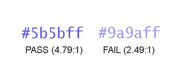
Use Sufficient Color Contrast
For regular-sized text content, be sure to choose colors that achieve at least a 4.5 to 1 contrast ratio between the text and its background. Large text (above 18pt or 14pt bold) must only achieve a more meager contrast ratio of 3 to 1. Remember that this contrast requirement also applies to images of text (which should be avoided in general, if at all possible).
Distinguish Embedded Links
Links come in two flavors, so to speak:
Those that are isolated in a section of the page that is clearly designated as navigation
Those that are embedded in other text content, like me
In the case of the latter, designers should use some type of distinguishing visual characteristic, such as an underline, to identify links in a manner that does not rely on color alone. In short, color must not be the only visual feature that calls attention to a link’s unique identity, unless that link is not surrounded by any other text content.
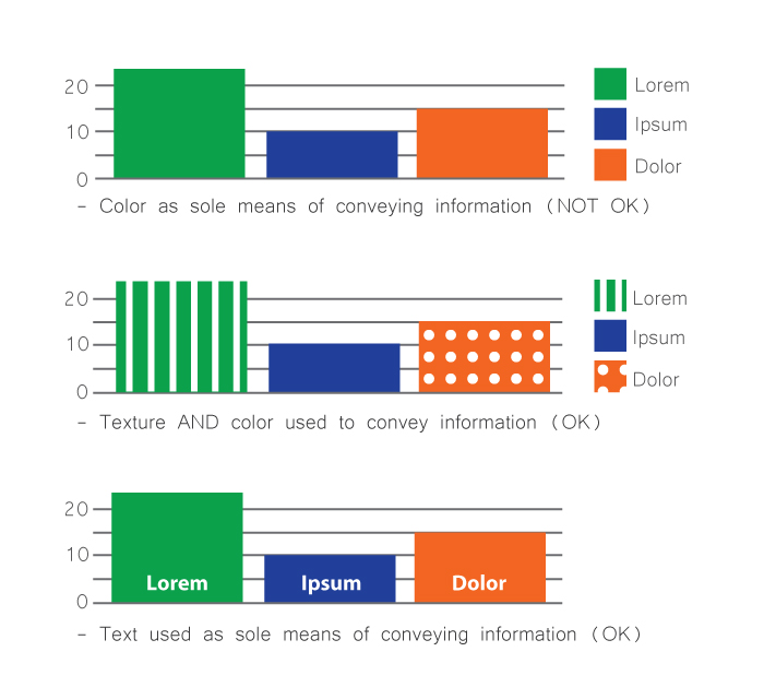
Reinforce Color As Information
When color is used to convey information, such as in a monthly earnings chart that uses a legend to assign a meaning to each color, make sure that some other means of identifying the same information is available. For instance, a combination of color and pattern could be used to distinguish the bar for “March” from the bar for “February” in an earning chart, or the names of each month could be embedded directly below (or within) the bar instead of isolated in the key.
As a reality check, as yourself: “if I was incapable of distinguishing one color from another, would I be able to understand the information being presented to me?” The answer must be “Yes.”
Don’t Hide Controls Under the Hovers
Some interactive user controls are peripheral to the main workflow and are not desired to be shown in the default page layout. It is common practice in such circumstances to hide these controls, and to show them only when the user decides that he or she needs them. This is fine; but you must design the behavior of such hiding mechanisms so that users need to take an explicit action to summon, and dismiss, the additional controls. Do not make them appear temporarily only when the user’s cursor hovers over a page area.
It is perfectly acceptable to display text content in a popup tooltip which appears when an element is hovered, or receives focus; but this type of popup is not appropriate for user interface controls. Controls that only become available when other portions of the page are hovered are notoriously difficult to reach for both keyboard-only users and people using speech recognition software.
Know Your Role
Acquire a basic understanding of the semantic roles put forth in the WAI-ARIA specification. As a designer, you shouldn’t feel required to know the ins and outs of each semantic role, but you should be able to recognize when your design contains objects that are attempting to fill multiple roles (in other words, be multiple things) all at once. Cull these objects from your design and explore ways of allowing each object in your design to serve a single specific purpose.
Other Considerations
Observe the following additional principles as well – your users will thank you.
Don’t suppress focus indication
Give isolated links self-descriptive text content (avoid link text like “more info”)
Once you’ve internalized the design principles described above and are comfortable applying them to new design solutions, it’s time to develop a technique for capturing your accessibility-related requirements for others in your organization. This is an important step that helps ensure the decisions you’ve made regarding things like reading order, keyboard interactivity, and document structure will inform the remaining stages of the development process.
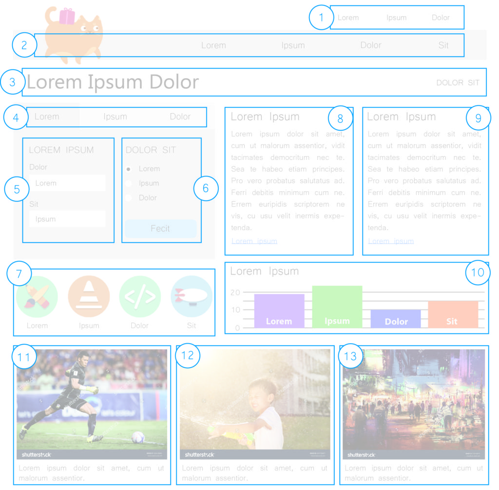
Document Structure and Semantics
The easiest way to create an artifact that captures information about document structure and semantics is to annotate your design comps with this information. This can be as simple an exercise as drawing* boxes on important structural elements, such as:
Headings
Navigation areas
Links
Buttons
Images
Page header and footer
Spending a small amount of time assigning a semantic identity to key design components will prevent a lot of confusion down the road, and will give developers the information they need to implement your design according to your vision for the users’ experience. Otherwise, you roll the dice and hope that the button you designed, used to download a PDF of this year’s product catalogue, won’t simply be implemented as a clickable <div> element that will confound users of assistive technology and will be completely unreachable by individuals using a keyboard.
*I use the term “drawing” here in the most general sense possible. You do not need to use a pen or pencil to conduct this exercise. By all means, use all the tools at your disposal to annotate your comps, including the tools you used to create the comps in the first place – e.g., Illustrator, Photoshop, Sketch, Axure, Balsamiq, etc.
Reading Order
Make a copy of your design comp and draw boxes around each area of the page, numbering them sequentially according to the order in which you intend users to read the content. Not all web content must be designed to be read as if it were a page in a book, but content that provides important context for understanding other parts of the page should be encountered in the proper order. This helps assure that users who experience your design sequentially have the requisite information to understand where they are.
Developers can use styling in a variety of ways to implement a given visual layout. As a result, it’s important to ensure that the source code of your view is arranged in an order that preserves the meaning of its content. Make note of the intended content order, and pass it on.
Image Semantics
Identify and document which images in your design are informative and which are decorative. Precise definitions of these terms are available in the WCAG specification, but a useful litmus test you can use is as follows: ask yourself if you could replace the image with a stock image without causing the essential meaning or significance of the content to be altered or diminished. If the answer is “No”, then the image is probably informative and will need an alternative text value.
Depending on the structure of your organization, it might not be your responsibility as a designer to supply alternative text for images. Regardless, it’s your prerogative to mold the user experience of the page. Deciding which images are meaningful, and which are not, is an integral part of shaping that experience.
Mouse/Keyboard Operability
Document the intended mouse and keyboard operability of each interactive component in the design. This will be a familiar exercise to many designers, who are already familiar with stipulating the intended behavior of UI components. Somewhat new, perhaps, is the notion that you need to start considering hover and focus to be equivalent modes of UI interaction. Any dynamic UI behavior that that is triggered on hover should also be triggered when the object receives focus, as in when a user presses the Tab key to arrive at the component.
Take some time to consider how keyboard-only users will interact with every aspect of your UI. If you find yourself struggling to explain how a component should work with the keyboard, it’s time to take a step back and reconsider the design of that particular component. Applying these considerations will streamline your design, improving its usability and its accessibility.
Conclusion
As user experience designers, you are in a unique position to make informed decisions about things like document structure, keyboard interactivity, and reading order, which have a huge impact on the accessibility (and therefore the usability) of the products you create. As a result, it’s imperative that you apply some basic accessibility principles to your work in the interest of achieving success in those areas. It’s equally important that you document the results of your decision-making for other groups in your organization so they too can benefit from your knowledge and guidance. I hope that the principles and techniques described above will empower you toward that end!
Matt Isneris a JavaScript Developer at Deque Systems. Matt specializes in teaching development teams to plan, test, and code for accessibility and has helped orchestrate large remediation efforts of complex enterprise applications. He is intrigued by the idea of the computer system as an expression of human neurobiology, and champions the notion that accessible web content is better understood by both humans and computers.
Matt Isner
Matt Isner is a JavaScript Developer at Deque Systems. Matt specializes in teaching development teams to plan, test, and code for accessibility and has helped orchestrate large remediation efforts of complex enterprise applications. He is intrigued by the idea of the computer system as an expression of human neurobiology, and champions the notion that accessible web content is better understood by both humans and computers.
This is a continuation of Paul J. Adam’s ongoing Accessibility Support Series, where he explains how to build accessible widgets and which screen readers they’re compatible with.
In the last post in the A11y Support Series we talked about ARIA role=”alert” Modal Dialogs. Continuing on with our series, we’re going to build another accessible ARIA widget: a simple role=”button” UI control. Then we’ll test what screen reader and browser combinations are supported when using other ARIA attributes allowed on role=”button.”( i.e. aria-expanded, aria-pressed, and aria-disabled). Although aria-haspopup can also be used on role=”button”, we’ll save that for another post on the menu button pattern.
Button, Toggle button, Expanding Button, or Menu Button
Instructions for building a proper role=”button” UI control can be found at the WAI-ARIA Authoring Practices 1.1. The Authoring Practices says that in addition to the normal button widget there are two other types of buttons, Toggle button (aria-pressed) and Menu button (aria-haspopup). This post will discuss ordinary buttons, toggle buttons, and expanding/collapsing buttons.*
Aside from stating that it’s an allowed tribute for that role, the ARIA Spec and Authoring Practices doesn’t have much information on using aria-expanded=”true/false” on a role=”button” widget that expands and collapses.,*(See the ARIA 1.1 Spec on button (role) for more information). There is also an Authoring Practices button role Example.
Why Not Just Use a Real <button>!?
Good question.There are a lot of great reasons – that I’ll cover below – , for using a native <button> or <input type=”button”> control over a custom <div role=”button”>. So why the heck would you ever use a role=”button” over a real <button>? Well, for starters:
Retrofitting accessibility into legacy website cannot change HTML tags which breaks CSS.
Absolute control over CSS appearance of your button across multiple browsers/operating systems.
Framework choice already determined and you’re stuck with DIV buttons.
It doesn’t really matter to me why you can’t use a real <button> over a <div> button, what’s more important is did you code the custom role=”button” control to work EXACTLY the same as a native <input type=”button”>? Screen reader users don’t care if you used a native <button> or an ARIA role=”button” so long as it’s accessible.
There’s an ideal way to implement accessibility in the early stages of website development, using the proper tags for the right controls. And then there’s the real world of websites that are not coded to perfection and designed with no accessibility in mind from the start. ARIA is your savior when it comes to making real-world websites accessible.
How Does a Native <button> Work, Exactly?
Usage
Buttons are used to trigger an action or event (i.e. submitting a form, opening a dialog, canceling an action, or deleting an item).
Buttons are not used to open webpages, instead use Links.
Appearance
<button> on macOS vs iOS
macOS
iOS
Buttons look different depending on in what browser and operating system they’re viewed. Inconsistent button designs do bother folks who want to maintain complete control over the appearance of their buttons in all platforms. Many usability experts recommend keeping the standard design of native buttons as they appear in that user’s device, because they already expect that look and feel. By using a custom styled button you’re deviating from the standard experience for that OS.
But if you use buttons, make sure they retain the same standard appearance so they are easy to identify.
Buttons need a fully visible keyboard focus outline so users can see them when tabbing.
NOTE: blog post and demo does not modify the CSS of the <span role=”button”> and <a href role=”button”> examples. If these demos were used in the real world you will need to style them to look like actual clickable buttons and not plain text spans or blue underlined links. The aria-expanded and aria-pressed button examples have extra styles to make them look pressed.
Keyboard Operation
Buttons operate with Enter key and Spacebar key! A common problem is that <div role=”button”> controls don’t work with the Enter AND Spacebar keys or they don’t work with the keyboard at all. They’re either skipped right over when tabbing or pressing enter, or spacebar keys have no effect because they only have a mouse-dependent onclick JavaScript event.
NOTE: When using a screen reader like NVDA or JAWS pressing the spacebar and enter key will activate onclick events on buttons. They do this because most fake buttons are not accessible. Try it with the screen reader turned off.
NOTE for Mobile: Tap events are treated like onclick events. VoiceOver can activate a fake <div onclick> button with a double tap but the user would have to guess that it’s a button to begin with because there is no role so they would only hear it as plain text. Android works like a desktop computer with a keyboard connected unlike iOS.
When a JavaScript onclick event is attached to a native <button> or <input type=”button”> the keyboard accessibility for both Enter and Spacebar keys is included for free and you don’t need a role attribute.
So just one onclick event is accessible on a <button> but that same event on a <div role=”button”> will not be accessible at all to keyboard users.
<button> vs <a href=”#”>
<button> has a button role, <a href> has a link role.
<a href=”#” role=”button”> only works with click and enter key, <button> works with spacebar also.
Focus jumps to top of page when user activates an <a href=”#”> control whereas focus stays put on a <button>.
<button> looks like a Button, <a href> looks like a Link.
If you forget the href attribute, i.e. <a onclick> then there is NO role, NO keyboard focusability, and NO enter key activation. <a> is basically the same as a <span> unless you have the href attribute.
.preventDefault() Required for ARIA role=”button” Controls
Notice that in the Live Demo where the role=”button” and <a href=”#” role=”button”> examples are missing the JavaScript .preventDefault() method when you press Enter and Spacebar keys those custom ARIA controls don’t function like a real native button. When you press Spacebar key the browser scrolls down the page just like the Page Down key functions. That’s because scrolling down the page is the default behavior of the Spacebar key, and we need to prevent that default behavior.
You’ll also notice that on the <a href=”#” role=”button”> controls when you press the Enter key or click the link/button the browser scrolls and moves focus to the top of the page. So both a <div role=”button”> and an <a href role=”button”> need JavaScript event.preventDefault();.
Native <button> or <input type=”button”> controls don’t need this extra code!
Keyboard Focusability
HTML Native Controls Focusable by Default
<button>
<a href>
<input>
Common Non-focusable Custom Fake Buttons
<span onclick>
<div onclick>
<img onclick>
<a onclick>
Span, div, and img elements are not focusable unless they have a tabindex=”0″ attribute/value applied. Tabindex=”0″ only lets the user TAB to the control but it does not let the onclick event magically work with enter and spacebar keys. You need a <button> for free keyboard accessibility.
If you want to make a <span> focusable you need to add tabindex=”0″ then add an onkeydown event in addition to the onclick to make it keyboard operable.
Keyboard Operability with JavaScript
Native <button>
To make a button keyboard operable all you need is the onclick event and it works with Enter and Spacebar keys!
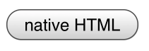
Code
<button onclick="alert('native HTML button activated')">native HTML</button>
Output
Custom ARIA <a href=”#” role=”button”>
<a href> does give you the Enter key for free with an onclick event but you still need to add an extra onkeydown event that checks for keyCode 32 (Spacebar) and if that key is pressed the default behavior (scrolling the page) is prevented and instead jQuery .toggle() method is run. This is still extra work than a <button> and our control looks like a link now not a button.
Code
<a href="#" role="button" onclick="event.preventDefault();$('#span2').toggle()" onkeydown="if(event.keyCode==32){event.preventDefault();$('#span2').toggle()};">a href role preventDefault</a>
<span> has no focusability and no accessibility role. Whereas <a href> defaults to link if you don’t add role=”button”, <span> has no default role. Add tabindex=”0″ to make the <span> focusable and role=”button” to give it a role. The onclick event will not fire on enter and spacebar keys with a <span> . That means you have to add an onkeydown event and check if the enter or spacebar keys are pressed, then prevent the default behavior for the spacebar key and run the code.
Code
<span role="button" tabindex="0" onclick="alert('custom ARIA button activated')" onkeydown="if(event.keyCode==13){alert('custom ARIA button activated with Enter key')}; if(event.keyCode==32){event.preventDefault();alert('custom ARIA button activated with spacebar key')}">custom ARIA preventDefault</span>
If your button changes context, (i.e.. loads a new view into the page of a single page app), then you should send focus to the starting point for that new page.
WAI-ARIA Roles, States, and Properties
The focusable button control must have role=”button”. An accessible label is required which is first derived from the text inside the button element. If there is no text inside the button then an aria-label or aria-labelledby attribute can be used to give the button an accessible name.
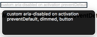
aria-disabled
If a description of the button’s function is present then aria-describedby points to the id of the description text. If the ARIA button is disabled then it must have aria-disabled=”true” applied.
VoiceOver macOS: “custom aria-disabled on activation preventDefault, dimmed, button”
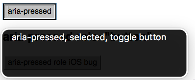
aria-pressed
If the button is a toggle button, e.g. a Bold text button, then it has an aria-pressed=”true/false” state to let the screen reader user know when the button is pressed.
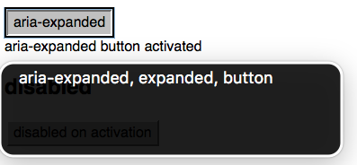
The authoring practices does not cover aria-expanded but it’s an allowed attribute on role=”button” and it is very common to see buttons that expand and collapse content used in modern websites. You could make a very simple expanding menu with just role=”button” and aria-expanded=”true/false”, the same code could be used for an accordion and a hamburger menu. You don’t necessarily have to use menu and tab roles to convey state to screen reader users when aria-expanded works well with button and link roles. aria-controls should also point to the id of the container the button expands and collapses.
Desktop screen readers have excellent support for all the ARIA attributes tested today. However, on mobile both VoiceOver iOS 10 and Android TalkBack/Chrome do not support the aria-pressed attribute unless the additional role=”button” attribute is present. The worst bug is with the latest versions of TalkBack Android/Chrome where aria-expanded has no support on role=”button”. Firefox shines on mobile Android with full support for all the attributes tested just like Firefox on desktop.
So the workaround to get almost perfect support for aria-pressed is add some extra code, role=”button”, to your <button> tag. This reminds me of writing <footer role=”contentinfo”> to make sure the footer landmark works in more screen readers.
A bug report needs to be filed with Google to get aria-expanded working in Chrome on Android.
ARIA role=”button” Support
Attribute/Value/IDref
VoiceOver macOS 10.12/Safari
NVDA Windows 7/Firefox
VoiceOver iOS 10/Safari
TalkBack Android/Chrome
TalkBack Android/Firefox
role=”button”
Yes
Yes
Yes
Yes
Yes
aria-pressed
Yes
Yes
Yes (role=”button” only)
Yes (role=”button” only)
Yes
aria-expanded
Yes
Yes
Yes
No
Yes
aria-disabled
Yes
Yes
Yes
Yes
Yes
Closing Thoughts
There’s a lot to consider when making a custom button control fully accessible with an experience equal to a native <button>. You need tabindex=0, role=button, onkeydown, .keyCode == 13, .keyCode == 32, event.preventDefault(), and extra CSS to make it look like a real button. Screen reader and keyboard-only users don’t really care if you use a real <button> or a <div role=”button”> as long as you’ve actually copied all the accessibility of a real button to your ARIA button. The reality is that most faux <div> buttons are not keyboard or screen reader accessible at all, and as a developer you’re responsible for implementing the full functionality of the control you use based on its role. So either use native buttons or mimic them completely.
Our next post will be on role=”checkbox” and creating custom fake checkboxes that fully mimic a native <input type=”checkbox”>. Thanks for reading! Feel free to leave any questions or comments below.
Paul J. Adam
Paul J. Adam is a former Accessibility Evangelist for Deque Systems. His focus is on Mobile Accessibility and Modern Web Accessibility, with expertise in Mobile Web, Native iOS & Android, Hybrid Apps, Responsive Web Design, HTML5, JavaScript, WAI-ARIA, WCAG 2.0, and Modern Web development techniques. Paul’s been a registered Apple Developer since 2011, and spends his free time creating iOS apps and learning modern JavaScript development.
At Deque, our mission is to ensure that the web is accessible to everyone. That’s why we strive to develop innovative products and services that will help pave the way towards digital inclusion.
That’s also why we created the comprehensive courses offered at Deque University – to empower people with the right tools to make digital accessibility and inclusion a reality.
A few months ago, our Director of Training Paul Bohman came up with a plan to offer scholarships to Deque University for people with disabilities. Since launch, the program has endowed over 670 applicants with scholarships, and the majority of the recipients are enrolled in two or more courses at Deque University.
It’s our hope that both our scholarship recipients and our other “students” at Deque U will use their newly acquired accessibility knowledge to gain a foothold in the industry; at the very least, we hope they’ll bring their digital accessibility skills to their current or future workplace. It may sound a bit ambitious, but we hope that these courses will have a lasting impact on the people who receive them. Knowledge is power, and it’s a huge part of our goal here at Deque – to inspire self-empowerment. With the right tools and training, anyone can become an active accessibility evangelist.
Marcy Sutton posted recently about this on her blog, Accessibility Wins. “Accessible design and development is critical for people with disabilities to be treated equally on the web,” Marcy wrote. “But it also provides job opportunities to people as developers, testers, project managers, and so on. Deque U’s scholarship provides a concrete step for people with disabilities to advance their skills and learn about accessibility as a career. That’s pretty awesome.”
We couldn’t have said it better. Recently we reached out to some of these Deque University Scholarship recipients to see how the scholarship has affected their lives. We are featuring one of those stories here, and will share others in the future.
Alex Fatum was one of our first scholarship recipients. A computer engineering major at the University of North Texas, Alex has Dyslexia and ADHD. “I have struggled my whole learning career,” he said. “ I didn’t really learn to read until the end of first grade. My parents would spend hours after school each day with me, just trying to get me to understand how to read. They taught me the skills of perseverance and determination. I learned that I can achieve anything I want, if I put in the work and have faith…Going into a computer related field, these courses will help expand my knowledge, and help me create the accessible computers of tomorrow.”
To date Alex has completed 12 courses at Deque University and is in the process of taking 3 other courses. He appreciates how thorough the courses are. Most importantly, he says, “the courses have opened my eyes to the way that software has become inaccessible for a portion of the population. The internet is a record containing almost all of human knowledge, no one should be excluded from learning any of it. Going into the future, website designers and software engineers need to be cognizant of those who have a difficulty using a computer with a classic mouse and keyboard.” With regards to his own future, Alex is hopeful that the knowledge he gains from the courses will help propel his career forward. “I hope to integrate what I have learned from the Deque courses into software I write and computer systems I build. Everyone should be able to use a computer. Nothing should limit any of us.”
We couldn’t agree more. And in keeping with that mindset, we’ll continue to post more inspirational stories like Alex’s on our blog.
If you think you might qualify for a scholarship to Deque University, check out our post on How to Apply .
Deque Systems
Deque is the global leader in digital accessibility, helping the world’s top enterprises build inclusive products, services, and experiences and achieve lasting compliance. Recognized by leading industry analysts for its AI-powered tools, comprehensive services, and developer-trusted solutions, Deque delivers the industry’s most complete accessibility offering. The Axe platform, anchored by Axe-core, has more than 3 billion downloads and 875,000 installed extensions, making it the global standard for accessibility testing. As a pioneer of people-first accessibility, Deque applies a human-in-the-loop approach that blends expert insight with AI innovation to advance its mission of digital equality for all.
The following post is the second in Caitlin Geier’s 2-part series, “Tips and Tricks for Real-Time Remote Usability Testing with Screen Readers. This post details how to implement usability testing for screen reader users with helpful advice and how-to tricks.The first post (Real-Time Remote Usability Testing with Screen Readers, Part 1: Practical Overview) serves as an introduction to remote usability testing and outlines the advantages and disadvantages, along with tips and important points for consideration.
Now that I’ve gone over the basics of remote usability testing for screen reader users, I’m going to cover the process in more detail.
Setting Up the Usability Test
In my mind, there are 4 major questions to answer when setting up a usability test:
What tasks will you ask the user to perform?
What information (if any) do they need ahead of time?
How will you observe as they perform the tasks?
How will you understand and record the way they’re using your application?
These points are relevant regardless of who you’re doing the usability testing with. You may need to make some minor adjustments to account for the different technologies your users may be using, but ultimately, you want the test to be as similar as possible for all of your users. The more alike the setup is for each user, the more likely your results will speak to the spectrum of users you’re testing with.
1. Tasks
Screen reader users (and for that matter, users with any types of disabilities) should be given the same tasks that you would give anyone else. The key to having an accessible website or application is making sure that any user – regardless of ability – can use all of the features in the application. You won’t be doing yourself any favors by giving easier tasks or customized tasks to screen reader users. If you’re concerned that a screen reader user will fail at the task you’ve given them because your application isn’t accessible enough, then let them fail. Doing this will help you understand why your application isn’t accessible, and will give you ammunition to push for accessibility fixes.
2. Communicating Ahead of Time
Most likely, screen reader users will be using their own computer and technology to access your application. If they need to have anything installed, need to be on a VPN, or need to log in to a system in order to perform the tasks in your test, give them that information ahead of time! In fact, if you’re interested to see whether operating systems, browsers, or other technology may make a difference in how people use your application, you may want to consider requesting that all of your users use their own computer to test your application. In that case, you’ll want to give the same instructions to everyone.
I always send instructions via email. And I make sure that the subject line is clear (for example, “Preparation for usability test session on Tuesday, April 8th”). That way, users can easily reference your instructions before the test. If you have any non-disclosure agreements that need to be signed by your users before the test, you can add them as attachments. If possible, make sure that agreement forms are accessible and can be digitally signed – otherwise, screen reader users may have to ask someone to help them sign the agreements.
Also, be prepared to talk your users through any setup they need to do when you meet for the test. When you send setup instructions, you’re asking your user to spend additional time on top of the actual session time. Some of your users may not be willing to take the extra time, or they may assume that all they need to do is show up for the session.
3. Observing the Tasks
If you’re testing remotely, ideally you will want to see the screen of the user you’re testing with, and perhaps also their webcam feed. There are a lot of applications out there that allow you to screenshare, often in conjunction with a conference call, but few of these are accessible. In my experience, Google Hangouts and WebEx work the best when testing with screen reader users, because the controls are accessible to screen readers. Both require new users to download and install browser plugins, and Google Hangouts requires that the user have a Google account. Whichever you choose, make sure your users are aware that some setup will be required if they haven’t used the service before. In my experience, WebEx is a bit easier to set up as a new user than Google Hangouts.
As with all guided usability tests, encourage your user to talk aloud about what they’re thinking as they go through the tasks. With screen reader users, it’s important to emphasize that they narrate what they’re doing so that you can follow along more easily. You won’t be able to follow the user’s mouse because they likely won’t be using one. You can, however, follow focus indicators. But for the most part, you will need to rely on the user to tell you where they are on the page. If they seem stuck or confused, ask them what their screen reader is telling them.
Finally, give your screen reader users extra time if they need it. Sometimes that means skipping a task or two, or skipping a few post-test questions. Sometimes it means being flexible in your scheduling and allowing for extra time at the end of a session. Or it could mean following up with your user via email or a subsequent call in order to finish the session or to ask follow-up questions.
4. Recording the Tasks
Unless I’m using meeting software with a built-in recording feature, I typically record video of sessions using Snagit, while also taking notes on paper. If you intend to record task success / failure rate and time spent, make sure you record everything consistently across users.
The Rewards are Worth the Effort!
Testing with screen reader users may sound a bit complicated at first, but once you know what to expect, it’s fairly straightforward. It can sometimes take a bit of extra planning, but in my experience, the rewards are well worth it. Most all screen reader users who volunteer to do testing with you will be pleased to explain how their screen reader works, or why they think something on your site isn’t working for them. By performing usability testing with screen reader users, you’ll have an opportunity to learn a ton about a whole subset of your users. And you’ll be taking a big step forward in helping your application become more accessible.
Caitlin Geier is a UX designer on Deque’s product team. As a UX designer, Caitlin’s work with accessible design flourished once she began working for Deque. She is passionate about understanding the users she’s designing for, and she continually strives to incorporate accessibility elements into her work in order to ensure that all users can benefit from inclusive design.
Caitlin Geier
Caitlin Geier is a UX designer at Deque. As a UX designer, Caitlin’s work with accessible design flourished once she began working for Deque. She is passionate about understanding the users she’s designing for, and she continually strives to incorporate accessibility elements into her work in order to ensure that all users can benefit from inclusive design.
 update to our free Chrome extension (Firefox coming soon), as well as updates to our open source modules axe-webdriverjs and react-axe.
 Are you going to


 Deque University for Self-Paced Web Accessibility Courses
 Another popular accessibility tool/accessibility fixer that came along after Bobby and Cynthia Says were the original HiSoftware tools AccVerify and AccRepair. The latter of the tools, AccRepair, was the desktop testing tool that could be used by developers during their production phase (similar to Deque’s WorldSpace Assure). AccVerify, on the other hand, was the server-based, compliance monitoring tool (similar to WorldSpace Comply). Interestingly, the “rules engine” that was AccVerify was also ported to the web-based evaluation tool Cynthia Says. John shared his experience with the tools: “I personally first started using [AccVerify] back in around 2003, in part because not only did it have a robust reporting engine, but the tool had been built in such a way as to allow for additional Quality Assurance checks to be run at the same time as the accessibility check was performed. This interested both myself and my former business partner at the time, as we were chasing


 Alex Fatum was one of our first scholarship recipients. A computer engineering major at the University of North Texas, Alex has Dyslexia and ADHD. “I have struggled my whole learning career,” he said. “ I didn’t really learn to read until the end of first grade. My parents would spend hours after school each day with me, just trying to get me to understand how to read. They taught me the skills of perseverance and determination. I learned that I can achieve anything I want, if I put in the work and have faith…Going into a computer related field, these courses will help expand my knowledge, and help me create the accessible computers of tomorrow.”
