Digital accessibility matters across industries, but it especially matters for insurance companies that provide essential services related to people’s health and finances. For one, insurance companies’ central goal is to care for customers’ medical and financial needs; failure to accommodate customers of all abilities online would be antithetical to these companies’ core values. 

But beyond doing the right thing, developing digital platforms without accessibility in mind ostracizes a massive consumer market, considering approximately 1 in 4 adults in the US has some type of disability. Moreover, applying for life insurance can already be more challenging and stressful for people with disabilities, beyond digital accessibility hurdles. 

We spoke with three insurance companies, all with unique motivations and commitments to leveling up their accessibility standards. Below, accessibility professionals from Providence Health and Services, Puritan Life, and USAA share the strategies that were most effective in developing their accessibility practice and setting them up for success.  

Accessibility starts with automation

Each organization’s accessibility journey was sparked by an initial urge to automate its development processes. To grow their business, Providence acquired smaller health groups over the years. As a result, their now-massive organization spans regions, bringing together many disparate dev teams, each of which was handling accessibility in different ways. To streamline all the development teams within the organization, the corporate team at Providence sought to increase automation across the board. Doing so exposed the roundabout ways many teams were approaching accessibility, if at all. 

For Puritan Life, their small team worked to automate accessibility prior to the launch of their new, direct-to-consumer product, Canvas. Their two-person dev team recognized that they needed the right accessibility tools to help them save time, effort and resources– otherwise, accessibility would fall to the back burner and jeopardize the user experience. Without additional accessibility-specific experts or resources, they needed a solution that was easy to implement and could get them started and up-to-speed on a deadline. 

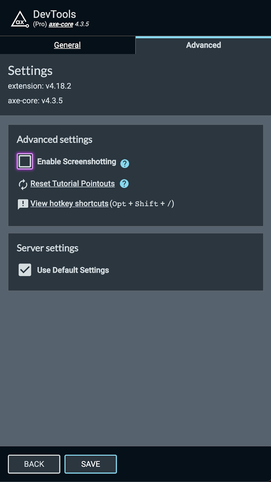
Meanwhile, at USAA, the development team was already eager to implement greater accessibility but was resistant to leveraging automation to help them do it. Many developers were only willing to integrate automation if it was guaranteed to be easy, quick and reliable. Luckily, their dev teams quickly recognized the virtues of creating accessible experiences, so very little convincing was needed once they saw that robust automation solutions existed. Bryan Osterkamp, Technical Architect Principal at USAA, who teaches a class on testing, uses browser extension automated solutions to demonstrate how accessibility can be made simpler through automation. “In class, we pull up a webpage and run browser extension tools to find accessibility issues. Newly hired developers and testers go through the findings and discuss not only what the issues are, but also how those impact the end-user and oftentimes how easy it is to fix it,” he explains. “This shows them that accessibility testing doesn’t have to be hard or complex and some of it can be easily automated.”

Integrating accessibility early and often

One major misconception about accessibility presides over the development community and business leaders alike: it takes up time and money. But what’s missed in this calculation is an even greater amount of time and resources that are needed to fix accessibility problems further down the road. Or, worse still, the time and resources required to deal with lawsuits if digital platforms don’t meet compliance standards. Recognizing this need, developers at Providence and Puritan partnered with Deque Systems to begin to weave accessibility throughout the development pipeline. 

To bake accessibility into their development processes from start to finish, each organization deployed axe DevTools® to incorporate checks throughout their pipelines. “Integrating accessibility into the pipeline as soon as our team is engaged in the project, that’s where I think we’re going to get the most bang for our buck,” said Jeff Cato, Quality Assurance Test Manager at Providence. “Deque had the best mix of automated and manual testing to make sure we avoided issues down the road,” continued Cato.

Cato shared that Providence’s Health Plan group was the first to weld accessibility into their pipeline for HTML development. The team incorporated testing into the redesign of their website just in time for the general health plan open enrollment, as well as their Medicare open enrollment. Practicing accessibility here was critical, as the Health Plan group delivers the most external-facing content, making it the riskiest and customer-impacting if they don’t meet accessibility standards. At the same time, the speed of delivery could not be compromised to meet the enrollment opening. 

The development team isn’t the only place where testing for accessibility makes an impact. Creating a culture of accessibility across the many teams that contribute to digital efforts limits the likelihood of future accessibility issues. For the team at Puritan, a newfound awareness of accessibility concepts like color contrast are now an important consideration for future decision-making, such as with design and branding. Working with Deque helped Puritan to identify key accessibility issues, such as brand colors, and create strategic solutions that improve the user experience, like a dark-mode switch. “It was important to us to be able to bake accessibility into our software lifecycle and get it into our process moving forward,” notes Megan Duty, Vice President of Technology and Project Delivery at Puritan Life.

Closing the accessibility education gap

Education on accessibility is a huge piece of the puzzle, whether it’s getting executive buy-in to invest in accessibility tools or empowering developers to put accessibility into practice. However, few developers are trained in accessibility. “It’s just not part of the typical curriculum. Most coursework teaches developers to code and the thought process behind it, no extras,” said John Meister, Application Development Manager at Puritan Life. 

To fill this gap, accessibility champions at Providence worked from the top-down, sharing the knowledge they had learned from Deque University with executives around the potential legal fallout they could face if noncompliant. The team also shared how early detection of accessibility issues saves time and money, with automation tools from Deque now able to catch 76-84% defects out of the box.

To nurture their team’s growing passion for accessibility, USAA implemented an Accessibility Champions network, which encourages employees to explore screen readers and other accommodations first-hand or to connect with people who benefit from digital accessibility. Knowledge sharing can foster the empathy capable of translating accessibility from a development chore to an opportunity for innovation. “Our goal is to help our employees understand what it really means for a member or employee that can’t access something because it is inaccessible,” says Bryan Osterkamp. “One way we foster a culture of empathy is by allowing our employees to use assistive technology tools and understand how they work. We try to put ourselves in the shoes of our members and employees that use assistive technology every day to help demonstrate how important it is to provide accessible experiences.”

At Puritan, their big accessibility project that launched the Canvas site helped kickstart the future of accessibility within the organization, setting the precedent for proactive, sustainable accessibility across teams and business units. “At a high level, people are starting to learn about accessibility internally,” explains Meister. “This attention has started to bring accessibility initiatives to other areas of the business.”

No news is good news

Like many efforts in the development world, sometimes the best way to know if you’re doing a good job is when you aren’t hearing feedback– as most people only reach out when experiencing problems– which all three companies reported. Users want and often expect good experiences on the web, especially for something as important as health care and insurance. A frictionless experience puts trust in the organization and its brand. 

Organizations benefit tremendously from increased education on accessibility and access to tools that seamlessly weave testing throughout the development pipeline. Not only can businesses save time and resources, but they can also deliver a better digital insurance experience and weave accessibility into their culture. Access benefits everyone, from customers to fellow employees, and the industry, as fellow insurers challenge each other to be the best they can be for all

Grace Kirkley

Grace Kirkley

Grace is a Customer Marketing Analyst at Deque Systems. Empathy-driven, Grace strives to make the customer experience meaningful and engaging.

While many of us were getting ready for the 2021 holidays, governments throughout Europe were racing to put the final touches on the first reports for the EU’s Web Accessibility Directive. Under the EU Web Accessibility Directive issued in October 2016, all government agencies throughout the EU were required to ensure their websites and apps are accessible to people with disabilities by June 2021.

Every country in the EU has to monitor the accessibility of its digital assets annually and report its findings to the EU every three years. December 23rd, 2021 was the end of the first reporting period. My colleagues and I in the Deque’s European office have been reading the reports as they become available, and some interesting trends are starting to emerge.

European Government Websites Not Fully Accessible

All 27 EU members conducted research. The United Kingdom produced a report as well, though there was no formal obligation to the EU. The UK ceased to be a member state of the European Union on the 31st of January 2020.

Out of the more than 800 in-depth website audits that were done during the monitor, only four (4) were reported to be fully accessible (i.e. fully complying with EN 301 549 and WCAG 2.1 Level A + AA). Mobile applications turned out slightly better, with eight (8) out of 286 tested apps being fully accessible.

That’s not to say web accessibility is in a terrible state across Europe. Having a fully accessible website is sort of like having a dust-free house. If you work hard at it, it is something you might achieve, but keeping it that way is almost impossible. The real question is how common and how substantial the accessibility problems are. This is difficult to say, as there is no standard way to measure this. The EU does not prescribe any particular metric, and so quite a few countries didn’t try to quantify their findings. Unfortunately, this means that in the next report, it will be difficult to judge if web accessibility in those countries improved over time.

Kudos to the countries that did attempt to quantify their findings. While we can’t make direct comparisons between countries because they don’t use the same metrics, three years from now when they report again, we will be able to see to what extent accessibility has improved across the board. One example that is public is www.toegankelijkheidsverklaring.nl, a register of Dutch Government websites, ranked A to E.

Accessibility Statements Are On The Rise

Perhaps a little more telling are the accessibility statements that the Web Accessibility Directive requires. An accessibility statement is a web page that includes information on the current state of accessibility for that website. Every EU government website and app is required to publish a public and easy to locate accessibility statement. This statement must also include information on how someone can report accessibility issues.

Of the 25 monitoring reports, we found that 13 countries reported how many accessibility statements they found when sampling government agency websites within a given country. The differences here are stark, ranging from as high as 96% to as low as 12%, with an average of around 50%. This suggests a significant difference in awareness of accessibility requirements in different countries. The countries reporting the highest levels of accessibility statements are the following:

  1. Denmark (96%)
  2. United Kingdom (90%)
  3. Netherlands (78%)
  4. Slovakia (54%)
  5. Austria (54%)

It should be mentioned that the way this percentage is measured varies. Mostly, these percentages come from checking how many monitored websites had an accessibility statement. However, which websites get monitored is not truly random. Instead, the monitored websites have to strike a balance between organizations of different sizes and regions and prioritize websites that people with disabilities deem most important. In some cases, the list of websites used for monitoring is in part based on an index of websites with an accessibility statement.

Consistent Test Results

One thing EU countries seem to love to do is to report how common certain accessibility problems are. This is something Deque reported on when studying how many accessibility issues can be tested automatically (the answer is 57%). This gives some interesting insights into how varied accessibility testing can be, even using the same accessibility standard. Some key findings:

  1. The European standard EN 301 549 (v2.1.2) includes a good number of accessibility requirements that are not part of the Web Content Accessibility Guidelines (WCAG). For example, section 11.7 requires apps to support user preferences configurable through the operating system. It is therefore notable that more than half of the countries did not consider the additional EN requirements in their monitoring efforts.
  2. While several countries list WCAG Success Criterion 4.1.1: Parsing as the most common accessibility problem, others don’t even have it in their top 10. This is not because some countries do this significantly better than others, but because they test in different ways. While it’s a good thing that countries like Denmark, France, and Sweden have a test methodology, inconsistencies between them creates problems for organizations that provide services in multiple EU countries.
  3. There is a surprising diversity of accessibility test tools in use in this EU monitor, with almost 50 different tools. This speaks to the broad diversity and availability of accessibility testing tools. It is encouraging to see quite a few of those tools support Accessibility Conformance Test Rules, an effort largely funded by the EU to encourage consistent and high-quality accessibility testing. Of the simplified monitoring done, 60% of the tools used were based on WCAG Test Rules.

Other Highlights

United Kingdom: Many things look great in this report, and if you plan to read any at all, we would suggest you read this report published by the UK government. What we loved was how the UK communicated their results and retested the sites 3 months later to see how much they had progressed. This showed that sharing these results greatly improved these sites. Many EU countries did not appear to have shared their findings with the monitored organizations. We hope the UK convinces them to do differently. We can only applaud the UK for setting a strong example as a former EU member. 

Ireland: The Irish report included qualitative summaries for each in-depth audit they did, which they shared with the organizations whose websites and apps were monitored. These summaries give insight that is hard to gauge from the perspective of other countries. Several countries noted in their report that just sharing raw results with organizations led to a lot of questions. An approach similar to the Irish could help address this.

Netherlands: The Dutch did something unique: require accessibility reports and plans for improvement to be included in the accessibility statements. This gives insight into what efforts organizations have taken. The Dutch government created a compliance level A through E– A being fully conforming to EN 301 549, B is non-conforming but with clear knowledge of what is left to address and plans to remediate it, all the way through E meaning no information at all. However, the monitor found that almost all sites with compliance level A still had some accessibility issues.

Cyprus, France, and Portugal: These countries are somewhat late in publishing their reports, so their results were not used for this post. This post may be republished once these reports are available.

Final Thoughts

The intent of monitoring the web accessibility directive isn’t to compare accessibility between different countries. However, the lack of consistency does also make it difficult to figure out what approaches are successful and which ones are not. For example, Finland held a large-scale media campaign to promote awareness of inclusion and accessibility. It would be great to know if their campaign was effective, or if that kind of effort is better spent in, for example, creating free training courses as Croatia did.

Setting up EU-wide monitoring of government web accessibility is a great step forward for establishing digital accessibility as a standard across Europe. There is much that can be learned from this first reporting period. As always, there is room for improvement. The need for standard metrics in accessibility, for example, is a common limitation of the current standards, which the upcoming WCAG 3.0 may address. The next reporting period for the EU ends in December 2024, although we hope monitoring agencies will consider publishing preliminary results annually.

If you’d like to learn more, the EU has collected all reports, including an automated English translation. Our own research was done with automated translations, which does have its limitations.

Wilco Fiers

Wilco Fiers

Wilco is the principal product owner of axe-core and axe DevTools at Deque Systems. He is based in the Netherlands and has worked in accessibility for over 18 years. During this time, Wilco has worked in auditing, consulting, standards authoring, and accessibility tool development. Notable work includes being project manager of WCAG 3, founding chair of ACT Rules Community, lead developer of axe Linter and WCAG-EM report tool, and industry advisor to the EU's Web Accessibility Directive Expert Group.

As a developer, you are considered the last line of defense between your application’s impact, and the end-user. Implementing and understanding best practices is a part of your job. If your code was knowingly unusable by 15% of your audience, would you or your leadership accept that? What if it meant boosting the application’s one billion a year revenue by one hundred fifty million?

I want to introduce myself and my journey into mobile accessibility. My name is Kim Arnett and I joined Deque in the summer of 2021 as the Native Mobile Team Lead. It meant a lot to me to transition my career into something that would have more meaning and a greater impact — such as ensuring your applications are accessible to everyone. My journey into iOS development came out of passion, finding what I enjoyed doing while earning my degree and interning. I truly enjoyed the Apple ecosystem, the products, the community, and enjoyed the challenges of mobile development. It took a few years into my career to even learn what accessibility was.

My first encounter was when a team lead brought in a switch control to work one day. He was building a talk on making Android apps accessible and gave me a quick intro to what mobile accessibility was about.  From there – I started poking around the internet, but there wasn’t a whole lot of information out there.  I learned about Deque and the work they were doing in the webspace, but as far as mobile went, it seemed like uncharted territory for the time. There were mentions of `accessiblityLabel`s, `accessibilityIdentifer`s for iOS.. some mentions of voice over, but those words meant nothing to me.  As a few more years went by I eventually learned that `accessiblityLabel` was used on an element for the screen reader to speak to the end-user. I then learned that `accessibilityIdentifer` was mainly for navigating the hierarchy of a view for testing. That was about the extent of my knowledge, but I treated it like the source of truth for many years. Probably misusing it and creating more harm than good, but that leads me to my next adventure.

Eventually, I was fortunate enough to work on an application that shipped worldwide. Within the company was an accessibility team that would occasionally run audits on all our products and file bugs for production accessibility violations.  I didn’t learn about them right away, but once a quarter tickets floated in our backlog around accessibility and I was intrigued. Through these bugs, I was able to find a channel where I could ask that team questions, I could learn more about how they came to the conclusion of the issue, and how I could help fix these issues going forward. It helped immensely with my understanding and helped paint a picture of a world that I had not truly been exposed to before.  The “aha!” moment I had around mobile accessibility came on Global Accessibility Awareness Day (GAAD). A competition was held between team members (iOS and Android) of who could use their respective app, (keep in mind we’ve been building on this app, some of the team for years), blindfolded and achieve a certain set of goals that were identical for each person. It was a timed event, and I must admit the task itself was the main use case of our app. What I didn’t expect is how difficult it would be when relying on assistive technologies.  Only a handful of developers were able to achieve all the milestones, but all of us came out of the experience with a “wow, we have to do better” attitude.

I really took that experience to heart – for every feature I built and shipped, I ran it through a screen reader to determine what the experience was like when relying on assistive technologies. When the extra time came up, I’d go back and fix other areas of the app my team owned to ensure each swipe was intentional, each element had the context necessary that anyone would be able to achieve what they were trying to do.  Looking back and after getting more introspect into the accessibility world with Deque, did I have a clue what I was doing? No. No, I did not. However, I was on the right track, and anything I did made the experience better than the day before which was a win for each of our customers.

I’d like to challenge your team to try the same exercise listed above on your application. Can you get through the primary use case while relying on assistive technologies? Can you do it blindfolded or with headphones on? Can you do it with only touching a switch control? How difficult was it? Would you come back and do business with that app again? Were you even able to achieve what you were trying to do? Through an exercise like this, you’ll learn firsthand why you, a mobile developer, should care about accessibility in your application.

Thanks to Deque, our mobile team, a team of accessibility experts, and amazing tools – you don’t have to know everything about accessibility. You just have to care — we’re here to help you with the rest.

Kim Arnett

Kim Arnett

Kim is the Mobile Team Lead at Deque with a background in iOS development. She cares about diversity, inclusion, accessibility and making tech a better home for all. In her spare time she collects plants and dogs, and enjoys activities in nature such as hiking and kayaking.

After receiving numerous feature requests relating to exporting an entire saved test and all of its issues, we are excited to ship that very feature in the axe DevTools v4.21 extension release!

Updates to Export Feature

Prior to v4.21, users could export issues for a single automated scan or saved test, which facilitates importing those issues into your issue tracking systems. Now, in addition to the issue export, Pro users can also export data for their entire saved test in JSON format.

This export will allow you to see the full picture for all of your automated and guided testing, which is especially useful for users working at organizations who need to keep thorough accessibility testing records.

How to Export a Saved Test

To export a saved test, simply:

1.) Navigate to any saved test and click “EXPORT”

Screenshot he axe DevTools browser extension highlighting the "EXPORT" button.

2.) Select “Saved test and issues” and then click “EXPORT”

Screenshot of the Export modal in the axe DevTools extension highlighting the new option for Pro users to export "Saved test and issues".

Watch this quick demo video to see what the Export feature can do for axe DevTools Pro users.

Saved Test JSON Export Data

The saved test and issues JSON export consists of the following:

Property name Description
allIssues An array of issue data containing the following properties:

  • created_at (date/time the issue was created)
  • description (description of issue)
  • found_by (email of user who found the issue)
  • help (additional information about the issue)
  • help_url (URL of associated accessibility rule page)
  • id (the id of the issue)
  • impact (the impact/severity of the issue)
  • is_manual (whether or not the issue was found in an Intelligent Guided Test™(IGT))
  • manifest_guide (the IGT in which the issue was raised)
  • manifest_id (the id of the IGT manifest)
  • needs_review (whether or not the issue needs review)
  • related_nodes (any nodes related to the issue)
  • remediation (information on how to remediate the issue)
  • rule (the identifier for the accessibility rule which failed)
  • screenshot_id (the id of the issue screenshot)
  • selector (the unique selector for the issue’s element)
  • shared_with (who the issue is shared with. Value will be null if issue has not been shared, and will be ‘anyone’ if shared)
  • source (the HTML source code for the issue’s element)
  • summary (a summary of the issue)
  • tags (an array of the issue’s tags. It contains information pertaining to associated wcag levels, categories, and best practices)
  • test_id (the id of the saved test which the issue belongs to)
  • test_name (the name of the saved test which the issue belongs to)
  • updated_at (when the saved test was last updated)
  • user_id (the id of the user who saved the test)
  • variant (the type of issue – “violation” or “best-practice”)
axeVersion The version of axe-core used for the saved test.
bestPracticesEnabled If best practices were enabled at the time of export.
extensionVersion The version of the extension at the time of export.
failedRules An array of failed accessibility rule objects containing the following properties:

  • name (the name of the accessibility rule)
  • count (how many times the given issue was raised in saved test)
  • mode (how the issue was found – “automated” or “manual”)
igtSummary An array containing a breakdown of each Intelligent Guided Test™ (IGT) containing the following properties:

  • name (the name of the IGT)
  • relevantNodesFound (whether or not relevant elements were found within the page or scope)
  • run (whether or not the IGT was run)
  • skipped (whether or not the tool was skipped)
  • tool (the type of IGT – e.g. “Keyboard”)
issueSummary A breakdown of issue severity counts:

  • bestPractices
  • critical
  • minor
  • moderate
  • needsReview
  • serious
needsReview An array of needs review issues containing the following properties:

  • name (the name of the accessibility rule)
  • count (the number of times the issue type has been raised within given saved test)
  • mode (how the issue was found – “automated” or “manual”)
standard The WCAG standard set at the time of export.
testingEndDate The date/time that automated or Intelligent Guided Testing last occurred.
testingStartDate The date/time that the first automated test was performed for the saved test.
url The URL which the automated scan was run on.

Conclusion

Along with minor bug fixes, axe DevTools v4.21 enables Pro users to export the data for an entire saved test. We would like to thank our users for giving us the great feedback that led to this feature addition!

If you’re not currently using axe DevTools Pro, you can try it free (no payment needed).

Harris Schneiderman

Harris Schneiderman

Harris Schneiderman is a web developer with a strong passion for digital equality. He works at Deque Systems as the Senior Product Manager of axe DevTools building awesome web applications. He wrote Cauldron (Deque's pattern library), Dragon Drop, and is the lead developer on axe DevTools Pro. When he is not at work, he still finds time to contribute to numerous open source projects.

Further demonstrating its commitment to the disability community, Deque Systems expands axe DevTools Mobile to Apple’s SwiftUI framework, delivering the most comprehensive mobile support in the industry.

HERNDON, VA – December 16, 2021 – Deque Systems, a leading software company specializing in digital accessibility, today announced their axe DevTools Mobile now offers the most extensive mobile testing capability in the industry. Supporting Apple and Android ecosystems, axe DevTools Mobile enables developers and application owners to integrate accessibility into their entire native mobile development ecosystem. Amid the holiday season, this integration comes at a particularly impactful time for today’s e-commerce environment, creating a more inclusive mobile environment.

In 2021 alone, $2.4 trillion of global e-commerce revenue came from mobile devices. And, with people with disabilities, their friends and families accounting for 73% of consumers, that’s $1.8 trillion in revenue potentially at risk if mobile apps aren’t accessible. By shifting left, Deque’s enhancements of axe DevTools in SwiftUI integrate accessibility into mobile development processes, which streamlines accessibility testing.

“Mobile accessibility matters” explains Preety Kumar, founder and CEO at Deque Systems. “The potential for lost revenue is enormous and growing every year. And, with mobile technology becoming critical for industries from retail and business to financial services and healthcare, accessibility has become a core business issue in almost every industry. Our customers’ bottom lines depend on it. Online shopping has ratcheted up significantly this holiday season and it’s only going to grow from here. With the extended disability community touching so much of this spend, embracing accessibility is essential for driving revenue and winning brand loyalty.”

Axe DevTools Mobile helps organizations prioritize accessibility testing, even when faced with the need to deliver across multiple fast changing platforms. Deque’s significant and continuous investment into mobile accessibility testing reflects its commitment to furthering native accessibility. The company also provides comprehensive testing services and training to enable customer success anywhere on their accessibility journey.

Currently, axe DevTools Mobile tests Apple apps written in Swift or Objective C, supporting both UIKit and SwiftUI, and Android apps written in Kotlin and Java. The tool will be adding support for Android apps written in JetPack Compose in Q1 2022.

About Deque Systems

Deque (pronounced dee-cue) is a web accessibility software and services company, and our mission is Digital Equality. We believe everyone, regardless of their ability, should have equal access to the information, services, applications, and everything else on the web. We work with enterprise-level businesses and organizations to ensure that their sites and mobile apps are accessible. Installed in over 250,000 browsers and with over 4,000 audit projects completed, Deque is the industry standard.

News Media Contacts

At Deque:
Ryan Bateman, +1-703-225-0380, marketing@deque.com

At Deque Europe:
Ron Beenen, +31 6 28 26 78 54, ron.beenen@deque.com

Deque Systems

Deque Systems

Deque is the global leader in digital accessibility, helping the world’s top enterprises build inclusive products, services, and experiences and achieve lasting compliance. Recognized by leading industry analysts for its AI-powered tools, comprehensive services, and developer-trusted solutions, Deque delivers the industry’s most complete accessibility offering. The Axe platform, anchored by Axe-core, has more than 3 billion downloads and 875,000 installed extensions, making it the global standard for accessibility testing. As a pioneer of people-first accessibility, Deque applies a human-in-the-loop approach that blends expert insight with AI innovation to advance its mission of digital equality for all.

There are some awesome updates included in the 4.19.0 axe DevTools browser extension.

The primary focus of this release is issue screenshotting. When Pro users are sharing issues found with automated analysis or one of our Intelligent Guided Tests™ (IGTs), the extension now captures and stores a screenshot of the element in question to provide context and insight into the issue!

In addition, version 4.19 will ship some important bug fixes and an upgrade to axe-core version 4.3.5.

Introducing Issue Screenshots

Highlighting an accessibility issue is a great way to view the associated HTML element within the context of the whole page, but what if you want to save an issue and come back to it later? What if you want to share that same insightful context with someone else on your team? With our new issue screenshotting functionality you can!

Anytime you run an automated scan or an IGT, the axe DevTools browser extension will automatically capture a screenshot of the issue for you. For automated issues, it captures the full page and highlights the element within that page. For IGT issues, it takes a screenshot of just the issue’s element. When you share an issue, the associated screenshot will be included.

Watch a quick demo video to learn more about this new functionality.

Managing Your Data

To support this new feature, our extension captures and stores additional data (the screenshot) as you would expect. The screenshot is only visible in the context of your shared issue and we will never share any of your data with anyone for any reason.

Opting Out of Screenshots

While we don’t recommend opting out of screenshots, if you are not comfortable with this feature, you can disable it in the settings view. However, doing so will turn off all screenshotting including our IGT machine learning optimizations, which save you tons of time.

To disable all screenshotting:

  • Click the options menu in the top-right corner of the axe DevTools Extension
  • Select “Settings”
  • Click “Advanced”
  • Uncheck the “Enable Screenshotting” checkbox
  • Click “SAVE”.

Screenshot of the Advanced Setting option where you can Enable/Disable Screenshotting functionality in the axe DevTools

On-premises/Private Cloud Configuration

If you have an on-premises instance of the axe DevTools server, the screenshot feature will need to be installed and enabled. Please contact helpdesk@deque.com if you would like this great new feature enabled.

Conclusion

As always, it’s our mission to make accessibility testing easier and more efficient for all. You and your teammates will surely appreciate the context provided by this brand new issue screenshot functionality. Enjoy the new and improved shared issue view and happy a11y testing!

Remember, if you’re not currently using axe DevTools Pro, you can try it free (no payment needed).

Harris Schneiderman

Harris Schneiderman

Harris Schneiderman is a web developer with a strong passion for digital equality. He works at Deque Systems as the Senior Product Manager of axe DevTools building awesome web applications. He wrote Cauldron (Deque's pattern library), Dragon Drop, and is the lead developer on axe DevTools Pro. When he is not at work, he still finds time to contribute to numerous open source projects.

Increase Contrast is an accessibility feature available in iOS that allows users to increase the contrast of all text and controls across their entire device.  Even if your app is WCAG compliant, some users may benefit from having controls and other elements stand out in your app.  In this blog post, I will cover:

  • how to check if your app responds to Increase Contrast
  • the various ways to support Increase Contrast
  • how Dark Mode is affected
  • some best practices for supporting Increase Contrast

If you would like, follow along with an app I made for this blog post!

WCAG Compliance

One disclaimer before we get started: Supporting Increase Contrast does not make your app WCAG compliant. This blog post is purely about supporting a great feature in iOS that can help users feel more comfortable with using your app. You can learn more about testing Color Contrast in mobile apps here.

Increase Contrast

Before digging right in, you may want to first check which components in your app already respond to Increase Contrast.  To try it, go to Settings > Accessibility > Display & Text Size, and select “Increase Contrast.” When enabled, you may notice in Settings that text immediately becomes darker, each individual cell becomes more defined, and each control appears darker, including the back button.  This is the behavior you want in your app.

Display & Test Size setting default state Display & Test Size setting with Increase Contrast enabled
Default Increase Contrast On

How to Support Increase Contrast

There are four different ways to support Increase Contrast.  The way you choose to support it depends on how color is already incorporated into your app, and whether you have a specific color palette in mind.

Using Default Colors

The easiest way to support Increase Contrast is to simply use the default color scheme.  All controls and text become darker when Increase Contrast is enabled.

Increase Contrast On Default color contrast
Default Increase Contrast On

Using System Colors

If you want to branch out of the default colors, another option is to use “System colors.”  System colors automatically adapt to Dark Mode and accessibility settings (such as Increase Contrast).  You can learn more about System colors in Apple’s Human Interface Guidelines.  In this example, I used the “Label” color for the text color, System Indigo for the button and slider tint colors, and System Orange for the Switch’s tint color.  I also used System Gray 6 as a background color.


Default system colors System colors with Increase Contrast On
Default Increase Contrast On

Using Colors in Assets

If you have specific design requirements, you may have your colors defined as a Color Set in an xcassets folder.  To allow these colors to support Increase Contrast, simply select the “High Contrast” option under “Appearances,” then, you can adjust the color for High Contrast.

Color Set in the xcassets folder

In the following screenshots, you can see how the “Switch Tint” and “Tint” colors are defined in my assets and how they look within my app.  You may also notice how the “Background” colors (above) do not look drastically different in the Color Set, but in the app, there’s a huge difference!

Switch Tint examples comparing normal and high contrast

Tint options comparing normal and high contrast

Default background in grey Increased contrast background in white
Default Increase Contrast On

Using Coded Colors

If your colors are defined in code, you have two options: you can either respond to the UIAccessibility.darkerSystemColorsStatusDidChange notification, or you can override traitCollectionDidChange.

Notification Listener

If you would prefer to listen for the UIAccessibility.darkerSystemColorsStatusDidChange notification, add an observer in an initializer (or in viewDidLoad on a ViewController):

NotificationCenter.default.addObserver(self,
                                       selector: #selector(updateColors),
                                       name:
UIAccessibility.darkerSystemColorsStatusDidChangeNotification,
                                       object: nil)

Then, in your “updateColors” function, change colors based on whether the property is enabled:

@objc
private func updateColors() {
    if UIAccessibility.isDarkerSystemColorsEnabled {
      label.textColor = UIColor.black
    } else {
      label.textColor = UIColor(white: 0.9, alpha: 1.0)
    }
}

In my app, instead of changing a color, I used this notification listener to add a border around each control and its associated label.

Override TraitCollectionDidChange

If you would prefer to override the TraitCollectionDidChange function, use the “accessibilityContrast” property in traitCollection to update colors based on whether Increase Contrast is enabled:

override func traitCollectionDidChange(_ previousTraitCollection: UITraitCollection?) {

super.traitCollectionDidChange(previousTraitCollection)

   // Increase Contrast disabled
   if traitCollection.accessibilityContrast != .high {
      self.label.textColor = .brown
   }

   // Increase Contrast enabled
   } else {
      self.label.textColor = .darkText
   }
}

What about Dark Mode

There may be some users who want increased contrast, even on Dark Mode.  This means that if your app supports Dark Mode, it will have to support Increase Contrast on Dark Mode too!

Display & Test Size setting default state in dark mode Display & Test Size setting high contrast state in dark mode
Increase Contrast Off, Dark Mode On Increase Contrast and Dark Mode On

Luckily, default and system colors already support Dark Mode with Increase Contrast enabled.  With custom colors, however, you may need to adjust your Color assets for the “High Contrast” setting (notice that “Dark Appearance with High Contrast” is its own color):

Switch tint options with dark mode enabled

If you have your colors defined in code, the easiest way to support both is by overriding traitCollectionDidChange. Here’s an example of how this can be done:

override func traitCollectionDidChange(_ previousTraitCollection: UITraitCollection?) {

   super.traitCollectionDidChange(previousTraitCollection)

   let darkModeIsEnabled = traitCollection.userInterfaceStyle == .dark

   // Increase Contrast disabled
   if traitCollection.accessibilityContrast != .high {

      if darkModeIsEnabled {
         self.label.textColor = .lightGray
      } else {
         self.label.textColor = .brown
      }

   // Increase Contrast enabled
   } else {
      if darkModeIsEnabled {
         self.label.textColor = .lightText
      } else {
         self.label.textColor = .darkText
      }
   }
}

How to Support Best Practices with Increase Contrast

Now we’ve covered all the different ways that you can support Increase Contrast in your app.  Does this mean that literally every single color in your app should respond to this accessibility setting? The short answer is “No.”

In general, I would recommend having text colors, tint colors, and any “accent” colors respond to Increase Contrast. For example, in Settings, as we saw at the beginning of this post, the background color of a TableView changes to a darker color, but TableViewCells keep the same background color. The visual divider between each TableViewCell changes to a darker color too.  This is to make it easier for users to distinguish what is a cell (and therefore tappable) and what is not.

For the colors that will end up supporting Increase Contrast, make sure that they do, in fact, increase the contrast. Ensure also that the added colors are not distracting. As always, follow Apple’s Human Interface Guidelines on how to best incorporate color into your app.

Final Thoughts

However you end up supporting Increase Contrast, do what is best for your users! Supporting this accessibility setting may be simple, but it can make a world of difference.

Jennifer Korth

Jennifer Korth

Jennifer Korth is a software engineer who has been working in iOS accessibility at Deque since 2015. While Deque was her introduction to accessibility, one of her projects before graduating from the University of Michigan in 2017 was working closely with C.S. Mott Children’s Hospital to create an accessible, stress-relieving Hololens application for children undergoing cancer treatments and other procedures. In her free time, she loves playing video games with friends, knitting, and having board game nights with her family.

All modern web browsers have built-in developer tools that are essential for web development. By now you’ve also likely heard about or maybe even used the axe DevTools browser extension for Google Chrome, Microsoft Edge, or Mozilla Firefox. The axe DevTools extension is incredibly useful for finding and fixing accessibility issues without having to be a skilled accessibility expert.

When you combine the built-in web developer tools with the power of the axe DevTools Extension, you can multiply the effectiveness of your web development and testing. In this post, I’ll be primarily focusing on tips for Google Chrome DevTools, but keep in mind most of these tips and tricks will translate to other browsers as well.

Before we begin, it is important to understand how to open Chrome developer tools. There are keyboard shortcuts or mouse click options to open the developer pane. I find the quickest way is to right-click anywhere on the website you want to test and then select “Inspect” from the menu. Once the developer tools have been opened, you can switch to the axe DevTools tab and get started. Check out this article for more detail.

Tip #1 – Change the browser extension options

When you first install the axe DevTools browser extension, it will not have permissions to run in an Incognito/private browser session. It will also not have permission to run on a file URL. These permissions can be allowed by navigating to the extensions manager (chrome://extensions/) and clicking on the button labeled “Details” for the axe DevTools – Web Accessibility Testing block. Once you’ve arrived at the details page you can toggle the “Allow in Incognito” and “Allow access to file URLs” options on.

A screen capture of the axe DevTools Extension settings in Google Chrome. The options "All in Incognito", "All Access to File URLs", and "Collect Errors" are all turn on which will allow for greater usage of the axe DevTools extension.

Now, if you open an HTML document that is not served through a web server, you can still run the automated and Intelligent Guided Tests! You can also do this while using incognito mode.

Tip #2 – Emulate Devices

In my last article, I covered how to use Chrome’s DevTools to emulate devices so you can test responsive pages or layouts. Not much has changed since then, but it is worth mentioning that you can emulate the viewport sizes for a variety of popular devices like iPhone X, iPad Pro, Galaxy S5, etc. There is a button to toggle the rotation from portrait to landscape or throttle the network speed. Extra pro tip: open the 3 button menu for even more options and features.

This image shows a screen capture of Google Chrome using the device emulation feature. The axe DevTools Browser Extension is also open and allows one to test a website as if they were on a mobile device.

Tip #3 – Element Inspector

This is a broad topic due to the fact that there are so many important features in the element inspector.

3.1 Edit as HTML

Did you know the front-end markup can be modified? It’s easy to do and gives you a way to test your changes before going through the process of source implementation. When axe DevTools finds an issue, use the element inspector link to get to the element source.

A screen capture of the Google Chrome element inspector showing HTML markup and style properties. The right click context menu is open and shows the "Edit as HTML" option in a highlighted hover state.

You’ll then be able to use the provided solution options to modify your markup and test the fix.

A screen capture of the Google Chrome element inspector showing open textbox with HTML markup ready to be edited.

3.2 Style Editor

CSS can be a chore to learn at first. The CSS editor makes this a lot easier to understand. Use the Styles pane in the element inspector to modify and set new properties in real-time! There are other helpful tools like box-shadow, flex, and color widgets to help choose the values for your design. This also comes in handy when fixing accessibility issues that need style adjustments.

Google Chrome developer tools showing the style properties for the selected element. This pane allows you to toggle the properties on and off so that you can easily sample your changes.

3.3 Hide or Delete Elements

I’ve often found that testing an individual element or component of a page is helpful for focusing the results. There are times, however, when I need to test the whole page except for a specific component. This can be accomplished by using the Hide or Delete Element actions. To use these actions, navigate to the element inspector and find the element you want to remove. Open the right-click context menu and select the “Hide Element” or “Delete Element” options. At this point, you can run the axe DevTools tests and you won’t see any test results for the removed elements.

A screen capture of the Google Chrome element inspector showing HTML markup and style properties. The right click context menu is open and shows the "Hide Element" option in a highlighted hover state.. A screen capture of the Google Chrome element inspector showing HTML markup and style properties. The right click context menu is open and shows the "Delete Element" option in a highlighted hover state.

Force State

Similar to Hide or Delete Elements, you can force a state on a given element. Open the context menu again and look for the “Force State” option list.This can be used for a number of practical purposes, but one of the most common use cases is to test the active, focus, or hover state of button/link elements. It’s important to consider the color contrast of these states to ensure you’re providing an accessible experience. You can also use this feature to expose tooltips or other items that may only show on during these states.

A screen capture of the Google Chrome element inspector showing HTML markup and style properties. The right click context menu is open and shows the "Force State" option in a highlighted hover state with a submenu of options of active, hover, focus, visited, focus-within, and focus-visible.

Below is a screen capture of the Google Chrome Styles inspector with checkbox options to toggle the Force element state between active, hover, focus, visited, focus-within, and focus-visible.

A screen capture of the Google Chrome style properties inspector. Checkbox options to toggle the state are available: active, hover, focus, visited, focus-within, and focus-visible.

Conclusion

The axe DevTools browser extension is powerful, but having some fundamental understanding of how to use the built-in browser developer tools will make your testing even more effective. Do yourself a favor and learn about these tools and features of your favorite browsers’ devtools– they will exponentially increase your productivity and make your life a lot easier, while also helping to create an accessible experience for your users.

Josh McClure

Josh McClure

Josh helps organizations discover technical solutions to challenging business problems. During his career, he has worn many hats and played various parts on product engineering teams to help fill the gaps. Some of his roles include: developer, consultant, devops engineer, project manager, and sales engineer. Apart from work, Joshua enjoys making music, hiking, camping, and kicking back with his family.

Over the last decade or more, schools across the country have integrated digital tools to connect the dots between students, teachers, and parents and enrich learning experiences. Even prior to 2020 when the COVID-19 pandemic turned many classrooms completely virtual, Clever, the most widely used single sign-on platform for K–12 education, was enabling virtual classrooms for schools nationwide. Their innovative platform empowers teachers to create personalized and organized digital classrooms where students can access all the resources they need to log in and start learning.

But engaging in a virtual classroom is different for everyone, especially for those with disabilities. For students, not having proper access to their teachers, tools, or learning materials due to an unaccommodating digital classroom can negatively impact their education. Similarly, teachers and parents can struggle to support their students if the tools they’re using to connect aren’t accessible.

For Clever to unlock the world of digital learning for all of its users, taking accessibility into account is critical. We chatted with Chloe Caelynn, a Software Engineer at Clever, about how the Clever team worked with Deque to broaden their accessibility knowledge and ensure their platform can deliver on its mission of making learning smoother for students, teachers, and parents.

Chloe Caelynn HeadshotPictured: Chloe Caelynn

Recognizing gaps and misconceptions

The foundation for accessibility was present at Clever from the beginning, with the team’s core mission to unlock new ways to learn for all students. However, the Clever team soon recognized the need for further education around accessible design and developing and advocating for accessibility across the board.

“There was a huge misconception that accessibility is a secondary feature. The truth is, holes in accessibility are just bugs in the code, like any other,” Caelynn said. “Unfortunately, the issues weren’t addressed as proactively or approached with the same seriousness. This ultimately left accessibility issues to be uncovered by our users, which is not the kind of experience we want.”

Caelynn knew from experience that designing for accessibility can sometimes sound challenging to accomplish, and even present a roadblock for development projects if the proper tools and systems are not in place. Although she’d done some accessibility work in the past, she felt she needed additional knowledge and resources to be able to advocate for it across the organization.  

Caelynn began taking Deque University courses to understand how to raise awareness and help the team develop a culture where accessibility wasn’t just a bonus feature, but a priority. “After learning some verbiage and witnessing how little steps can make a big impact, I gained the confidence to talk about accessibility across the organization and become an evangelist for the Clever team,” she says. 

Engagement through education

Through her learning experience with Deque University, Caelynn realized that accessibility was never spoken about during her computer science training or amongst her fellow engineers at the different organizations she’d been part of. She came to the conclusion that Clever’s product, design, and engineering teams needed to be aligned about accessibility from the start to easily weave it in throughout different processes.

Caelynn began sharing what she’d learned at Deque University with her colleagues, developing their own short-and-sweet guide to accessibility, which included running the axe® extension, understanding what an aria-label is, and ensuring pages are keyboard navigable.

Knowledge sharing like this has helped energize engagement across the organization. By planting the seed through sharing her own learnings, Caelynn helped accessibility audits and training at Clever become more widespread, gaining the buy-in needed to make accessibility happen. “We make time for so many other trainings. Accessibility needs to be made a priority just like upskilling in other areas,” Caelynn says.

Knowledge is power

Cross-team audits and training helped clear up the misconceptions that once held the Clever team back from tackling accessibility proactively. With a new understanding of how simple changes– like using different colors or including aria-labels– can make a big impact on students, teams across the organization have put accessibility at the forefront of their processes. “Working with Deque helps make accessibility a daily consideration, rather than something ‘extra,'” she notes. “axe DevTools helps turn what we’re learning into action items.”

Caelynn also shared that the number of accessibility issues across projects reported by users has already decreased since working with Deque and implementing accessibility best practices across the organization. But more broadly, conversations about accessibility are happening at Clever that weren’t happening before. “Seeing accessibility proactively considered in the new things we’re building is amazing,” Caelynn says. “I’m looking forward to seeing how much better we will be able to make our products going forward.” To learn more about engineering at Clever and how the engineering team is building a more inclusive culture for both students and its workforce, visit the Clever Engineering blog.

Grace Kirkley

Grace Kirkley

Grace is a Customer Marketing Analyst at Deque Systems. Empathy-driven, Grace strives to make the customer experience meaningful and engaging.

Axe DevTools Mobile now supports Apple’s new SwiftUI framework! We’re excited to launch a new iOS framework—axeDevToolsXCUI. Fundamentally different from the UIKit framework, the XCUI framework supports both UIKit and SwiftUI, and runs via API in your UI tests. It supports any UI testing framework built from the native XCTest, including Appium. While we will continue to update and maintain the UIKit framework with manual and automated testing, the XCUI framework makes accessibility testing seamless within your existing CI/CD flow.

You likely have a combination of new and existing apps developed in UIKIt and SwiftUI, with varying features, new capabilities to address like AI, location-based technology, enhanced security, biometrics…and it all has to work on thousands of different iOS devices. Now you can test for accessibility throughout your entire native iOS mobile development ecosystem.

The mobile ecosystem is always changing. Sometimes, it seems, faster than the speed of light! We are here to help you stay on top of the mobile market and ensure that your products are accessible to everyone. Current axe DevTools Mobile customers should speak with their account executive or customer success manager to find out more. If you’re using SwiftUI today and you’re not yet taking advantage of the most comprehensive mobile testing in the industry, contact us. As with all of our products, we welcome your feedback on this new release of axe DevTools Mobile. Stay tuned for more exciting axe DevTools Mobile updates!

This post was written as a collaboration with input from Rachael Yomtoob.

Kim Arnett

Kim Arnett

Kim is the Mobile Team Lead at Deque with a background in iOS development. She cares about diversity, inclusion, accessibility and making tech a better home for all. In her spare time she collects plants and dogs, and enjoys activities in nature such as hiking and kayaking.