Using our skills as technologists to protect the equal rights of users

As developers of web applications and websites, we create interfaces for people to use (for the most part). In doing so, we have a responsibility to make our applications not only usable by those people, but also to avoid infringing on their rights. In the tech industry we’re very often in positions to make an impact, so let’s talk about what this can mean for us and our users.

Civil rights are the rights of individuals to receive equal treatment, and to be free from unequal treatment or discrimination based on a protected characteristic like race, disability, gender or sexuality.

This means citizens should receive equal protection under the law, regardless of their abilities, what they look like, or who they love. People have fought for our civil rights–from housing to employment and education–and those rights will be eroded if we don’t continue to fight for them. Improvements in these areas are for the common good. As they say, equality is not like slices of pie: more rights for people of protected classes do not mean legal rights are taken away from someone else.

In this post, we’ll discuss the potential impact of web interfaces on users’ civil rights, particularly where it meets digital accessibility, but we can’t cover it all. There are also other areas relating to civil rights that could be deserving of your time as technologists: elections and voting rights, security, legal services, government, housing, healthcare and AI to name a few. If fighting for your users’ rights intrigues you, find subject matter that aligns with your passions and experience and you could have an impact there, too. Regardless, after reading this article, I hope you’ll seriously consider protecting your users’ civil rights in the craft of any digital user interface. It could be as simple as populating non-discriminatory form options, like the case of Facebook ads and the Fair Housing Act; but we’ll also discuss ways to make an impact with JavaScript.

Once we understand how people’s’ rights might be affected by the interfaces we put out into the world, we can start to make a difference–so that’s what we’ll discuss in this post. We’ll focus mainly on web development with JavaScript because of its reach, but some of these principles will apply no matter the specific technology.

JavaScript is ubiquitous

Imagine you’ve built a sizable web application entirely with JavaScript, pulling in dependencies from the open source ecosystem and rapidly producing a draggable/droppable user interface. Accessibility wasn’t considered in the design or development phases, and auditing the code for security was demoted on the priority list in favor of shipping new features. Your team was never given adequate time to go back and fix the technical debt acquired from the very beginning, yet development marched on. Eventually, frustrated disabled users and their representatives brought legal action to try and improve things. To make matters worse, you’ve also had to deal with the fallout of a security breach. Both of these things could have been avoided with some attention paid up front to the rights and needs of your users.

Web developers rely on JavaScript to do many things, from managing our projects’ dependencies and build systems to rendering entire user interfaces. As one of the most widely deployed programming languages in the world on both the client and server, JavaScript is ubiquitous. JavaScript can impact our users’ civil rights to physical and mental integrity, safety and privacy, as we’ll discuss in the following paragraphs. These rights are often interconnected, particularly in the context of digital experiences.

In the United States, there are a number of federal, state and local civil rights laws on the books that impact people’s lives every day. You might even recognize some as relevant to discussions we have repeatedly in tech (equal pay, age discrimination, family leave, etc.). These laws can come up in a number of settings: including, but not limited to, developing software for the federal government, education, and employment. Throughout the public and private sectors, the risk of legal action can be a good motivator to protect users from discrimination through our code, and rightly so.

Learn more about accessibility compliance: https://www.deque.com/accessibility-compliance/

The Right to Be Free from Barriers to Access

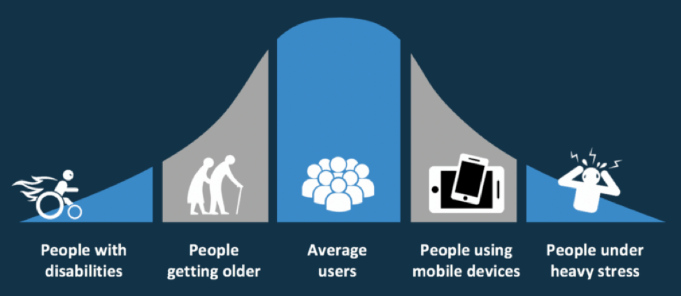
It’s not too difficult to imagine relying on software programs to do your job, given our heavy usage of online productivity tools and IDEs for programming (amongst other things). Many of these modern applications make heavy use of JavaScript to compose UI components and make smooth network updates in the background. If you have a disability–whether permanent, temporary, or situational–an inaccessible software application can make it extremely difficult or impossible to do your job effectively. Inaccessible software can also prevent a disabled person from getting a job at all, when they could otherwise contribute skilled work and more diverse perspectives.

Illustration of different types of disabilities - people who touch, hear, see and speak each having permanent, temporary and situational examples

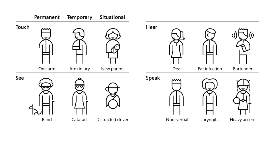
Find more personas in the Microsoft Inclusive Design Toolkit (PDF)

As designers and developers of software, we act as gatekeepers in people’s lives more than we realize. When done right, our software could be the difference between someone with a disability living an independent, productive life, or needing outside help to complete a task, including at their job. From banking, to grocery shopping to collaborating online, accessible software can range from somewhat convenient to a total game changer helping someone to excel in life. This applies to all digital experiences, for both contributors and authors as well as consumers.

For example, people with disabilities work with content management systems all over the place, but particularly at universities with platforms like WordPress and Drupal. If these systems aren’t designed and developed for accessibility from the ground up, an update to a new JavaScript-heavy user interface can severely impact someone’s education or job performance. Accessibility isn’t just a “nice to have”; it can affect everyone’s livelihood, including people with a range of disabilities (vision loss, inability to use a mouse or a trackpad, cognitive impairments, and more). Knowingly or unknowingly putting barriers in place that disproportionately affect access for people with disabilities–or any other protected characteristic–is discrimination, and it’s definitely something to worry about.

No one automatically knows about digital accessibility, so don’t be discouraged if you have zero knowledge or experience with the subject. It’s something we all have to learn and work at, and we have to start somewhere! Over the past few years I’ve talked to many people who, after hearing about accessibility for the first time, have enthusiastically taken up the cause in their own organizations. Some have even become accessibility champions throughout the web development industry, and our collective reach has undoubtedly made an impact on the lives of users with disabilities. (Join us in the web-a11y Slack!)

“I’m disabled and I can’t use this site, why don’t they want my money?!”

It’s also true that some teams need more incentive to actually improve accessibility in their own organizations. So here’s some incentive: without attention paid to accessibility, your application and content may discriminate against people with disabilities. Not only does that carry a higher legal risk, but you’re also likely missing out on customer spending no matter what country you’re in. In the US alone, people with disabilities control over $645 Billion in disposable income. That’s a pretty large demographic to leave behind.

JavaScript Accessibility Considerations

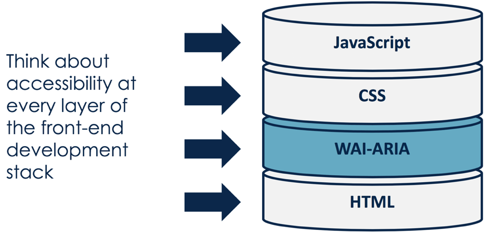
For developers of JavaScript-heavy applications, all accessibility basics apply. We can make a huge impact by paying attention to things like color contrast, keyboard support & visible focus states, semantic HTML structure, form labels, and text alternatives for images and media content. Beyond the basics, common technical JavaScript accessibility requirements include:

  • Focus management of layers and modals. You’ll need to be familiar with tools like `document.activeElement`, `element.focus()`, and listening for key events.
  • Fully disabling inactive layers and components with CSS `display: none` and `visibility: hidden`,  HTML attributes `tabindex=”-1”` and `aria-hidden=”true”`, or the `inert` attribute with a polyfill.
  • Announcing view changes & asynchronous updates to assistive technology using ARIA Live Regions.
  • Gracefully handling keyboard focus on deletion or removal of DOM nodes.
  • Correct use of ARIA states, roles and properties.
  • Automated software testing for accessibility.

Read my latest blog post for extra tips on accessibility in JavaScript-heavy applications: https://www.deque.com/blog/accessibility-tips-in-single-page-applications/

Fortunately, these days it’s easier to achieve a baseline of accessibility with modern testing tools and procedures. Deque has a number of resources and tools to help with this, including Deque University, axe (powering the accessibility portion of tools like Lighthouse and webhint.io), and the entire WorldSpace product suite, amongst other great tools throughout the industry. However, at the end of the day, what matters most is that we improve things for users with accessibility needs, rather than what tools we use to get there.

Accessible JavaScript Starts with UX

We can talk about the technical aspects of accessible JavaScript all day long, but to truly remove systemic barriers to access in our software we must first consider accessibility in UX and Design. To quote Cordelia McGee-Tubb, “accessibility is like a blueberry muffin—you can’t push the berries in there afterward.” As a JavaScript developer, let me also tell you: there are some things you can’t solve with code alone.

Say you’ve implemented a user interface design heavy on mouse interactions, with click and drag events all over it. As a developer adding “accessibility support”, you try throwing some more JavaScript event handling at it, and you quickly find conflicting key shortcuts and complications in assistive technologies: accessibility bug whack-a-mole ensues. Aside from the feasibility and cost to develop and maintain, these kinds of interfaces are often less intuitive and more complicated for users with disabilities.

“Power user” requirements with obscured controls, subtle design treatments, and forced “discoverability” don’t succeed in making your app cool and elite if they also make it much harder to use. Requiring memorization of excessive key shortcuts when the equivalent mouse flow is effortless is a display of power imbalance. It exposes a bias toward the designers and developers of said software over actual users who can’t know it as intimately as the team who created it: obscure icon buttons with no visual text labels also come to mind.

Organizations can combat bias by testing applications early and often with users with disabilities and taking their feedback seriously. Maybe you can’t redesign your entire application at once, but you can identify ways to simplify and streamline the experience in core user flows, replacing some of it one sprint or dev iteration at a time.

As JavaScript developers and individuals, it can be difficult to swim against the tide in pursuit of more accessible experiences when you encounter resistance. Remember that you’re not alone, and even small contributions towards accessibility can add up to make a big difference for users over time.

The Right to Safety

Technology can cause actual harm to people. Like that time someone tweeted a strobing GIF at a reporter with epilepsy. Or that time an accessibility plugin was hacked to mine cryptocurrency, impacting thousands of web users across the world. Or those times app developers added location sharing features that could be used for stalking or bullying.

We can’t police what every user does or contributes online, but there are several areas in the software development life cycle where we can take care to prevent unsafe situations:

  • Consider up front how your designs could be used by bad actors to cause harm and abuse. Not an expert? Hire people from marginalized communities to consult with you.
  • Combat prejudice in machine learning by being transparent about training data and looking for hidden biases.
  • Establish reasonable terms and moderation processes for user conduct with public policies and hold users accountable should they break that code.
  • Follow security best practices and perform regular updates to avoid compromising the integrity of your deployed software.

Thoughtful AV Design

For users with seizure risk, vestibular disorder, traumatic brain injury or motion sickness, navigating sites and apps full of auto-playing videos and flashing animations can be a dangerous task. As developers of these sites and apps, it is possible to minimize harm and still implement beautiful and innovative designs. Warn users of sensitive or flashing material on loading screens, and avoid auto-playing media without user consent (this is also relevant to saving everyone’s data plans).

Animation developers can use the prefers-reduced-motion CSS media query or JavaScript function for Safari and Firefox to provide an alternate styling hook based on a user’s system preference. Configurable toggles at the individual site level are also a nice way to improve the experience for users with motion sensitivities, by allowing them to specify a preference for less animation (or some other style treatment) that can be translated into the visual design.

Protecting the vulnerable from malicious third-party code

There are still more ways that we need to keep our users safe. Vulnerabilities in third-party dependencies and libraries we use could put our users at risk by allowing unauthorized code to run on their system, so those libraries must be kept up to date with security patches or removed entirely.  There’s a reason so many developers use ad-blocking software: today’s modern internet is full of tracking scripts making requests to questionable domains, as well as malicious or unwanted cookies.

We can do well by our users across the board by deploying secure sites over HTTPS, checking the integrity of scripts fetched over the internet, and following other security best practices. But there is also a business argument to be had: Do we take ad revenue from a sketchy third-party platform or is there something safer for our users, like a subscription-based model? A theme has emerged in this article: the strongest defense of user safety is to plan for it earlier in the product development life cycle.

The Right to Privacy

Our last look at how JavaScript can affect civil rights isn’t far from what we’ve discussed in the previous section; safety and privacy are quite intertwined. The same tracking scripts that store cookies on your computer “for convenience and basic functionality” can also sell your personal information to data aggregators and brokers. This is the price users pay for free social media applications, where their interactions and data are the products being sold. The least we can do is protect their legal right to privacy and allow them to opt out of data collection whenever possible. This is even more relevant after the passing of GDPR, which strengthened user privacy protections in Europe.

How we design and develop user contact forms in HTML can also have an impact on privacy. Consider whether you really need to include a gender field for basic functionality. Can you mark gender as optional, or add a non-binary option to it? We shouldn’t ask for gender data simply for tradition’s sake if the data isn’t actually necessary.

User privacy and the Accessible Object Model

Similarly, people don’t want to disclose their disability to you for basic site support. JavaScript developers are excited about the upcoming Accessibility Object Model, or AOM, which will provide more tooling for specifying accessibility information through scripting (as opposed to ARIA in HTML). Imagine being able to get a computed role or set an accessible name directly through a JavaScript API; that’s some of what AOM could do for you. It’s a very exciting proposal that could shape the web technology of the future; it has also produced some tension between user privacy and making complex accessibility use cases possible.

AOM has been compared to HTML5 geolocation, in that for privacy reasons, users would likely have to approve something in the browser to enable the new behavior. While the proposed design for AOM has evolved to use synthetic events, a permissions screen may still be a requirement in some cases. (There was also talk of making it HTTPS-only, but that’s pretty undecided at the moment.) When implemented in browsers, this powerful new tool must be used wisely, likely with redundant UI affordances to accomplish accessible tasks.

For example: a text input allows a user to search without agreeing to share their location through the geolocation API. Similarly, to use AOM features like Assistive Technology events, a user may need to approve the API. As developers, we need to provide UI affordances to complete the same task without requiring our users to sacrifice their privacy for access.

Conclusion

As you can probably gather by now, there are many ways we can impact our users’ civil rights for the better or worse. It might be overwhelming to try and hold all of these practices in mind, when everything inches out everything else for most important concern. When we say “accessibility first”, “mobile first”, “security first”, etc., we’re bound to fail or miss the mark in whichever ways weren’t prioritized. Some of the high-level items in this article might be out of your control as a developer, as well.

Therefore, it could help to start with something like this federal digital services checklist and adapt it to your team’s needs. Perhaps you can focus your attention to the relevant laws in your particular sector of technology. You should regularly evaluate how users’ rights will be impacted by each new design or feature you’re working on and start asking questions. In this line of thinking, you might ask things like:

  • How would this feature impact the employment of people with disabilities?
  • Are we leading all students to success through inclusive online education platforms and course materials?
  • What privacy trade-offs are required in our APIs and user interfaces, and are we encouraging adequate alternatives?
  • Are we introducing or tolerating bias in machine learning and algorithms, disproportionately impacting underrepresented groups?
  • What processes do we have in place for reporting and escalating issues of user rights to privacy, safety, and access in our technology?

Fortunately, as JavaScript developers trying to respect our users’ civil rights, following industry best practices for accessibility, security, privacy and performance can get you quite far. Getting trained in these areas can provide practical tips for applying related principles: training has certainly helped to inform some of the information contained in this article. We have a huge impact over people’s lives as developers, whether we realize it or not. So let’s put our values to work!

Marcy Sutton

Marcy Sutton

Marcy is a Developer Advocate at Deque Systems. She's also an #axeCore team member, @a11ySea meetup organizer & mountain enthusiast.

It’s no surprise that blind people can’t see your multimedia and deaf people can’t hear it. What IS surprising though is the frequency with which content creators overlook this fact when creating multimedia. In the United States alone, 11.4M people have a hearing disability and 7.7M people have a vision disability. This demographic of nearly 20M people find your text, images, audio and video, nearly useless and likely will take their attention and business elsewhere.

The good news is that making your multimedia content accessible to people with disabilities isn’t actually that difficult, as we have certain rules that specify how and what needs to be done to ensure your multimedia is accessible. Let’s explore how.

What is multimedia accessibility?

Multimedia accessibility can be explained as the delivery of the information, intent and content presented in videos and audios immaterial of user’s disability. The core areas of multimedia accessibility are – synchronized captions, text transcripts and audio descriptions.

Synchronized Captions

Captions are the text format equivalent of the spoken audio from within a video. Captions address the need of users who cannot access audio. By providing content information via a textual format, all users, including your deaf users, stand to benefit.

The following screenshot from a youtube video, showcases captions explaining what is happening on the screen. Ideally captions must identify background sounds, speakers and any other important information that is being conveyed. They also should have a good color contrast with foreground and background colors to have a good legibility.

Screenshot of a youtube video playing with the caption function on

The three main criteria that need to be considered for captions are:

  1. Synchronized – captions must be synchronized or available at the same time with the video and audio content.
  2. Accessible – captions must be accessible with respect to color contrast of the text and background or even the placement of the text on the video.
  3. Textual equivalent  – captions must present the same content that is available in the audio track of the multimedia content.

Intended Users for Captions – Deaf users and any users who do not comprehend the language or slang, in which dialogues are spoken.

Text Transcripts

Text transcripts are a way for deaf and deaf-blind users to know the content of an audio podcast. Transcripts include the verbatim dialogue (words spoken) and additional details, for example when there is laughter sound, the same should be mentioned in the transcript. Captions must be present for a video file whereas transcript alone will suffice the need for audio only content.

The image below showcases how a transcript file might be organized. Transcript consists of all the verbatim dialogues that are being spoken by the speakers in an audio or video file. For example, image showcases the conversation between 2 individuals – Shawn and Giles.

Text transcripts are vital because they allow people who are deaf the ability to understand the content that is present in any multimedia file. Again, it is important that we make this content accessible by ensuring good color contrast between the foreground and background along with font size and style to ensure readability of the transcripts.

Screenshot of a neatly organized text transcript with the speaker and audio information detailed.
Source: https://www.w3.org/standards/webdesign/accessibility

Intended Users for Text Transcripts – Deaf, blind and Deaf-blind users

Audio Descriptions

Audio description is mainly aimed at users with visual disabilities.  Key context can easily be lost without the visual information from a video. Relying only on the dialogue often won’t convey everything that’s happening in a video. An example might be a scene in a movie where a person (and the audience) can see a snake but the only audio is the person screaming in fear. The sighted audience understands why the person is screaming.  The non-sighted user needs to know about the visual part of the scene (the snake). As sighted users, we understand the context and content but for non-sighted user the same doesn’t apply. Audio descriptions address that gap and thus are very important for blind and visually impaired users.

Here is a great example from the ABA, describing a scene from a popular animated movie.

Audio description must be provided for videos where there is important visual information that is not conveyed by the dialogue.  Verbal explanation of what is being visually shown is what makes an audio description useful for non-sighted users. If you’d like more examples, feel free to visit the Audio Description Project – Initiative by American Blind Association website.

Intended Users for Audio Description – Blind users

Conclusion

After this brief read, you might have an idea on what needs to be done in order to make your multimedia assets accessible. If you can add captions, audio descriptions and text transcripts to your multimedia, you’ll be providing all users an equal and inclusive experience. Not only will this improve the overall user experience, your multimedia and web traffic will also benefit from the expanded user base, will see an increase in search engine rankings as well as revenue.

Aparna Pasi

Aparna Pasi

Aparna is the Vice President of Services at Deque; with an impressive 19+ years of enriching experience in accessibility consulting, testing, building, training, and leading accessibility teams, Aparna is a true pioneer in the field. Passionate about user experience, diversity, and inclusivity, she leads cross-cultural teams to deliver top-tier solutions across mobile/web tech, banking, e-commerce, gaming, and e-learning. Recognized for her innovative thinking, exceptional communication skills and IAAP- CPWA certification, Aparna ensures accessibility is at the forefront of all projects. With a stellar track record in management and a dedication to bridging business needs with user-centric design, she’s a driving force in creating a more inclusive digital world.

I recently authored a chapter on Accessibility in Single-Page Applications in the new Smashing Book 6, New Frontiers in Web Design. In the chapter, I wrote about the unique characteristics of accessibility in web applications rendered with client-side JavaScript frameworks and libraries, such as React, Vue, Angular, Ember, and so-on. I covered focus management, properly disabling backgrounds, and handling asynchronous form updates in a screen-reader accessible way. I also included a bulleted list at the end with relevant and easy-to-digest accessibility tips.

Of course, now that my chapter has been printed into a gorgeous hard-cover book with embossed gold metallic flourishes, I have a few things I wish I could add; particularly to the short list of tips.

To capture a more complete picture of accessibility in single-page apps still in a concise format, I’ll start with the “accessibility rules” listed in the book chapter and add a few extras that are still on my mind now that it’s been published. Each one of these could probably consist of its own blog post, but the intent of this one is to highlight tips and techniques that could help in your next JavaScript-focused project.

  1. It’s easier and less costly to incorporate accessibility the earlier you tackle it, starting with UX and Design.
  2. Prototype complex or custom interactions early, and include accessibility.
  3. Check out the ARIA Authoring Practices for known interaction patterns.
  4. Be generous with color contrast; it not only both helps people with low vision and color deficiency, but also low-contrast projectors and outdoor displays.
  5. Screen readers have ways of navigating other than using the TAB key, so you don’t need to make everything focusable.
  6. Interactive widgets (i.e. “controls”) should be designed to work with the keyboard, not just on hover or swipe.
  7. Get comfortable with focus management in JavaScript, and write it into your automated tests.
  8. Test with accessibility browser extensions and automated testing tools for extra muscle. (Deque’s axe and WorldSpace Attest tools fall into this category)
  9. Test your app with real users, including users with disabilities. Organizations like Knowbility’s Access Works can help.

And now for the additional stuff:

  1. Accessibility is about more than developing for users with blindness or low-vision. Familiarize yourself with the needs of people with disabilities with help from the W3C.
  2. Consider whether a single-page app is really necessary, and if you even need to use a JavaScript framework at all.
  3. If you do go the single-page app route, ensure your core user paths actually work without JavaScript turned on, using server-side pre-rendering. This also helps with SEO!
  4. Make sure that client-side view changes are known to screen reader users by announcing the change in page title, using ARIA live regions and/or focus management.
  5. Semantic structure is more important than developer ergonomics. Craft the most semantic HTML pages you can, regardless of your CSS or JavaScript development tools.

Without these accessibility rules applied, JavaScript-heavy web applications can leave users with disabilities behind. It’s unfortunate how few good examples there are of client-rendered applications like these, but with the right knowledge and best practices we can put much better accessibility examples out into the world.

For more information on developing accessible web applications with JavaScript, check out our training materials on dequeuniversity.com or a number of talks and articles from me (Marcy Sutton). If you have any questions about how to apply these principles or would like to schedule a pairing session, don’t hesitate to reach out to us on Twitter or email.

Marcy Sutton

Marcy Sutton

Marcy is a Developer Advocate at Deque Systems. She's also an #axeCore team member, @a11ySea meetup organizer & mountain enthusiast.

By now you have most likely have heard the term digital accessibility and may have an inkling about what it is— but have you bought into the hype? Or are you secretly asking yourself questions like:

  • “How many people visiting my website or app actually need these accessibility features?”
  • “Won’t it take too much time/effort/money to make my website or app accessible?”
  • “Will my website or app be ugly if I make it accessible?”

If you or your client have pondered these (or similar) thoughts, I am here to challenge your thinking by busting some myths around digital accessibility!


Myth #1: Only a small percentage of my users need an accessible website or app

Bell curve graphic with average users in the middle, elderly and people on mobile devices expanding outward with people under stress and people disabilities on the edges.
Accessible websites can be useful to more populations than you might realize.

Nope, not even close!

According to last US census results, about 19% of the United States population identifies as having a disability. That works out to roughly 57 million individual people. Thinking of these numbers in a different way, there are more people with disabilities than populations of New York and California combined. If you consider a global audience, you are talking about 15% of the world’s population according to the World Health Organization (WHO). That is over one billion people worldwide!

Of course, the number of people who consider themselves disabled is huge on its own. But there is also a large percentage of the population who could benefit from an accessible website or app, but who do not identify as having a disability.

Examples of these communities include:

  • Aging population—may need captioning on videos or larger font sizes to read the text
  • Users whose native or primary language is not English—may need more time to read text on auto-rotating slideshows
  • Users with cognitive limitations—may need accessibility-friendly fonts or bulleted content to help focus
  • Users with limited or low vision—may need to zoom in on content to be able to read and understand it
  • Users with situational disabilities—may need better color contrast so glare on a screen does not interfere with them reading the content
  • Users with temporary disabilities—may need to access everything with only their keyboard because they are unable to use a mouse

So when you consider these additional groups, the number of people needing websites and apps built in an accessible way is much higher than the number of people reporting that they are disabled. And of course, that number will continue to grow as people live longer and technology becomes even more prevalent and important to our daily lives.


Myth #2: It will take too much time/effort/money to make our website or app accessible

Image of Deque's shift left philosophy. Illustrating how it is more cost-effective to invest in accessibility during the backlog, design, coding and testing phases rather than after a website or application is released.

Not really!

A lot of companies test accessibility at the end of the development cycle, right before their new website or app is launched to the public. But if you wait to test accessibility at the end— then you are late to the party. The tiny accessibility bugs that could have been squished with one line of code, have morphed into giant Mothra-sized bugs that may require major rewrites that can frustrate the entire team. But by being a little proactive about accessibility and building it in from the beginning, you will stomp the bugs as you find them and thus save time, effort, and money in the long run.

This “accessibility first” or “shift left” approach may seem a little daunting. It might even seem like a radical shift in thinking to some, but we’ve been here before. In fact, the way you might feel about digital accessibility today is much like how a lot of us felt when we first heard about the “mobile first” approach. In the beginning, the “mobile first” approach was confusing and sometimes frustrating (remember pixel perfect breakpoints?!). But we struggled through it and now it is a normal part of our daily workflow. In fact, it’s hard to image designing or developing a website or app without considering multiple devices now. I predict that is what digital accessibility will feel like in a few years—just a normal part of the workflow process that doesn’t require much additional time or effort.


Myth #3: Digital accessibility is a one-time-only task for the developers

No way!

If we wait to incorporate accessibility best practices at the code level, then we’ve missed the point of making accessibility a priority (see Myth #2). It is true that developers have a lot of influence on how accessible a website or app is in general. But there are a lot of other people that *should* be responsible for digital accessibility as well including:

  • Clients/Shareholders—This group holds the money and dictates the timeline of the project (which is usually the cheapest product in the fastest amount of time). They need to understand that taking some extra time and budget to build accessibility into the beginning of the project will help them in the long-run — especially if they are one of the unlucky ones who gets sued for not having an accessible website or app in the first place.
  • Marketing/Sales—This group should understand that making websites and apps more usable can directly lead to more sales/web traffic for the client. By pointing out that some SEO techniques are directly related to accessibility best practices, they can maximize their client’s time and money.
  • Web Architects/Designers/UI and UX Specialists—This group inspires the code that will be written and is a big influence on a website or app’s accessibility. In some organizations, a developer will not (or cannot) question what is sent to them from this group, so designers and UI/UX specialists must ensure their wireframes and mockups are accessible before a developer even writes one line of code.
  • Digital Strategists/Editors/Content creators—This group has more influence on accessibility than some might realize. Even if the website or app has been optimized, designed, and developed with accessibility in mind the actual content on the page can break all of that down. Content is fundamental to the overall accessibility of your website or app.
  • Users—This group is really what it is all about. Let’s say you did your job and your website or app is as accessible as you could possibly make it — awesome! But guess what? Users are people. And people are varied and so are the browsers, devices, environments, and assistive technologies that they use. It is impossible to make your website or app 100% accessible to all of that variety, so users should have a place to report issues that they encounter with your website or app and you should *listen* and make those changes.

For a deeper dive on this subject, check out Dennis Lembree’s series on building accessibility into your organization.


Myth #4: Accessible websites and apps are plain or ugly

Screenshot of deque.com homepage including a clean and colorful presentation of information
We think deque.com is pretty

Not true!

A lot goes into designing a website or app—idea/sketch phase, prototyping, UI/UX considerations, wireframes, mockups, style guides, etc. With so much already going on, it can feel daunting to add more thing to the mix—especially something like digital accessibility which many feel is the opposite direction of modern website/app design. But fear not! Accessible websites and apps do not have to be plain or ugly.

There are so many examples now of beautiful and mostly accessible websites including (but not limited to):

There are more examples I could list, but you get the point — websites and apps of any genre can be both modern *and* accessible. By mentally reframing digital accessibility as a kind of “design challenge” and less of a forced requirement, you can open the door to many possible solutions that are both beautiful and accessible.

Disclaimer: most of the sites on this list do have some outstanding accessibility issues, but the overall number of issues are low or the infractions are minor compared to the majority of websites out in the wild. Also, keep in mind that website/app designs and features continuously change so this list may be outdated by the time you read this article! Do your own testing please and let us know if we need to update the list.

If making websites and apps more inclusive wasn’t enough, a side benefit to knowing about digital accessibility— more job opportunities! If you are a design professional or student looking for a job, having accessible design experience or knowledge will most definitely set you apart from your competition.

If you are new to the field, there are a lot of great resources to help you start your journey, including:


Myth #5: I used some automated testing tools, so my website or app is now accessible

Using automated testing tools is a great first step, but don't stop there

Hold your horses, partner!

According to a study on the world’s most inaccessible website, automated testing tools can reliably catch up to 41% of *some* types of errors. There is a lot of heated discussion around these kinds of studies and which are the “best” automated tools—but regardless of the automated tool(s) you choose to use, there are other testing factors to consider as well.

Some automated testing related questions include:

  • Which browsers or operating systems do I test on?
  • What devices should I test – desktop, tablet, mobile?
  • How reliable is the automated tool I am using?
  • What if different tools give me different results?
  • How do I prioritize the accessibility bugs the tool reports out?
  • What errors did the tool miss?

So while automated tools are truly amazing and getting “smarter” with each new version, as of today they cannot find all of your accessibility issues and still require a human to interpret the results and prioritize the issues they do find. For example, an automated testing tool might tell you that your image is missing alternative text, but it cannot tell you what alternative text to write. Or in the case of a decorative image, it may flag it as needing alternative text, when it actually may not.

That said, most accessibility experts agree that automated testing tools are a great first step towards accessible websites and apps?. Just don’t stop there! Automated testing tools most effective when coupled with manual testing.

Manual testing can include:

  • Reviewing website or app structure/architecture (ex. reviewing heading order)
  • Keyboard compatibility tests (ex. logical reading/tab order)
  • Media review (ex. audio and/or text description for video)
  • Assistive technology device testing (ex. screen readers and beyond)
  • Real user testing!

Recap: Accessibility Myths Busted!

Hopefully, I helped “bust” some of your myths around accessibility with this article. Together we can help spread the word that:

  • Digital accessibility helps more people than you might realize
  • Think about accessibility early and often in the design and development process to save time, effort, and money on the overall project
  • Digital accessibility is the job of every single person in your company— not just the developers or QA
  • Websites and apps can be both beautiful and accessible
  • Using automated testing tools is a great first step, but you must also include manual tests in order for your website or app to be truly accessible

Of course, these are just a few accessibility myths that are floating around— let me know if you have others for another round of myth busting! In the meantime, remember that digital accessibility is NOT an all or nothing game. Even incorporating a small change into you or your company’s workflow can have exponential benefits. So get out there and bust some accessibility myths of your own!

Carie Fisher

Carie Fisher

Carie Fisher is a Senior Accessibility Instructor and Developer at Deque. She has been building websites professionally since 2005 and is passionate about accessibility and promoting diversity in the tech world. She founded both the A11y Style Guide and the YouTube series Accessibility Talks to help educate others on website accessibility.

WorldSpace Attest Android is a toolkit for the Android Mobile Development Platform and version 1.1 is here! Read more on Github if that’s your preference. If you’re not familiar, Attest Android is part of the WorldSpace Attest family, enabling automated testing throughout your dev lifecycle for HTML, Android and iOS apps. Attest saves tons of development and testing time, runs on a world-renowned testing library and is fast and flexible.

In addition to integrating into CI/CD processes, Attest Android can also be used at run time, along with the Attest Android Desktop Client and Accessibility Service, to analyze your applications at by your QA/Accessibility Teams. Or, Development Teams can utilize this ability to access to advanced accessibility debugging information.

Screenshot of the Attest Android desktop application and mobile app emulator, drawing focus to accessibility issues
No requirement for Android Studio, perform accessibility tests from the desktop app and an emulator

What’s new in Attest Android 1.1?

Enabling collaboration and making it easier to explore accessibility hierarchy was a key focus for us in this release. Here are the key improvements in version 1.1:

  • Significantly improved startup process.
  • Ability to explore accessibility hierarchy of imported sample app screenshots.
  • Ability to highlight accessibility issues in captured screenshots from sample application content.

Easier startup process

You still can, but you don’t HAVE to use Android Studio anymore! In this release we wanted to make sure folks outside of development could easily fire up the desktop application and connect it to a device or emulator. In just a few simple steps, users can now take perform an accessibility analysis with minimal effort.

1. Connect your device

Screenshot of Attest Android Desktop app ready to "connect device" to an emulator
Ensure USB debugging is enabled on your device and connected via USB. Then click Connect Device from the Attest Android desktop application.

2. Turn on the Attest accessibility service

Screenshot of Attest Android app and emulator with Attest settings turned on
Navigate to the Accessibility settings on your Android device and turn on the previously installed WorldSpace Attest service.

3. Enjoy your test results 🙂

Screenshot of Attest Android app returning results alongside the emulator
Launch your demo application and begin your analysis

Understand TalkBack Better: Emphasize TalkBack Focusable Items with Interactive Screenshots

Screenshot of alert message :Attest will start capturing everything that's displayed on your screen."When connecting the Attest desktop application to your device, you’ll notice the following message; “Attest will start capturing everything that’s displayed on your screen” when attempting to activate the service. This permissions prompt is allowing the Attest accessibility service to send interactive screenshots to the desktop application and nowhere else.

Sending these interactive screenshots allows Attest desktop application users to analyze how TalkBack interacts with your demo application without having to maintain that active connection with the demo app, device or emulator. This is critical for error reproduction, analysis and info sharing, which we’ll talk more about later.

Notice in the example below, the interactive screenshot on the left is highlighting the TalkBack focusable element from my demo app. However, upon further inspection on the right, it becomes clear that the demo app on my device is treating TalkBack improperly.

Screenshot of talkback issues highlighted in Attest Android

Dig deeper with DevTools & Easy collaborate around your results

We’ve also added a new feature in this release that allows developers to go to the Attest menu to open DevTools alongside your Attest info. This is super helpful for developers used to using the Accessibility Inspector or other View Hierarchy Explorers, who can now explore the interactive screenshot while looking for elements within the accessibility hierarchy. We’ve also made it really easy to save and share this screenshot.

Screenshot of Attest Android results getting saved to a local file on the desktop
Saving and sharing this information can be invaluable in Bug Reports and Issue Trackers, providing intimate details about the state of the View Hierarchy at the time a bug is reported. It’s also super helpful for Android Accessibility experts, allowing them to easily collaborate with dev teams.

Summary

If you’d like to digest this info in an interactive video, I’ve done my best to cover this same info in the video below. The video also includes additional detail where I dig deeper into troubleshooting an accessibility issue using these cool new features.

Chris McMeeking

Chris McMeeking

Chris McMeeking is a software engineer and architect at Deque Systems, leading development efforts on Deque’s native mobile accessibility analysis products. His journey in accessibility began through a project at the University of Michigan, The ASK Scanning Keyboard. This application won multiple awards including the $100,000 Intel Innovator’s Award, runner up at the Mobile World Congress, and the Student of Da Vinci award from the Multiple Sclerosis foundation. Chris is the lead developer behind the Android Analyzer, and an active member of the task force developing these new accessibility mobile standards.

I can’t believe my first year in accessibility has passed already. I’m certainly no expert but I am a site owner who’s experienced the full range of accessibility emotions. Based on what I’ve observed so far, nothing compares to the passionate, engaging, supportive and collective nature of the digital accessibility industry. If you’ve seen HBO’s Silicon Valley, you know how rare it is to work at a software company that actually helps make the web a better place. Deque is undeniably one of those difference-making unicorns.

Male speaker on event stage
Silicon Valley start-up speaking claiming he “makes the world a better place through scalable fault-tolerant distributed databases with ACID transactions.

I’d like to build an accessibility time capsule. Like any time capsule, I don’t know if what I’m putting in it is correct, or useful or at all representative of what other people would include to properly represent this topic, but I think this will be a healthy exercise. The best part of time capsules is seeing the reaction from others, especially when they have the benefit of hindsight. Let me know what you think as you sort through the elements of this capsule and if you’ve got additional questions and comments that should be included.

The People of Accessibility

The greatest common trait I’ve seen across this industry so far is that the people within it are wildly passionate. I literally have a colleague with accessibility-themed tattoos. Friendships and professional relationships have broken over differences of opinion in interpreting accessibility guidelines. The degree of passion many accessibility practitioners share knows no bounds.

Also unique to this industry, is the curiously broad number of roles involved both simultaneously and separately. Companies practicing accessibility at any level of maturity could have any of the following roles responsible:

  • Legal/compliance officers
  • Project or Product owners
  • QA/testers
  • Development
  • Designers/UX
  • Subject matter experts

When will a pattern of ownership emerge? Is it expected behavior to see Legal as the most common project kick-off? Is it natural that some scattered developers have been secretly dabbling in accessibility already? Why can’t they, or the other non-legal champions on the above list get internal priority and resource? This is a group of passionate people, what’s preventing digital accessibility testing from getting the same attention Security or Performance gets?

The size of the Digital Accessibility industry

To understand the potential of this industry, I’d like to make some comparisons to the Security and Performance monitoring industries. The risk of offering an insecure app is obvious. The effect of a slow (loading…) app is something everyone can relate to. But why isn’t the Accessibility of an app obvious and relatable? The similarities are otherwise extensive. Accessibility, Security and Performance all; carry liability, directly impact users, were evolved from complicated service engagements to integrated toolsets, require programmatic adoption to succeed, and have a similar cost structure. Maybe you’re thinking scale is the difference? Are you really willing to say out loud, that there aren’t enough people with disabilities to justify the testing or inclusive design effort? We do edge-case testing in security, performance, design and hundreds of other industries all the time. Accessibility is not a feature, it’s a requirement.

So, why isn’t Accessibility a $100B+ Security industry? Or even a $6B Performance industry? (at least not yet)

Is it just ignorance and lack of empathy? Or is Accessibility growth subject to orgs waiting until they have no choice but to become accessible? Just like those other industries, the lawsuits are coming. Inevitable aging and disability are a certainty for all user bases. It’s always cheaper and better for your users to fix the problem early and we have the benefit of similar industries blazing the trail already.

The accessibility library Axe-core has been downloaded over 4M times. If that’s any indication of the future of this industry, I’m very excited.

Advice for future accessibility generations

I’m certainly not an accessibility veteran but I do think there is value in sharing my observations from this “sweet-spot.” I’ve been here just long enough to see some true colors, but not so long that my perspectives have been altered. With that said, I’d suggest the following feedback for these common accessibility stewards:

  • Legal/compliance officers
    • It’s cheaper to fix the problem. Get proactive about protecting your employer or client, ask your web or app owner if they’ve had an accessibility audit.
  • Project or Product owners
    • Build empathy amongst your peers and leadership. With empathy comes understanding, priority and budget.
  • Development/QA/testers
    • File bugs. Build on easy wins and stack them high enough to buy automated tools and manual testing expertise.
  • Designers/UX
    • Design for everyone. Take your mobile-first mentality, inject it with steroids and apply accessibility best practices.
  • Subject matter experts
    • Understand the balance of priority. Be pragmatic. Clearly identify accessibility blockers. Understand that your personal favorite best practice may not be the only way to design an accessible experience.

Other fun observations

  • People in the accessibility industry like puns more than any I’ve ever seen.
  • Listening to folks pronounce WCAG (wuh-cag, w.c.a.g., w-cag) is fun.
  • Accessibility vets will write a 1,000 word explanation on proper form markup but won’t take the time to include the 11 other letters in accessibility. #a11y
  • Accessible components are solid gold.

I love my time spent in accessibility so far. Here’s to an accessible future! Let’s all check back in next year to see what progress we’ve made.


Ryan Bateman

Ryan Bateman

Ryan is a Marketing leader at Deque. He's worked in the telecommunications and performance monitoring industries for over ten years and cares deeply about improving the web for everyone.

Introduction

It’s the most wonderful time of the year! No, I’m not talking about winter break, but that other magical time of the year that parents eagerly await and teachers dread – back to school time! All joking aside, I was that nerdy kid who actually loved school. I still remember the smell of the pencil shavings and chalkboard dust, the sound of opening a new book and cracking its spine, getting to see old friends and learning new subjects…what’s not to love?

Fast forward to today, most adults feel a bit different about learning something new. Somewhere between our school age and adult years, the art of learning changes for a lot of us. Learning becomes less about being creative and having fun and turns into something more mundane, mandatory, or even menacing. Think about it – when was the last time you’ve actually been excited to learn something new?

With this accessibility beginner series, I am hoping to recapture some of this excitement for learning while introducing you to a variety of topics in the world of digital accessibility. The plan is to keep these articles light, factual, and most of all, give you something practical to add to your daily workflow.

ARIA Act One

Scene 1: The Foundation

ARIA was first developed in 2008 by the Web Accessibility Initiative (WAI) group – a subset of the overarching World Wide Web Consortium (W3C) who govern and regulate the internet. ARIA is an acronym for “Accessible Rich Internet Applications” and is formally called WAI-ARIA (but many people call it by its abbreviated name).

The WAI group defines ARIA as:

“A way to make Web content and Web applications more accessible to people with disabilities. It especially helps with dynamic content and advanced user interface controls developed with Ajax, HTML, JavaScript, and related technologies.”

Put more simply, ARIA defines a collection of attributes to help modify incorrect markup and to bridge gaps in HTML to create more accessible experience those using assistive technology (AT). Correctly incorporating ARIA into your code ensures that assistive technology device users will have all of the information they need to use your website or app.


There are three main features of ARIA as defined by the guidelines:

  1. Roles — defines what an element is or does. Roles can help identify landmarks, document structure, and widgets as well. An example of this is:

    <div role="button">Here is a snazzy button</div>


  2. Properties — express characteristics or relationship of an object. An example of this using `aria-describedby` is:

    <div role="button" aria-describedby="some-other-element">Here is a snazzy button</div> <div id="some-other-element">This page will self destruct in 10 seconds.</div>


  3. States or Values — define the current conditions or data values associated with the element. An example of this using `aria-pressed` is:

    <div role="button" aria-describedby="some-other-element" aria-pressed="false">Here is a snazzy button</div> <div id="some-other-element">This page will self destruct in 10 seconds.</div>

Of course, this is a simplified explanation of ARIA and the code examples above are pretty streamlined to illustrate the functionality of ARIA (i.e. there is additional code you would want to include on a real button). As your code gets more complex, ARIA roles, properties, and states can be layered until the final accessibility goal is reached. Knowing the basic rules of each ARIA role, property, and state can help you figure out what elements need to go where in your markup.

At this point you might be worried ARIA will change your web page functionality and overall look and feel – don’t be! ARIA does not actually change anything with the native browser functionality. Think of ARIA as an additional layer of understanding between the HTML and ATs. Similarly, ARIA does not change your web page from a visual perspective, unless you add styling to your CSS that specifically targets ARIA. This means that no one except ATs (and the people using them) will notice any differences between a web page or app with ARIA and one without it.

Scene 2: ARIA vs HTML

In 2014, the W3C officially published the HTML5 recommendation to the world. With it came some big changes, including the addition of elements such as `<main>`, `<header>`, `<footer>`, `<aside>`, `<nav>` and attributes like `hidden` and `required`. With the addition of these new HTML5 elements and attributes coupled with increased browser support, parts of ARIA are now obsolete – or at least less critical than before.

In cases where the browser supports an HTML tag with an implicit role that has an ARIA equivalent, there is usually no need to also add ARIA to the element. However, ARIA still includes many roles, states, and properties that aren’t available in any version of HTML so these will continue to be useful for some time.

To keep it simple for beginners, at Deque trainings we repeat the first rule of ARIA created by the W3C:

“If you can use a native HTML element or attribute with the semantics and behavior you require already built in, instead of repurposing an element and adding an ARIA role, state or property to make it accessible, then do so.”

So if we look back at the earlier coding example, instead of using ARIA to define the role of our button element, we can use the HTML `<button>` element instead.

Original code (using ARIA only):

<div role="button">Here is a snazzy button</div>


New code (using HTML only):

<button>Here is a snazzy button</button>


New code (using HTML + ARIA):

<button aria-describedby="some-other-element">Here is a snazzy button</button> <div id="some-other-element">This page will self destruct in 10 seconds.</div>


Technically, each example conveys the same semantics, but the big difference is the ARIA only version requires us to define the functionality of the button role with additional code, while the HTML versions work right out of the box for browsers that support the `<button>` element.* When we combine the powers of HTML and ARIA as shown in the last example, we provide additional information about the button’s purpose.

*Note: since the <button> element was introduced in HTML4, I can reasonably speculate that it is fully supported by the latest versions of all the major browsers and will play nicely with most ATs. However, the same cannot be said of all of the newer HTML5 elements and attributes. To check for browser compliance, I often reference websites such as HTML5 Accessibility, Can I Use, or W3C’s list of ARIA in HTML attributes before making my choice of whether I can use HTML or ARIA elements for a particular pattern. I will go into this topic a bit deeper in a follow-up blog post on ARIA.

Accessibility experts and users of ATs all have differing opinions on the subject of ARIA vs HTML and will probably be discussing this topic for a very long time. These discussions are great in a theoretical world, where a developer focused on accessibility would have full control of the markup, styling, and functionality of a website or app. But the reality is often more complex.

For example, there may be times where you cannot change all the `<div role=”button”>`’s on your page to `<button>`’s and that is maybe not ideal, but it is OK. If you do have more control over your website or app code, by all means, add in fully supported HTML elements (and any ARIA helpers you may need) from the beginning. But from a practical sense, I encourage other developers to just do what works for your particular situation and be sure to test your code before releasing it. Even if you only change one small piece of code at a time – every little bit helps!

Scene 3: ARIA in Action

As mentioned earlier in this article, it is best practice to use native HTML elements when the browser support is good. But when coded correctly, ARIA elements can and should act like native HTML elements. So you have some flexibility when making your pattern more accessible!

I find it more useful to see code examples rather than explain them, so let’s break down a typical pattern you might find on a website or app in more detail. For this article, we will look at radio buttons and groups. All radio groups require a group label of some kind. The classic method is using `<fieldset>` and `<legend>`. The ARIA method of `role=”radiogroup”` and `aria-labelledby` can also be used. Both are technically correct, so depending on your situation you could use either method and that would result in a similar experience for the user.

Method 1: Using HTML `<fieldset>` and `<legend>` elements:

<fieldset class="deque-radio-group">

 <legend class="deque-radio-group-label">What's your favorite flavor of ice cream?</legend>

 <div id="radioGroup">

   <span id="Whatsyourfavoriteflavor_0" class="deque-radio" aria-labelledby="vanilla"></span>

   <span id="vanilla">Vanilla</span>

   <span id="Whatsyourfavoriteflavor_1" class="deque-radio" aria-labelledby="chocolate"></span>

   <span id="chocolate">Chocolate</span>

   <span id="Whatsyourfavoriteflavor_2" class="deque-radio" aria-labelledby="strawberry"></span>

   <span id="strawberry">Strawberry</span>

   <span id="Whatsyourfavoriteflavor_3" class="deque-radio" aria-labelledby="none"></span>

   <span id="none">I prefer cake</span>

 </div>

</fieldset>


Option 2: Using ARIA `role=”radiogroup”` and `aria-labelledby` elements:

<div class="deque-radio-group" role="radiogroup" aria-labelledby="inspire">

 <div class="deque-radio-group-label" id="inspire">

   Which one of these scientists most inspires you?</div>

 <div id="radioGroup">

   <span id="Whichoneofthesescientistsmostinspiresyou_0" class="deque-radio" aria-labelledby="curie"></span>

   <span id="curie">Marie Curie</span>

   <span id="Whichoneofthesescientistsmostinspiresyou_1" class="deque-radio" aria-labelledby="goodall"></span>

   <span id="goodall">Jane Goodall</span>

   <span id="Whichoneofthesescientistsmostinspiresyou_2" class="deque-radio" aria-labelledby="franklin"></span>

   <span id="franklin">Rosalind Franklin</span>

   <span id="Whichoneofthesescientistsmostinspiresyou_3" class="deque-radio" aria-labelledby="lamarr"></span>

   <span id="lamarr">Hedy Lamarr</span>

 </div>

</div>


Screenshot of Option 1

Image of question with four multiple choice options

Screenshot of Option 2

Image of method 2 output

You can see from the screenshots that the visual output from either the HTML or ARIA radio patterns is the same. From a functionality perspective, they should be essentially the same as well, but there are some variances between each browser and assistive technology device combinations. One size doesn’t necessarily fit all, so each pattern might need to be modified to suit your accessibility needs. For a live example of the above code see https://codepen.io/cariefisher/pen/VGPEBo.

Scene 4: Complexities of ARIA

Of course, this article wouldn’t be complete without a couple of warnings about ARIA. First, you must use caution when adding ARIA to your markup! This is a time where a little bit of coding knowledge can be detrimental (or just plain annoying) if used incorrectly. A mentor once told me that “Bad ARIA is worse than no ARIA at all” – words of wisdom I try to live by with each line of code I write. Sometimes in an effort to help, we add too many ARIA attributes or the wrong ARIA attributes. Remember to keep it simple.

Second, although the button and radio button/group patterns we reviewed are fairly straightforward, creating accessible custom patterns can get very complicated very quickly. There are a lot of things to pay attention to (including but not limited to) – keyboard, mobile, and touch interactions, ARIA authoring best practices, or even the basic choice of whether to choose HTML or ARIA in the first place. Try to anticipate the needs of your users and be sure to test your code for accessibility. If you can find (and pay) users of ATs to help test – that is even better. At the very least, make sure there is an accessible way a user could submit a bug ticket if they find an issue.

Those warnings aside, digital accessibility really is not an all-or-nothing situation – it is a spectrum that allows for some gray areas such as this where multiple coding solutions can be seen as “correct” depending on the situation. What is important is that you keep learning, testing, and trying to make our digital world more open to all!

ARIA Act One: Recap

Hopefully, this article gave you a quick glimpse into the rich world of ARIA. Here are some takeaways:

  • ARIA defines a collection of attributes to help modify incorrect markup and to bridge gaps in HTML to create more accessible experience those using assistive technology (AT).
  • Correctly incorporating ARIA into your code ensures that all users will have the information that they need to use your website or app.
  • ARIA can be broken down into:
    • Roles — define what an element is or does.
    • Properties — express characteristics or relationship of an object.
    • States and Values — define the current conditions or data values associated with the element.
  • ARIA on its own does not change the functionality and overall look and feel of your website or app.
  • There is more than one way to write accessible code. HTML can oftentimes replace or be supplemented by ARIA – but you need to check for browser support first.
  • When in doubt, use a browser supported HTML element and skip the ARIA. Bad ARIA can be worse than no ARIA at all!
  • Test your code – preferably with the help of users of assistive technology devices. At the very least, provide an accessible way for these bugs to be reported.

Since this article was targeted at beginners, there were a few important topics I intentionally glossed over. In the next article on ARIA, I plan to explore some more intermediate questions such as:

  • How do I know what ARIA or HTML element to choose?
  • Where is ARIA supported?
  • How do I test for ARIA?

If there are other general ARIA questions you want to see, please let me know in the comments! In the meantime, to get even deeper knowledge about ARIA and see additional pattern examples in action, you can enroll in our Deque University courses.

Carie Fisher

Carie Fisher

Carie Fisher is a Senior Accessibility Instructor and Developer at Deque. She has been building websites professionally since 2005 and is passionate about accessibility and promoting diversity in the tech world. She founded both the A11y Style Guide and the YouTube series Accessibility Talks to help educate others on website accessibility.

A common accessibility issue that I’ve noticed in Android applications is nesting active elements together. I want to discuss why this is inaccessible in a demo and who it could possibly effect. I will also walk you through where in the developer tools you can find this issue, how to fix it, and how to follow best accessibility practices. Follow along with the video below if you’d like:

Overview

In this blog post we will discuss:

  • Nesting elements into a single focusable container
  • When nesting elements is a bad idea
  • When nesting elements is a good idea

Getting Started

Let’s deep dive into talkback accessibility and a common violation that I see around nested active elements in Android Apps. We’ll talk best practices and discuss how Deque has developed a rule to automatically analyze and scan for this issue. Let’s begin, what I have here is an emulator. One of the cool things about the Android accessibility ecosystem is when you see emulators, they work essentially exactly like devices.

I’m showing this example on an emulator because it’s a little more convenient for demo purposes. To start, you’ll see I have this toast popping up at the bottom, reading “blocking off switch”. This is the text that would be read out loud by a talkback if I had the device in my hand. Now I’m bouncing back and forth between these two switches. If I go outside of this switch and click on here as I touch to explore gesture, I focus another view that is wrapping these two switches together. Now this is the fundamental issue that I want to talk about.

Why nesting active elements is bad

When nesting of elements together, it becomes very unclear what type of thing you’re trying to accomplish as a screen reader user. Picture that you’re blind and you are going through this app in the different ways you can navigate. For example, if I am a touch to explore user, I am finding elements that are nested within other elements. This is confusing because if I drag my finger across the screen I can end up hitting multiple touch targets within the same touch target. The other problem we get with this is when a user is navigating via tabs.

My tab navigation versus my swipe navigation actually end up being different because sometimes things are focusable and sometimes things are accessibility focusable. My swipe navigation and my keyboard navigation end up being different type of touch targets. I just hit the right arrow button and I do different things than if I hit the tab key.

To fix this problem we need to a) be able to identify this issue and b) we want to understand exactly why it’s happening. What is causing these multiple touch targets? What other issues might we see outside of talkback focus? When we explore these questions we understand the core of this problem.

Fixing inaccessible nested active elements

Now let’s explore how to use accessibility tools to find this problem. Notice here I’m sharing, I have this screen here where I can show focus and as I scroll over the screenshot I’m seeing the different areas of accessibility focus.  If you open the developer tools you can start to analyze these controls. Let’s dig into the accessibility property of one of these controls, there are a couple of switches within a linear layout. When we’re scrolling over the switches, we have:

  • importantForAccessibility = true
  • clickable = true

We have two views here that are clickable, both of theses switches are clickable and also the linear layout. They’re all clickable and focusable and that is actually why they’re being accessibility focused. When we look at the text we get null text blocking off, text blocking off but focusable true and clickable true. This is confusing based on what we discussed above, because not only are we going to want to try and activate one of these controls but when we focus this bigger rectangle we activate it.

Implications of Nested Active Elements

What does activating a collection of elements even mean? That’s a confusing thing and you can see we’ve marked up this demo here simulating this inaccessible situation, but you can actually end up seeing this in a lot of different things. One of the places I see this is coming from some hybrid libraries that are potentially reliant on web view. When the web view ends up being clickable and also containing other clickable elements, it’s a very confusing situation to be a talkback user who’s hearing that they can take action with some element that is also composed of other actionable elements.

Another place where you can see this create accessibility problems is for switch control. If you’re a switch control user and you’re cycling through the active elements on the screen you end up at minimum having an unnecessary target, which if you have a one second delay on your scanning is frustrating. At the same time you can end up activating something that you don’t intend to activate or that has an undefined behavior. What we want to do is go in and make this not actionable. In this case, the solution would be to make this outline not focusable.

Best Practices

Why is this hybrid application wrapping web view and clickable to begin with? We don’t want this thing to be clickable at all. This is similar fix here, what we have is an informative control and an  informative element. Clickable is false and focusable is false, that’s good. We have a switch here which is going to be clickable and focusable and we have the linear layout which is clickable and focusable. We also have made the touch target size for this nice and big. However, we just no longer need to interact with this switch, right? In talkback as I try to click on these things, I’m clicking on the minor, the informative control, and I can’t focus it individually but I can focus the talkback switch individually.

This is good behavior because I have this nice big touch target, basically this is saying “hey, all of the behaviors you can get if we make this linear layout actionable, all of the information is wrapped in this control”. What we’re going to do is look at a good example of this where we have this passing. This passing example should say, “hey, all of the information is available on this switch” or, potentially, as a best practice, we could wrap all of that information together. On the example over here we could say, “hey, all of the information conveyed by this switch is available in this rectangle” and then provide the switch action on that big layout.

What that allows is for a nice big touch target without having to even focus the individual controls, this a best practice. It’s a little more painful to code up in our case in the emulator, what we have is the most simple version, which is to associate the two with a label for, that way in switch control, you end up only focusing on the switch. In talkback you can access the two controls individually, that’s the easiest way to code it. Ultimately, we end up associating these two with the label for attribute, but if you want to go the next mile, you can do is wrap those two things together in one accessible target.

Conclusion

Nesting elements together can provide a more seamless user experience. It limits the overall number of on screen focusable targets for Screen Reader users, which is good. However, if two elements provide an action, they MUST be separate. Even if individual targets do eventually get their own focus, nesting active elements into one target is confusing, and creates undefined behavior if a user should attempt to activate such a target. Also, nesting overly nesting informative controls can lead to long announcements and a lack of structural feel to your application. Let separate controls be separate controls and nest elements together when you need to create relationships amongst groups of controls. Finally, only nest a single active control in any particular focusable group.

Chris McMeeking

Chris McMeeking

Chris McMeeking is a software engineer and architect at Deque Systems, leading development efforts on Deque’s native mobile accessibility analysis products. His journey in accessibility began through a project at the University of Michigan, The ASK Scanning Keyboard. This application won multiple awards including the $100,000 Intel Innovator’s Award, runner up at the Mobile World Congress, and the Student of Da Vinci award from the Multiple Sclerosis foundation. Chris is the lead developer behind the Android Analyzer, and an active member of the task force developing these new accessibility mobile standards.

Throughout September, Deque will be rolling out new Attest HTML tools. There are a number of fantastic new tools and features available to simplify integration of Attest and get you started quickly. Additionally, all Attest HTML tools will be upgraded to use axe-core 3.1. This includes the following improvements:

  1. New rules, including WCAG 2.1 rules
  2. Accessibility support checks
  3. Localisation of French and Japanese
  4. Many smaller improvements and fixes, see the changelog

For more details, see our post about axe-core 3.1. Read along below for more about what to expect this month as additional Attest HTML updates roll out:

WebdriverIO integration

Attest-webdriverio is a new tool in the Attest HTML toolkit. This integration lets you use Attest in your WebdriverIO environments without having to write your own Attest injection scripts. Attest-webdriverio comes with the the features you may already be familiar with from other Attest integrations:

  • Support for custom rules
  • Configurable versions of axe-core
  • Reporting integration
  • Idiomatic APIs
  • Etc.

Screenshot of webdriverio integration

New command line tools

In the coming release of WorldSpace Attest for NodeJS, we will be releasing stand-alone executable versions of our command line times. With these stand-alone executables, you are now able to use all the testing and reporting power of the Attest HTML command line tools, even if you do not have NodeJS available in your test environment. These binaries are available for Windows, OSX and Linux. This includes executables for all of the following tools:

  1. AGet: Codeless test runner
  2. Attest Standards: Custom rules generator
  3. Attest Reporter: Report generator for Attest data

Attest extension: SimulAT 2 beta

SimulAT is a tool in the WorldSpace Attest extension for Chrome and Firefox that is used to analyze and understand the structure of the page. SimulAT is designed to simulate how Assistive Technologies will consume a page. This gives a good basic understanding of the structure and semantics of a page. But for more advanced tests, other tools are often used. With SimulAT 2, Deque aims to deliver a complete testing solution for QA and accessibility experts alike. No more insecure bookmarklets that let you down half the time.

In the Attest extension version 2.2 for Chrome and Firefox, both the existing SimulAT, and the beta version of SimulAT 2 will be available. Having a public beta version will help us collect feedback, without disrupting existing user processes. Our first priority is to gather user feedback and to thoroughly identify all use cases for such a tool. Once we’ve achieved this, we will work with our users to transition over to this new version of SimulAT.

Screenshot of Attest SimulAT 2.0 Links tool identifying link text values
SimulAT 2.0’s “Links” tool identifies links and displays their accessible text values to make manual validation quick and easy.

Attest extension: AGet action recorder

Also in the Attest extension 2.2 for Chrome and Firefox, the scripts panel, which you may have used previously to record scripts for WorldSpace Comply now comes with an export feature for AGet. This allows users to record scripts in the Attest extension, such as logging into a page, and than running this script in your automated tests with AGet.

With this capability, it becomes trivial to automatically test all your critical user flows with Attest. Even if you do not have automated testing set up, with AGet you can test it, no coding necessary. Simply record the user flow in the Attest extension, export the actions script, and run the script in AGet.

Wilco Fiers

Wilco Fiers

Wilco is the principal product owner of axe-core and axe DevTools at Deque Systems. He is based in the Netherlands and has worked in accessibility for over 18 years. During this time, Wilco has worked in auditing, consulting, standards authoring, and accessibility tool development. Notable work includes being project manager of WCAG 3, founding chair of ACT Rules Community, lead developer of axe Linter and WCAG-EM report tool, and industry advisor to the EU's Web Accessibility Directive Expert Group.

In June, the W3C published Web Content Accessibility Guidelines, version 2.1. WCAG 2.1 is the latest version of a recommendation that is used the world over for defining what it means for web content to be accessible. WCAG 2.1 introduced a number of new success criteria related to accessibility for people with low vision, cognitive and learning disabilities, and for accessibility with mobile devices.

As of axe-core version 3.1, Deque will be adding rules for WCAG 2.1. For this first version, we have added rules for the following:

  • Test that form fields correctly use autocomplete. This helps users with learning disabilities to customize how forms are displayed. For instance, with this technique a browser extension could add familiar icons to all forms asking for a user’s personal information. Having familiar icons on all such fields helps users quickly understand what information a form is asking for.
  • Check that orientation lock of content. Users may have their phone mounted in portrait mode. If web pages than forces content to be displayed in landscape mode, all content will be displayed on its side, with no option for the user to rotate it. With this new rule, axe-core will find instances of content forced in a certain orientation. You will have to enable experimental rules to run this.

Other WCAG 2.1 rules are also in preparation and will come shortly. Stay tuned!

Accessibility support in axe-core

If you’ve read our article about accessibility support in axe-core, you may be aware that axe-core takes great care to make sure content works in a wide range of screen readers and other assistive technologies. As of axe-core version 3.1 we will start differentiating between techniques that fail because they are used incorrectly, and techniques that fail because they are not widely supported.

Screen readers and other assistive technologies sometimes behave in a way that is difficult to predict. Axe-core will find such behaviors and report them explicitly. We’ve started reporting ARIA roles that are not widely supported. Other properties, and greater configurability of these support properties will come as we learn more about how such features will be used.

Axe localisation

As part of our ongoing effort to spread accessibility across the world, we are introducing a new localisations of axe-core and of the axe extensions for Chrome and Firefox. These will include translations for French and Japanese. To configure the locale in axe-core, a new API was added: axe.configure({ locale }). You can find details about this in the axe-core API documentation. In the next version of the axe extension for Chrome and Firefox we will add options for localising axe to French and Japanese.

If you are interested in helping us localise the axe extension to your language, we welcome a pull request on Github. For details, see the section on localisation in the readme.

Wilco Fiers

Wilco Fiers

Wilco is the principal product owner of axe-core and axe DevTools at Deque Systems. He is based in the Netherlands and has worked in accessibility for over 18 years. During this time, Wilco has worked in auditing, consulting, standards authoring, and accessibility tool development. Notable work includes being project manager of WCAG 3, founding chair of ACT Rules Community, lead developer of axe Linter and WCAG-EM report tool, and industry advisor to the EU's Web Accessibility Directive Expert Group.