Open-source digital accessibility testing rules library axe-core achieves incredible milestone
HERNDON, VA – Dec 5, 2023 – Today, Deque Systems, the trusted leader in digital accessibility, marked an important landmark in accessibility history with its open-source accessibility rules library, axe-core, surpassing 1 billion downloads.
“We’re incredibly proud and fortunate for so many reasons; the community support, the incredible partners, our brilliant engineers, and for having the foresight to develop our “no false-positives” mantra so many years ago,” said Preety Kumar, CEO and Founder at Deque Systems. “In an age now where AI has the power to amplify noise, our measured approach acts as a signal, continuing to earn trust while still rapidly accelerating what automated accessibility testing can do.”
Axe-core is the world’s most popular accessibility testing library embedded in accessibility-first development and testing initiatives worldwide. According to npm-stat, axe-core is downloaded nearly 15 million times a week.
“The acceleration and wide adoption of axe-core over the years is really a testament to the hard work of our contributors,” said Dylan Barrell, CTO, Deque Systems. “We added support for WCAG 2.2 this year and continue to invest significantly in the development of the project with a commit per workday and a release every month, on average, over the last 12 months.”
Deque reached out to axe-core contributors asking them what this milestone means to them. Here is what they said:
Special celebration giveaway
We’re giving away free axe-core shirts! Register for your chance to win a “3-commas” shirt, representing the growing prevalence of accessibility and each of the commas in 1,000,000,000 axe-core downloads.
Deque (pronounced dee-cue) is a web accessibility software and services company, and our mission is Digital Equality. We believe everyone, regardless of their ability, should have equal access to the information, services, applications, and everything else on the web. We work with enterprise-level businesses and organizations to ensure that their sites and mobile apps are accessible. Installed in 800,000+ browsers and with 8,000+ audit projects completed, Deque is the industry standard.
Axe ® is a registered trademark of Deque Systems, Inc.
Deque is the global leader in digital accessibility, helping the world’s top enterprises build inclusive products, services, and experiences and achieve lasting compliance. Recognized by leading industry analysts for its AI-powered tools, comprehensive services, and developer-trusted solutions, Deque delivers the industry’s most complete accessibility offering. The Axe platform, anchored by Axe-core, has more than 3 billion downloads and 875,000 installed extensions, making it the global standard for accessibility testing. As a pioneer of people-first accessibility, Deque applies a human-in-the-loop approach that blends expert insight with AI innovation to advance its mission of digital equality for all.
Color is often used to evoke emotions and emphasis. That’s one of the reasons why designers see color as an important element in their work. Colors communicate messages on both psychological and visual level. The importance of color is undeniable, but is basing the message solely on color the right thing to do? This post is a humble attempt to answer that question and explain the reasoning behind my opinion.
This may be obvious, but everyone is different. Intellectually and physically, we all have different abilities. And, if we are different from what is considered “the norm”, does that mean that we should be excluded from the experience that all others are having? Not at any level! We need to think inclusively when it comes to designing experiences. I am not saying that you cannot or should not use color, but rather that color should be used along with other ways of conveying the information.
Some Background on Color Perception and Color Blindness
Many people have difficulty identifying or seeing colors. In fact, statistics prove that men are more prone to be color blind than women and that one in twelve men are color blind. Now, for everyone’s benefit, color blindness is not the inability to see colors, but more to differentiate between colors. For instance, color blind people may see the world in browns or yellows. This is an important reason why we should not rely on colors alone to convey information.
Three Common Mistakes: Who gets affected?
When we use only color to convey important information, it affects people who are color blind, visually impaired and, to some extent, elderly users. In the image below, we assume that everyone can see that carrots are orange and beans are green. But to a person with color blindness, everything may be green—all beans. This would result in a very different recipe! Providing the information conveyed with color through other means such as text or descriptions on the page, ensures users who cannot see color can still perceive the information.
What are the most common mistakes that we make?
We commonly use color only in graphs and charts to differentiate between data points, but there are other examples. Let’s look at some of these examples.
Mistake 1 – Graphs and charts
It’s very common to use different colors to differentiate between segments of data. A legend would explain the colors and what they represent under the graph or chart, but the only way to correlate the data series to the values in the graph is through color. No visual text alternative is available. Even if a text alternative for the image is available programmatically, that is useful only for visually impaired users, not for sighted color blind users.
In the first image below, blue, gray and orange color bars are used to convey the three data segments, and the differences would be clear to most people. But people with color blindness might see the second image with the bars in shades of gray, making it impossible to understand the data.
Does this mean that we cannot use colors at all? No! It means that we have to provide alternative means of conveying information. One way is by providing a textual alternative via a table or a complete description of the chart. Another way is to use patterns to convey the series. Pattern usage is shown in fig 4 where both color blind and non-color-blind users can consume the information due to the use of patterns in the chart.
Mistake 2 – Errors being conveyed using color
Another common scenario is when errors are identified on a page. Any page that has form fields is enabled with a validation mechanism to see if the form field input has the information to meet the form’s requirements. When that doesn’t happen, the form fields must display the errors so that the user is given the context and information to correct the error and submit the form.
I often come across scenarios where errors are identified either via “fields in error are marked in red” or just red borders around the form fields with errors and green borders around those that are validated successfully. In the below example, you see that a sighted person without color blindness will be able to identify that the “Email” field has an error, where a color blind user will see all the form fields highlighted in the same color and so, will not be able to identify the field with the error.
An easy fix to this would be to describe the error in words right below the form field as an “inline” error message. A better way to fix it is to provide the error message and an icon representing the error or success state of each form field as illustrated below.
Mistake 3 – Links being identified using color alone
Another scenario that we often encounter is identifying links within paragraphs using color alone with no other visual indication. Now, users without color blindness can identify the different colors and their meaning as in example one below. But for a person who cannot differentiate the colors, the link is completely invisible, as in the example two:
A good way to address this is to increase the font size along with color and/or to underline the link so it is clear that it has a functionality associated with it. Another option would be to change the font style and size.
Conclusion
We see all of these scenarios far too often on web pages. And this is nowhere near a comprehensive list, just the most common. The good news is that all of the fixes described here are fast and easy. As content authors and designers, we must provide other ways to convey the meaning of content in addition to color to ensure that we enable our entire audience. Understanding the pain of the many people who cannot differentiate colors will give us the needed empathy to make conscious decisions around color use and implement alternatives.
Aparna Pasi
Aparna Pasi is Vice President of Professional Services, APAC at Deque Systems, with nearly 20 years of experience in software engineering and accessibility consulting. She drives Deque’s mission by empowering organizations to build inclusive digital experiences, offering executive-level advisory and accessibility risk strategies to growth-stage companies. Aparna also contributes to the broader accessibility profession as an active WCAG Working Group Member at W3C. Throughout her career, she has led cross-cultural teams delivering accessible, compliant solutions across mobile and web technologies in industries such as banking, e-commerce, gaming, and e-learning. Aparna holds a Master of Science in Information Systems and is IAAP certified as CPWA, WAS, and CPACC.
Welcome to the next edition of my Design Strategy blog series. Today, I’m sharing a client story with the hope that y’all will focus on thinking about WHY you should do things differently so that your program can rapidly mature and scale quickly. I will once again skip the “how-to” article formula and dry laundry lists of tactical “do this/don’t do that” mechanics. On to the story…
The Problem
This client came to us to do an assessment of their digital property. “Of course,” we said, “we’d be happy to help!”
Their website had a heap of issues. It’s important to know that that’s okay. Focusing on the positive side of this, the client now clearly understands where they are and what needs to be done.
Heck. This scenario is actually better than okay–it’s fantastic! Why? Because we are working with a client that’s now eager to roll up their sleeves not just to remediate, but also to dig around to find and fix the root cause. In other words, they’ll focus on fixing what went wrong and put energy into understanding what can be done to make sure it doesn’t happen again. This focus will help their organization quickly scale and mature.
From this point, let’s look at how this played out. We’ll examine the root causes and their associated learning opportunities.
Are There Themes in These Findings?
As I started to wade through this client’s assessment results, I noticed some key themes. In this case, more than half … HALF!!! … of the issues were related to Name/Role/Value. Like a lightning bolt, it came to me— “Let’s start here!” OK, maybe not a lightning bolt…but an obvious place to get significant progress, quickly.
Name/Role/Value
Let’s align on some specifics from Web Content Accessibility Guideline (WCAG) Success Criteria 4.1.2… [Read this like one of those TV commercial spokespersons that read those dry bits at the end very, very quickly.]
States and properties are attributes used to convey essential information about an element to screen readers and other assistive technologies. Some roles require certain state and property information – such as the checked/unchecked state of a checkbox. This code needs to be valid in order for a screen reader to convey the information to a user. Every user interface control must have a role along with any applicable states and properties so that screen reader users know how to interact with the control. Developers must add the relevant role(s) and any applicable states and properties as well as expected swipe interactions.
Let’s explain this better with an example. Say we want the user to opt out of newsletter subscriptions (rather than opting in) when they complete a form. So, we design a user experience where the “Sign-up For Newsletter” checkbox is pre-selected; the choice has already been made for the user. The user has to unselect this before submission if they do not want to sign up for a newsletter. The annotation in the wireframe must detail for the developer that the checkbox should be checked “on” as part of their build so that it appears checked on page load. This annotation also informs the tester to ensure that the checkbox is checked on page load as part of their testing process. They, of course, will also test that it can be selected (off and on) and test that it can be submitted properly in the unselected state.
The ‘A-Ha!’ Moment Followed by Contemplations and Insights
Let’s look at the final sentence of that blurb a little more slowly:
Developers must add the relevant role(s) and any applicable states and properties as well as expected swipe interactions.
As I contemplate this statement, I begin to wonder how the developers would know they need to add the roles, states, and properties. More importantly, I wonder where the values have been documented and what they are defined to be.
With even a little industry experience under our belts, we know that if something is not defined and documented, developers sometimes move forward with their own definitions. And yes, sometimes they push back saying they do not have all the information they need to code efficiently. Not every developer just makes stuff up to move the code downstream.
Further contemplation makes me think about the journey analyst (some companies call this business analyst or agile story coach.) What expectations does this client have on their JA? Did they realize this information is missing as they wrote the Jira story or captured the requirements. Are they empowered to push back on the designer to define it. Does the client define a RACI to this level of detail?
This leads us to some insights:
Informed teams have established roles that define who is responsible for which task. In this case, the user experience designer should be specifying these details in their wireframe annotations and design leaders should be ensuring that these details are present and appropriate prior to Design Review. For those with component libraries, this information should be clearly defined in the component’s supporting documentation.
Successful organizations have checks and balances: Everyone in the work stream double checks the work from the previous step in the process. If anything is not meeting standards or is out of spec, the work is returned to the step in which the error occurred for repair. This is possible in large part because everyone in the team understands everyone’s roles and responsibilities. This knowledge allows them to immediately know the right person to correct the problem. This is not only more efficient, it helps to ensure the whole team’s success while building stronger teams.
NOTE: Want to see this in action? Watch your favorite big chain coffee store’s team in action the next time you’re waiting for a delicious coffee beverage. Everyone understands each position’s contribution and the importance of proactively chipping in to keep the whole thing moving along effectively.
Team members must be empowered and encouraged to speak up in the moment. When they see something is missing or not quite right, they speak up. They understand the savings in time and effort if problems are rectified as soon as possible. In this case, the issue could have been prevented by the Design Leader or an Accessibility Subject Matter Expert (SME) during the design phase. It could have been caught by the journey analyst in their effort to ensure that the developer has all the information they need to successfully code. The developer could have pushed back to inform everyone earlier in the stream that this information was missing. The tester could have caught this issue when they were working on their test script and reviewed the wireframes. There were several opportunities for this issue to be prevented from moving into production.
Mature accessibility testing should have been able to identify this issue prior to production where it would be less expensive to repair than an issue found in production.
The level of risk (and cost, too) is compounded when process failures are considered in addition to the WCAG violation.
What Could We Do with These Insights?
There is a lot of “meat” here to generate improvements, efficiencies, and strong methodologies. Work efficiently, but also take time to employee design thinking tactics to understand your issues and possible solutions. (In the end, this actually improves efficiency.) Plan strategically to sequence process changes and adjustments so that they are both measured (for ease of adoption by your teams) and prioritized (to bring your organization the most value at the earliest opportunity.)
Some considerations:
Use trends in your data to tackle your issues based on quantity, ease of repair, or ability to repair.
Build role matrixes to ensure that all the needed bits are identified and assigned to a role. In this case, Role/Name/Value should be documented by a user experience designer. The Design leader should have the assignment to ensure its presence and accuracy.
Ensure that all team members understand the contributions–and the importance of those contributions–for the roles and activities that precede them. Ensure they understand the importance of their contributions to those that follow them in the process.
Empower your team members to understand the value of taking a moment to fix something when it’s in front of them as compared to the effort and cost if those issues come back sometime later as tickets or defects.
Help your teams to understand the value of cross-checking work and that pointing out flaws or issues is a good thing. Complaints are a gift if they happen early enough. (There are any number of books on the subject of complaints as a good data resource; I encourage you to look these up later..)
Ensure that your SDLC processes are analyzing and testing accessibility at each stage of the process and often within the various stages.
Use agile retrospectives to examine defect trends and actively work at finding root cause solutions that will ensure no mistakes of that type are made in the future.
Look for micro-education moments that will help prevent these issues . Create the materials and showcase them in lunch-n-learns, on your accessibility program portal or intranet site, in newsletters, and/or with your learning management tool. In this case, create training for all roles on what Name/Role/Value is, how it should be documented, coding standards, and how it should be tested.
For those just starting their accessibility program, lean into defect remediation by having your teams focus first on clearing blockers and critical errors. As your sprints or epics proceed, keep adding additional defect levels until all net-new code is free of any accessibility issues. Then have your teams prioritize clearing the accessibility-related technical debt in your product (end-to-end) until testing is showing no issues.
Why I Love This Approach for Solving Design Problems at Scale
Any team and any team member can look at a defect and quickly come up with a long list of potential improvements. But chasing all of the possible options is time-consuming and ineffective. The key is to keep asking questions to get to the root of the problem. (If you recall, we highlighted the Fish Bone technique a few blogs ago.) When a problem is well-defined, it’s easier (and faster) to find the right solution.
Let’s return to the client problem where half their issues were related to Name/Role/Value. I hope you are seeing that I am using this issue as an allegory to help you understand that, as you hash this problem out, you begin to see that the problem goes deeper than role definition. There are team dynamics issues and there’s a cultural problem of allowing poorly-documented wire frames to be built.
Everyone is racing to get this coded and into production. I get it. Trust me, I have been there. But, if you don’t build this well from the start and build the journey so the user doesn’t have issues, you will be back fixing the screens when it doesn’t deliver value to the user or the business. For me as a strategist and service designer, fixing operational mechanics and process efficiencies is more important to your overall operations than almost anything else. Addressing these can compound the positive benefits that root cause solutions can deliver. Don’t just fix the bug. Learn to fix things in a way that solves problems at scale. Before we leave, let’s tell you the happy ever after…In the case of this story, the team was able to quickly resolve half of their known issues within a single sprint and they identified who is responsible to initially document Name/Role/Value. They are actively working on team building to ensure everyone feels empowered to point out issues knowing that they actually reduce work in the long run. Well done team!
Matthew Luken
Matthew Luken is a Senior Vice President and Chief Architect at Deque, consulting with companies of all sizes, markets, and industries to grow their digital accessibility programs. Matthew also provides thought leadership to advance the profession and practice of digital accessibility and mature and maximize operations, processes, and outcomes.
Prior to Deque, Matthew built and ran U.S. Bank’s digital accessibility program, providing accessibility design reviews, compliance testing services, defect remediation consulting, and more. The program leveraged over 1,500 implementations of Deque’s Axe Auditor and nearly 4,000 implementations of Axe DevTools and Deque University.
Matthew also served as Head of UXDesign’s Accessibility Center of Practice, where he was responsible for supporting the digital accessibility team’s mission. As a digital accessibility, user experience, and service design expert, Matthew has worked with over 500 brands, covering every vertical and market. He also actively mentors digital designers and accessibility professionals.
A 3-Part Series on the digital accessibility of the housing process experienced by people with disabilities.
In this 3-part series, we will look at the challenges and rewards of the entire experience surrounding the process of acquiring housing for people who live with a disability.
We will look at:
Buying an existing home
Leasing an apartment or home
Building a new home
All three options have some similarities and many differences. We will recap the 3-part blog series with a webinar, where Matthew Luken and I (Patrick Sturdivant) will have a conversation about my firsthand experience with all three scenarios, and can answer any questions about the process. You can register for the webinar here.
Who is this blog posting for?
We hope that anyone interested in digital accessibility will find this series of value, but more specifically, the blog applies directly to the following groups.
Business professionals in the housing industry working with customers or providing platforms to support home ownership.
Technology professionals focusing on the apps, websites, and electronic document resources that drive the entire process from locating, financing, closing, and moving to making the process work efficiently for people of all abilities.
Digital Accessibility program leaders looking for opportunities to improve their organization’s overall experience for people interested in buying or leasing a home.
People living with a disability that are interested in participating in the process to own or lease a home.
Part 3: Building a Home “Tailor-Made to Suit Your Needs”
This last piece in our 3-part blog series focuses on my experience building my second custom home. If you’re interested in learning about the experience of buying a home and leasing an apartment or home, check out Part 1 and Part 2 of this blog series.
In 1993, I went down a similar path to build my first home. Here’s what was different back then:
The economy was still in a building-bust phase where there was insufficient work for builders.
Interest rates were high relative to today’s market.
I set out on the first build with the support of my parents.
Here’s what both builds have in common:
I purchased the land before the build.
I used AutoCAD to assist in the design process.
I used the same builder.
The home’s exterior style is very similar in design and materials.
Lifestyle requirements drove the size and layout of both homes.
Background:
I am writing this blog posting because of COVID. So many things in my life have developed or changed due to COVID. About five years ago, I seriously thought about building a new home but felt it would be impossible given that I would be doing it solo since my parents have passed and I don’t have a partner to share in the joy (and work) of home building. I put the idea on the back burner, and then COVID came.
COVID changed everything, giving me a new perspective on life. Working from home was a new reality that I grew to appreciate. It meant I didn’t have to live near the office and that in the future, I would want a house that met my new requirements for enjoying living and working from the same location. Working from home gave me the freedom to pick where I could live, within reason, and motivated me to see a change in my future.
Personal Challenges:
For this blog posting, keep in mind the following:
I am blind (no light perception). This means I can’t see plans, product brochures, handwritten information, or sketches. Reviewing completed work with no vision is challenging but achievable, given different techniques.
I am very comfortable with all types of technology.
I come from a building/construction background.
I am very comfortable with math and numbers.
I have excellent spatial relationship skills.
I could see for the first 14 years of my life.
My advice for potential home builders: Never say never! You can’t be certain when everything will align, and you may find yourself in a similar situation as mine.
My advice for home building contractors and construction workers:Be open to the opportunity of interacting with someone with a disability looking to build their own home.
Objective:
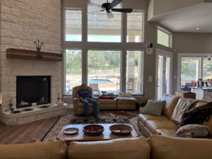
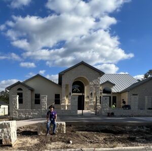
Build a single-story, low-maintenance home that was as accessible as possible, allowing me to live there for at least the next thirty years. The house would have everything I wanted to live in until I was ready to give up homeownership and move into a true assisted living community 30 or more years into the future. The home would be on one level (unlike my first home) to future-proof my ability to get around all spaces. The house would be constructed with a completely wood-free exterior, leveraging stone, stucco, concrete and steel for its components. The days of rotten wood and painting were to go away. While not completely wheelchair accessible the home would have wide doorways and halls, ramps where needed, and roll-in showers for the future.
Why Build?
Custom building lets you get as close to your ideal home as possible. Custom building is not perfect, as nothing in life is perfect. Custom building is about compromise. Sometimes, it’s compromising for budget reasons but also compromising because you are forced to when something happens and it is too late to make a change. Be ready to compromise to fix problems.
Custom Building Formats:
When considering building a home, as opposed to buying one already constructed, you have a choice, depending on your interest in customization.
Production Built: These homes are built to the builders’ specifications, based upon a predetermined set of stock floorplans and may allow you at the end to pick floors, counters, paint colors, and plumbing/lighting fixtures from a pre-set list of products. Not all builders allow for customization through interior finish choice, but many do. This format is the most economical, especially if you can find a builder that offers ADA compliant plans if you have that as a requirement.
Semi-Custom: These homes allow you to customize the product more by moving walls, adding a room over the garage, and picking interior finishes, as well as potentially picking the lot in the neighborhood it will sit on. This option is suitable for people new to building and don’t want to take on the full responsibility of starting from nothing in the process. It blends the best of full custom with off-the-rack home building and provides some level of customization. For the first-time home buyer with a disability this is the best option if you don’t have, or desire to gain, construction experience. This format is also well suited to introducing ADA requirements that are more suited to your needs, as long as the builder is receptive to small changes that can be planned in advance.
Full Custom: This form of building is what I engaged in during my first and current build. It allows you to start with your own dream and see it come fully to fruition. It also allows you to experience the entire construction process, which has its good and bad points. This can also be the most labor-intensive and stressful, as you start with a clean sheet of paper and have to make all the decisions yourself. It also requires working with a cadre of building professionals to make the reality come true. From architects, designers, land developers, engineers, bankers, lawyers, landscape architects, decorators, and building professionals, you will be engaging with a wide variety of people to make your dream home come true.
My advice to potential home builders: If you are new to construction and have a limited support network, start off by building a production home that allows you some personalization but is much more manageable.
My advice to builders of production homes: Offer accessible websites to highlight your product offerings and have some, if not all, plans that have accessible features as increasingly more people appreciate a good product that accommodates people of all abilities. Make sure your website meets the internationally recognized standard Web Content Accessibility Guidelines (WCAG) 2.2 AA compliance and ensure any PDF-based materials you offer are also accessible.
Selecting a Location:
We already covered this topic in the first and second blog postings, so I won’t repeat myself but will add that full custom home development typically is in a neighborhood where other custom homes are being constructed but it can also occur on larger tracts of land in more rural areas. Your builder can help guide you in the lot selection process. A real estate professional can also help if you are already working with one. I highly recommend that you do not purchase a lot unless a qualified builder has reviewed it and said your general concept is compatible with the property. A professional builder will warn you about the budget challenges you face when building on different types of lots as they vary depending on the topography of each individual lot. The size of the home you want to build, along with other outdoor structures, will also dictate the size of the lot you need. In my case, I wanted a one-story home, a pool, and a front courtyard garden. This dictated the size of the lot I needed and the amount of slope the lot could have. I knew what the house should look like for the most part; adding in the other outdoor elements dictated the size requirements. You can also approach this in the opposite direction by picking the lot and designing the house to fit the space. It is always best to have an idea of what you want to build before lot selection.
My advice to potential home builders: Don’t purchase land that is not developed, doesn’t have completed streets and utilities, no matter the price. Get a second opinion and ensure your friends and family members weigh in on your selection.
My advice to large developers of residential neighborhoods: Ensure your website and PDF-based brochures and contracts are accessible. Having a ramp to the office door for the sales office is nice, but don’t forget the digital accessibility of your public-facing digital assets.
Accessible Design and Computer Aided Design (CAD) Software
Working with a Designer:
There are many ways to design a home, and no one way is perfect. You can purchase pre-developed plans off the internet, or you can start from a blank piece of paper and an architect or a home designer to work with you and make a unique plan that meets your needs. Many builders offer design services, or you can work with an architect or designer independently before finding a builder. This is the route I went down. I had plans in hand before approaching builders. There is no wrong way to go about it. I do think I would use an architect over a designer due to aspects of my disability, the need to be very detail-oriented, and the need to be able to speak about terms and concepts in a way a blind person can understand.
The key is finding an architect or designer that has experience working with someone with a disability. This was not easy to find, and even harder during the peak of the pandemic, when I had to do the initial design work over Zoom calls. I’d recommend interviewing different professionals and ensure you are upfront with your disability and the challenges posed. In my case, the challenge would be seeing what they drew. Make sure you go to the designer with a requirements list for rooms, rough estimates of sizes, and specific features the home needs to have. Make a list of special features required to make the home accessible to your particular disability. If you are a wheelchair user and desire a two-story home, an elevator system will be a requirement. Ramps are often necessary for wheelchair users, but as a blind person, I really appreciate them too. I normally don’t use a cane indoors or outside when on my property. My home was designed with no steps, so I can come and go without worrying about finding and using stairs. It’s a bit of a challenge when you live on a hill, but my landscape architect and the designer were able to make it happen, and I have a lovely eight-foot-wide ramp sidewalk that leads to the front door.
I am comfortable with using AutoCAD and scripting commands. Using AutoCAD is a very technical skill, similar to programming. Developing the plans for my house was backward from the standard processes. You usually give the designer the list of requirements, and from there, they develop concepts to show you. Since I can’t see these types of concepts when they’re drawn, unless a labor intensive process is executed to build a 3D model, it’s easier to take my ideas in my head and draw them out on AutoCAD, allowing me to show my representation of the layout on paper or PDF for what I wanted the house to look like. The designer would review and we would discuss concerns and challenges. They would propose other ideas and solutions, then back to the AutoCAD drawing board I would go to rework my design. We would iterate on this until we finally got a rough design I was happy with, and the designer said was workable, and then it was turned over to them to develop the final set of plans. We did a 3D model of the final design concept that was used to make small tweaks which was a big help with solidifying the design.
My advice to potential home builders:Find an architect or design professional that’s comfortable working with you. Discuss in advance the need for additional time required to communicate the design so you get what you want and plan a strategy for how you will consume the design if you can’t see it.
My advice to computer aided design software professionals:Work to make computer aided design software as WCAG compliant as possible and provide keyboard alternatives for non-mouse users.
The Builder:
Finding a builder is a lot like finding an architect or a designer to work with. They have to be comfortable and willing to work with someone who does things differently. Pick your builder carefully because in the custom home building business it is a long-term relationship that averages a year or more. There were three months of bidding for the job and contracting, fifteen months of construction, and another one to two months of adjustment and warranty work once I moved in. Your builder should recognize and understand your needs and be willing to be flexible to accommodate your needs. For me, that meant understanding that I can’t see pictures and PDFs that are not accessible. I will have problems with reading, transportation is always a challenge, and any problem solving requires a job site visit to get my hands on the issue in order to discuss. Builders should also understand that they may need to spend more time working with you on selections and solving problems, as it was for me since being blind means these types of things are done differently. Time spent reviewing plans even after initially signing off from the designer is one area I should have been more assertive on in order to avoid some of the problems I encountered, but like anything, everyone is always under pressure for time and this did not get as much attention as needed.
Spend the time to have a conversation with your builder on who is responsible for what activities. Who is responsible for picking up products, reviewing work, and making decisions? How will changes be handled and what’s the process for payment of over-budget items? The more time you spend picking out specific items – make sure to include brand,model number or style – and getting them written into the contract before you sign off on them, the better off you will be.
Selection Challenges:
When building a fully customized home, selection is the name of the game. You have to pick everything, all the way down to the door handle, door style and paint color for the door. While a lot of selection work can be performed online, as long as the site is accessible, there are many cases when it is just easier for a person who is blind to go out and touch the products being selected. For me, this was important when picking tile and flooring. This is normally conducted at a showroom where you are hoping they have the particular product you want to see. Sometimes materials have to be ordered when the showroom doesn’t have a particular sample. Having friends and family that know your style and are good at describing things is necessary. If you are blind, I do recommend you have a decorator or trusted friend that is good with color to help with all color selections since changing color after it has been applied can get expensive. Selecting colors online is a good first attempt at the process but I do recommend actual samples to get a good read on the color before deciding to paint the entire interior a specific color. I found reading color reviews and watching YouTube videos on color selection very helpful, even though I cannot see.
My advice for potential home builders: Talk to your builder up front about all the potential accessibility issues that can come up. Most issues will be PDF based since you will be reviewing a lot of bids and signing off on changes and contracts that usually are in some form of a PDF file. Electronic signature systems can also be another sticking point if they are not WCAG compliant.
The Construction Process:
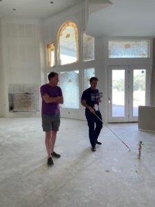
Construction is a very slow process that takes time, no way around that. You will meet a lot of people during the process and yes, you may be of interest since most construction workers are not used to a disabled customer visiting the job site. They may have a lot of questions, but might not want to ask you directly. In many cases, they may be scared to talk to you, preferring to go through the builder or a friend/family member that may be accompanying you. I don’t like it but this is the reality, at least in my case. The most popular question was always, “how will Patrick get home?”, if I was not with a friend or family member. Not everyone is used to the resourcefulness of people who live with disabilities. Plan on a language barrier too unless you speak more than one language as many of the trades people use English as a second language or may not speak English. Google translate can be your best friend at times.
Inspecting the Work:
During the building process, you will need to be on-site as much as possible to inspect work and catch problems before they get too far in the building process that they can’t be easily corrected. If you are blind, during construction is when the plans become reality and I can almost guarantee some form of miscommunication between architect, designer, or builder will occur and something will either get built, or not get built that, you did not expect and did not catch in the agreed upon plans. I got a gable I did not ask for and really couldn’t fix, a living room ceiling that was not sloped that was fixable for a “nominal” $2000 change fee, and a wall that was six inches too far over that I ended up finding and told the builder about but was completely ignored because it was already too far along in the process. My biggest frustration is not being able to see the plans and having to rely on others to read them for me to catch any problems. Getting people’s attention is hard too and finding someone trained in reading blueprints is not easy.
At first, you may visit the job site one or two times a week, but if you are like me and want to stay on top of things as they progress, you will end up visiting upwards of five to six times a week. Trust me, if a construction worker can find a way to ignore something, they will. It is your job to find the problems, point them out, and stay on top of them until resolved. Don’t expect your builder to always do the right thing as every additional dollar they have to spend fixing something is a dollar out of their bottom line. Expect somewhere during the building process to be taken advantage of. This is normal for anybody building a home and it can be much easier to take advantage of someone with a disability. You hate to have to say that people will take advantage of someone with a disability, but it is often a reality. It is real, and I have experienced it many times, which is why I have to enlist a host of friends, family and hired professional inspectors and engineers to work with me to ensure the project is being built to the requirements outlined in the contract.
My advice for potential home builders: Hire a trusted home inspector for at least three visits to be your eyes on the project and provide professional advice on the progress. This is in addition to the on-site engineer the builder should have to monitor foundation, framing and mechanical work being performed. Let professionals that you may hire know that you will need accessible and compliant PDF documents or alternative document formats, like Word, that are usable to you to be sent for their final reports. My home inspector report was completely inaccessible and I had to OCR (Optical Character Recognition) it to get the information contained.
Home Building Challenges:
Communication:
Like any major project, communication is the key to success. You will be working with a large group of people to make your custom home a reality. Even if you delegate most of the construction management to the builder, you have to manage the builder relationship as well as the bank, if you are financing. You have many selections to make and have to sign off on things like color, style and quantity. Selections are something the builder will provide their opinion on, but they won’t be making the decisions. If you are not good with making a lot of decisions and writing a lot of checks, you might want to look at the semi-custom route for building a home. The biggest problem in the communication arena is the prevalence of inaccessible PDF documents and payment systems. Yes, the builder will be paying most of the bills but you are most likely going to want a change or to add something to the home that is not in the original contract that you will want to purchase and therefore will have to pay for.
My biggest problem was when I wanted to add glass tile to the bathrooms which was not on the original contract. It should have been simple. The designer at the showroom helped me pick out the glass tile and place the order. Then came time to pay for it. Online payment wasn’t the problem. The form was pretty accessible until it came to signing. The form wanted me to sign with a mouse or my finger on a touchscreen. A royal pain that requires me to find a sighted person to scribble nonsense in a box just to make an automated system happy in order to make the payment go through and get the tile ordered. This happened several times.
Owning property has its advantages and disadvantages. When you own the property, you call the shots since the land is yours. When the builder owns the property, they are in total control since ownership of the completed property and any home improvements don’t become yours until after closing.. Technically, when the builder owns the property they can ask you not to set foot on the property unless you are supervised by them during designated times. When you own the property, you do have to do more work for that advantage of control. Many governmental processes fall on your shoulders to manage. Setting up accounts for utilities and dealing with a property or homeowners association also falls on your shoulders if you own.
Both ways have their advantages and disadvantages but I prefer owning the land despite the extra work and headaches that can occur. I bring this subject up because as the owner of the property and entire project, you will be faced with a host of additional organizations you have to deal with which opens up many opportunities to discover inaccessible systems, such as PDF and online workflows that you have to deal with.
Some examples I encountered were yes/no buttons from my water company for electronic statements set up that couldn’t be operated by keyboard, a troublesome payment form that required a mouse for a simulated signature for trash service, and numerous inaccessible PDFs from my local government regarding tree ordinances. The good news was that my local city government has an accessibility department that helped me out, but they don’t control the electric or water company.
Transportation:
If you are disabled, transportation can be a hassle. Much less so now that we have rideshare. Nevertheless, it is an important thing to take into consideration and you may want to budget for it. I couldn’t be successful at building this house or with living where I am building without the technology behind rideshare. Make sure you have a plan to visit the job site regularly and ways to go to showrooms and building centers to make selections and purchase products. Friends and family are always your best first choice and some contractors are willing to come to you depending on the product and need, but you should always have a backup method to get to where you need to go for conducting the business of building a home since meeting timelines are critical throughout the process.
My advice for potential home builders: Plan for inaccessibility. Try to educate as much as possible, but don’t expect to fix it all. If you do, you may never get your house built.
Digital Accessibility and the Smart House:
When building a fully custom home, you have the opportunity to choose all the products and systems that go into it. This is good because it allows you to tailor the environment to your specific needs, ensuring as much as possible that the products are accessible. This can also be challenging since you will be responsible for the accessibility of each system, which can make the selection process time consuming, tedious and frustrating. Many manufacturers are clueless regarding the accessibility of their own products and unfortunately, most builders are also clueless to digital accessibility and will require you to select products and systems that are usable to you.
Below is a list of just some of the products that warranted a decision I had to make for my new home where the accessibility of the product was in question. If the line item has “connected” listed next to it in parenthesis that means you can manage the item with an app on your phone. If it doesn’t, it means you can’t. In some cases when it came to very expensive items that were run by a touch screen system or app on your phone, I chose a less expensive product where the accessibility could be judged by standard controls.
Climate and Security:
Thermostats (connected)
Electronic deadbolt locks
Lighting controls (connected)
Security system (connected)
Security camera system (connected)
Doorbell (connected)
Appliances:
Refrigerator (connected)
Wall oven (fixed touch panel)
Cook top. (fixed touch panel)
Microwave oven (fixed touch panel)
Dish washer (fixed touch panel)
Entertainment and Convenience:
Garage door openers (connected)
Audio/video distribution systems (connected)
Gas fireplace (connected)
Pool equipment management system (connected)
Irrigation controller (connected)
Water softener (physical buttons)
The oven is one specific example of this. There was an option for a color touch screen version but I was told the app didn’t have all the functionality on it, requiring you to still use the control panel for some functions. With expensive items, I erred on the side of being conservative in selecting simpler solutions, until the day comes where all manufacturers are required to make products everyone can use. While the ability to find products with non-touch screen interfaces is still fairly easy, more and more product designers are moving in the other direction especially on more high-end products. A push needs to be made to ensure these products are accessible. My cooktop ordered in 2022 is about to be discontinued and replaced by an updated version with a dynamic touch-screen model that I can’t use. I had to make sure my unit was available as it still has fixed glass panel buttons that don’t change and can be labeled in Braille. Designers and manufacturers of any product that uses an electronic interface that include touch screens should ensure all people of all abilities can see it or that there’s an alternative accessible app on their phone so that full accessibility is provided.
As I finish up writing this posting I am attempting to create my online account for the app on my phone that will manage my swimming pool equipment. It’s not a good experience when you can’t even fill out the create account screen to get into the app but that is where I am at and I will need to get assistance to set up the account to include my password, so there goes security and accessibility for this app. Just another thing for me to work on in my limited spare time.
My advice for potential home builders: Start early in the product selection journey to locate accessible products for your new home. Don’t wait until you are in the building process to find them since there won’t be time and you will be forced to make decisions that may not result in the best experience.
My advice for manufacturers of home appliances, automation and audio/video equipment: Remember that your customers have varying abilities and your products should be designed to meet the needs of as many people as possible.
Important Things to Remember:
Compromise is the name of the game: Your home will not be perfect, I can almost guarantee it. Knowing how to compromise is key to a successful build and your sanity.
Have a Plan B: Things will happen. Always be flexible and have an alternative way to solve a problem. Just plan for it. If your favorite roof color is denied by your HOA, be ready with a second color you could compromise on to get the process moving.
Budget Concerns: I didn’t like hearing this but at the end of my build I have to say it is true. Take your construction cost and add 10% more for final completion. For some, this may be a large number. Given the current economy, it is true. At least in my experience. Remember to always have a plan B.
Be prepared: Having to answer questions about your disability is common because for many in the construction trade you are the first disabled person they may meet.
Conclusion:
At the beginning of the process, especially the design process, custom home building can be a lot of fun. During the initial construction, as the foundation and walls go up, there is a lot of enjoyment seeing your ideas become reality. What is also a reality is that the farther into the building process you get, the more problems will appear. By the end of the entire process, you will be worn out and you’ll probably just want time alone without a contractor asking you questions that require decisions or more money to be paid.
Would I do it again if I could roll time back three years?
Most likely.
Will I custom build again in the future if I find myself needing to move again and buy another home.
No.
Would I do this all over again if I had the choice?
More than likely. I would certainly give the thought of purchasing an existing home more of a chance before going down the path of custom building, but I would do it again.
It has been a three year long journey from looking at property and getting my past home ready for sale (first year), to designing the home, purchasing the land and locating a builder (second year), all the way to the actual building process (third year), which at the time of writing this blog, will be about fourteen months total, not including the pending landscape work.
The home building process is definitely a life experience and I am glad I am doing it now when I am still young and able to endure physical and mental stress. I got my perfect home for the most part and I look forward to the day when it is truly complete. I still have a lot of landscape work to complete that will take time, energy and of course money. I still have the move-in process to work through and look forward to being completely moved in, pictures hung and all boxes unpacked.
Digital accessibility is everywhere in life, including all aspects of the home building process. From construction professionals, to big box stores, to home construction product manufacturers, their websites, PDF documents, apps and touch interfaces. All need to be accessible to people of all abilities because all people should have the right to have a place to call home that they feel safe in and are able to live in comfortably.
I hope you enjoyed this three-part series on “Housing, It’s a Human Right”. Make sure to tune in for the webinar by registering below. I also welcome your comments, questions or requests for more detail on how I handled a specific piece of the home building process through the comment form below.
Patrick Sturdivant
Patrick Sturdivant is Vice President and Principal Strategy Consultant at Deque Systems. Patrick has worked in information technology for over 30 years. An experienced software engineer who is blind, Patrick deeply understands the technical challenges our customers and the disabled community face when it comes to accessibility. Coupled with his testing, team building, training and DE&I strengths, Patrick is a consulting force to be reckoned with. For the last eleven years, Patrick has been dedicated to promoting digital inclusion for all through awareness and the benefits digital equality brings to all users by sharing his own personal story of leading a digital lifestyle using multiple screen readers on both desktop and tablet platforms. Patrick’s accomplishments include accessibility lab and disability employee resource group establishment experience, US Patent holder for several bank products designed for the blind and his ability to influence at all levels of an organization’s business and technical teams.
A 3-Part Series on the digital accessibility of the housing process experienced by people with disabilities.
In this 3-part series, we will look at the challenges and rewards of the entire experience surrounding the process of acquiring housing for people who live with a disability.
We will look at:
Buying an existing home
Leasing an apartment or home
Building a new home
All three options have some similarities and many differences. We will recap the 3-part blog series with a webinar, where Matthew Luken and I (Patrick Sturdivant) will have a conversation about my firsthand experience with all three scenarios, and can answer any questions about the process. You can register for the webinar here.
Who is this blog posting for?
We hope that anyone interested in digital accessibility will find this series of value, but more specifically, the blog applies directly to the following groups.
Business professionals in the housing industry working with customers or providing platforms to support home ownership.
Technology professionals focusing on the apps, websites, and electronic document resources that drive the entire process from locating, financing, closing, and moving to making the process work efficiently for people of all abilities.
Digital Accessibility program leaders looking for opportunities to improve their organization’s overall experience for people interested in buying or leasing a home.
People living with a disability that are interested in participating in the process to own or lease a home.
Part 2: Leasing an apartment or home “Your Peaceful Sanctuary”
For many people of all backgrounds, apartment living is their first step towards being independent. For many people with a disability, apartment living is a great first step towards being independent, as well as a wise long-term housing solution. While my experience detailed in this blog was with leasing an apartment, much of what is covered here also applies to leasing a standalone home.
For those of you visiting this blog posting for the first time, it is a 3-part series covering my transition from owning a home, selling it, renting an apartment and building my new home. Check out Part 1 to learn about the home buying process and get ready for part 3 (coming soon) which will cover my experience building a home as a person with no sight.
While most people move into an apartment as their first time living independently,, I actually experienced this process in a different order than most as this is the first time in my life that I have ever lived in a leased property. My first step towards living independently was the building of my first home in 1993.
I initially wanted to rent a single-family detached home after the sale of my first home of 28 years but was advised not to do so for a few reasons. I was leaning away from apartment life because I was so used to the single-family detached house experience. Friends and real estate professionals told me a house would be more work to maintain. The yard would require maintenance and I might have a harder time extending a lease flexibly for periods less than a year at a time, like a month-to-month, unless I moved into an apartment. While yard maintenance is not a problem for me, having tackled that task for 28 years in my previous home, it would take time, money and effort away from building my new home. The main reason I went to the apartment living side was for the flexibility in leasing terms to coincide with the end of my build so I could be positioned properly for the final transition from the apartment to the new home.
I will break out the process of leasing an apartment into these main categories:
Locating an apartment
The apartment application and move-in process
Daily life in a leased property
The move-out process
Locating an apartment or home to lease
The process for locating your new apartment or home is similar to purchasing a new home, which you can review in part 1 of this blog series. You basically need to focus on the part of town you would like to be in, the type of property you want to live in: apartment, duplex, townhouse, single-family house, etc., and the amenities you would like your new space to have. There are a variety of apartment and housing locator services that can assist with current property features and openings like Zillow, Apartments.com, and others. There are also real estate professionals that can help with locating apartments but these professionals tend to lean more to helping with home rentals. You may also have friends and family (aka word of mouth) that can help in your search.
If you’re looking for an apartment home and have determined the area of town you’re interested in living in, the process is to review all the complexes in your desired area and find the one that has the right price, quality and amenities that align with your requirements. You can do some homework up front by reviewing websites for each complex or by visiting one of the many apartment locator services that can show properties in a given area of town all from one site. The accessibility of each apartment’s website or locator services’ website will vary so be prepared for potential accessibility issues to overcome.
If you require an apartment with specific features to accommodate your particular disability (i.e. wheelchair accessible) add the “ADA” tag to your search to locate units that are advertised as being accessible. Once I found apartments I was interested in, I made a call to the leasing office to get questions answered and check availability since there is no point in visiting a community if there are no available units in your given move-in timeframe. In my search, the leasing agent did offer me a wheelchair accessible option but I declined since I really did not need this level of accessibility. Once you find the complex you like, then it is just a matter of working to determine when a unit will become available depending on the current market demands for units. I ended up visiting six properties. From these options, I luckily found the perfect fit available at the time I needed.
While location was a big factor in my selection of my apartment, there were a few more factors I was looking at to guide me to the perfect property:
What kind of onsite security was available?
What were the storage space offerings?
What parking options were available: surface, covered, reserved, shared garage, or private garage?
What were the outdoor spaces (balcony, patio, common areas, etc.) like?
It was these elements that helped me focus on one particular complex. Having an apartment that had some level of controlled access was a major factor for me so I could feel safe or as safe as one can feel in a large multi-unit apartment building. Parking was the next big item that got me hooked on my current apartment because I have two vehicles that needed to be garaged out of the elements in a relatively safe area. Access to a private garage for one car was a plus for a nominal monthly fee. The building is multi-story with five floors.
What attracted me to this property was the ability to drive up through the garage to the same level of the building as your unit to park. This allows me to easily transfer groceries or purchases to and from the vehicle safely and out of the elements without having to deal with stairs or elevators. I say safely because if you can’t see, navigating open parking lots in large spread-out complexes is not ideal. The ability to park, get out of your vehicle, and walk a few steps to a door to go through and down the hall to your unit is what sold me on this complex for compromising over a leased single family detached home.
Important apartment or house hunting considerations:
Do you require an ADA compliant unit?
Is an elevator a requirement if not living on the first floor?
How many bedrooms do you need?
Is high speed internet available in the unit?
Do you have requirements for where in the property your unit is located: first floor, upper level, near the lobby, backside (potential for less noise)?
My advice for renters: Call ahead and talk to the leasing staff about your requirements before visiting. Tour as many properties as you can and take along a friend or family member to help evaluate the properties.
My advice for apartment properties and apartment locator services:Make sure your website is ADA compliant and meets Web Content Accessibility Guidelines (WCAG) 2.1 AA level to ensure all visitors to your “electronic front door” have a good experience and can obtain the information required to properly evaluate the property’s offerings. Ensure your electronic documents can be read by everyone, including those who use a screen reader. Never presume the potential customer will have family members to help with electronic documents or electronic signatures.
Application and move-in process
Renting or leasing an apartment or house is kind of like buying one, but there is not as much long-term commitment and a lot less paperwork. I said less, not none. You will still need to complete an application and be approved before you are able to review the final contract. The application process will require you to provide many documents in electronic formats such as proof of income and proof of insurance. The rules for a leased property are important to know. Try to get as much detail in advance so you can review and know what you will be responsible for doing while you are a resident. Most likely, you will receive these documents electronically and hopefully they are accessible. I leased from a large corporation that has many large properties so most documents came as PDFs. Depending on where you are leasing, you may be working with a much smaller operation, so documents may not come in electronic formats. Hopefully, you can receive some form of electronic copy otherwise you will be dealing with paper hardcopy.
Once your application is approved, you will need to sign the lease. This can be performed either electronically or as a hardcopy. I was able to get through the application process, review my lease agreement, and electronically sign all documents rather smoothly. My leasing agent was helpful answering questions and walking me through the process of signing and submitting necessary supporting documentation like rental insurance and information on the vehicles I would be keeping at the property.
Everything went smoothly until the move-in day when I was asked to perform a move-in review of the unit to document any issues prior to taking residence. This was during the COVID-19 pandemic and people were just getting back to interacting with each other in-person. The problem I had was that the report to be submitted was electronic and was to be input to an iPad the leasing office provided. I did have a friend to help with this task, but the software wasn’t very user-friendly and involved answering questions and taking pictures. After about an hour of frustration, my friend and I returned to the leasing office and said this solution wasn’t going to work and that we needed to find an alternative solution. Luckily, I had a top-notch leasing agent that knew this problem could be solved by just coming up to the unit and doing the report together on their iPad. We walked the apartment, noting all the scratches, dirt, and missing items. She recorded and photographed the items and the problem with the move-in review went away.
When you can get connected to people who are willing to be flexible in solving problems and addressing accessibility issues, many times it can be a simple fix. Even though their applications weren’t completely accessible to me, their provided accommodation was a good workaround for a one-time solution.
Daily life in a leased home
Communication:Living in either a leased apartment or a house is different from owning the property in several ways. When you own your home you get to make up most of the rules for the property, but when you don’t own your home your landlord makes the rules. Knowing the rules of a leasing agreement is important so having the rules in an accessible format is key. Understanding the rules of living in a leased property is not just a nice-to-know thing. For example, it can actually impact your pocketbook with fines if you forget to register your new puppy with the leasing office.
Receiving updates regarding activities, incidents or planned maintenance in the complex is important to have access to as well. Email communications need to be accessible especially when PDF attachments are involved. If you have a vision problem, make sure your property manager is aware that you may not be able to read all their signage. Many times, I have experienced a quick sign posted with no other form of communication like a follow up email. As I write this blog posting, there are some sort of issues with all the pools in my complex, but I can’t figure it out and had to email the leasing office asking for an explanation. I am sure there is a sign on the pool gate, but I can’t see it.
Maintenance:One of the best benefits of leasing is that you aren’t responsible for maintenance when something goes wrong. I am fortunate that the maintenance crew at my complex is very responsive to my requests once they are submitted. One of the main problems I have is that the accessibility of the public-facing side of the apartment complex’s website, which is the marketing side, is very different from the resident’s portal which is the side of the website that you use when you are a resident to submit requests or pay rent. The public-facing website uses digital accessibility solutions to make it accessible which is not the case for the resident portal. The accessibility of a static site that shows lots of pictures and marketing verbiage is one thing, but interacting with an online portal for payment processing, maintenance ticket submission/tracking and document uploading is another.
When I first moved in, I spent over an hour trying to set up my payment preference through the online portal before I had to give up and go to the leasing office for assistance. Unfortunately, it was at the cost of me having to let them log into my account to get me set up. The problem got solved but I did have to deal with the inconvenience of having to change my password once it was set up.
One of the main concerns I have been experiencing with accessibility problems is submitting maintenance tickets. It is doable through the resident portal, but it is a bear of a process since the form requires you to go through five to six drop down lists that aren’t accessible in order to describe which room, what type of problem and other key details about the maintenance request so the maintenance team knows what to be ready to work on. I keep putting in tickets periodically just to see if anything has improved. If I am not in a hurry, I’ll just drop by the office and ask that they submit a ticket for me, which they happily do and the staff in the leasing office has had to learn a lot about working with a person who has a disability, which I hope they can appreciate more after two years of me being there to remind them I do things differently.
Packages:You would think that receiving an Amazon order or any type of delivery from UPS, FedEx or USPS would be easy, but not when you live in a large apartment complex. My community uses a package delivery locker system that delivery services use to distribute packages to residents instead of delivering them direct to your door. This is a room with several large locker cabinets about eight feet tall and sixteen feet long that has a touch screen kiosk in the middle that you have to use to log into in order to open the door of the appropriate locker containing your package. There is a website and an application for your phone that you use to maintain your account. You receive text alerts when packages are delivered for you to pick up. You have to log into the kiosk with your username and password or scan a QR code to get the locker to recognize your account and open the locker door that contains your package(s). None of the available tech would work to do this automatically since the kiosk is a touch screen and a screen reader is not an option. The QR code scanning doesn’t work because you have to use the touch screen kiosk to select the QR code mode before you hold your phone up to the camera.
Since Amazon deliveries are critical to my way of life, fixing these issues was a must considering that the leasing office staff that is located in another part of the building would have to help open my locker each time I had a package wasn’t going to be a long-term solution. I had to email the customer service for the locker kiosk system explaining my problem and asking for a solution that could use a screen reader. Their answer was to call customer service when I had a package, authenticate over the phone and the agent would remotely open my locker. This is not the perfect solution, as there are times when you are placed on hold to wait for an available agent, but for the most part it has worked as a viable solution to accommodate my need for access to packages.
My advice to renters: Ask how you will receive packages, to your door or to a locker system. Be prepared for kiosk accessibility issues if using a locker system.
My advice to kiosk vendors: Have you considered how people of all abilities will use your system if they can’t see or use their hands to perform fine motor skills?
Lease Renewal:When maintenance items are not an issue, daily living in a leased property is fairly easy and straightforward. Like anything, nothing lasts forever. At the end of my first year it was time to sign a new lease. The signing of the first lease was a snap and went smoothly as I was able to read the 70-page PDF and use my favorite electronic signing software to place my John Handcock on the PDF all by myself. I informed the leasing office I was going to renew my lease so they generated the lease renewal document and emailed me a link to click and download the document so I could read through it prior to electronically signing.
When the link arrived in my email, things started to become problematic. In order to keep this part of the story short, I will not bore you with all the details but will say after investigation, the software the leasing company’s website vendor used to create the PDF and provide the electronic signing feature changed from a well-known accessible platform to a much less expensive off-brand product that couldn’t even spell accessibility. The new software was so bad that my screen reader couldn’t read one word of the page let alone show me how to access the PDF that was stored in their system. To make things worse, the original leasing agent I worked with during move-in had taken a promotion and was moved to a different property so my issues with the software wasn’t taken well initially by the remaining staff that had gotten used to avoiding me and having my original agent always work with me. I explained the problem and was met with no alternatives.
I had to be a bit assertive with the new agent I was working with when I was told I had to sign electronically and that wet signing was not an option. The accessibility of the new software was so bad that I couldn’t even get the document to come up to a point where I could print a hardcopy. I asked if they could print me a copy and was told they would have to talk to their corporate office to see if they would be able to do that for me. That was when I lost my cool and emailed the corporation and asked why my leasing agent was not offering me alternative options when they were the ones who now had an inaccessible solution that was causing problems. An hour after my email was sent, I was called and asked to come down to pick up a hard copy and was told that wet signing was now an option whenever I was ready. This is a great example of knowing when it is time to escalate a problem to the next level for assistance.
I ended up using my Seeing-AI app on my phone to read the 70-page document. Most of the document was straight forward and was the same content from the year before but there were a few critical pages that talked about the terms of the lease that were read but not perfectly for my liking when it comes to facts and figures. I ended up having the agent read me the three or so pages with the terms and figures to me and I executed a wet signature to seal the deal. So far, this has been the worst part of my apartment living experience when it comes to accessibility.
My advice for developers of property management software: A great on-line experience can go south with one update. Testing of accessibility needs to be performed with every release. When changing vendors accessibility has to be accounted for. If the software company changing electronic signature vendors had tested prior to the contract signing they would have been aware problems would be encountered by users who have disabilities.
Apartment management software needs to be accessible both on the public and resident side. On premise digital solutions for security access, package lockers and the like all need to be made accessible to people of all abilities. While small landlords who have a handful of properties (units) may get by in a court of law that it would be an undue burden to provide accessibility when a large corporation with 5000 units is being asked to be accessible to people it will most likely be looked at differently when it comes to the undue burden department.
The move-out process
As I write this, I am currently in the middle of the move-out process. The first step was giving 60 days’ notice and signing a document. The document, which was a long list of things to do and clean that included key dates, was for the most part an accessible version of what appears to be a Word document. I was not given an option to sign electronically so I signed a hardcopy. I was able to receive the PDF as an email attachment in order to read and understand it. I did have to go down to the office and have them fill out the form since I didn’t want to recreate a Word version of the PDF to complete on my computer. Moving out will require an inspection but this time the leasing office will perform that and provide me with a report. I will do an in-person walk through at the end with a leasing agent to verbally go over any issues they may see prior to giving up the keys and making my final payment.
My advice to renters: Be flexible and think of alternative ways to accomplish the task at hand and have a plan B
Conclusion
Housing, in whatever format works for you,, is a human right. Everyone requires shelter to survive and that includes people who do things differently to accommodate disabilities. While the accessibility of housing websites, mobile apps, electronic documents and kiosks varies a lot in the leased property realm, you have the right to expect equal access whether you’re leasing a home with or without any type of assistance. It is my opinion that digital accessibility in the real estate business, and all relative businesses involved in housing, still has a long way to go to catch up to other industries that are more closely regulated and therefore have had to work to be inclusive and accessible for a longer period of time. As digital accessibility becomes more mainstream, I do see this space becoming more usable to people of all abilities. The important thing is to make people aware of what you expect and work with them as they learn about inclusion of the disabled. I know my leasing team at my apartment is now much more in-tune with working with a person who is blind.
If you work in the technology space for the home or apartment leasing industry and provide customer facing web pages, documents, mobile apps or kiosk solutions and want to learn more about automated testing for accessibility, the Web Content Accessibility Guidelines, or digital inclusion for people of all abilities as it relates to your products and services, reach out to Deque Systems for assistance.
Stay tuned for the final installment in this 3-piece blog posting about housing: building a new home without sight.
Patrick Sturdivant
Patrick Sturdivant is Vice President and Principal Strategy Consultant at Deque Systems. Patrick has worked in information technology for over 30 years. An experienced software engineer who is blind, Patrick deeply understands the technical challenges our customers and the disabled community face when it comes to accessibility. Coupled with his testing, team building, training and DE&I strengths, Patrick is a consulting force to be reckoned with. For the last eleven years, Patrick has been dedicated to promoting digital inclusion for all through awareness and the benefits digital equality brings to all users by sharing his own personal story of leading a digital lifestyle using multiple screen readers on both desktop and tablet platforms. Patrick’s accomplishments include accessibility lab and disability employee resource group establishment experience, US Patent holder for several bank products designed for the blind and his ability to influence at all levels of an organization’s business and technical teams.
There has been a lot of buzz recently about Artificial Intelligence, with some people speculating that we are approaching the long-awaited AI revolution. This hype has been chiefly generated by recent advanced algorithms powering ChatGPT and other language-related models. While I believe that these models are still a far cry from general AI (AI which is able to learn for any task or problem), there is certainly a lot of power behind Artificial Intelligence driven algorithms.
While the field has been around for a long time, it has only been recently (in the last decade) that Deep Machine Learning approaches have started to take off. These advancements are owed to a couple of key factors.
This blog post will focus on how to specialize AI for understanding user interfaces for accessibility testing, the importance of algorithm and data integrity for accessibility, and how machine learning (machine learning is a subset of Artificial Intelligence that employs a variety of statistical and mathematical methods) can be used to simplify accessibility testing.
Advancements in Machine Learning
First, time has allowed researchers to collect data and also focus on high-quality data. That’s been one of the things that we’ve focused on at Deque. Larger datasets require solidifying data management practices. In turn, larger data sets and better data collection methods result in better performance from algorithms that are trained on that data.
It’s important as you scale up your data sets to make sure that you’re not introducing any noise and that you’re targeting your data collection in areas that will actually yield improvements for your artificial intelligence (AI) algorithms.
Secondly, algorithms are becoming more and more advanced. As mentioned, the basic convolutional neural network has been around since the 1980s and is a relatively primitive technology as far as things go. Since then, significantly more advanced approaches to computer vision have come out that have really helped drive performance in AI.
Lastly, there’s more advanced hardware to train the neural networks on. The GPUs that we have today are very good at processing large amounts of data in parallel and very quickly. They’ve made it very easy to train on large data sets and see huge gains.
ChatGPT has recently generated a lot of hype around AI. For those who haven’t heard about ChatGPT, it is what’s referred to as a Large Language Model (LLM). LLMs are trained on an incredibly large corpus of data and as a result, they can predict next sequences in text and code very effectively. They work on the same probabilistic principles as other algorithms. LLMs are very powerful for quickly generating easy-to-understand answers to prompts, code completions, and more.
It’s important to note that ChatGPT doesn’t actually work particularly well for accessibility. That’s because it’s trained on a general corpus of code and information available on the internet, which as we know, is not particularly reliable from an accessibility perspective.
Specializing Machine Learning for Accessibility
To tackle accessibility with AI and ML, we need a specialized model trained on specialized data. Machine Learning is well-suited in instances where you want to understand something a little bit deeper than what’s just there in the programming.
For example, ML can help if you want to understand what the role of an object is, or what its significance is in a user interface. We use ML to infer the role that an object in a user interface performs. In turn, that can help us check that its programming in the markup meets certain conditions.
This is helpful for a variety of reasons because it reduces the amount of fully manual testing and the amount of knowledge required to test things, while also increasing efficiency. At Deque, we address this particular problem by using several ML techniques: optical character recognition, computer vision, and human-centered AI.
A few years ago, it became our mission to achieve a large-scale, high-quality, accessibility-focused dataset with algorithms designed to interpret user interface design. We should note that Machine Learning is a statistical approximation of real-world data. Unless you can derive a very simple, very basic example, it is impossible to get everything right.
In the chart above, I have plotted what’s referred to as a decision boundary. The decision boundary does a decent job of separating the blue and orange points into their respective classes. Everything on one side of the decision boundary will be considered as one class, and everything on the other side will be in the other. However, unless you model an arbitrarily complex decision boundary, which will actually hurt your performance on real-world data outside of what it was trained on, some things will be classified incorrectly. The algorithms and the tests that power Machine Learning models are designed for account for a certain degree of error-proneness that the models have. Instead of using ML models as a source of truth, we use them to guide users into accessible design.
Computer Vision and Accessibility
At Deque, we use computer vision to tackle the problem of semantic role. Computer vision is a field of AI that enables computers and systems to derive meaningful information from digital images, videos, and other visual inputs and take action or make recommendations based on that information.
Deque’s ML models look at a webpage and analyze the visual appearance of all the components on the page. They also compare the components to one another to incorporate more context, determining what the role of everything on a webpage is and whether it’s interactive or structural.
For instance, a structural component is a heading, a navigation area, a list, a table, etc. The interactive components could be buttons, icons, tabs, list boxes, and inputs. By leveraging our large user base to help us collect machine learning data, we have a huge amount of customers, and subsequently, a huge amount of screens, that we can train on.
Here’s an example of what we use computer vision for: Above is a screenshot of a flight checkout page with a list box to select round trip, one-way, or multi-city. There’s also a date picker, popup button, another list box to select the number of passages, a submit icon, two checkboxes, and another list box for advanced search.
Deque’s ML looks at this webpage and outputs a bounding box around every single element on this page and what it thinks its role is. Our Intelligent Guided Tests (IGT) in the axe DevTools browser extension compare this prediction to what is actually in the markup. This allows us to test things further and make sure that they were programmed with the correct role.
The Importance of Reliable Data for Accessibility
We use a team of qualified human experts to label our data to ensure that the training data we use for our algorithms are accurate and reliable. This is especially important for accessibility as you can’t just rely on what’s in the markup because it often contains semantic role issues. In that case, we actually have humans that are trained in user interface design patterns to verify the accuracy and integrity of our data.
Human experts make sure that what is labeled and inputted into our neural networks is consistent with what is actually semantically there on the page, not what’s in the markup. This ensures better accuracy for our ML models, even though it is often more time-consuming and expensive to collect this data. We want to maintain veracity and reliability with the data outputs.
Using AI to Find Interactive Elements
One of the first examples of how Deque uses this in the real world is in our interactive elements IGT tool. Our ML-based interactive elements tests analyze webpages on their visual appearance and checks that the semantic role of an object on the webpage matches what the ML thinks it is.
For example, our ML algorithms can look at a screenshot of a webpage and identify the buttons, inputs, and other controls, just like a sighted user would. Afterward, this inference is compared to the markup to check that the role makes sense. Once we believe we know what the role of something is, we can test further.
Below is the list of interactive elements our Machine Learning is able to reliably identify:
Accordion, Advertisement, Card, Carousel, Checkbox, Current Nav Item, Date Picker, Icon, Input, Link, List Item, Listbox, Map, Modal, Nav Bar, Popup Button, Radio Button, Selected Tab, Slider, Switch, Tab List, Text Button, Unselected Nav Item, Unselected Tab, Video
The most common objects are navigation items, list boxes, inputs, radio buttons, checkboxes, and text buttons.
Above is an example on the Amazon Web Services login page. At the top, there is a heading that says sign-in as an IAM user. From the bounding boxes on the screenshot, you can see our machine learning has identified everything on this page. All inputs, the sign-in button, links, and logos have been identified and correctly classified. Note that we’ve also identified all of the inputs and the input labels that are associated with them.
Our ML can associate inputs and input labels together on a visual basis. In other words, we don’t need to rely on what’s there in the markup to know which inputs are associated with which input labels.
Above is a screenshot of the Walmart homepage. Observe that there are many different interactive and structural components on this page. Our ML has identified all of them. At the top, we have a navigation menu with several icons and navigation items. For clarity, some labels have been omitted.
An interesting note is that there are several nested presentational tables or layout tables here on the page. Inside each of those tables, we’ve identified the cards, the headings, and the images. In a complicated page with nested components, our ML is able to identify everything present.
Above is the OpenSnow page for my personal favorite ski mountain, Mammoth Mountain. This webpage contains a navigation menu and a tab menu. In many ways, these two items are quite similar, but they do have an important difference and our ML algorithm is actually able to tell the difference between them.
We’ve also identified the button to show a map, all of the headings, all of the list items, all of the icons, the search field at the top, and the switch at the bottom.
The example above shows our interactive elements tool and what we actually do with the output of the ML model. This screenshot is from the Eastern Sierra Avalanche Center, a nonprofit resource that outputs forecasts for avalanche danger on any given day.
When analyzing their page with our interactive elements tool, we’re able to identify a small issue with it: there is a navigation menu that allows you to select from a couple of options. The navigation item that is being analyzed is labeled “accidents.” This item has been marked up as a list item, and the interactive elements tool’s calculated role for this element is list item, but our AI detected that this is a menu item. Is our AI correct?
Instead of telling the user that they are wrong, we ask a question to guide them toward the right accessible markup. We give them the option to say, “No, actually your AI is wrong here. We like the option that we selected more.” In this case, we could argue that a menu item is the most correct markup. In the field of AI, this is called Human-Centered AI (HCAI). Human-centered AI is an emerging discipline intent on creating AI systems that amplify and augment rather than displace human abilities.
Here is another example of a flight checkout page through the context of our tool. In this example, there are two checkboxes at the bottom and the associated text, “add a flight” and “add a car.” Again, we’ve identified everything on this page. The fact that our AI knows which tab is selected just from the difference in the color of the text is of particular interest.
Instead of considering objects individually from one another, our ML looks at them and augments our object detection network with a module that considers object detections relative to one another. This allows us to do some really neat things, like determining which element is the selected tab.
It’s also important to note that our interactive elements tool flagged a potential accessibility issue. These checkboxes have been programmed using a div tag with no provided role. Our ML is able to look at these, know that these are checkboxes, see that there’s no role provided, and then ask the user a question about whether or not there should be a role provided. It will also suggest that a checkbox is the correct role in this case.
For a final example, there is a tab list at the top of this webpage. It says ontologies, features, metadata, and functions. Those are, in my opinion, the four tabs in this tab list. The provided role of the features tab is a button. One could argue that a button is a fine role for this tab in this particular tab list, but it could also be argued that because only one of these things can be selected at any given time and the focus changes based on which one you select, our AI is correct in suggesting that tab should be the markup here.
Again, instead of telling the user that they’re wrong, we ask them a question based on what our AI thinks is going on. We give the user a chance to say, “No, your AI is not correct,” or, “Yes your suggestion is correct.” This approach can help guide you more efficiently and effectively toward a more accessible design without inserting a potential false positive based on our ML detections.
Using ML to Understand Table Structure
Machine Learning is beneficial to digital accessibility testing not just with interactive components, but also with structural components. We use ML to look at and interpret the structure of tables. Deque’s systems can tell what the headings are and what the table, row, and column headers are.
Similar to our interactive elements tool, we check that the visual semantics of the table structure matches how they’re programmed. For example, we look at table cells, table headers, etc. We ensure that what our ML sees on the page matches our understanding of what is programmed. We also identify other structural components such as layout tables, lists, headings, input labels, and their associated input.
In the example above, there is a comparison table for different ski bindings with axe DevTools Pro open with the table tool. This is a complicated table with multiple headers, both for columns and for rows. In fact, there are two column headers on top of one another. The first column header here is an image for the binding, and the second one is the name of the binding. There are also headers like image, product rating, availability, price, etc.
Our ML will take a look at a screenshot of this table and analyze what it thinks the headings and the table cells are. In this example, the first row images have correctly been marked up as headers and all the columns on the left have also correctly been marked up as headers but the name of the binding has not been marked up as a header. This has been marked up as a data cell.
Our ML is able to look at this very complicated table example with multiple layers and determine that the second row is actually a row of headers. This has been programmed as a data cell but the AI identified this as a header cell. Our IGT will then ask the user if that is correct.
Unique ML Challenges in UI Interpretation
When we started this project several years ago, there was little to no prior work or research done on using Machine Learning or computer vision to interpret web pages and user interfaces. There are a couple of unique problems with using computer vision on a web page or user interface.
For instance, user interfaces can be very densely populated with objects. You can have a lot of objects on top of one another or right next to one another. It’s important to have a network that can efficiently process all of these objects.
User interfaces also have objects of very large and very small relative sizes. For example, an icon vs. a footer or a navigation menu. The relative size of those is a factor of many tens, maybe even a hundred. It is a technical challenge to consider so many objects of varying sizes through our neural network efficiently in a single pass.
Then, there’s the challenge with the data. All of the data that is out there for user interfaces or for the web is not collected with accessibility in mind. We had to collect our own data and ensure that the data is labeled manually by humans who are trained in user interface semantics.
Labeling training data can actually be quite time-consuming and expensive to collect because of how many objects can be on a page and how big pages can be. One screen can take up to 30 minutes for one of our experts to label manually. It’s taken many years to grow our dataset to the size that it is. It’s very important to ensure that as our dataset grows, we do not sacrifice quality because it’s very easy to just add a bunch of low-quality data, train on it, and hope for the best.
It’s important to ensure that the labeled data points of our dataset actually add to the diversity of our data. We have implemented targeted data collection methods to ensure that the data that we capture is improving our models so that our investment in this area is targeted.
A Look at Our Algorithm
Our computer vision algorithms are unique because they implicitly encode information about the relationships that objects have with one another. We do this by including a module in our object detection network that considers object detections relative to one another.
In the tab example, it would be impossible to tell whether or not one tab is selected or not by considering it on its own but because of this module in our neural network, we can consider the relationships that objects may have with one another.
There are many more complicated and nuanced examples in a user interface. For example, the search is at the icon next to the input in the navigation menu. Once we implemented this approach, we all of a sudden see much more consistent and reasonable detections coming out of our neural network.
This is a project several years in the making that started as an experiment out of a Jupyter Python Notebook. We wanted to see what was possible with AI and accessibility because there was nothing that existed at the time. Even in the broader field of user interface interpretation with ML, there wasn’t much out there.
Our data sets have grown considerably and our algorithms have advanced to the point where ML is now shaking up the way that we think about accessibility testing. Our data management practices and targeted collection efforts have also helped our advancements significantly.
What Sets Deque Apart
At Deque, our customers help inform our ML algorithms. We also have a complicated and continuous automated data pipeline. Every time we see a data point, it gets integrated into our data pipeline and allows us to learn. If we get something wrong in our interactive elements or our tables tool, our users will let us know. We use this as a future training example for our algorithms.
The amount of time between when we see we get it wrong, when we learn, and when we have a fix in the deployed model out in production is at most two weeks. Lastly, our computer vision algorithms are designed specifically to meet the concerns of user interface design. We are using this relationship module in our neural network to specifically target the user interface design specifics and the relationships that objects have to one another. We also have a team of expert human labelers that are trained in user interface semantics and they verify the accuracy and integrity of every single data point that we have.
We also use some unsupervised ML methods and human input to perform targeted data collection to ensure that any investment we have in our data set does not go to waste and that all the data points that we collect are actually helping to improve our networks.
Data Management and Collection
Deque has access to the largest accessibility ML data set in the world. We have several hundreds of thousands of user interface screens and we train on all that have been labeled and verified for their integrity. Each user interface screenshot has all of its components labeled structural and interactive by these experts.
We do a couple of things here to increase our labeling efficiency. First of all, our ML models are used to pre-annotate each data point so that our labelers aren’t just starting from scratch. They’re actually correcting the template label that we give them from our ML model. We found that this improves efficiency from anywhere between 25-50% during the labeling process.
We also use unsupervised machine learning model methods to compare our potential data points to one another. If we know that we’re doing poorly on one class and one object in the user interface, we can actually use some of these methods to automatically suggest future data points as training examples. This helps us to speed up, target our data collection, and make sure that our investment is well spent.
This has significantly improved the gains from our models with less time and financial investment. We’re able to quickly deploy models that have improvements and see gains and improvements in our ML models.
Deque’s Continuous AI Data Pipeline
Deque has a continuous and automatic AI data pipeline which is illustrated in the image below.
This diagram shows the different steps in Deque’s continuous ML pipeline. Many of the steps are automated, with two steps requiring human involvement, and one that occasionally requires human involvement. The first few automated steps are as follows: A user will use axe DevTools on their application, which causes a screenshot of their user interface to be captured. This data is then deduplicated and imported into Labelbox, a data management and labeling platform. This imported data is then annotated automatically by an existing proprietary Computer Vision model. In the first human-involved step, the auto-generated labels are corrected by experts. These corrected labels are then used to automatically train a new Computer Vision model, using Deque’s advanced algorithms. In the second human-involved step, our machine learning experts will analyze the quality and output of the newly trained model, and refine the parameters for training if need be. Finally, this model is deployed to an AWS service for use by Deque IGTs and other tools. Data can also be imported into Labelbox from a variety of different sources to target deficiencies in the model.
AI and ML Simplifies Accessibility
We are using machine learning to simplify several parts of accessibility testing. This means that we can reduce the barrier of entry to accessibility testing. We can increase the efficiency by reducing the amount of manual testing required and we can allow for further testing of components before they need to be fixed to match their appearance.
If we know what a component is, it doesn’t need to be fixed to test. If we know that a component is an input, it doesn’t need to be fixed to test input-related items on that component.
In Summary
AI and ML can sometimes be seen as a dirty word in the accessibility community. There are some solutions that claim that using AI can magically solve all digital accessibility issues on a page. Additionally, neural networks like ChatGPT don’t work well enough for digital accessibility because it’s trained on a very large general dataset of all the code on the internet that is mostly inaccessible.
The truth is that AI-augmented tools can be ethical if they are built by accessibility experts and used to simplify the testing process. AI can significantly expand what is possible for automated accessibility testing and lower the barrier of entry for non-experts to do manual testing.
Noé Barrell
Noé Barrell is a Machine Learning Engineer at Deque Systems. For more than three years, he has been working on developing machine learning methods that help us further accessibility testing through our Intelligent Guided Tests.
Have you ever noticed the blue outlines that sometimes show up around buttons or form fields? What about when you click on a menu item? Have you ever tried to make those outlines disappear?
Browsers use the :focus-visible css pseudo class to give outlines to form fields and other elements when they’re focused. Here’s another hint: if you decide to get rid of the browser default outlines, make sure to replace them with something else! There’s a whole subset of users who rely on these outlines to tell them where they are on the page.
These outlines are called focus indicators. They’re visual markers that show (indicate) which element on a web page is focused. Only one element on a page can be focused at a time, and it should be obvious. Most all focusable elements are interactive – form fields, links, buttons, tooltips, etc.
A rule of thumb for accessible design: if you can interact with an element with the mouse, you should also be able to use the keyboard to perform the same actions. And if you’re using a keyboard, anything you interact with should have visible focus.
Why Focus Matters
The key purpose of focus is to give a user guidance.
For users who can see, having a focus that is clearly visible and recognizable is important. It’s a pattern just like any other element you design and should adhere to your standards of consistency. Your focus shows users what is “clickable,” and it helps to identify what an element is.
Who Needs Focus Indicators, Anyway?
Who doesn’t navigate websites with a mouse, you ask? As it turns out, a lot of people (1 in 4 adults in the U.S. have a disability) use the keyboard as their primary means of using the web, including:
People who use screen readers. Screen reader users are often blind, but not always! People with low vision or cognitive disabilities (like dyslexia) also use screen readers to help them understand content on the web. Screen readers are almost entirely controlled using the keyboard.
People with limited mobility. For example, people who don’t have enough fine motor control in their hands to use a mouse. They may use something like a mouth stick to operate a standard keyboard, or a switch, which simulates a keyboard.
Power users. A power user could be someone like a web developer, who spends all day writing code. Or an administrator who does a lot of data entry. I personally like to be able to tab through a web form while I’m filling it out rather than clicking on each field.
A number of different elements on a web page can (and should!) be focusable. All of them need to have a focus indicator of some sort to make them look different from the surrounding elements. Here are a few of the many things that should be focusable on any website:
Links
Buttons
Form Fields / Controls (text fields, select boxes, radio buttons, etc.)
Menu items
Things triggered by hover, like tooltips
Widgets, like a calendar picker
Again, if you can interact with an element with a mouse, you should be able to use the keyboard to interact with it, too.
What Focus Indicators Look Like
Showing an outline around an element helps everyone who is a) using a keyboard to navigate and b) can also see the screen.
Want to see how it works? Reload this page, and then hit the Tab key a few times. You should see yellow outlines around some of the items in the header, like the logo and the social media icons.
Every time you hit Tab, the outline moves to the next element in the focus order (which is usually the order in which each element appears in the code). You can hit Enter or Return to activate the link. You can navigate most of the web with the keyboard using the Tab, arrow, and Enter/Return keys.
The most common browsers (Firefox, Chrome, Internet Explorer and Safari) all have default focus indicators for most (if not all) elements built into the browser. If you don’t define focus anywhere at all, you will at least be able to rely on the native browser indicators.
However, focus indicators look different across browsers. If you want your website to have a consistent look and feel across multiple browsers, it would be worth investing the time to define focus styles.
Creating an Accessible Default Focus
There are a few keys for well-designed focus indicators. Some of them have already been mentioned above. For easy consumption, here’s a list:
Good contrast
Complementary shape and size to the element
Color scheme is complementary, but also stands out
Doesn’t need to be the same for all elements
Animations help users track focus movement
Should degrade gracefully (be visible on older browsers)
Should be the same across browsers
Designing for Focus
Make a list of all focusable elements. How many variations of each do you have? If there are primary and secondary buttons that use different colors, will the same focus indicator work for both of them?
Think about your color scheme. Are you using a callout / highlight color? Would that color work well for focus? If not, is there a different color that would?
In a lot of cases, a good focus state might be the same as the hover state. If your hover state is obvious, consider using that as a focus indication as well.
It’s generally a good idea to replace the native browser focus style for all elements with a custom style so that focus indicators are consistent across browsers.
Let’s look at the default CSS focus for our pattern library, Cauldron:
*:focus {
outline: 2px solid #d71ef7;
}
Our default focus is a saturated purple so that it shows up against a white (#ffffff) or off-white (#fdfdfe) workspace. It has an outline of 2px so it’s a bit more visible than a single 1px stroke, and there is a 2px offset so it doesn’t butt up against the text, such as when you focus a link.
Good Example
Bad Example
Tab around your application and notice where your focus looks really good and where it looks… um, less good. The places where the focus style feels out of place may be candidates for a custom focus.
Dark and light mode focus examples from Cauldron
Custom Focus
There are two instances in which we use custom focus:
When you want to give the focusable element special prominence (e.g. inputs or terminal buttons).
When the default focus color doesn’t work against a specific background.
Let’s look at a few custom focuses we developed for Cauldron.
Field Inputs
This is a non-focused field from Cauldron.
We wanted our field focus to have a distinct feel and to adjust to the field’s state. We chose to co-opt the color of the field’s stroke and give it a gentle glow to indicate focus.
When the field is in the error state it gets a thicker stroke and red outline along with the supporting error text.
When focus returns to an error field, the thick border diffuses back into a glow, giving visual continuity to the non-error focus state.
We tried to make the focus state for fields feel like a natural extension of the pattern rather than something that overlays it.
Buttons
This is a non-focused primary button from Cauldron:
Our terminal button focus is a personal favorite not only because our front-end developer did a brilliant job implementing it but also because it’s visually interesting and immediately identifiable as a focused state.
Our secondary and error buttons use the same focus but have their color changed to appropriately match the text.
We made button focuses very visually distinct so they would pop out as they are used for terminal actions in our applications.
Cauldron light and dark mode buttons with multiple states (resting, disabled, focus, hover, active)
Dialogs
When a screen reader user enters into a form that has text or a header, that information needs to be read out. Therefore, the form would need to be focused in some way. This often shows up as the entire form being highlighted (sometimes invisibly?). When we have text areas, we use a couple of different focuses to allow AT to read out without being visually messy.
For chunks of text that will be read out in a block, we use a left bar that appears in the gutter of the bounding object such as here in our alert. Once you tab out, it goes to the first tabbable object, which, in this case, is the READY button.
For things like modals, where we have a form with a clear header, we use an underbar to indicate focus. It also moves to the first tabbable object after you hit Tab, which in this case would be First name.
Default Doesn’t Fit
There are times when you don’t want to make a custom focus but the default doesn’t fit the color of the background. I bet you can guess what you’re supposed to do: change the focus’ color. Below is an example from our toasts.
Good Example
Bad Example
Even though the close X uses the default focus, we needed to change the color to better pass color contrast and fit the color scheme better.
Things to Avoid
A few things to try and steer clear of when designing your focus:
A focus that’s too discrete. I think we’ve all experienced the horrible dotted line focus that’s visible to practically no one. The focus should be visually clear.
Disappearing focus. This is often a z-index issue of some sort, and you see it a lot in tabbed menus. It’s important to check and make sure the focus of an element isn’t being cut off by something else.
Visually mismatched focus. This one is certainly up to your design discretion, but don’t forget the old rule: if something feels off, it usually is.
How / When to Tackle Focus Indicators
Regardless of when you start, the first thing you’ll want to do is make a list of all of the focusable elements you’ve used or will be using on the site. How many color or style variations of each do you have? Is your site using any custom widgets or controls? Does your site (or system) use multiple color schemes?
There are two spaces you might be in when designing focus indicators:
Designing new patterns
Improving an existing application
The best time to tackle designing focus indicators is before the element patterns have been implemented – for example, when starting from scratch on a new site or when doing a style refresh for an existing site. While you can make a push to change focus indicators on the fly, it’s often easier to design for focus when designing the element patterns themselves, for multiple reasons:
It’s easier to get buy-in for focus indicators when they exist as part of a cohesive design.
It’s easier to implement focus at the same time as other states, like the hover state.
It’s easier to design focus when designing other states (like hover and active) because you have time to give more thought to how focus fits in with the rest of the design.
My advice: include focus indicators early, and evaluate them often. The hardest way to include focus in an application is to do it on a short deadline. Your site’s users will thank you for including focus indicators from the start, too.
Aparna Pasi
Aparna Pasi is Vice President of Professional Services, APAC at Deque Systems, with nearly 20 years of experience in software engineering and accessibility consulting. She drives Deque’s mission by empowering organizations to build inclusive digital experiences, offering executive-level advisory and accessibility risk strategies to growth-stage companies. Aparna also contributes to the broader accessibility profession as an active WCAG Working Group Member at W3C. Throughout her career, she has led cross-cultural teams delivering accessible, compliant solutions across mobile and web technologies in industries such as banking, e-commerce, gaming, and e-learning. Aparna holds a Master of Science in Information Systems and is IAAP certified as CPWA, WAS, and CPACC.
Ambiguous IDs: Harmless Lurker or Queen of Disaster?
A Little Background
Duplicate IDs of the most common WCAG 4.1.1 violations reported by automated accessibility testing tools such as axe, and it can cause a fair share of problems for your users. It happens when more than one element on the webpage have the same ID attribute. People often ask me how these seemingly innocuous ambiguous IDs can cause so many problems.
The simple answer: as with so many accessibility and usability issues, it really depends on the situation and how ID attributes are used. Sometimes, the use of non-unique ID attributes can be disastrous – and not just for accessibility, but for usability too. I’ll show you how in this example.
Example 1 – Dude, which credit card did I use?
The following situation did not occur A long long time ago, in a galaxy far far away. It happened on a real webpage of a real corporation.
With your mouse, try clicking on the second or third label in the form (“Card ending in 9892” or “Card ending in 2388”):
Q: Which checkbox got checked?
A: Most likely the first checkbox (“Card ending in 4499”).
Hold on. What happened?
On this form the labels are explicitly associated with their checkboxes (the value of the label’s attribute matches the ID of the checkbox). When done right, this translates into being both accessible and easy-to-use. When a label is specifically associated with a form field, users can click on the label with the mouse to interact with the form field. For example, they can check or uncheck a checkbox or radiobutton or move focus into a text input field. The enlarged clickable area benefits a lot of users, like older people with low vision, or people with limited fine motor control. It’s also helpful for your regular old Joe (or Joanna), simply because it’s easier to see and use.
But in our example all the checkboxes had the same ID. This is invalid HTML and the browser must do its best to compensate. Most browsers look for the first element in the DOM whose ID matches the one specified in the label element’s “for” attribute. Then the label is associated with that element.
And so it came to pass that all 3 labels got associated with the first checkbox. The other checkboxes were left out in the cold, empty and nameless.
But when I click directly on the checkbox or check it with the space bar, everything is fine!
When you interact with the control directly, the browser doesn’t have to guess which checkbox you needed.
I see this is a usability problem. But why is this an accessibility problem?
People often say that accessibility is usability on steroids. And here’s why:
Users of assistive technology applications such as screen readers rely on programmatic associations to a much larger extent than regular users. They can’t see the screen, so visual placement, proximity, and cues don’t do much for them.
When a screen reader user moves focus to a form field, the screen reader has to announce the field’s accessible name. The screen reader looks for the label associated with the form field and announces the label’s text contents as the form field’s accessible name.
In my example the screen reader is stumped. When the user moves focus to the first checkbox, It finds not 1 but 3 labels associated with it. Most screen readers link their text content into one string and announce that string as the checkbox’s accessible name.
I tested this example running NVDA 2023.1 and Jaws 2023 with Chrome 116.0.5845.97.
The first checkbox is announced like this: “Card ending in 4499 Card ending in 9892 Card ending in 2388 checkbox not checked” by both screen readers.
The situation gets even more confusing for checkboxes 2 and 3. JAWS and NVDA do not announce an accessible name for these checkboxes. The screen reader user has no reliable technique other than selecting a checkbox at random in the hopes that the information about the card will be revealed later in the process.
So how serious is this problem?
If your customer accidentally selects the wrong credit card to pay a bill, that means they’ll end up making a financial transaction they didn’t intend to make, which could end up hurting customer relationships.
Of course, you can partially address the potential problem by complying with WCAG success criterion 3.3.4 which would give the customer a chance to confirm or correct his data. But ultimately it would be better to prevent this kind of mishap from happening in the first place.
Example 2 – screen readers talking rot.
Sometimes accessibility requires developers to programmatically expose a relationship between page elements on a webpage to assistive technologies. A common scenario is when instructions are associated with a form field. Visually this is achieved by placing the element with instructional text close to the form field on the screen, or by displaying the instructional content as a tooltip when the user mouses over or puts focus on the form field. But screen readers aren’t able to communicate that info without additional markup.
No need to worry! We can easily provide the required mark up using the aria-describedby attribute. The attribute goes on the form field and its value is the ID (or a space separated list of IDs) of the element or elements that screen readers should announce when user puts focus on the form field.
And so we find ourselves back to ID attributes. What should the screen reader do if the value of the aria-describedby attribute points to an ID used by more than one element?
Screen reader hints gone wrong.
Here I’ve provided helpful tooltips for both form fields in a way that screen reader users won’t understand.
The <span> elements containing the hints have the same ID attribute: id="hint".
Both form fields point to their hint elements using aria-describedby="hint".
This is invalid HTML though it will probably only affect users of assistive technologies.
How will the screen readers handle this mess?
Testing with the same combination as in the first example, I shifted my focus to the phone number input field. Guess what I heard?
JAWS: “Please enter your phone number, edit. You can only use letters and white space, no numbers please..
NVDA: “Please enter your phone number, edit. You can only use letters and white space, no numbers please..
Uh-oh. Both screen readers look for the first instance of the referenced ID and announce the text contents of that element.
And so it came to pass that all screen reader users in the land were told to enter their phone numbers using only letters or spaces.
So, how serious are non-unique IDs?
Let’s recap.
If the IDs are not used by attributes or scripting on your webpage, the chances are that they won’t affect the accessibility of your webpage. But the minute that an ID attribute is used to provide programmatic relationship on your webpage, it starts affecting your users.
There are many situations where IDs are used for providing functionality on webpages. I’ve only listed 2 of the most common ones.
Besides providing programmatic context as demonstrated here, ID attributes can be used as targets for Javascript or CSS selectors. Use your imagination to think of the myriad of scenarios that can arise when your selectors are not working the way you expected.
I used the case of a screen reader user to illustrate the problem, but many other assistive technologies, such as speech recognition software and screen magnifiers take advantage of programmatic relationships between webpage elements. As assistive technology solutions make their way into the mainstream (such as in speech-enabled web browsing solutions for cars), it’s likely that the number of users relying on the uniqueness of your ID attributes is going to grow.
What should I do?
Remember: A webpage element has certain inalienable rights; having a unique ID is one of them.
Prevent html element identity theft by ensuring that every element on your webpage that needs an ID has a unique one.
This will save your users a lot of headaches and decrease the chances of confusing your customer service staff. It will also reduce the instances of developer frustration, and, in severe cases, damage to office furniture. 🙂
*Special shout out to Birkir Gunnarson for his previous contributions to this piece.
Lee Amador
Lee Amador is a Senior Accessibility Consultant at Deque Systems with over 20 years of experience as a web developer and UX/UI designer. He has worked in the accessibility field since 2017 as a tester, engineer, trainer, coach and consultant. He is a Certified Professional in Web Accessibility (CPWA) and a Section 508 Trusted Tester. Outside of work, Lee is an advocate for video game accessibility.
HERNDON, VA – October 17, 2024 – Deque Systems, the trusted leader in digital accessibility, announced today that the fourth annual axe-con conference will return next year on February 20-22, 2024. With the success of axe-con over the past three years, Deque will continue to host the conference as a free and virtual event.
Axe-con is the world’s largest digital accessibility conference that welcomes developers, designers, business users, and accessibility professionals of all experience levels to a new kind of accessibility conference focused on building, testing, and maintaining accessible digital experiences.
The Keynotes at this upcoming year’s conference are Dr. Rumman Chowdhury, Responsible AI Fellow, Harvard University, co-founder and CEO of the nonprofit Human Intelligence, and former Director of AI Ethics, Twitter; Jonah Berger, International Bestselling Author, Wharton School Marketing Professor; and Squirmy and Grubs, Interabled YouTube Couple (Shane and Hannah Burcaw) and Disability Rights Advocates.
“Each year, axe-con has transcendent speakers, each bringing fresh takes on how to advance digital accessibility forward. We’re ecstatic to have renowned thought leaders to speak on topics that are top of mind for the industry such as Ethical AI, gaining organizational buy-in, and how to be effective advocates” said Preety Kumar, Founder and CEO at Deque Systems.
According to a survey taken by Deque following axe-con 2023, 99% of attendees said they would join again for 2024 and 96% said they would recommend axe-con to a colleague. In addition to more inspiring speakers and sessions, the fourth annual axe-con will also feature the axe Awards for individuals and organizations who have achieved incredible results in the digital accessibility field.
Last year, axe-con saw a global audience with more than 27K people registered representing more than 10,000 organizations and featured over 70 expert speakers, including Gene Kim, Wall Street Journal bestselling author, researcher, and multiple award-winning CTO; Imani Barbarin, Disability Rights, and Inclusion Activist and Speaker; Eve Andersson, Senior Director of Product Inclusion, Equity, and Accessibility at Google; and Ed Summers, Head of Accessibility at GitHub.
Deque (pronounced dee-cue) is a web accessibility software and services company, and our mission is Digital Equality. We believe everyone, regardless of their ability, should have equal access to the information, services, applications, and everything else on the web. We work with enterprise-level businesses and organizations to ensure that their sites and mobile apps are accessible. Installed in 800,000+ browsers and with 8,000+ audit projects completed, Deque is the industry standard.
Axe ® is a registered trademark of Deque Systems, Inc.
Deque is the global leader in digital accessibility, helping the world’s top enterprises build inclusive products, services, and experiences and achieve lasting compliance. Recognized by leading industry analysts for its AI-powered tools, comprehensive services, and developer-trusted solutions, Deque delivers the industry’s most complete accessibility offering. The Axe platform, anchored by Axe-core, has more than 3 billion downloads and 875,000 installed extensions, making it the global standard for accessibility testing. As a pioneer of people-first accessibility, Deque applies a human-in-the-loop approach that blends expert insight with AI innovation to advance its mission of digital equality for all.
This post is co-authored by Michael Fairchild and Jeremy Katherman.
That little minus sign before a number is very important. It can mean the difference between having money in your bank account or paying overdraft fees. It can be the difference between a deposit or a withdrawal.
Negative numbers can be indicated in several ways, including:
Red text: $100
Parentheses used for the number: ($100)
A minus sign in front of the number: -$100
These patterns can present various challenges for accessibility. To discuss those challenges and how to address them, let’s center the conversation around a couple of personas.
Each persona will contain an acceptance criteria that outlines the expectation and how to test it.
Summary
While color may visually emphasize that a number is negative, another method is required to signal that it is negative. Using parentheses or adding a minus sign are common solutions.
For a minus sign: the minus character (`−`) will provide the most robust support across most screen readers and formats.
The hyphen-minus character that is found on keyboards (`-`) also has pretty good support but has some gotchas. If you use the hyphen-minus character, do not put a space between the character and the value.
For parentheses: It’s best to make sure that users are informed that negative numbers will be marked in parentheses, especially if used in a non-accounting context where the parentheses may be unexpected.
Persona 1: a low-vision user who is colorblind.
Some people who have low vision or are colorblind may incorrectly conclude that a number is positive if red text is the only indicator that it is negative. While color may visually emphasize that a number is negative, another method is required to signal that it is negative. Using parentheses or adding a minus sign are common solutions.
Acceptance criteria
Scenario: A low vision user who is colorblind can determine when a number is negative
Given I am testing the low-vision / colorblind experience
When the page contains a negative number
And I look at the page through a grayscale filter
Then I can tell that the number is negative
Examples
Bad example: $100
Good example: ($100)
Persona 2: a blind screen reader user.
How the negative number is coded is also very important. If it is coded incorrectly, some blind screen reader users might not be aware the number is negative. There are several techniques to accomplish this with varying levels of screen reader support.
Acceptance criteria
Scenario: A blind screen reader user is made aware that a number is negative.
Given I am testing the blind screen reader user experience
And the page contains a negative number
When I navigate to the negative number
Then I hear that the number is negative (usually announced as “minus”)
Using a minus sign
There are several characters that can be used to code a minus sign. Some examples:
Unicode’s hyphen-minus character (`-`). This is the character that is most often used because it’s the character found on most keyboards. Note: the hyphen-minus character is technically different from the hyphen character in unicode. The hyphen character is not found on most keyboards and is not commonly used.
The minus character (`−`). This character is not found on most keyboards and must be coded. In HTML, a common way to code this character is by using the `−` HTML entity.
Other dash characters, such as em and en dashes. These have different styles and meanings than the hyphen-minus character and minus characters, but are sometimes used in designs for their appearance.
There are also several formats that can be used to indicate a negative dollar value. A few examples:
-$100 (no space between the minus sign and the dollar sign).
– $100 (a space between the minus sign and the dollar sign).
$-100 (dollar sign before the minus sign).
Recommendation
The minus character (`−`) will provide the most robust support across most screen readers and formats. The hyphen-minus character (`-`) also has pretty good support but has some gotchas, especially with certain formats. If you use the hyphen-minus character, do not put a space between the character and the value.
Using parentheses
It is a common practice, especially in accounting, to indicate a negative number by wrapping the amount in parentheses: ($100). Testing shows that most screen readers ignore parentheses with default settings and typical navigation commands, which means that if the user isn’t explicitly looking for the parentheses, they might not realize that the number is negative.
Recommendation
It’s best to make sure that users are informed that negative numbers will be marked in parentheses, especially if used in a non-accounting context where the parentheses may be unexpected. This notice will prompt users to explicitly look for the parentheses while navigating the content. It may also be worth considering using a minus sign instead of parentheses.
Tests and results
The testing done for this blog post is pretty exhaustive, covering eight different screen reader and browser combinations. This level of testing can sometimes be helpful in revealing support gaps and gotchas, but takes a lot of time, effort, and expertise, and may not always be reasonable to perform. Nor will it always be possible to achieve 100% support.
The testing shows that:
The minus character (`−`) yields great support in most screen readers, and suffers less situational gotchas than the hyphen-minus character.
Narrator does not support this character. However, Windows users primarily use other screen readers, so this is not likely to cause a significant issue unless your users are restricted to just using Narrator (perhaps for example, because of corporate restrictions).
The hyphen-minus character (`-`) provides good support in all formats that were tested. This will likely be a good starting point, and is also probably the easiest to implement.
There are some gotchas with the hyphen-minus character that cause some screen readers to not announce the value when reading in browse mode (or similar). For example: Including a space between the hyphen-minus and the number value. Avoid a space between the character and the value whenever possible to steer clear of this problem.
The tests were executed using default settings in all screen readers and used the command to navigate to the next line (or equivalent) in browse mode to navigate to the number under test. For example, in JAWS, NVDA, and Narrator, the down arrow command was used. In VoiceOver for iOS and talkback for Android, the swipe-right gesture was used.
Screen reader settings and navigation commands can be used to announce the character even if it is not announced when navigating line-by-line or element-by-element. However, these may not be used by all screen reader users, especially if it is not obvious that the number they are reading might be negative.
9 Text followed by hyphen-minus before dollar sign, no space
Pass “Balance minus 100 dollars”
Pass ”Balance colon minus dollar 100”
Pass “Balance colon minus dollar 100”
Pass “balance dash dollar 100”
Pass “balance minus 100 dollars”
Pass “balance minus dollar 100”
10 text followed by minus character before dollar sign, no space
Pass “Balance minus 100 dollars”
Pass “Balance colon minus dollar 100”
Fail “balance dollar 100”
Pass “balance minus 100 dollars”
Pass “balance minus dollar 100”
Versions
NVDA 2023.1 with Chrome 116 on Windows 11 22H2
NVDA 2023.1 with Firefox 117 on Windows 11 22H2
JAWS 2023.2307.37 with Chrome 116 on Windows 11 22H2
JAWS 2023.2307.37 with Firefox 117 on Windows 11 22H2
VO on iOS 16.6
VO with Safari 16.6 on MacOS 13.5
Talkback 13.5 with Chrome 115 on Android 13
Narrator with Edge 116 on Windows 11 22H2
Jeremy Katherman is a Senior Accessibility Consultant/Coach at Deque with over a decade of experience leading teams in accessibility in the banking and insurance industry and consulting with various companies worldwide to develop their accessibility programs. Throughout his career he has worked to inspire inclusion and a love of learning. He is a Certified Professional in Web Accessibility (CPWA) from the International Association of Accessibility Professionals (IAAP) and eager to help you take the next step in your accessibility journey.
Michael Fairchild
Michael is a Manager of Accessibility Consulting at Deque, with over a decade of experience with accessibility - including development, testing, coaching, and leadership. He is a Certified Professional in Web Accessibility (CPWA) from the International Association of Accessibility Professionals (IAAP) and is working thoughtfully to make the digital world more inclusive and accessible.