“Digital accessibility is becoming an increasingly important engineering discipline as regulation expands and the pace of software development accelerates. The inaugural Gartner® Magic Quadrant™ for Digital Accessibility reflects that evolution in our opinion. We believe Deque’s recognition as a Leader reinforces our long-held “shift-left” view that accessibility must be engineered into the software development lifecycle and not addressed after the fact—and that accessibility engineering is fundamental to achieving digital equality.” —Preety Kumar, CEO and founder, Deque
The accessibility engineering platform
Deque has shaped many of the practices that have defined modern digital accessibility, from introducing shift-left strategies and open-sourcing Axe-core to embracing a zero-false-positives approach and being the first to use AI in automated accessibility testing.
Our work has always been guided by one overarching vision: scaling digital accessibility by empowering accessibility champions and equipping developers and product teams to build accessibility into every stage of the software lifecycle.
Accessibility engineering is how we put that vision into practice.
As an accessibility engineering platform, Deque is focused on equipping organizations of all sizes with high-quality, innovative, impactful tools and practices that are easy to integrate, efficient to use, and designed to help teams build accessibility into the way digital products are created and maintained.
Deque’s strengths in digital accessibility
We believe the 2026 Gartner® Magic Quadrant™ for Digital Accessibility reinforces the value of our approach and validates what we think is important, including:
AI, development, and accessibility team integrations: Deque’s open-source Axe-core engine, browser extension, design assistants, Axe MCP server, and test integrations embed the Axe Platform across the modern agentic SDLC, supporting both development teams and centralized accessibility programs, regardless of where they are in AI adoption.
AI-driven accessibility workflows: Deque’s Axe MCP Server and AI-driven analysis are leading the industry, delivering remediation suggestions to agents and AI-driven automation, and supporting both agentic and human-in-the-loop workflows in all the places that matter, including coding agents, IDEs, CI/CD, and pull requests.
Operational flexibility: Serving large enterprises and mid-market organizations alike, Deque provides robust and highly flexible enterprise deployment options, including multi-tenant SaaS, private cloud, full on-premises environments, and local serverless tools.
Community engagement: Through its extensive global reach, Deque is able to offer free and low-cost access to accessibility knowledge and technology through Deque University, Axe-con, Axe-core, and publicly available remediation guidance.
Leading the way in the new era of digital accessibility
We see being named a Leader in the 2026 Gartner® Magic Quadrant™ for Digital Accessibility as a reflection of how far accessibility has evolved as an engineering discipline, and the work that our customers, accessibility practitioners, and product teams have done to move it forward. Like security, accessibility is becoming integral to the software development lifecycle.
In our view, the inaugural Gartner® Magic Quadrant™ for Digital Accessibility, and Deque’s placement within it, demonstrates that automation and inclusion are not competing priorities; done well, automation accelerates inclusion.
To us, it’s about highlighting the importance of doing automation the right way, recognizing where the technological limitations are, and pushing the boundaries without sacrificing quality or completeness. Knowing when to use an automated Intelligent Guided Test, a deterministic test, or manual testing is the real differentiator in achieving compliance in a sustainable, cost-effective way.
Deque continues to expand this approach and our AI capabilities with Axe Assistant and Axe MCP Server, along with advanced rules and automated Intelligent Guided Tests (IGTs), bringing accessibility guidance, testing, and remediation into AI-assisted developer workflows. This is accessibility engineering in action—making the right tools and capabilities available to the teams and workflows where accessibility work happens.
We are grateful to the organizations, large and small, that have placed their trust in Deque to help make accessibility part of how they build and operate digital products at scale.
For us, this recognition reinforces the direction we’ve pursued for years: accessibility built into the software lifecycle, supported by better automation, and able to keep pace with how technology is now created.
The work ahead is scaling accessibility at the pace of technological change.
Gartner, Magic Quadrant for Digital Accessibility, Brent Stewart, Nabeeha Ahmed, Paige Kirk, Sarah Baumunk, 5 October 2026.
Gartner and Magic Quadrant are trademarks of Gartner, Inc. and/or its affiliates.
Gartner does not endorse any company, vendor, product or service depicted in its publications, and does not advise technology users to select only those vendors with the highest ratings or other designation. Gartner publications consist of the opinions of Gartner’s business and technology insights organization and should not be construed as statements of fact. Gartner disclaims all warranties, expressed or implied, with respect to this publication, including any warranties of merchantability or fitness for a particular purpose.
Deque Systems
Deque is the global leader in digital accessibility, helping the world’s top enterprises build inclusive products, services, and experiences and achieve lasting compliance. Recognized by leading industry analysts for its AI-powered tools, comprehensive services, and developer-trusted solutions, Deque delivers the industry’s most complete accessibility offering. The Axe platform, anchored by Axe-core, has more than 5 billion downloads and 800,000 installed extensions, making it the global standard for accessibility testing. As a pioneer of people-first accessibility, Deque applies a human-in-the-loop approach that blends expert insight with AI innovation to advance its mission of digital equality for all.
MCP Apps are changing how AI agents show information to people. Right now, when your MCP (Model Context Protocol) server returns a result, the agent handling the conversation decides what to present to the user: what to show, how to phrase it, or whether to show anything at all. MCP Apps change that. Instead of leaving those decisions to the agent, you can ship an actual interface that renders inside the client itself: buttons, forms, cards, real UI.
That’s good news, but there’s a catch. If a tool is going to ship real UI instead of plain text, you need to make sure the UI works for everybody. Otherwise, as MCP Apps spread, we will have built an entire new class of interface that locks people out from day one.
We need to step in right now, because the risk here isn’t just a poor experience. Whether the client also describes your result in text is entirely up to the client. The spec says nothing about it, and behavior varies. In our testing, Claude Desktop described results alongside the widget, while other developers have reported clients that suppress that text completely. You don’t control which one your users get.
A description isn’t a substitute anyway. Text can summarize what your app shows, but it can’t replace what your app does. Every button, filter, form field, and sort control exists only inside the widget. If the widget is inaccessible, those capabilities disappear for people who can’t use it, regardless of what the client writes underneath.
This means we need to test for accessibility.
Unfortunately, however, the official MCP Apps testing guide covers functional testing only: no unit testing, no integration frameworks, no accessibility. On top of that, the MCP specification itself doesn’t mention contrast, keyboard, screen reader, or focus. They’re both essentially silent on accessibility. This issue has been raised before, including in this GitHub ticket from February 2026, which asks the group to “validate that the spec provides the hooks and constraints needed for strong accessibility.”
Fortunately, while testing MCP Apps for accessibility is fundamentally different from testing web apps, it can definitely be done, and done well. In this post, I’ll show you how.
Why testing MCP Apps is different
When it comes to testing MCP Apps for accessibility, you’re immediately dealing with two concrete problems that don’t exist in the same way with web apps.
You can’t force a live agent to show you every state your app can be in. Testing normally means producing edge cases on demand: the empty result, the error, the string long enough to break your layout. Against a real client and a real tool call, you would have to find inputs that happen to produce each one, and for some states, no input will do it.
The protocol guarantees at least one of them: your app has to load, complete a handshake, and report that it is initialized before the client can send it any data, so there is always a moment when you are on screen with nothing to show. Canceled and teardown are the same kind of thing, driven by the person or the client rather than by your data. None of these are edge cases you can schedule by picking a better prompt.
Your app renders inside a sandboxed, cross-origin iframe, in a page you don’t control. To test it at all, you need a client that renders your app in a browser. MCP Inspector works well, and our own MCP server team uses it: it renders your app the way a production client does, and it’s straightforward to point browser tooling at.
From there, most testing tools still can’t see into the frame. Axe DevTools can, giving you a choice: scan the host page and get your app’s issues alongside the client’s, or target the frame and get back only your app’s issues.
Both options leave the real constraint in place: you’re a guest. You need to know the frame path; it’s specific to the client you’re testing in, and it breaks when that client changes its markup. The client decides when your app renders and with what data. Nothing about the environment holds still long enough to be a reliable test target.
A local dev server fixes both problems.
How to test
First, some vocabulary. The application your app renders inside, whether that’s Claude Desktop, VS Code, or something else, is what the spec calls the host. Your app and the host talk over a small JSON-RPC protocol, which is where message names like ui/initialize and host-context-changed come from.
An MCP app’s state is driven by the messages the host sends it, so testing one largely means replaying those messages yourself. Apps that call back out, whether through the host or to an API you’ve declared, also need those responses stubbed. You’re not mocking internals, adding test hooks, or building a second version of the UI for testing. Your app can’t tell your harness from a real client, which is exactly what makes the results meaningful.
Setup
Serve the exact artifact your MCP server serves. Import the same HTML from the same module your ui:// resource handler uses. Don’t copy it or build a variant. If your dev server and your MCP server can drift apart, they will, and you’ll end up testing a UI your users never actually receive. This is the single most important decision in the whole setup.
Write a stub host. This takes less than 100 lines of code. It answers ui/initialize, sends tool input and tool result once the app reports it’s initialized, and replies to ui/open-link. That’s the whole thing: no framework, no dependencies, and it works in any language with an HTTP server.
The harness renders no UI, ever. Your app is the top-level document here, so any buttons or state pickers land in the same DOM as your app, and every accessibility scan reports your own dev chrome as your app’s problems. The stub is a script tag with nothing visible.
Make every state addressable. Your stub needs to be told which fixture to replay, and a URL parameter is a simple way to do it: one URL per starting state, selecting a fixture rather than holding your app’s state. Since scanners take URLs, you get a ready list of targets out of it.
Getting to a state isn’t the same as testing it. Once you’re there, interact with the app the way a user does and scan what you reach. Fixtures exist for the states clicking cannot produce: the failed call, the canceled run, the teardown, and the app on screen before any data arrives.
The states you need to test
Walk the message sequence and take every branch: connecting (initialize unanswered), awaiting data, streaming input, success, empty, error, canceled, teardown, and context change.
Then cross that with a data axis: minimal, many items, and pathological data, meaning long unbroken strings, right-to-left text, and missing optional fields. Cross the whole thing again with light and dark themes.
Turn each state into a URL
Print every URL on boot, and serve them as JSON. The output of setup is a list of URLs that any tool can consume, and that a person can paste one at a time. That’s the handoff point between the harness and the testing.
This is where the harness pays off. You don’t need a new tool built specifically for MCP Apps. You use Axe DevTools the same way you already do, against a target you now control completely.
How to avoid common mistakes
Even with a solid harness in place, there are a few mistakes specific to MCP Apps worth knowing about as you build your app’s UI.
Document structure
Start your headings at h1. Your app is its own document inside that iframe; heading levels are scoped to it, and you have no way of knowing what the client’s outline looks like. Trying to slot in underneath it by starting at h2 or h3 is a guess that will be wrong in some clients, or in some position in the conversation.
Don’t skip heading levels.
Give the document a real and sufficiently descriptive title. A screen reader user moving into your app may hear nothing else.
Keep the title and the h1 from saying the same thing. The title should describe the app, something like “Accessibility results,” and the h1 should describe this particular result, like “4 accessibility issues.” If a client announces both, they complement each other instead of repeating. Avoid putting the tool’s name in your h1, because that is the string a client is most likely to be using for the frame label already.
Keyboard shortcuts
If your MCP app binds keyboard shortcuts, be sure to check them against the client’s. If the MCP client has shortcuts to open menus or perform toolbar actions, theirs may trump yours.
Another consideration is that your app lives in its own document, so a keystroke inside it won’t necessarily reach the client through the page the way it would in a typical app. Some clients may forward keys deliberately; others won’t. You can’t assume your bindings work globally, and your users can’t assume the keys they rely on elsewhere in the conversation still work while focus is in your widget. Test both.
Either way, the best approach is to allow users to remap keyboard shortcuts. If you bind a single key, WCAG 2.1.4 requires that the shortcut be switchable off, remappable, or active only while the relevant component has focus. Remapping is the most forgiving option, and it’s the only one that also helps with the collisions above. Whatever you bind, make sure focus can still leave your app by keyboard.
CSS and styling guidance
Use tokens for both halves of a color pair, or neither. The specific failure to watch for is a host-provided background paired with your own hardcoded text; a pairing nobody can verify. The spec itself warns about this hazard.
Pair within a semantic family. Shipping --color-text-danger alongside --color-background-danger says the two are meant to be used together and to meet contrast when they are. --color-text-tertiary on –-color-background-secondary says nothing of the kind. The spec doesn’t require hosts to verify either way, so treat a matched pair as a good default rather than a promise, and scan it.
Set color in as few places as possible. Establish a pair on a container, let descendants inherit it, and use currentColor for borders, icons, and SVGs. Fewer declared pairs means fewer combinations you have to verify.
Fallback colors need to work in both directions: legible against your own fallback background, and legible against whatever the host actually provides.
Use --color-ring-* for focus indicators, and check that ring against the host’s surface, not just your own.
Safe area insets
Don’t use env(safe-area-inset-*) directly. It resolves against the viewport of the browsing context where it’s evaluated, and inside your app that is the iframe, not the device screen. Your frame’s viewport carries none of the device’s notch or home indicator geometry, so in practice you get zeros that tell you nothing about where the real edges are. The client is the only party that can see them, which is why it passes them to you instead: read them from hostContext.safeAreaInsets and set them as CSS custom properties yourself, as the snippet below does. The bullets that follow assume you have.
Apply insets to whatever actually paints at the edge, not just body. That includes fixed toolbars and anything else pinned to the edge of the screen.
Compose with max() rather than adding: padding-block-end: max(12px, var(--safe-bottom)). You keep your own padding when the inset is zero and get the inset when it’s larger, instead of stacking one on top of the other.
Reapply insets on every update instead of reading them once. Rotation and display-mode changes both change insets, and host-context-changed sends a partial context, so merge new values in rather than replacing what you have.
Default to zero, and treat the whole thing as progressive enhancement. The field is optional, and plenty of hosts won’t send it.
This mostly matters in fullscreen and picture-in-picture. An inline widget sitting in a scrolling chat column is already inside the host’s own safe area, which is why inline insets are usually zero. The field earns its keep when your app owns the whole screen.
There’s no SDK helper for this. You have to write it yourself:
This mirrors how you’d already write env() in a normal web app.
Reduced motion and other media queries
Reduced motion needs no special handling. Use the same prefers-reduced-motion media query you’d use in any other web app. The same is true for prefers-color-scheme, forced-colors, and prefers-contrast. All four propagate through intact.
What you can do today
MCP Apps are still new enough that whatever approaches we can establish now will be the ones that stick over the long term. Which means if we can get accessibility right at this stage, it will stay right as the ecosystem grows. This is how we can avoid introducing the same problems we’ve had to deal with across the rest of the web for so long.
The good news is, you can start right now. Stand up the dev server. Walk your states. Point the accessibility tools you already have at a target that will hold still long enough to test.
Remember, the ultimate goal is digital products, services, and experiences that work for everyone. MCP Apps are showing promise, and they have a lot of momentum. Now is the time to ensure they’re accessible.
Harris Schneiderman
Harris Schneiderman is a web developer with a strong passion for digital equality. He works at Deque Systems as the Senior Product Manager of Axe DevTools building awesome web applications. He wrote Cauldron (Deque's pattern library), Dragon Drop, and is the lead developer on Axe DevTools Pro. When he is not at work, he still finds time to contribute to numerous open source projects.
Every accessibility testing tool has a ceiling. Rules inspect a page as it is. They can tell you an image has no alt text, but not whether the alt text describes it. They can check a dialog’s markup, but they can’t open the dialog and watch where focus goes. That level of work has traditionally required someone with accessibility expertise. Automated Intelligent Guided Tests (IGTs) change that. IGTs can perform those tests, make those judgments, and then hand the results to a person to confirm.
The ceiling is why we built IGTs in the first place. An IGT can identify the elements to test, then present the decisions in the same way an expert would, in a form a developer can work through. With that shift, the expertise moved into the tool. The tool asks the questions; a person provides the answers. What used to take hours became doable in minutes.
Now, the volume is going up. AI assistants are helping teams produce more code and more interfaces, without there being a matching increase in the people qualified to test them. That poses a tremendous challenge, because the work above the ceiling only scales by adding people.
Automated IGTs offer the solution. Automated IGTs not only ask the questions but also provide the answers: whether a component traps keyboard focus; whether an image is decorative or carries meaning; whether a control’s accessible name actually describes what it does.
Automated IGTs show their work: what was assessed, what was concluded, and why. Confirming or overriding those conclusions is a human decision, made by someone equipped with the information they need to make the right decision.
Experience automated Intelligent Guided Tests in action!
Extending human capabilities with intelligent automation
Human interaction and judgment have always been a part of accessibility testing: navigating with a keyboard, evaluating focus behavior, or determining whether an image conveys meaningful information.
IGTs made those tests easier by guiding developers through necessary actions and decisions. But while the process was guided, and accordingly easier and faster, someone still had to manually assess each step.
An automated IGT improves this process by handling much of the test execution and assessment. Standard manual tests can take 30 to 45 minutes to fully tab through every tab stop and manually record every issue. With traditional IGTs, tabbing and issue logging are automated, and that same 30- to 45-minute test can be done in two to three minutes. Now, with automated IGTs, two- to three-minute tests can be completed in seconds.
With this kind of velocity now possible, you can run more tests more often, incorporate them into more points in your development workflow, and automatically cover more types of accessibility issues—without proportionally increasing testing effort.
Consider that keyboard navigation example from above. Traditionally, testing keyboard behavior required navigating through the page with a keyboard, inspecting tab stops, evaluating focus behavior, and identifying problems such as missing tab stops or keyboard traps. With an automated IGT, most of that work happens automatically. Your developer reviews the findings, corrects any assessment the AI got wrong, and fixes the confirmed issues.
With this approach, a test that previously required substantial manual work becomes routine. Automated IGTs also run through the Axe MCP Server, which puts them inside the environment where the code is being written, so a developer can run a guided test and get remediation guidance without leaving their editor.
Shifting complex testing earlier
Testing that needs a specialist tends to happen late, because it waits on that specialist’s availability rather than on the code being ready. Automated IGTs move that testing to where the code is being written.
Without automated IGTs:
Your developer runs an automated accessibility scan and fixes what it reports.
Someone has to decide which manual tests the component still needs.
The work queues until a developer, QA engineer, or accessibility specialist is available to run them.
Findings come back to the team, against code that has moved on.
Your developer makes changes, and the component goes back for validation.
If validation fails, it queues again.
With automated IGTs:
Your developer runs the scan and the guided tests in one pass.
Results come back with each assessment, along with the reasoning behind it.
Your developer confirms or corrects the assessments and fixes what’s real.
They run it again to validate.
Instead of waiting for complex accessibility testing to happen in QA or during an accessibility review, your developers can get feedback while they’re building. They can address issues before code is merged, preventing accessibility problems from becoming late-stage rework.
A more efficient and effective division of labor
With this approach, two positive changes happen simultaneously. Developers no longer have to wait on a specialist for checks they don’t need to perform, and specialists stop becoming bottlenecks for those checks.
Imagine your developer is building a modal dialog. They may know that keyboard behavior and focus management need to be implemented. However, verifying that is its own skill set. An automated IGT runs the checks and hands back an assessment your developer can act on: they can confirm it, correct what the AI got wrong, and fix what’s real.
Automating this type of execution gives valuable time back to your specialists, who are then freed to focus on tasks such as:
Finding the systemic problems behind individual findings, usually in shared components and design systems.
Validating solutions for complex or high-risk issues.
Coaching developers and product teams so accessibility knowledge lands in everyday practice.
Prioritizing accessibility risk across products, and setting strategy rather than executing tests.
This is the work automation can’t do, and it’s where your specialists’ expertise is most valuable.
Start using automated Intelligent Guided Tests today
Five Intelligent Guided Tests run automatically today:
Interactive Elements: accessible name, role, and state on buttons, links, and custom controls.
Modal Dialog: whether focus moves into the dialog, stays inside it, and returns to a logical place when it closes, whether screen reader users can reach content behind it, and whether Escape dismisses it.
Images: whether an image is decorative or carries meaning, and whether its accessible name holds up.
Structure: headings, lists, page language, and titles.
More are on the way, and the documentation always has the current list.
If you have an Axe DevTools Extension (Pro) or Axe DevTools for Web subscription, you can run these today. Learn how to use automated IGTs.
Harris Schneiderman is a web developer with a strong passion for digital equality. He works at Deque Systems as the Senior Product Manager of Axe DevTools building awesome web applications. He wrote Cauldron (Deque's pattern library), Dragon Drop, and is the lead developer on Axe DevTools Pro. When he is not at work, he still finds time to contribute to numerous open source projects.
Deque Systems is pleased to announce the opening of registration for Axe-con, the company’s annual digital accessibility conference. The largest of its kind, Axe-con welcomes developers, designers, business users, and accessibility professionals of all experience levels to come together for two days of expert sessions, panel discussions, and keynote presenters. Last year, 35,000 people from 12,000 organizations across 130 countries attended the free, virtual event.
Deque Systems is also announcing its first keynote presenters for the 2027 conference: Chris Coyier, co-founder of CodePen, and Jennison Asuncion, co-founder of Global Accessibility Awareness Day, will present on “Team up to keep up: How engineering and accessibility leaders can create positive momentum in an AI-powered era.” The event promises to be a lively and interactive conversation about artificial intelligence (AI), development velocity, and the gaps between actual and presumed accessibility. The two experts will explore evolving dev workflows and digital accessibility challenges, and examine how AI best fits into the accessibility testing process and where it may cause more harm than good. Attendees will get a clear understanding of how engineering and accessibility leaders can come together to scale digital accessibility and build digital experiences that work for everyone.
The quality and range of presenters have been a hallmark of the Axe-con experience from the start, and the call for 2027 presenters is now open as well.
Axe-con presentations are organized into four tracks: Development, Design, Organizational Success in Accessibility, and Wildcard. The Development track covers topics such as testing, QA, and Axe-core case studies. “Accessible by Default: Scaling Design Systems with AI-Assisted Development Sessions” is an example of a successful past session in this track. Design covers topics such as UX, user testing, and role-based best practices, while Organizational Success in Accessibility covers everything from business strategy and procurement to governance and metrics. The Wildcard track is reserved for creative, out-of-the-box digital accessibility topics.
As digital accessibility continues to rapidly evolve, regulatory and technological advancements are redefining what it means to build a truly inclusive world. The power of the Axe-con community has never been more relevant, and the momentum generated by the event has never been more vital.
Axe-con is the only digital accessibility conference that brings together the world’s leading experts and allies to share insights and inspiration alongside practical strategic guidance. For the more than 100,000 people passionate about digital accessibility who have joined the Axe-con community over its multi-year history, attending the conference is a powerful way to meet challenges, seize opportunities, and drive meaningful progress.
Deque is the global leader in digital accessibility, helping the world’s top enterprises build inclusive products, services, and experiences and achieve lasting compliance. Recognized by leading industry analysts for its AI-powered tools, comprehensive services, and developer-trusted solutions, Deque delivers the industry’s most complete accessibility offering. The Axe platform, anchored by Axe-core, has more than 5 billion downloads and 800,000 installed extensions, making it the global standard for accessibility testing. As a pioneer of people-first accessibility, Deque applies a human-in-the-loop approach that blends expert insight with AI innovation to advance its mission of digital equality for all.
On September 2, 2026, EN 301 549 v4.1.1 was officially published. This represents a major update to Europe’s accessibility standard for ICT products and services, and it’s a big milestone. But in practice, it’s only the first step along a three-point timeline.
The second step is for EN 301 549 v4.1.1 to be cited in the Official Journal of the European Union (OJEU). Until that happens, it does not carry presumption of conformity, which is the legal safe harbor that comes with being a cited harmonized standard. EN 301 549 v4.1.1 is currently on track to be cited in the journal around November 30, 2026. When cited, it will become the harmonized standard that confers presumption of conformity.
The third step is when EN 301 549 v4.1.1 gets referenced in national law in each European Union (EU) country. As a reminder, EN 301 549 is the technical standard the European Commission has formally designated to support the European Accessibility Act (EAA), through standardization request M/587. However, the EAA is a directive, not a law. So while the goals it lays out are legally binding, each EU member state must enact its own regulations to ensure implementation. Those transpositions will also define when a member state expects compliance; governments commonly set lead times to allow organizations to meet the new standards.
Having read the above, your question might be: when should my organization start preparing for conformance to EN 301 549 v4.1.1? The answer is: Now. For three main reasons:
EN 301 549 v4.1.1 will soon be the officially cited EU standard. It’s just a matter of when. If you’re building anything that you expect to last into next year, you should be building and testing to EN 301 549 v4.1.1.
Some national transpositions don’t pin a version. Where a national law references EN 301 549 without a version number, a newly published version can become the operative benchmark with no new legislation. This means compliance requirements could hit even sooner than you might think.
The changes are significant, and how significant depends on your scope. Real-time text requirements were substantially revised and are a big lift for telecom and hardware. For the web and digital documents, the delta is the WCAG 2.2 criteria. Conformance will take time and effort.
Significantly reworked User Preferences requirements
Updated requirements for real-time communication and real-time text
EAA mappings in the Annexes
Updates across web, documents, software, and other ICT
The most consequential of these changes for digital interfaces like websites and digital documents is the adoption of WCAG 2.2 Level AA, and the fact that WCAG 2.2 adds six success criteria:
2.4.11 Focus Not Obscured (Minimum) — Level AA. Focused components must not be entirely hidden by sticky headers, footers, or overlays.
2.5.7 Dragging Movements — Level AA. Any drag-based interaction needs a single-pointer alternative.
2.5.8 Target Size (Minimum) — Level AA. Pointer targets must meet a 24 by 24 CSS pixel minimum, subject to defined exceptions.
3.2.6 Consistent Help — Level A. Help mechanisms must appear in a consistent relative order across pages.
3.3.7 Redundant Entry — Level A. Previously entered information must be auto-populated or available for selection.
3.3.8 Accessible Authentication (Minimum) — Level AA. Cognitive function tests in authentication require an accessible alternative.
Having shared the above, it should be noted that meeting WCAG 2.2 Level AA is not the same as meeting EN 301 549 v4.1.1. WCAG 2.2 AA is the baseline for web, documents, and software. It doesn’t cover items such as the real-time communication changes described below. In short, testing only for WCAG 2.2 AA—where regulation calls for conformance with EN 301 549—will not be enough.
Clause 6 in EN 301 549 v4.1.1 is another notable change. It pertains to real-time, two-way communication, and its scope broadens from two-way voice communication toward real-time bidirectional communication more generally, reflecting a “Total Conversation” model in which voice, real-time text, and video operate together within a single session.
Key areas of change include:
Substantially revised and extended Real-Time Text (RTT) requirements, including interoperability and concurrent operation with voice and video.
Clearer expectations for the simultaneous availability of voice, text, and video channels.
Updated requirements relating to caller identification, alerting, and call controls.
This clause applies directly to calling, messaging, contact-center, and video-conferencing products. If your organization operates in these categories, expect a meaningfully larger scope of work to achieve conformance.
What should your organization do right now?
An update this significant has a far-reaching impact and will cause disruption to your organization. Everyone from chief accessibility officers and UX leaders to legal teams, product owners, and procurement leaders will first need to understand the new standard’s requirements, and then work towards the changes needed to meet conformance.
The first and best piece of guidance we can give you is to continue meeting the legal requirements that apply to you today. At the same time, if you haven’t already moved your accessibility program toward WCAG 2.2 AA and the new EN 301 549 v4.1.1 requirements, now is the time to begin that process.
From there, consider the following:
Build a plan: Define your approach to this change, focusing on scalability with minimal disruption. How will you inform your teams about the large-scale effort you are about to kick off? How do you best minimize the team’s perception that this is “just another accessibility project?” How will you educate everyone on the new success criteria, changes to testing, and specifics related to their role? Does your policy need updating? What is the most efficient way to complete gap analysis in your organization? How will you prioritize remediation efforts against all the other tasks your organization needs to do at year-end?
Prepare for additional findings as you transition. The six new WCAG 2.2 criteria will likely surface issues in components that previously passed. This reflects a raised bar, not a regression in your product. But it will still require work to meet the new requirements.
Focus on your design system as the highest-leverage place to start. Target size, dragging alternatives, and focus visibility can usually be resolved most efficiently at the component level.
Pay early attention to real-time communication products. If your product is in scope for Clause 6 as detailed above, we recommend an early scoping conversation, as this might be a technically challenging refactor.
Next steps
We encourage you to reach out to Deque today to schedule a readiness conversation with our strategic consultancy team. We can review what the change means for your specific portfolio, and plan a transition sequence that fits your release cycle.
There is potentially a lot to tackle with this update. You need to understand the three key points along the timeline, the changes in EN 301 549, and how the new requirements will directly impact your organization.
The good news is, you can start the work now, and we’re here to help.
~
This article was co-authored by Glenda Sims, Chief Information Accessibility Officer, Deque.
Matthew Luken
Matthew Luken is a Senior Vice President and Chief Architect at Deque, consulting with companies of all sizes, markets, and industries to grow their digital accessibility programs. Matthew also provides thought leadership to advance the profession and practice of digital accessibility and mature and maximize operations, processes, and outcomes.
Prior to Deque, Matthew built and ran U.S. Bank’s digital accessibility program, providing accessibility design reviews, compliance testing services, defect remediation consulting, and more. The program leveraged over 1,500 implementations of Deque’s Axe Auditor and nearly 4,000 implementations of Axe DevTools and Deque University.
Matthew also served as Head of UXDesign’s Accessibility Center of Practice, where he was responsible for supporting the digital accessibility team’s mission. As a digital accessibility, user experience, and service design expert, Matthew has worked with over 500 brands, covering every vertical and market. He also actively mentors digital designers and accessibility professionals.
Large organizations face a challenge when it comes to standardizing their components. Most enterprises run more than one frontend framework at once: one product line built in React, another in Angular, a newer acquisition running Vue. Chances are, those choices made sense at the time, and solved a real problem. But maintaining a separate version of the same component for every framework gets expensive as an organization grows, and keeping those versions consistent with each other only gets harder over time.
This has implications for accessibility. While every one of those independent implementations represents an opportunity to meet accessibility requirements, there’s no single way or place to verify all of them at once.
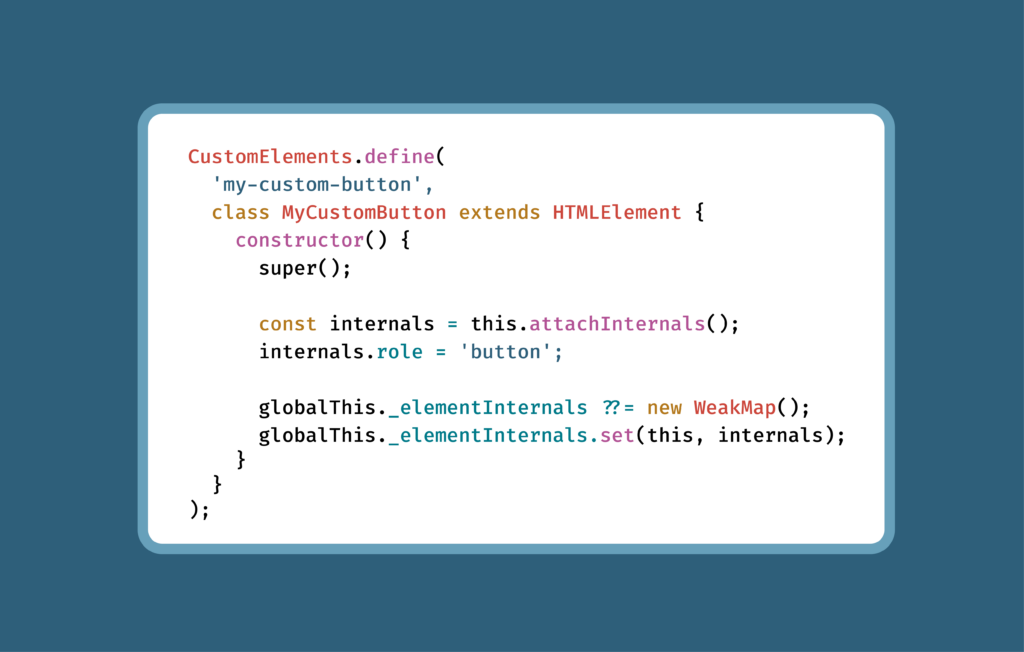
Fortunately, custom elements can solve the standardization problem: build a component once, and it works in any framework. ElementInternals, a feature of custom elements, lets a component declare its own accessibility role, like whether it functions as a button or a checkbox, without relying on Accessible Rich Internet Applications (ARIA) attributes added from the outside after the fact. That addresses the accessibility factor. And, with Axe-core now supporting ElementInternals, you can test those components and trust the results.
Fragmented components mean fragmented accessibility
When it comes to accessibility, there’s no partial compliance. If nine out of ten implementations of a button pass and one doesn’t, the organization doesn’t get to claim it has accessible buttons. It has one that fails.
At enterprise scale, this makes testing and compliance difficult. There can be dozens of independent implementations of the same component, and confirming that all of them, not just most of them, are accessible requires checking each one on its own terms. That’s a lot of costly, time-consuming work.
Custom elements: How the browser solves the framework problem
A custom element is built once, directly on top of what the browser provides, rather than on top of any particular framework. React, Vue, and Angular can each consume the same custom element, because the browser itself defines what the component is. Nothing about the underlying markup or behavior depends on which framework happens to be rendering it.
Many of the enterprises we work with are moving in this direction already, because it’s the only realistic way to standardize a component library across an organization that isn’t going to consolidate onto one framework anytime soon.
Where custom elements started: Bolt-on accessibility
A custom element with no special markup is just an anonymous piece of HTML, the same as a plain <div>. To make something like that behave like a button or a checkbox for assistive technology, you have to bolt that meaning on from the outside, using ARIA attributes like role=”button” or aria-checked=”true”. It works, but it’s an extra step, applied after the fact, and the burden falls on whoever assembles the component to remember it every time.
What ElementInternals makes possible: Built-in accessibility
With ElementInternals, a custom element can declare its own role and state from the inside, as part of its own definition, rather than depending on whoever assembles the component to add the right ARIA attributes later. A custom element built with ElementInternals can say, in effect, “I function like a tab” or “I’m currently checked,” as part of how it’s built, not via something layered on top.
To put this in context: browsers and assistive technologies have historically relied on two layers of accessibility information. The first is native semantics, the meaning built into standard HTML elements like <button> or <input>. The second is ARIA, the attributes you add to any element to describe what it’s supposed to be when the native tag doesn’t already say so. ElementInternals introduces a third layer: the same kind of semantic vocabulary, but now expressible from inside a custom element’s own logic rather than only in its markup.
The false-positive problem
ElementInternals solves something important, but there’s a catch. For accessibility testing to be trustworthy, it needs to be able to see that third layer. Otherwise, you get a false positive: a component that’s correctly built and correctly declares its own accessibility semantics getting flagged as an accessibility failure.
To prevent this from happening, we needed to update Axe-core.
The Axe-core solution
Making accurate testing possible for our large enterprise customers that were using ElementInternals meant building a new way for testing tools to see this data, since ElementInternals doesn’t expose itself the way ARIA does.
The result: starting in version 4.13.0, if you’re testing custom elements with Axe-core, ElementInternals-based semantics are recognized for the rules most responsible for producing false positives: aria-allowed-attr, aria-prohibited-attr, aria-required-parent, aria-required-children, and the list/listitem rules. In practice, that means a custom element that declares itself as a list item through ElementInternals is now recognized as one, instead of being flagged for missing a role it already has.
To our knowledge, Axe-core is the first automated accessibility testing tool to support ElementInternals in any capacity.
One thing to note: ElementInternals are invisible to Axe-core by default. Developers need to specifically give Axe-core access for them to be picked up. You can find guidance on how to do that at this GitHub community protocol.
Next steps
If you’re a large enterprise organization with accessibility issues resulting from interoperability challenges, moving to ElementInternals is a savvy move. You can standardize, and safely test.
If you’re already running Axe-core against custom elements, upgrade to 4.13.0 or later and re-run your existing test suite to confirm that any false positives you were seeing are now resolved.
Contact us to learn more about Axe-core’s ElementInternals support and what it means for your design system.
Wilco Fiers
Wilco has been in the field of accessibility for 18 years, and is the product manager of Deque’s advanced rules, and previously of axe-core and axe linter. He has a leading role at the W3C as Deque’s advisory committee representative, facilitator of the ACT Task Force, and former project manager of WCAG 3.0. On behalf of Deque, Wilco managed the EU-funded accessibility projects WAI-Tools & WAI-Coop, and regularly does public speaking on various topics related to digital accessibility.
What started nearly two decades ago as conversations between two people passionate about improving accessibility across Microsoft’s digital experiences has grown into a lasting partnership built on shared learning, mutual respect, and a common belief that accessibility should be built into every stage of software development.
I recently had the opportunity to reflect on that partnership with Jenny Lay-Flurrie, who was, at that time, Microsoft’s Chief Accessibility Officer (she has recently assumed the role of Vice President, Head of Trusted Technology). We filmed a short video about our organizations’ work together. Watching it back, what stood out to me was not just the milestones, although there have been many. It was the relationship behind those milestones: a partnership built on trusting each other enough to ask hard questions, challenge assumptions, and think through problems together.
The next frontier: Artificial intelligence that starts with accessibility
My conversation with Jenny was not just about the past. We also talked about where accessibility can go next, especially as artificial intelligence (AI) continues to reshape how software is built.
Today, we are at a critical juncture. Regulation, AI transformation, and digital accessibility are converging, and it requires a new kind of response from accessibility and engineering leaders. AI has the potential to dramatically accelerate software development, but only if accessibility is built into those workflows from the very first prompt, not fixed after the fact.
As we’ve seen through our own research, when accessibility is fully embedded into AI-assisted development, organizations reduce costs, lower compliance risk, and improve software quality. More importantly, they build experiences that work better for everyone.
The disability community has been advancing human-computer interaction for decades. That expertise isn’t just important from an accessibility perspective. It’s technically essential for building AI systems that are more robust, more reliable, and ultimately more effective.
The future of accessible AI will be shaped by the practices we establish today. That is a challenge bigger than any one organization can solve alone. It is exactly the kind of challenge that requires collaboration, and it reminded me why our long partnership with Microsoft has been so meaningful.
Partnership as a way of thinking, not just a way of working
During our conversation, Jenny reflected on something that has defined our relationship over the years:
“There aren’t many people to have that depth of conversation, where you’re genuinely curious about solving a challenge together rather than simply trying to reach a deliverable.”
Her words resonated with me because they capture something that many people in the accessibility community experience every day. Technical integrations and shared projects matter, but they’re built on something deeper: trust, curiosity, and a willingness to learn from one another. The accessibility community has understood this for years: meaningful progress comes not only from technology, but from the relationships and shared commitment behind it.
In an industry where accessibility expertise is still unevenly distributed, it is vital that we act in concert as a community. Tools alone are not enough. We need the shared expertise and lived experiences of everyone together, so that we can determine what is and isn’t working and what we can achieve together.
Building momentum across the accessibility community
One of the clearest examples of where this collaboration has led is Axe-core, Deque’s open-source accessibility rules engine. Microsoft has built Axe-core into its own development and testing practices for many years, making automated accessibility checks a standard part of how its teams ship software.
That internal adoption didn’t stay internal for long. Today, Microsoft vendors and partners are regularly expected to meet the same accessibility standards Microsoft was holding itself to.
This is the impact of a company like Microsoft making accessibility a priority. When organizations with broad reach set expectations for accessible products and experiences, those expectations extend throughout the ecosystem.
We see organizations strengthen their accessibility practices because Microsoft sets clear expectations and because the tools and guidance exist to help teams meet them.
That is what collaboration can do. It can turn one organization’s commitment into momentum for an entire community.
Collaboration, not competition
Accessibility has never been a zero-sum game. Every time one organization makes the digital world more accessible, everyone benefits. That is why collaboration has always mattered more than competition in this space.
Digital accessibility does not move forward because one company or one tool solves the problem. It moves forward when organizations choose to build together, share what they learn, and invest in solutions that benefit the broader community.
That is the lesson I continue to believe in: Find peers who will challenge you. Build together. Share what you learn. Stay curious.
For teams looking to strengthen their accessibility efforts, start by asking one simple question: who are the partners, advocates, and experts you can learn from? Accessibility moves faster when knowledge is shared. Whether through open source communities, industry conversations, or collaboration with accessibility practitioners, every organization has an opportunity to contribute to a more accessible digital world. We’re proud that organizations like Microsoft partner with Deque on accessibility, and we’re grateful for the trust every single one of our customers puts in Deque to help ensure their products and services are accessible.
We have a rare opportunity to shape the future of software at the same time we’re shaping the future of accessibility. Let’s seize it. By embedding accessibility into AI from the start and continuing to learn from one another, we can build better technology and experiences for everyone. The need is urgent and the time is now.
Preety Kumar
Preety is the CEO of Deque Systems and co-founded Deque in 1999 with the vision of unifying Web access, both from the user and the technology perspective. Under Preety's leadership, Deque has grown to be a market leader in the field of information accessibility, serving corporate and government clients with the highest standards in information technology such as Veteran Affairs, Department of Education, Humana, Intuit, HSBC, Target, and others. She collaborated with the W3C Web Accessibility Initiative and is a nominated member of the Accessibility Forum's Strategic Management Council: a GSA sponsored group with representatives from the IT industry, academia, Government Agencies, and disabled user groups that fosters information accessibility through mutual cooperation.
There’s a new deadline looming for the Accessible Canada Act (ACA), and it’s a significant one. From here, it may still look far away. But the work required to meet the new requirements is substantial. It will require a sequential effort with many steps, and you need to start now if your business is going to safely meet the new deadline. Previously, you were required to develop, commit to, and publish a plan. Now, you have to actually deliver against that plan.
The process should begin with self-assessment: where does your organization currently stand, where are the gaps, and what actions should you prioritize? In this post, I’ll share a five-question framework you can use to self-assess, and provide you with some clear next steps you can take today.
But first, let’s make sure we’re clear on deadlines and expectations.
Understanding the new deadline
Last year, the Accessibility Commissioner found 95 organizations non-compliant. The issues were wide-ranging. Some organizations published their accessibility plan in a format people with disabilities could not read. Some took their documents down early, before the seven-year retention period was up. Some named barriers without detailing what they intended to do about them, making progress impossible to verify.
This all took place before December 5, 2025, when Canada added a new requirement: technical evidence. What you tested. What you found. What you bought. Who you trained. Where you still fall short, in writing, on your own website.
That’s what the new compliance deadlines are all about, as detailed below:
December 5, 2027. Federal public sector organizations have to have their accessibility statement published, their web page conformance in effect, and the first round of training finished. Training must be completed that day for federally regulated businesses with 100 or more employees.
December 5, 2028. Web page requirements reach businesses with 100 or more employees. Mobile apps, digital documents, accessibility statements, and procurement requirements reach the federal public sector and businesses with 500 or more employees.
Note: Transportation providers, broadcasters, and telecommunications entities are exempt from some of these requirements, and the exemptions are drafted differently from one provision to the next. If you operate in one of those sectors, get your determination in writing before you build a plan around it.
Five reasons why the urgency is real
As I mentioned above, compliance is a multi-step process. Let’s explore why.
The statement is the last step, not the first. To write a public disclosure, you have to first test, prioritize fixes, and commit to dates. It’s a chain of actions, and the deadline lands on the last link. You need lead time to get there.
Conformance starts the day the rule starts. The new requirements apply to pages you create or update on or after the deadline. On day one, you must be producing conformant output. That means your design system, components, authoring practices, and QA gates must be adapted and ready months before the deadline hits.
The first round of training has to be completed, not started. Every single person who builds, maintains, or buys technology—across engineering, content, and procurement—has to have been trained by the deadline, and you’ll need the records to prove it. The requirement also states that refresher training must be completed every three years. Standing up a new training program is hard work in itself and takes time. Ensuring everyone actually completes the training is all the more challenging. You’ll need to set aside several quarters for this effort.
Get accessibility requirements into your procurement contracts now. Starting December 5, 2028, federal public sector entities and private sector entities with 500 or more employees must obtain a conformity assessment with gap analysis when initiating a procurement for products or services connected to a regulated web page or mobile application. The requirement attaches to the procurement action, not to products already in place. But the regulation doesn’t obligate your vendors to hand you an assessment. Your contract language does. Procurement templates take months to revise and even longer to become default practice.
Your next progress report is the first draft of your accessibility statement. Your progress reports are public, and your accessibility statement will be public. If the barriers in one do not match the gaps in the other, it will be clear to anyone who reviews them. It’s essential that your plans, progress, and proof tell the same story.
These requirements sit under the Accessible Canada Act. The rules are formally called the Digital Technologies Accessibility Regulations, and they add a new part to the Accessible Canada Regulations covering websites, mobile apps, and digital documents.
The technical standard is CAN/ASC-EN 301 549. For web content, that means WCAG 2.1 Level AA. If your organization is also subject to Ontario’s Accessibility for Ontarians with Disabilities Act (AODA), this is the same target you have been aiming at since 2021.
The five-question self-assessment framework
Getting started means assessing whether your current accessibility program is ready for greater regulatory scrutiny and identifying any gaps in governance, testing, procurement, and reporting. That is why it’s critical to start now. You can use the five-question self-assessment I share below as a kind of diagnostic trigger. It’s not a solution, but it’s a simple, practical way to surface the information you need right now.
Once you’ve identified the issues, you can assess how serious they are and determine what to do about them. That’s where Deque comes in. We’re here to absorb and interpret those diagnostic results and build a path to compliance with you.
As you work through these, you’ll see that each of these questions has a required document behind it—a record the Commissioner can ask you to produce, with a retention period attached.
1. Can you produce the accessibility conformity assessment?
Your obligation is conformance to the standard CAN/ASC-EN 301 549. An assessment with a gap analysis is how you demonstrate conformance. You must retain the report in electronic form for four years after completion.
One additional item to note: If you continue to offer a downloadable app that launched before your deadline, you still owe an assessment on that app, even though the conformance requirement itself only applies to apps launched later.
To get started, ask your team which properties have a current, documented gap analysis. And remember, an automated accessibility scan is not a full assessment!
Required documentation: A conformity assessment with gap analysis that must be kept for four years.
2. Does procurement produce an accessibility gap analysis, or just ask a question?
For the federal public sector and for businesses with 500 or more employees, the rule states that when you buy products or services for a website or app you are responsible for, you must obtain an accessibility conformity assessment with a gap analysis as part of that purchase.
Most procurement templates do not do this. A vendor questionnaire is not a gap analysis. Neither is a vendor’s Accessibility Conformance Report (ACR) on its own.
The Accessibility Commissioner of Canada’s 2025–2026 Annual Report provided very clear guidance about this:
“Put formal measures in place that require your vendors and third-party providers to meet or exceed your accessibility standards, so your clients consistently receive accessible products and services.”
One additional note here: CAN-ASC-4.1, the draft Canadian standard for accessible procurement, is expected to be published in the winter of 2027. It is voluntary until written into regulation, so build your process around the ACA rule that is already law.
Required documentation: A procurement conformity assessment with gap analysis that must be kept for four years.
3. Are your accessibility barriers connected to actions that will fix them?
The key here is the need to go through every barrier in your plan and ask three things: 1) What did we do about this one? 2) Where does it stand today? 3) Who owns the work that remains to be done?
This is an issue the Commissioner has flagged for two years running—the gap between identifying and testing a barrier and actually fixing the issue and removing the barrier. If a reader cannot follow a specific barrier to the specific work that addressed it and understand where things stand now, then, from the outside, there is no progress.
Your accessibility statement lists where your digital properties fall short, and your progress reports describe what you’ve been fixing. Both are public and need to say the same thing.
Required documentation: Your accessibility plan and progress reports, which must be publicly available for seven years.
4. Can you prove who was trained on accessibility, and when?
Everyone involved in building, maintaining, or buying technology has to have been trained on accessibility fundamentals by the deadline. They’ll also need to have a refresher at least every three years. And, you have to keep an electronic record of all training activities for four years.
Training should therefore be understood as an ongoing concern, not a single milestone. You need to be able to prove it on any given day, for anyone on that list—and that includes everyone from the developer who just joined the company last month to the procurement officer who almost slipped through the cracks.
To get started, take two questions to HR and engineering: 1) Who needs to be on the list? 2) How will you produce a dated training record for each of them?
Required documentation: Training records for every relevant employee that must be kept for four years.
5. Are you ready to publish your own gap list every year?
Federal public sector organizations and businesses with 500 or more employees must publish an accessibility statement by their deadline and refresh it annually. In plain language, it must acknowledge your obligations, provide two ways to contact you about accessibility, and describe your accessibility features. It must also list where you are not meeting the standard, explain the resulting barrier, and give your plans and timelines for closing the gaps. The statement must be easy to find from every page it covers. Remember, your customers, your competitors, and the people evaluating your bids can all read it.
Required documentation: A published accessibility statement, refreshed every twelve months, with a copy that must be kept for four years.
Governance and the business case for compliance
As you review the required records detailed above, it should be clear that they all have one thing in common. Every one of them expires. Assessments go stale. Training refreshers come due every three years. Statements need republishing every year. Plans and progress reports have to stay posted for seven years.
You could literally satisfy all five requirements in 2027, and then find yourself non-compliant in 2029—without changing a thing! That is the case for governance, and it’s not just a compliance case. It’s a cost case.
Organizations without governance pay for accessibility over and over. Every deadline is a scramble. Every audit is a surprise. Every release ships bugs that a component library would have prevented, and every one of those bugs gets found late, by a customer or a regulator, when it is most expensive to fix.
Organizations with governance pay once and get compounding returns. When you fix a pattern in your design system, every page built on it inherits the fix. Put conformance criteria in your procurement template, and the market absorbs the work. Train the people who write and build, and new defects stop arriving. Your first assessment will cost what it costs, but your third will only need to be a spot check, because you’ll already know your gaps and who owns them.
Compounding progress happens everywhere. Your assessments populate your accessibility statement. Your statement lines up with your progress report. Your training log has the answers before any questions even get asked.
Most importantly, governance is what turns a compliance date into a product that actually works for your customers.
Next steps
As we’ve now established, the required work is sequential and time-consuming, and next year’s deadlines aren’t so far off after all. Fortunately, there are two steps you can take right now that will make everything else doable.
First, get your scope determination in writing. Understand which rules apply to you, based on your organization type, your employee count, and your sector. This determination drives your timeline and your budget. This is the step most often skipped, and everything below depends on it.
Second, get one real assessment. Not just an automated scan. An accessibility conformity assessment with a gap analysis on a digital property that matters. That single document will tell you what your remediation will actually cost for that property. It will seed your accessibility statement and give you the budget number you need to ask for.
From there, the order is straightforward. Inventory what is in scope. Rewrite your procurement template before you sign the next contract. Stand up training with records that hold up. Then, draft an accessibility statement you would be willing to publish, and treat the distance between that draft and the truth as your backlog.
This is all necessary work, and it’s a lot of work. But here’s the good news. If you want a partner, this is what Deque does. We help you sort out which requirements apply. We run the assessments and build the gap analyses. We train your teams and help you reach a statement you’re comfortable publishing.
Glenda Sims is the Chief Information Accessibility Officer at Deque, where she shares her expertise and passion for the open web with government organizations, educational institutions, and companies ranging in size from small businesses to large enterprise organizations. Glenda is an advisor and co-founder of AIR-University (Accessibility Internet Rally) and AccessU. She serves as an accessibility consultant, judge, and trainer for Knowbility, an organization whose mission is to support the independence of people with disabilities by promoting the availability of barrier-free IT. In 2010 Glenda co-authored the book InterACT with Web Standards: A holistic approach to Web Design.
The global digital accessibility community is experiencing a time of incredible momentum and incredible urgency. From every corner of the world, we are seeing new stories emerge—regulatory expansion, technological innovation, groundbreaking legal decisions, and more.
This is happening at a time when AI is dramatically reshaping what it means to create digital products, services, and experiences. Our entire digital universe is being created and recreated at previously unthinkable speeds. Amid this transformation, the accessibility community has, of course, been concerned about whether digital accessibility can keep pace.
With that in mind, I am elated to share that Axe-core has just surpassed 5 billion downloads! It’s a remarkable number, made all the more so by the fact that it was only a year ago that we were announcing 3 billion Axe-core downloads.
At that point, the European Accessibility Act (EAA) was the hot topic in the accessibility community, having come into effect only weeks earlier. Today, the EAA is no longer the new kid on the block. It has transformed from concept to practical reality, with enforcement being more tangible and more tactical every day.
At the same time, updates to EN 301 549 are underway. While in Canada, the Accessibility Commissioner’s new 2025–2026 Annual Report makes it clear that Canada is entering a new phase of enforcement. The Australian Human Rights Commission recently affirmed WCAG 2.2 Level AA as its minimum benchmark. The Securities and Exchange Board of India (SEBI) is now enforcing ICT accessibility requirements for digital financial services. In South Korea, new amendments to the Disability Discrimination Act and the Digital Inclusion Act focus on digital accessibility across everything from websites and apps to kiosks and video content.
The global pace is accelerating, and it’s exciting!
Speaking of pace, we’re currently seeing nearly 10 million Axe-core downloads a day, which is a more than threefold increase since last year! It’s an amazing testament to the fact that over a decade later, open source still matters. That fateful decision to release Axe-core as an open-source accessibility testing engine in June 2015 is still reverberating, and it’s gratifying to know that focus on accessibility concerns is keeping pace with the velocity increases we see everywhere else.
We can also speculate about AI’s role in these trends. We know the use of AI agents is increasing, and that AI will often use Axe-core when prompted to make something accessible. If this is the case, it’s a good reminder about the importance of teaching your agents to do accessibility right, and to not rely on Axe-core alone. As we consider the meaning of this new milestone, we must understand Axe-core’s evolving role.
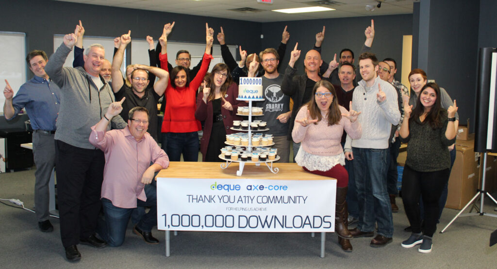
I am very grateful for this opportunity to pause and reflect. It’s not something I get to do very often. Like all of us in the accessibility community, there is truly no rest for the weary, and there remains so much to be done. But reflection helps to put things in perspective. In that spirit, I want to share a photo with you. It was taken in the Deque office in Ann Arbor, Michigan, back in 2018, when we met to celebrate the first one million downloads of Axe-core. There were lots of smiles that day, lots of high fives, and we probably all ate one too many Deque-branded cupcakes!
That was a big milestone, and the message on the sign is just as meaningful now as it was then: Thank you accessibility community! Deque CTO Dylan Barrell’s words at the time also still very much apply today: “The acceleration and wide adoption of Axe-core over the years is really a testament to the hard work of our contributors.”
Those are well-chosen words. It is hard work. While technology continues to make more things possible, it doesn’t necessarily make things easier. The reality is that technology has a knack for creating as many new problems as it solves.
In many ways, this is the world we find ourselves in today. AI is solving so much, but it is also creating new risks. So it is incumbent upon us all to ensure this transformational technology is harnessed as a force for good, and a force for digital inclusion. We can do this.
As I reflect on these Axe-core numbers, that is where my mind and my heart go—toward optimism. Because I see evidence everywhere that people are thinking about accessibility, that they care about accessibility, and that they believe accessibility matters.
Axe-core is, of course, not the entire answer. It’s a great baseline for accessibility, but it doesn’t make you accessible. For that, you need purpose-built tools and manual testing. Achieving accessibility compliance is a larger process. But ultimately, it’s not really about the number of downloads after all. It’s the energy behind those downloads. That’s what we’re celebrating today. Because every time someone downloads Axe-core because they want to make something accessible, that’s one more step toward achieving our mission of digital equality.
Preety Kumar
Preety is the CEO of Deque Systems and co-founded Deque in 1999 with the vision of unifying Web access, both from the user and the technology perspective. Under Preety's leadership, Deque has grown to be a market leader in the field of information accessibility, serving corporate and government clients with the highest standards in information technology such as Veteran Affairs, Department of Education, Humana, Intuit, HSBC, Target, and others. She collaborated with the W3C Web Accessibility Initiative and is a nominated member of the Accessibility Forum's Strategic Management Council: a GSA sponsored group with representatives from the IT industry, academia, Government Agencies, and disabled user groups that fosters information accessibility through mutual cooperation.
Accessible forms are essential for creating an inclusive digital experience, ensuring that all users—including those with disabilities—can easily complete and submit information. Well-designed forms improve usability, making it easier for individuals to navigate fields, understand labels, and avoid errors.
Beyond enhancing user functionality, accessible forms are also a key requirement for compliance with regulations such as the European Accessibility Act (EAA), the Americans with Disabilities Act (ADA), and the Web Content Accessibility Guidelines (WCAG). Organizations that fail to meet these standards risk legal consequences, reputational damage, and lost business opportunities. By prioritizing accessibility in form design, businesses can improve user engagement, expand their audience, and demonstrate a commitment to digital inclusivity.
How accessible web forms (or inaccessible web forms) can affect your daily life
Last month, I was booking a rental car for a trip. Simple task, I thought. I picked my dates, chose a car, and got to the driver details page. I filled everything in, hit Continue, and got bounced back with a vague banner at the top of the page: “Please correct the errors below.” No errors were visibly marked. I scrolled up and down twice before I noticed my zip code field had quietly turned a faint shade of pink.
There was no indication that the field was required. No indication before I started, no flag when I skipped it. The only clue was a barely-there color shift that I almost missed—and I have great eyesight and was under no time pressure. At that moment, I realized again how much is often taken for granted when forms are designed.
If a color hint was subtle enough that it escaped me, imagine the situation for a screen-reader user, someone with low vision, or anyone who was just trying to get through the form quickly on their phone!
Methods for indicating a required field
These six methods run the gamut from ideal to “make sure to combine this with another method” to “please don’t do this.” Let’s start with a method that is very reliable, if not particularly elegant.
Provide the required text in the label
For this method, users of assistive technology (and users who don’t!) will know which form control is required because it is exposed through the label. It involves simply putting the word “required” right in the visible label text.
Syntax
<label for="fname">First Name Required</label>
<input type="text" name="first-name" id="fname">
Preview
Because the word lives inside the label, every user gets it, whether they’re using a screen reader or not. There’s no dependency on symbols, color, or verbosity settings. It’s not the prettiest option—which probably explains why designers keep searching out other approaches—but it’s very reliable.
Provide an asterisk
The asterisk is still the industry default, and it’s an acceptable approach, as long as you handle two details that often get skipped.
First, tell users up front, before the form starts, that fields marked with an asterisk are required. Second, know that screen readers don’t always announce the “*” symbol; it depends on the user’s punctuation verbosity setting. If users have it set to announce “some” or “none” punctuation, your asterisk will silently disappear for them.
Syntax
<p>All fields marked with (*) are required</p>
<label for="first-name">First Name *</label>
<input type="text" id="first-name" name="first-name">
Preview
All fields marked with * are required
Because of that verbosity issue, you should treat the asterisk as a visual convenience, and not as your only accessibility mechanism. For example, you can pair it with something programmatic (see method 4). Also, make sure the asterisk is visually large enough to be seen; default browser rendering is often too small to register at a glance.
Provide a graphic asterisk with real alt text
Some design systems prefer a small icon over a plain character. That’s fine too, as long as the image carries meaningful alt text rather than being decorative.
Syntax
<label for="fname"> First Name <img src="required-icon.svg" alt="required"></label>
<input type="text" name="first-name" id="fname">
This works well, because the label and the image are still programmatically tied to the input.
Providing HTML5 and ARIA Required Attributes
This is where markup earns its keep. Add the HTML5 required attribute, or aria-required=”true” for custom or scripted controls, and assistive technology will announce the field as required automatically.
One thing worth knowing: when required is present, most screen readers will also announce the field as “invalid” until it’s filled in. That’s expected behavior, not a bug, but it does mean you shouldn’t rely on this attribute alone without including a visible cue as well. Sighted users still need to see it, not just have it announced.
Provide color alone (this is the one to retire!)
This approach is still prevalent (using color alone to indicate when a field is empty or required), and it’s still a problem. It fails outright for colorblind users, low-vision users, and anyone with a cognitive disability who needs more than a subtle hue shift to register meaning.
My rental car experience that I shared above is a perfect example. If color is part of your visual language, you can certainly keep it, but it should never be the only signal. Pair it with text, an icon, or both.
What’s new since we last wrote about required form fields
Here are a few things to consider as you’re thinking about required form fields in 2026:
Redundant entry is now a WCAG 2.2 success criterion. If you already know someone’s shipping address from a previous step, don’t force them to retype it into a “required” field further down the form. This isn’t strictly about labeling required fields, but it’s very much in the same spirit—don’t make required fields harder to satisfy than they need to be.
Inline validation is everywhere (and it’s easy to make it worse rather than better). AI-assisted, real-time validation that catches typos and flags missing fields as people type is a genuine trend in form design right now. Done well, it can help everyone finish faster. But when it’s too aggressive, it interrupts screen-reader users with error announcements before they’ve even finished typing. The better approach is to:
validate on blur (not on every keystroke),
pair the error with aria-invalid=”true” and aria-describedby pointing at the message, and
offer a summary of all errors at the top of the submission.
Required-field errors should read like “Email address is required,” never “Invalid input.”
Regulators are paying closer attention. EN 301 549, the technical standard for the EAA, still points to WCAG 2.1 AA as its floor. However, WCAG 2.2 is increasingly treated as the practical target, and enforcement bodies across the EU are actively building out audit and complaint processes this year. If your forms are still relying on color alone or unlabeled asterisks, now is the time to fix it, so you can stay ahead of regulatory scrutiny.
Getting required form fields right
Building accessible forms is ultimately pretty straightforward. Tell people which fields are required before they start, not after they fail. Communicate this with words somewhere, not just with color or a symbol. Back this up with required or aria-required attributes so assistive technology also gets the message. And when someone does miss a field, communicate clearly what went wrong and where.
A required form field may be a small piece of a larger form, but it’s also often the difference between someone completing their task and someone giving up and going elsewhere. In my situation with the car rental company, I did find the pink zip code field eventually, but not everyone would have. In that case, it’s quite likely they would have taken their rental car booking to a competitor without so much as a second thought.
Getting required form fields right can make all the difference when it comes to meeting compliance requirements and ensuring your products, services, and experiences are accessible to everyone, including people with disabilities.
If you have questions about accessible forms or want expert guidance on meeting consumer and compliance expectations, contact Deque today!
Aparna Pasi
Aparna Pasi is Vice President of Professional Services, APAC at Deque Systems, with nearly 20 years of experience in software engineering and accessibility consulting. She drives Deque’s mission by empowering organizations to build inclusive digital experiences, offering executive-level advisory and accessibility risk strategies to growth-stage companies. Aparna also contributes to the broader accessibility profession as an active WCAG Working Group Member at W3C. Throughout her career, she has led cross-cultural teams delivering accessible, compliant solutions across mobile and web technologies in industries such as banking, e-commerce, gaming, and e-learning. Aparna holds a Master of Science in Information Systems and is IAAP certified as CPWA, WAS, and CPACC.
Vestibulum imperdiet iaculis odio nam pretium praesent a a sodales habitasse sodales augue vestibulum praesent parturient parturient dignissim natoque a ullamcorper enim erat nisl.
Something went wrong. Please try again.
Free trial: Axe DevTools Extension
Get 14 days of the best accessibility testing browser extension ever, with the entire feature set turned on.