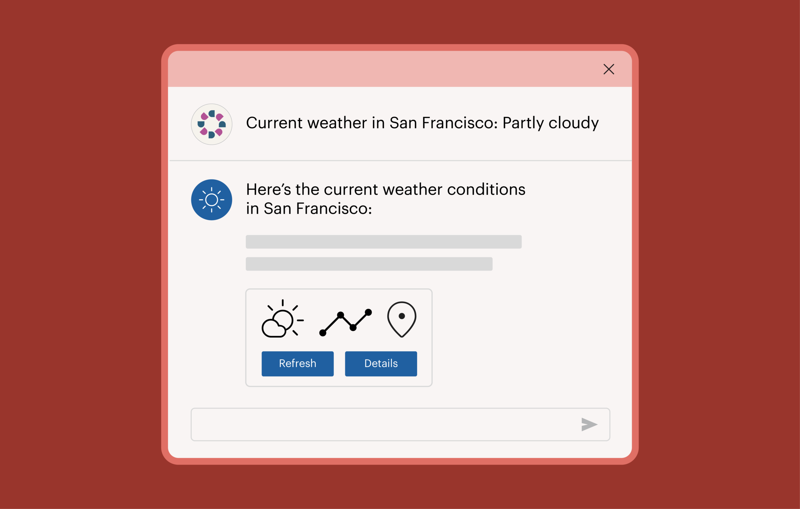
MCP Apps are changing how AI agents show information to people. Right now, when your MCP (Model Context Protocol) server returns a result, the agent handling the conversation decides what to present to the user: what to show, how to phrase it, or whether to show anything at all. MCP Apps change that. Instead of leaving those decisions to the agent, you can ship an actual interface that renders inside the client itself: buttons, forms, cards, real UI.
That’s good news, but there’s a catch. If a tool is going to ship real UI instead of plain text, you need to make sure the UI works for everybody. Otherwise, as MCP Apps spread, we will have built an entire new class of interface that locks people out from day one.
We need to step in right now, because the risk here isn’t just a poor experience. Whether the client also describes your result in text is entirely up to the client. The spec says nothing about it, and behavior varies. In our testing, Claude Desktop described results alongside the widget, while other developers have reported clients that suppress that text completely. You don’t control which one your users get.
A description isn’t a substitute anyway. Text can summarize what your app shows, but it can’t replace what your app does. Every button, filter, form field, and sort control exists only inside the widget. If the widget is inaccessible, those capabilities disappear for people who can’t use it, regardless of what the client writes underneath.
This means we need to test for accessibility.
Unfortunately, however, the official MCP Apps testing guide covers functional testing only: no unit testing, no integration frameworks, no accessibility. On top of that, the MCP specification itself doesn’t mention contrast, keyboard, screen reader, or focus. They’re both essentially silent on accessibility. This issue has been raised before, including in this GitHub ticket from February 2026, which asks the group to “validate that the spec provides the hooks and constraints needed for strong accessibility.”
Fortunately, while testing MCP Apps for accessibility is fundamentally different from testing web apps, it can definitely be done, and done well. In this post, I’ll show you how.
Why testing MCP Apps is different
When it comes to testing MCP Apps for accessibility, you’re immediately dealing with two concrete problems that don’t exist in the same way with web apps.
You can’t force a live agent to show you every state your app can be in. Testing normally means producing edge cases on demand: the empty result, the error, the string long enough to break your layout. Against a real client and a real tool call, you would have to find inputs that happen to produce each one, and for some states, no input will do it.
The protocol guarantees at least one of them: your app has to load, complete a handshake, and report that it is initialized before the client can send it any data, so there is always a moment when you are on screen with nothing to show. Canceled and teardown are the same kind of thing, driven by the person or the client rather than by your data. None of these are edge cases you can schedule by picking a better prompt.
Your app renders inside a sandboxed, cross-origin iframe, in a page you don’t control.
To test it at all, you need a client that renders your app in a browser. MCP Inspector works well, and our own MCP server team uses it: it renders your app the way a production client does, and it’s straightforward to point browser tooling at.
From there, most testing tools still can’t see into the frame. Axe DevTools can, giving you a choice: scan the host page and get your app’s issues alongside the client’s, or target the frame and get back only your app’s issues.
Both options leave the real constraint in place: you’re a guest. You need to know the frame path; it’s specific to the client you’re testing in, and it breaks when that client changes its markup. The client decides when your app renders and with what data. Nothing about the environment holds still long enough to be a reliable test target.
A local dev server fixes both problems.
How to test
First, some vocabulary. The application your app renders inside, whether that’s Claude Desktop, VS Code, or something else, is what the spec calls the host. Your app and the host talk over a small JSON-RPC protocol, which is where message names like ui/initialize and host-context-changed come from.
An MCP app’s state is driven by the messages the host sends it, so testing one largely means replaying those messages yourself. Apps that call back out, whether through the host or to an API you’ve declared, also need those responses stubbed. You’re not mocking internals, adding test hooks, or building a second version of the UI for testing. Your app can’t tell your harness from a real client, which is exactly what makes the results meaningful.
Setup
Serve the exact artifact your MCP server serves. Import the same HTML from the same module your ui:// resource handler uses. Don’t copy it or build a variant. If your dev server and your MCP server can drift apart, they will, and you’ll end up testing a UI your users never actually receive. This is the single most important decision in the whole setup.
Write a stub host. This takes less than 100 lines of code. It answers ui/initialize, sends tool input and tool result once the app reports it’s initialized, and replies to ui/open-link. That’s the whole thing: no framework, no dependencies, and it works in any language with an HTTP server.
The harness renders no UI, ever. Your app is the top-level document here, so any buttons or state pickers land in the same DOM as your app, and every accessibility scan reports your own dev chrome as your app’s problems. The stub is a script tag with nothing visible.
Make every state addressable. Your stub needs to be told which fixture to replay, and a URL parameter is a simple way to do it: one URL per starting state, selecting a fixture rather than holding your app’s state. Since scanners take URLs, you get a ready list of targets out of it.
Getting to a state isn’t the same as testing it. Once you’re there, interact with the app the way a user does and scan what you reach. Fixtures exist for the states clicking cannot produce: the failed call, the canceled run, the teardown, and the app on screen before any data arrives.
The states you need to test
Walk the message sequence and take every branch: connecting (initialize unanswered), awaiting data, streaming input, success, empty, error, canceled, teardown, and context change.
Then cross that with a data axis: minimal, many items, and pathological data, meaning long unbroken strings, right-to-left text, and missing optional fields. Cross the whole thing again with light and dark themes.
Turn each state into a URL
Print every URL on boot, and serve them as JSON. The output of setup is a list of URLs that any tool can consume, and that a person can paste one at a time. That’s the handoff point between the harness and the testing.
What to run against each URL
Run automated rules plus advanced rules against every target, at a realistic chat-column width rather than a full desktop viewport. Then run Intelligent Guided Tests.
This is where the harness pays off. You don’t need a new tool built specifically for MCP Apps. You use Axe DevTools the same way you already do, against a target you now control completely.
How to avoid common mistakes
Even with a solid harness in place, there are a few mistakes specific to MCP Apps worth knowing about as you build your app’s UI.
Document structure
Start your headings at h1. Your app is its own document inside that iframe; heading levels are scoped to it, and you have no way of knowing what the client’s outline looks like. Trying to slot in underneath it by starting at h2 oder h3 is a guess that will be wrong in some clients, or in some position in the conversation.
Don’t skip heading levels.
Give the document a real and sufficiently descriptive title. A screen reader user moving into your app may hear nothing else.
Keep the title and the h1 from saying the same thing. The title should describe the app, something like “Accessibility results,” and the h1 should describe this particular result, like “4 accessibility issues.” If a client announces both, they complement each other instead of repeating. Avoid putting the tool’s name in your h1, because that is the string a client is most likely to be using for the frame label already.
Keyboard shortcuts
If your MCP app binds keyboard shortcuts, be sure to check them against the client’s. If the MCP client has shortcuts to open menus or perform toolbar actions, theirs may trump yours.
Another consideration is that your app lives in its own document, so a keystroke inside it won’t necessarily reach the client through the page the way it would in a typical app. Some clients may forward keys deliberately; others won’t. You can’t assume your bindings work globally, and your users can’t assume the keys they rely on elsewhere in the conversation still work while focus is in your widget. Test both.
Either way, the best approach is to allow users to remap keyboard shortcuts. If you bind a single key, WCAG 2.1.4 requires that the shortcut be switchable off, remappable, or active only while the relevant component has focus. Remapping is the most forgiving option, and it’s the only one that also helps with the collisions above. Whatever you bind, make sure focus can still leave your app by keyboard.
CSS and styling guidance
Use tokens for both halves of a color pair, or neither. The specific failure to watch for is a host-provided background paired with your own hardcoded text; a pairing nobody can verify. The spec itself warns about this hazard.
Pair within a semantic family. Shipping --color-text-danger alongside --color-background-danger says the two are meant to be used together and to meet contrast when they are. --color-text-tertiary on –-color-background-secondary says nothing of the kind. The spec doesn’t require hosts to verify either way, so treat a matched pair as a good default rather than a promise, and scan it.
Set color in as few places as possible. Establish a pair on a container, let descendants inherit it, and use currentColor for borders, icons, and SVGs. Fewer declared pairs means fewer combinations you have to verify.
Fallback colors need to work in both directions: legible against your own fallback background, and legible against whatever the host actually provides.
Use --color-ring-* for focus indicators, and check that ring against the host’s surface, not just your own.
Safe area insets
Don’t use env(safe-area-inset-*) directly. It resolves against the viewport of the browsing context where it’s evaluated, and inside your app that is the iframe, not the device screen. Your frame’s viewport carries none of the device’s notch or home indicator geometry, so in practice you get zeros that tell you nothing about where the real edges are. The client is the only party that can see them, which is why it passes them to you instead: read them from hostContext.safeAreaInsets and set them as CSS custom properties yourself, as the snippet below does. The bullets that follow assume you have.
Apply insets to whatever actually paints at the edge, not just body. That includes fixed toolbars and anything else pinned to the edge of the screen.
Compose with max() rather than adding: padding-block-end: max(12px, var(--safe-bottom)). You keep your own padding when the inset is zero and get the inset when it’s larger, instead of stacking one on top of the other.
Reapply insets on every update instead of reading them once. Rotation and display-mode changes both change insets, and host-context-changed sends a partial context, so merge new values in rather than replacing what you have.
Default to zero, and treat the whole thing as progressive enhancement. The field is optional, and plenty of hosts won’t send it.
This mostly matters in fullscreen and picture-in-picture. An inline widget sitting in a scrolling chat column is already inside the host’s own safe area, which is why inline insets are usually zero. The field earns its keep when your app owns the whole screen.
There’s no SDK helper for this. You have to write it yourself:
function applyInsets(insets = {}) {
  const root = document.documentElement;
  for (const side of ["top", "right", "bottom", "left"]) {
    root.style.setProperty(`--safe-${side}`, `${insets[side] ?? 0}px`);
  }
}

:root { --safe-top: 0px; --safe-right: 0px; --safe-bottom: 0px; --safe-left: 0px; }
.page { padding-inline: max(16px, var(--safe-left)) max(16px, var(--safe-right)); }
.toolbar { padding-block-end: max(12px, var(--safe-bottom)); }
This mirrors how you’d already write env() in a normal web app.
Reduced motion and other media queries
Reduced motion needs no special handling. Use the same prefers-reduced-motion media query you’d use in any other web app. The same is true for prefers-color-scheme, forced-colors, and prefers-contrast. All four propagate through intact.
What you can do today
MCP Apps are still new enough that whatever approaches we can establish now will be the ones that stick over the long term. Which means if we can get accessibility right at this stage, it will stay right as the ecosystem grows. This is how we can avoid introducing the same problems we’ve had to deal with across the rest of the web for so long.
The good news is, you can start right now. Stand up the dev server. Walk your states. Point the accessibility tools you already have at a target that will hold still long enough to test.
Remember, the ultimate goal is digital products, services, and experiences that work for everyone. MCP Apps are showing promise, and they have a lot of momentum. Now is the time to ensure they’re accessible.