Large organizations face a challenge when it comes to standardizing their components. Most enterprises run more than one frontend framework at once: one product line built in React, another in Angular, a newer acquisition running Vue. Chances are, those choices made sense at the time, and solved a real problem. But maintaining a separate version of the same component for every framework gets expensive as an organization grows, and keeping those versions consistent with each other only gets harder over time.
This has implications for accessibility. While every one of those independent implementations represents an opportunity to meet accessibility requirements, there’s no single way or place to verify all of them at once.
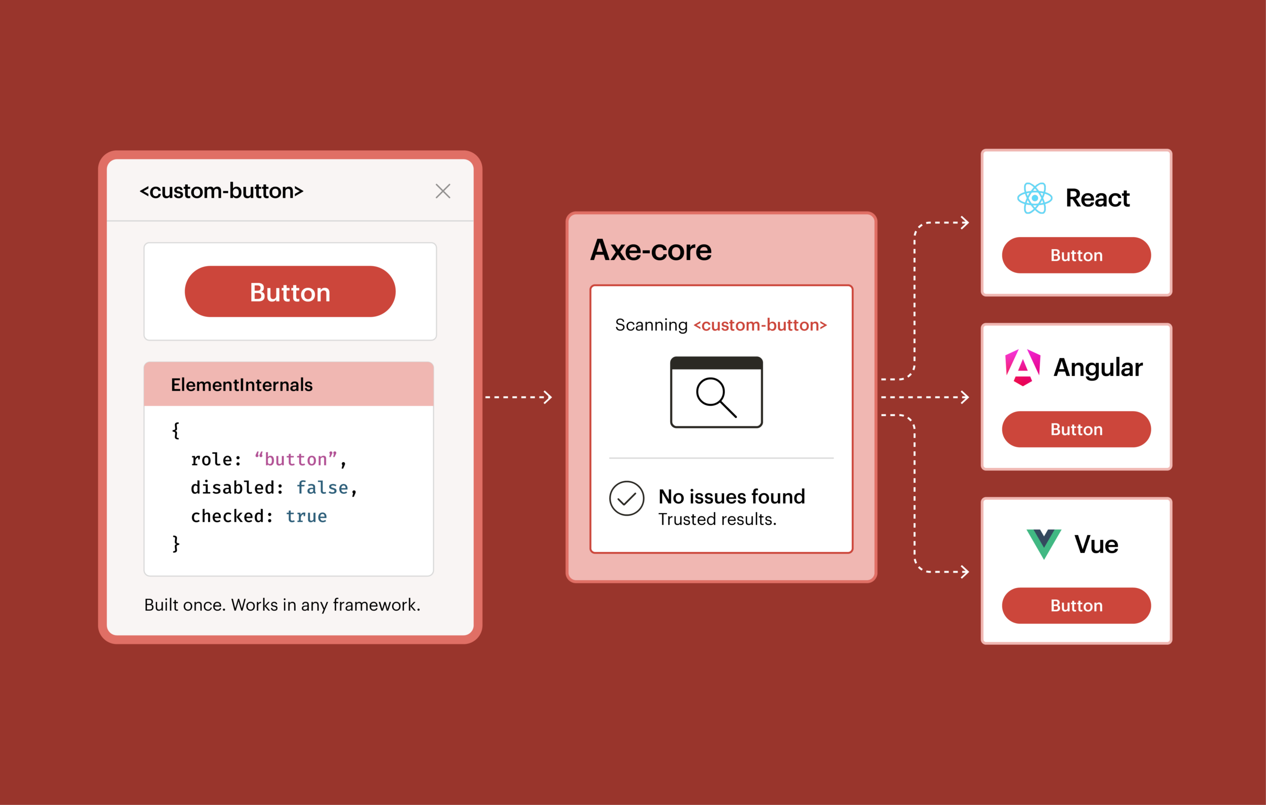
Fortunately, custom elements can solve the standardization problem: build a component once, and it works in any framework. ElementInternals, a feature of custom elements, lets a component declare its own accessibility role, like whether it functions as a button or a checkbox, without relying on Accessible Rich Internet Applications (ARIA) attributes added from the outside after the fact. That addresses the accessibility factor. And, with Axe-core now supporting ElementInternals, you can test those components and trust the results.
Fragmented components mean fragmented accessibility
When it comes to accessibility, there’s no partial compliance. If nine out of ten implementations of a button pass and one doesn’t, the organization doesn’t get to claim it has accessible buttons. It has one that fails.
At enterprise scale, this makes testing and compliance difficult. There can be dozens of independent implementations of the same component, and confirming that all of them, not just most of them, are accessible requires checking each one on its own terms. That’s a lot of costly, time-consuming work.
Custom elements: How the browser solves the framework problem
A custom element is built once, directly on top of what the browser provides, rather than on top of any particular framework. React, Vue, and Angular can each consume the same custom element, because the browser itself defines what the component is. Nothing about the underlying markup or behavior depends on which framework happens to be rendering it.
Many of the enterprises we work with are moving in this direction already, because it’s the only realistic way to standardize a component library across an organization that isn’t going to consolidate onto one framework anytime soon.
Where custom elements started: Bolt-on accessibility
A custom element with no special markup is just an anonymous piece of HTML, the same as a plain <div>. To make something like that behave like a button or a checkbox for assistive technology, you have to bolt that meaning on from the outside, using ARIA attributes like role=”button” or aria-checked=”true”. It works, but it’s an extra step, applied after the fact, and the burden falls on whoever assembles the component to remember it every time.
What ElementInternals makes possible: Built-in accessibility
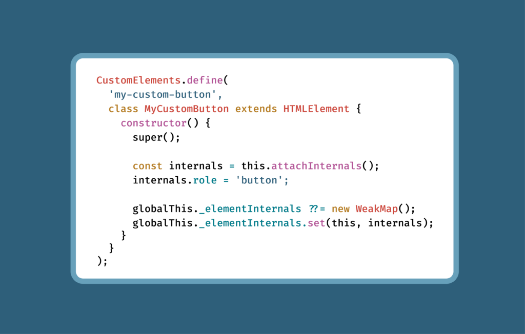
With ElementInternals, a custom element can declare its own role and state from the inside, as part of its own definition, rather than depending on whoever assembles the component to add the right ARIA attributes later. A custom element built with ElementInternals can say, in effect, “I function like a tab” or “I’m currently checked,” as part of how it’s built, not via something layered on top.
To put this in context: browsers and assistive technologies have historically relied on two layers of accessibility information. The first is native semantics, the meaning built into standard HTML elements like <button> or <input>. The second is ARIA, the attributes you add to any element to describe what it’s supposed to be when the native tag doesn’t already say so. ElementInternals introduces a third layer: the same kind of semantic vocabulary, but now expressible from inside a custom element’s own logic rather than only in its markup.
The false-positive problem
ElementInternals solves something important, but there’s a catch. For accessibility testing to be trustworthy, it needs to be able to see that third layer. Otherwise, you get a false positive: a component that’s correctly built and correctly declares its own accessibility semantics getting flagged as an accessibility failure.
To prevent this from happening, we needed to update Axe-core.
The Axe-core solution
Making accurate testing possible for our large enterprise customers that were using ElementInternals meant building a new way for testing tools to see this data, since ElementInternals doesn’t expose itself the way ARIA does.
The result: starting in version 4.13.0, if you’re testing custom elements with Axe-core, ElementInternals-based semantics are recognized for the rules most responsible for producing false positives: aria-allowed-attr, aria-prohibited-attr, aria-required-parent, aria-required-children, and the list/listitem rules. In practice, that means a custom element that declares itself as a list item through ElementInternals is now recognized as one, instead of being flagged for missing a role it already has.
To our knowledge, Axe-core is the first automated accessibility testing tool to support ElementInternals in any capacity.
One thing to note: ElementInternals are invisible to Axe-core by default. Developers need to specifically give Axe-core access for them to be picked up. You can find guidance on how to do that at this GitHub community protocol.
Nächste Schritte
If you’re a large enterprise organization with accessibility issues resulting from interoperability challenges, moving to ElementInternals is a savvy move. You can standardize, and safely test.
If you’re already running Axe-core against custom elements, upgrade to 4.13.0 or later and re-run your existing test suite to confirm that any false positives you were seeing are now resolved.
You can find the full set of changes in the Axe-core changelog, and track the original discussion in GitHub issue #4259.
Contact us to learn more about Axe-core’s ElementInternals support and what it means for your design system.