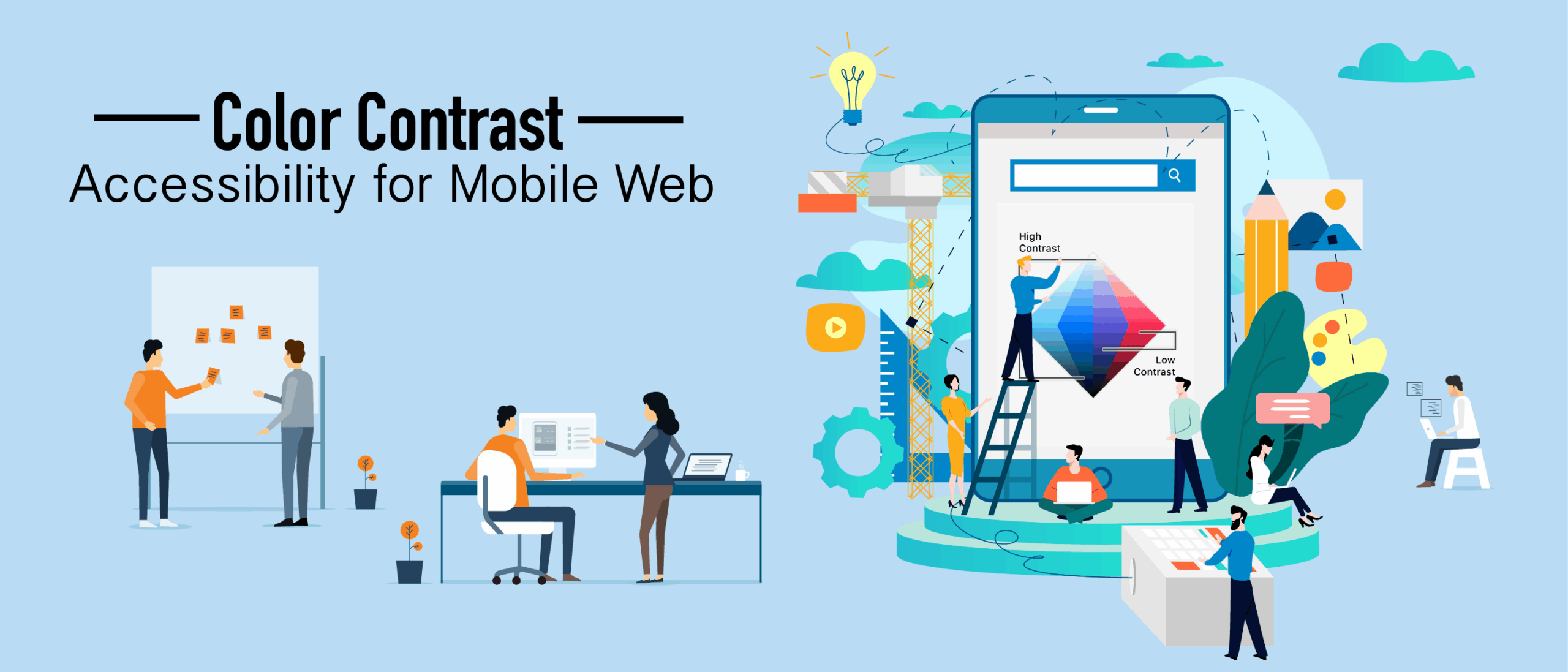
Der Farbkontrast ist ein aktuelles Thema im Bereich der Barrierefreiheitstests. Oftmals werden dabei jedoch die speziell für das mobile Web geltenden Best Practices zum Farbkontrast im Hinblick auf die Barrierefreiheit übersehen. Beginnen wir damit, uns näher mit den Richtlinien für barrierefreie Webinhalte (Web Content Accessibility Guidelines, kurz WCAG) und dem Erfolgskriterium zum Mindestkontrast zu befassen. Außerdem werden wir uns damit beschäftigen, was Webdesigner bei der Gestaltung beachten sollten, und prüfen, welche Tools sie zur Analyse des Farbkontrasts ihrer Entwürfe nutzen können.
Wenn Sie möchten, können Sie hier meiner aufgezeichneten Schritt-für-Schritt-Anleitung folgen:
WCAG 2.0 und Farbkontrast
In den WCAG 2.0, den Richtlinien für barrierefreie Webinhalte des W3C, ist das Erfolgskriterium der Stufe AA, das sich auf den Farbkontrast bezieht, 1.4.3. Dieses Erfolgskriterium lautet: „Mindestkontrast: Die visuelle Darstellung von Text und Textbildern weist ein Kontrastverhältnis von mindestens 4,5:1 auf, mit Ausnahme der folgenden Fälle“:
- Großer Text: Großer Text und Abbildungen von großem Text weisen ein Kontrastverhältnis von mindestens 3:1 auf;
- Nebenbei bemerkt: Wenn der Text oder die Textelemente Teil einer inaktiven Benutzeroberflächenkomponente sind, die rein dekorativen Charakter hat, für niemanden sichtbar ist oder Teil eines Bildes ist, das andere wesentliche visuelle Inhalte enthält, gelten für sie keine Kontrastanforderungen.
- Logos: Für Text, der Teil eines Logos oder Markennamens ist, gelten keine Mindestanforderungen hinsichtlich des Kontrasts.
Betrachten wir einmal großen Text, womit beispielsweise 18-Punkt- oder 14-Punkt-Fettdruck gemeint sein könnte – oder eine Schriftgröße, die eine vergleichbare Wirkung erzielt. Beachten Sie dabei unbedingt, dass die Punkt-Skala ursprünglich für den Druck gedacht war. Heute haben wir es mit dem Web zu tun, und Designer müssen die Skalierung in Pixeln, Prozentwerten und EMs betrachten. Zusammenfassend lässt sich sagen, dass die Größen 18 Punkt und 14 Punkt nicht mit 18 Pixel und 14 Pixel gleichzusetzen sind. Die Pixelgröße ist bei der Gestaltung für mobile Geräte sogar noch relevanter. Die Umgebung spielt eine größere Rolle – so kann es beispielsweise unterschiedliche Lichtverhältnisse geben. Man könnte in ein Restaurant mit gedämpfter Beleuchtung gehen oder sich im Freien aufhalten, wo Sonne und Helligkeit herrschen.
Automatisierte Tools zur Analyse des Farbkontrasts
Eine Möglichkeit, das Farbkontrastverhältnis zu ermitteln, sind automatisierte Tools. Das aXe-Tool von Dequebeispielsweise leistet sehr gute Arbeit bei der Analyse des sogenannten Hex-Codes. Jedes automatisierte Tool, das für Sie gut funktioniert, wird den Hex-Code wahrscheinlich sehr gut analysieren können. Eine Herausforderung für automatisierte Tools entsteht, wenn es eine Hintergrund- und eine Vordergrundfarbe gibt, dazwischen jedoch ein Bild liegt. Bei diesem Bild kann es sich um ein dekoratives Bild oder um einen Farbverlauf handeln. Auch Bilder mit Text stellen für automatisierte Tools eine Herausforderung dar. In diesem Fall sollte man auf ein Pipetten-Tool zurückgreifen. Um aXe zu verwenden, klicken Sie mit der rechten Maustaste auf „Element untersuchen“, um die Seite zu analysieren. Der Bericht gibt möglicherweise an, ob Elemente einen ausreichenden Kontrast aufweisen oder nicht.
Designer: Was Sie beachten sollten
Ein wichtiger Hinweis: Bei einer Schriftgröße von 18 oder 14 Punkt in Fettdruck darf das Kontrastverhältnis nur 3:1 betragen. In allen anderen Fällen muss das Kontrastverhältnis mindestens 4,5:1 betragen. Es ist außerdem wichtig zu beachten, dass Designer die Deckkraft des Textes ändern können. In diesem Fall kann der Hex-Code zwar einer bestimmten Farbe entsprechen, die Deckkraft hat sich jedoch möglicherweise geändert, sodass die Farbe heller erscheint. Darüber hinaus sollten Text und Bilder mit dem Pipettenwerkzeug analysiert werden, um die Pixel des Textes als Vordergrund und die des Bildes als Hintergrund zu ermitteln. Sobald Sie auf das Pixel klicken, das Sie analysieren möchten, wird der Hex-Code in Ihre Zwischenablage kopiert.
Zu verwendende Werkzeugarten
WebAIM ist eine Website, auf der Sie Hex-Codes kopieren und einfügen können, um das Farbkontrastverhältnis zu analysieren. Tanaguru ist ein weiteres hervorragendes Kontrast-Tool. Mit diesem Tool können Sie die beiden zu prüfenden Farben bearbeiten und das maximale Verhältnis anpassen. Oft wissen Designer nicht, wie sie einen unzureichenden Farbkontrast beheben können, und häufig handelt es sich bei den von ihnen verwendeten Farben um Markenfarben. In diesem Fall werden Fachexperten zwar sagen, dass die Anforderungen nicht erfüllt sind, doch letztendlich stellen Markenfarben eine Ausnahme dar. Mit diesem Tool können sie die von ihnen bevorzugte Farbe verwenden und so anpassen, dass sie so nah wie möglich an den Wert 4,5 herankommt.
Zusammenfassung: Die Mobilfunknutzung hängt von den Umgebungsbedingungen ab
Man sollte auch bedenken, dass es bei Mobilgeräten und der Funktionsweise von Mobilbildschirmen eine ganz eigene Dimension der Textgrößenanpassung gibt. Man sollte solche Aspekte im Auge behalten. Beispielsweise gibt es bei verschiedenen Viewports und Mobilgeräten Probleme mit der Schriftstärke, die für die Barrierefreiheit relevant sind. Die Textgrößenanpassung ist ein weiterer Faktor, der sich auf den Farbkontrast und die Lesbarkeit auswirkt. Dieses Video bietet einen kurzen Überblick darüber, wie Designer Probleme mit dem Farbkontrast beheben können und welche Tools ihnen dabei zur Verfügung stehen. Ich habe außerdem einige Punkte angesprochen, auf die Designer bei der Gestaltung mobiler Weboberflächen achten sollten. Im Folgenden finden Sie einige hilfreiche Links, die Sie bei Ihren zukünftigen Tests und Entwürfen unterstützen sollen:
- Tool zur Umrechnung von Schriftgrößen
- Tanaguru-Kontrastfinder
- WebAIM-Farbkontrast-Prüftool
- Axt
- CBs gute und schlechte Beispiele für Farbkontrast
Schreibt gerne unten eure Kommentare oder stellt Fragen – ich freue mich darauf, von euch zu hören.