

I love colors. This fact should not surprise anyone who knows me (I’m an avid knitter, and I love seeing how different colors can interact with each other in patterns). On top of just being nice, colors can be helpful for parsing through data, providing feedback, and creating visual continuity. But, using the wrong colors can make a bad impression. Attempting to read bright text against a bright background, for example, not only hurts the eyes, but it can also be downright unreadable, especially for those with color blindness.

How do we make sure that the color palette chosen for your app results in a good user experience, even for those with low vision and color blindness? In this blog post, I’ll cover
- general color contrast standards
- mobile-specific concerns when testing color contrast and
- how to ensure your mobile application meets these color contrast standards.
What is Acceptable Color Contrast?
Simply put, having an acceptable color contrast means that any visible text in your app can be seen clearly by any sighted user, even people with low vision or color blindness. When designing an app, it is important to ensure that the background colors do not interfere with the app’s foreground text. So, at what point is there a good enough contrast between the text and its background where it can be called “acceptable”? And, how do we make sure that text is readable by everybody, including those with low vision or color blindness?
The Web Content Accessibility Guidelines (WCAG) has a specific guideline (WCAG 1.4.3) to help figure out whether text is readable for sighted users. This criteria uses a particular algorithm to map color combinations into comparable ratios. Using this formula, WCAG states that a 4.5:1 color contrast ratio with text and its background is adequate for regular (body) text, and large text (14+ pt bold, or 18+ pt regular) should have at least a 3:1 color contrast ratio.
Special Considerations for Mobile
Unfortunately, mobile is not that simple. Before we jump right into ways to test for mobile, there are a few things to keep in mind when testing specifically on mobile apps. In particular, the rise of Dark Mode as an OS-wide setting, and what to do about Large Text.
Dark Mode
In the last few years, iOS and Android have both released a system-wide “Dark Mode” feature. If your app supports Dark Mode, you should test your app for color contrast issues in both Dark and Light Modes. If your app has any other themes that affect background and text colors, you should test the color contrast on each of those themes as well.
Large Text
It is difficult to determine text size by looks, particularly on mobile, which can have a wide range of DPI and screen sizes. For this reason, unless you know for sure that a certain font is 18+ pt or 14+ pt bold (24px or 19px bold for web), do not assume that text can be considered large.
High Contrast Settings
There are a few “High Contrast” settings available. In iOS, there’s “Increase Contrast,” and in Android, there’s “High Contrast Text.” Both of these are OS-wide settings where a user can increase color contrast across their entire device. Even though it’s great to support these settings in your apps, you cannot use them as a way to meet WCAG criteria. When testing color contrast in your app, make sure that you have all high contrast settings set to “OFF.”
Testing Methodologies
There are a few different ways you can test color contrast, and it all depends on what information you have access to. Fortunately, there are many websites and desktop applications available that can help calculate the color contrast ratio, so that you do not have to calculate it yourself! Below, I have highlighted four different ways to test color contrast on mobile.
Using Color Palettes
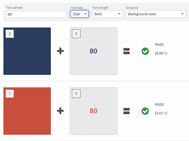
If you have access to your mobile app’s color palettes, this can be quite simple. I personally recommend using Deque’s Color Contrast Checker. Plug in the colors and input which are background and which are text colors, and it will tell you whether your color palettes meet WCAG 1.4.3. If they do not, it can recommend alternate colors that will meet this criteria. This is the preferred way of checking color contrast, as it will give you the most accurate color contrast ratios.
Testing on Simulators
If you do not have access to the color palette but have access to the mobile app on a simulator, you’ll have to use a website or desktop app that allows you to use a color picker. I have used both Deque’s Color Contrast Analyzer (website) and the Colour Contrast Analyzer (desktop app), and both work quite nicely. For each text element on screen, use the color picker tool to get the rendered text and background colors. To assess these colors as accurately as possible, you’ll want to pick the lightest pixel in the text, and the darkest pixel in the background (or vice versa if the text is dark and the background is light). Note that using the color picker tool may not be 100% accurate; however, it is a fairly accurate way to estimate the color contrast.
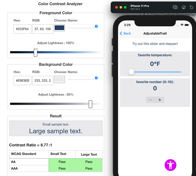
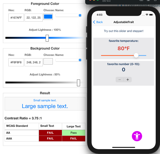
Here in this screenshot, the text elements that use the dark blue pass with a color contrast ratio of 8.77:1; however, in the next screenshot, the default color for the “Back” button present on most iOS apps has a color contrast ratio of 3.75:1, which does not meet WCAG success criteria.
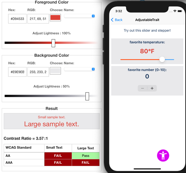
If the text color can change based on user input, check that color contrast too! In this example, when the slider is shifted to a higher value, the text color changes from dark blue to bright red. The new color contrast of this text element is 3.57:1. I happen to know in this instance that the font size is 30pt bold, so it does pass color contrast because it counts as large text.
Testing on Devices
Testing on a device is similar to testing on a simulator but involves an extra step. You first will have to take a screenshot of every screen and send it to your computer. Then, you can follow the same steps as testing on a simulator. Make sure to get screenshots with each different theme, and a screenshot if the text changes color!
axe DevTools Mobile
If you want to save some time with testing, but don’t have access to the color palette, axe DevTools Mobile can help! It can accurately check the color contrast of every text element on-screen for you, saving you time and money. Try out axe for Android (it’s free)!
Conclusion
There is a lot to consider when testing color contrast for mobile, but having adequate color contrast can be a simple way to make your app better for many users, including those with low vision or color blindness. If you want to learn more about mobile accessibility, check out our other blog posts and try out our iOS and Android products! If you have any questions, feel free to contact us, our experts are always willing to help.