ARIA Spec for the Uninitiated: Part 3
In the second part of this 3 part series, I went over the ARIA Authoring Practices to highlight key notices to hopefully dispel the incorrect practice of using the patterns demonstrated in the guide as a cookbook to copy/ paste without testing first. Before that, in the first part, I went over the actual ARIA spec and the 5 rules of ARIA. You should read those previous parts before getting into this third and final part, where I tie everything together in a practical example to create and Expand/ Collapse control.
Building an Expand/Collapse Control
For this example, I am going to start by creating an Expand/ Collapse control. In Bootstrap, this is called Collapse, and other UI libraries may call it Collapsible, but I am going to call it Expandable which hopefully will make sense to you soon enough.
Starting with the following basic HTML, here is some markup for an FAQ:
<h2 class=“faq-title”>

Where can I find the ARIA spec?

</h2>

<p class="faq-content" hidden>The ARIA Spec is located at <a href="https://www.w3.org/TR/wai-aria/">https://www.w3.org/TR/wai-aria/</a></p>
Imagine that the JavaScript provided allows someone to select a FAQ title to expand and collapse the content underneath. Unfortunately, this markup will only work for someone using a mouse or tapping with a touch device but not for anyone else using a keyboard, screen reader, or other methods of input. A person using a screen reader may be able to navigate to this content, but may not know it is a control they can interact with. Even if they somehow guessed, they would not be able to do so with their keyboard.
To start, I want to fix the problem of not expressing this control as interactive. To do that, we need to talk about semantics.
Semantics
Semantics express what something is. Once you know what something is, then you know how to use it and what is the expected result from using that thing. Semantics play a very big part in the accessibility of interactive web components.
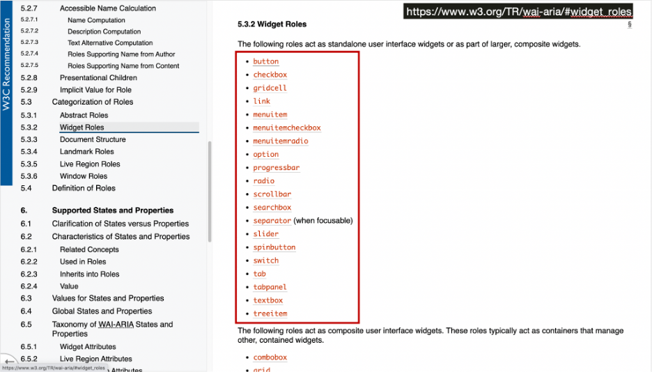
Every interactive control must provide the following three things: name, role, and value. Of these three things, it’s the role that provides semantics. The ARIA 1.1 standard provides 70 usable roles. Of these 70 roles in ARIA version 1.1, only 29 of them are interactive widget roles.
These are the only roles that are available in ARIA, you cannot make up your own! I repeat you cannot make up your own roles. You can select any of these roles to get more information. For this example, I am going to start with the button role.
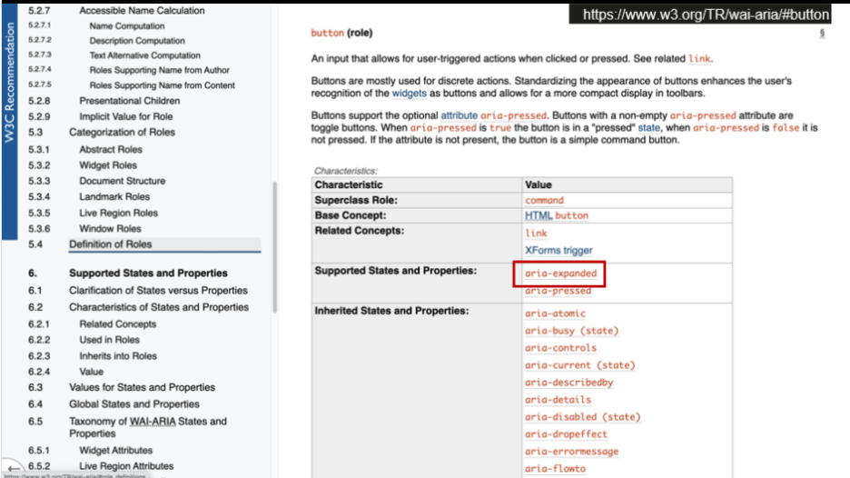
The button is described as “An input that allows for user-triggered actions when clicked or pressed.” That sounds exactly like what I need so I am going to add role=”button” to the FAQ title.
<h2 class=“faq-title” role=”button”>

Where can I find the ARIA spec?

</h2>
This control now has proper semantics and is communicated as a button to assistive technologies, but the definition also mentions that this should be triggered when “clicked or pressed.” This means that I should at least be able to activate this button by pressing the SPACE key, but it doesn’t fully work.
This is an important lesson in ARIA and semantics: ARIA roles don’t provide interaction, they simply just describe what something is. YOU need to provide the expected interaction. That means that this button is not complete, and I have effectively broken the first three rules of ARIA in the process.
I broke the First Rule of ARIA by using the ARIA role of button instead of just using an actual HTML button element. I broke the Second rule of ARIA as well, by putting the role of button on the h2 I effectively replaced the h2 semantics with the role of button. Finally, the Third Rule of ARIA that I broke was that the button is not accessible by keyboard.
To fix this, I can throw a whole lot of code at this like setting the tabindex to 0 to make it focusable with a keyboard. Then, maybe listen to key down events for ENTER or SPACE, and that would technically complete the button. Insead, I am going to make very quick change with very little impact to the JavaScript:
<h2 class=“faq-title”>

<button> Where can I find the ARIA spec?</button>

</h2>
First, I removed the role=”button” from the h2 then wrapped the FAQ title text with a <button>. That’s it! It’s a small change with a huge impact. HTML can provide semantics, focusability with TAB, and pair with your JavaScript to provide the expected interaction. This is why accessibility professionals stress learning HTML so much: it does a lot of the heavy lifting for you.
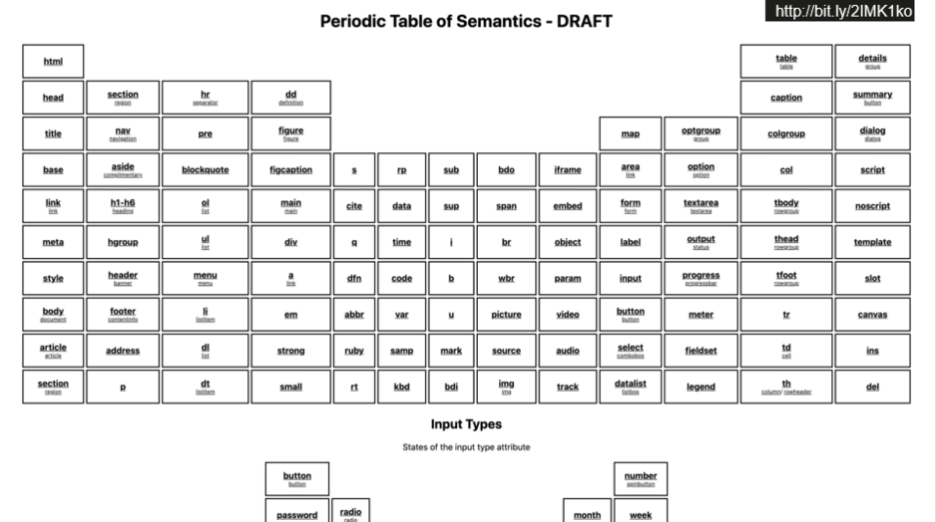
I know it’s a lot easier than it sounds since there’s a lot of HTML elements to choose from and it can be hard to know when to use HTML vs. ARIA. To help, I’m currently working on a periodic table of semantics.
This periodic table of semantics lists every HTML element available and matches it to an ARIA role. If you need to provide semantics, you can easily find out if there is an HTML element you can use. If not, you can fill in the gap using ARIA.
Maybe you’re not impressed with this example so far because technically I’m not using any ARIA. By using HTML to provide semantics, I don’t need ARIA yet. This is meeting the First Rule of ARIA: don’t use ARIA when you could use HTML instead. ARIA should only be used to fill in gaps when necessary, and there is a gap that I still need to fill.
States and Properties
Interacting with the button produces a visual change on the screen as it expands and collapses the answer, and since the main focus of accessibility is to provide the same experience to all users I need to express this change programmatically to assistive technology users. To do that I need to use some ARIA states and properties.
Along with providing semantics by way of roles, ARIA also provides states and properties to further describe interfaces to assistive technologies. Going back to the three things that all interactive controls need– name, role, and value– ARIA states and properties help provide values in order to present various dynamic changes programmatically.
In the latest version, ARIA 1.1, there are a total of 48 states and properties documented in section 6.6 for Definitions of States and Properties, and they all start with “aria-”. Similar to roles, you cannot make up your own states and properties. There are strict rules about which states and properties can be applied to specific roles.
Considering there’s a large set of options and a limited way to set and apply them, how do you figure out the right one to use? Well, we can check back on the button role definition to find out. Each role definition includes a table of characteristics which includes a list of supported states and properties. For the button role, there are two states and properties that are supported, one of which is the aria-expanded state.
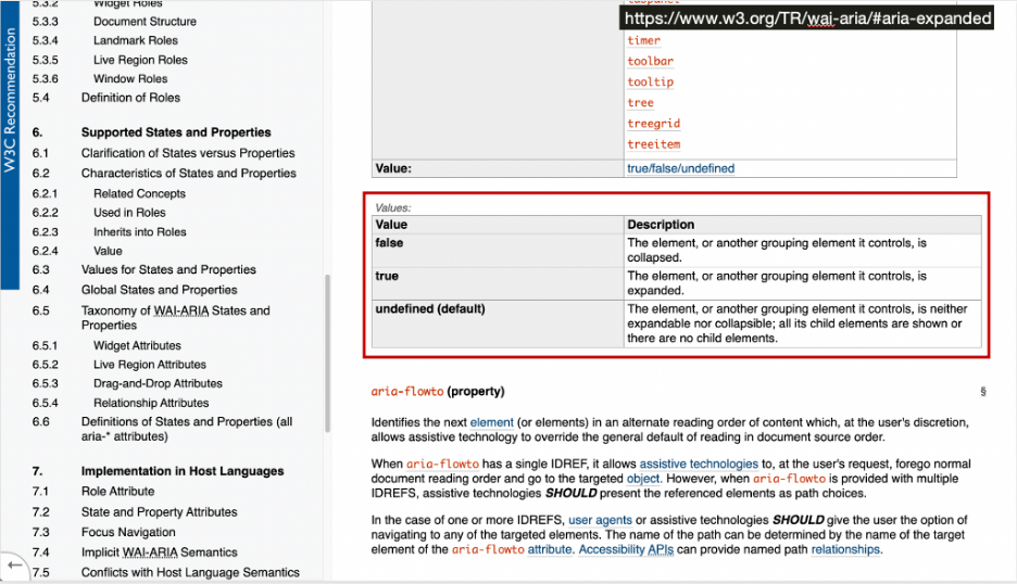
Looking at the definition of aria-expanded, it indicates whether the element, or another grouping element in controls, is currently expanded or collapsed. This is exactly what I need to express programmatically what is being done visually. Just like role definitions, each state and property definition has a table of characteristics. In the “Used in Roles” section, I can confirm that the button role will support aria-expanded.
As with most elements of ARIA, states and properties have a very specific set of values that they accept, you cannot make up your own values. This information is defined in the Values table. In the case of aria-expanded, only true, false, or undefined are valid. Undefined is the default value if none is provided, and in this case it’s better to leave the aria-expanded state off altogether instead of specifying a value of undefined.
I’m going to update the markup and simply just add aria-expanded=”false” on the button. I need to update the JavaScript to toggle this state between true or false. I won’t actually go over the JavaScript – you can use whatever you want, it doesn’t really matter. The important thing to remember is that the markup is rendered in the browser, and that is what your users and assistive technologies interact with. So whether you’re using jQuery or React, it doesn’t matter, the markup just has to be right.
<h2 class=“faq-title”>
<button aria-expanded="false">Where can I find the ARIA spec?</button>
</h2>
By this point, you should recognize why I decided to call this component Expandable. Adding the aria-expanded state will let assistive technology users know that this content can be expanded or collapsed, matching the visual change to provide the same experience for all users.
This example now provides name, role, and value information to assistive technologies and can be operated using a keyboard. I was able to do this with two small changes to the HTML and nothing to the CSS or JavaScript. The only thing left to do now is to test with various assistive technologies and browsers, and hopefully with disabled users with lived experiences.
Update 9/22/21: Speaking of testing, the code examples included here have been updated to nest the button in the header instead of nesting the header in the button, after Adrian Roselli and Scott O’Hara pointed out it was better to stick with the proper HTML and not rely on AT fallbacks. This only helps strengthen the point to TEST and validate your work.
Conclusion
In this final post, I walked through a practical example of using the ARIA spec to build a simple component while honoring the 5 Rules of ARIA. You now know how to use the ARIA spec to understand the relationship between roles, states, and properties which you can use to develop your own accessible components. The trick to ARIA is that It all starts with knowing HTML first, and then using ARIA to add additional information that HTML does not provide.
In summary, don’t be afraid of ARIA! Familiarize yourself with the specs, learn how to use them properly, and use ARIA only when needed. Mastering ARIA is not just about how to use it but, more importantly, when not to use it.


